|
|
 Roberto Arcari Farinetti
 {K:209486} 5/27/2006
|
wooww is so blurry that have a lot feeling my dear hugo, is so perfect also for the "project"..
a nice week end to you and yours..
cheers
roby
|
|
|
|
 In Transit
{K:29432} 5/1/2006
In Transit
{K:29432} 5/1/2006
|
On a flight I was reading an issue of the UK B&W, an d the application of lighting... with use of a while & a black reflector... I am not into this sort of thing... but it was 'enlightening'!
Window light is clearly the most complimentary!
|
|
|
|
|
dd df
{K:191} 4/9/2005
|
Hi, Hugo. I think using window light was best choice for this photography, cause it gave her face softness, youthfull and also she doesn't look so artificial with studio lights. Make model native in face is sometimes hard, but you did it perfectly. Keep up the good work. Best, Matej.
|
|
|
|
 Vinay Raj
{K:5537} 3/17/2005
Vinay Raj
{K:5537} 3/17/2005
|
Hugo
Nice mood, nice pic.
|
|
|
|
 PK- Photos
{K:13099} 11/13/2004
PK- Photos
{K:13099} 11/13/2004
|
Hi Hugo, I like this natural portrait and her look, but I am wondering about the little grainy-effect with this Sigma lense, I have the same.....
P.S. thanks VERY MUCH for all your comments&critique about my photos!:)
Ciao, Pia
|
|
|
|
 Hugo de Wolf
{K:185110} 11/6/2004
Hugo de Wolf
{K:185110} 11/6/2004
|
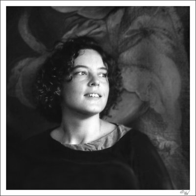
Hi Richard, thanks for your comment. It's not so much of motion blur, but the result of a very bad scan... I did what I could to make something of it, as I needed this shot within the two others in this series....
I took this shot during a wedding, during the ceremonies.... Playing around with reflectors wasn't much of an option, but I do like the idea!
Cheers,
Hugo
|
|
|
|
|
Richard Thornton
{K:26442} 11/6/2004
|
I am a big fan of window light portraits and pretty models as well. I think the softness appears to me to be motion blurring which suggests that there was some subject movement or that a tripod was not used. I wonder about the square format and how it would look with a more conventional vertical frame. The tones of the hair and the background merge in places. A reflector to the left might give just a little separation of hair from background. A nice feeling to this.
|
|
|
|
 ventrix drogo
{K:65398} 10/25/2004
ventrix drogo
{K:65398} 10/25/2004
|
Very good portrait. Great composition. I like it. Bye.
|
|
|
|
|
altur .
{K:6087} 10/23/2004
|
This serie is wonderful... great, expressive portraits. You used the light/exposure very nicely and managed to creat such a wonderful atmospher on these portraits and captured nice expressions on their faces. Congrats, good work.
Best regards, Alex
|
|
|
|
|
Hugo de Wolf
{K:185110} 10/20/2004
|
Hi Carmem, You are always allowed to say "I like it"...;o) Good to hear from you again! Thanks... ) )
Cheers,
Hugo
|
|
|
|
|
Carmem A. Busko
{K:48785} 10/20/2004
|
Hi, Hugo, since I?m late, and everything has been said, may I like say only " I like it" at this time?
In my opinion, this is the best of them. I must say "I loved it". Fav!
And what you calls a "bad scanning" looks perfect to me. It adds a very romantic mood!!!
Cheers,
C.
|
|
|
|
 Lilywhite Lilith
{K:1809} 10/17/2004
Lilywhite Lilith
{K:1809} 10/17/2004
|
expression and lighting are superb!
and i agree with biliana about the "out of focus" effect.
regards, ekkehard
|
|
|
|
|
Hugo de Wolf
{K:185110} 10/9/2004
|
Hi Ray,
Thanks for your comment, and I do see what you mean. Eventhough I don't quite agree with you on the first count, I do agree with you on the second. As I'm sure you are aware, I cannot influence the comments made by others. Rest assured, that if I don't like a particular shot I do say so too, but I do try to keep it constructive.
As for the first count, I also see the scanning quality as one of the flaws, but I decided to post it anyway, as my intention was not to post it as a good example of portrait photography (not even to be a special one), but to express an atmosphere. That idea is more profoundly explained in the second upload of this triptych. I apparently failed to get that across, but that's what Usefilm is for. Experiment, learn by the (Constructive) input of others as well as by ones mistaces, and thus improving ones work. At least that's the way I see it.
I appreciate your honest opinion, and am happy you explained it. I'd rather have constructive comments pointing out the flaws and providing advise on how to improve them, than positive comments without content. Douglas' comment wasn't very constructive though, nor had any relevant content, at least that's the way I perceive his bitter tone.
There's nothing wrong with being creative, I think. Creativeness isn't art, it's a trick that can be learned, and which can be very useful in experimenting in whatever field you're in to approach things differently. The softness is not created as an experiment to be creative; that's the distinct difference.
Cheers,
Hugo
|
|
|
|
 Rocco T
{K:4130} 10/8/2004
Rocco T
{K:4130} 10/8/2004
|
Excellent capture!
regards.Rocco
|
|
|
|
|
Hugo de Wolf
{K:185110} 10/8/2004
|
Douglas,
I found your comment utterly useless, and far from constructive, even reaching on destructive and rude. Regardless of the fact that you don't like the image, or you awarding it with a two, I respect your opinion about it, bearing in mind it's impossible to please everyone. I find your cynicism and the tone of your comment appalling.
And what on earth does the number of comments have to do with anything that might concern you?
The way I see it, Usefilm is about giving constructive comments, helping eachother to improve our skills. I don't see how your recent comments fit that profile. I've seen too many sneers by you, and I'm through with them.
I'd appreciate it if you kept your comments and bitterness to yourself, or find some other site to vent your frustations on.
Hugo
|
|
|
|
|
Ray Heath
{K:4559} 10/8/2004
|
must agreee with Douglas, this is very ordinary, may well be a fault in scanning, but if so why post, presentation is of the utmost importance, a badly presented image is a bad image, if soft focus is done for effect do it properly and do it when it suits or adds to the subject
too many people on this site lavish blind praise, why is this, not everything a creative artist does is 'excellent', if you don't like it say so, don't follow the mob, and if you reply to me that you really like it than you also are being creative and fooling yourself
|
|
|
|
 神 風
{K:10665} 10/8/2004
神 風
{K:10665} 10/8/2004
|
Regarding what EVERYONE else has said this is a totally amateur snapshot without the proper telephoto zoom ... end of story!
My rating is a two instead of one for encouragement!
P.S. If anyone else would have submitted this besides you it wouldn't have gotten more than ten views and probably NO comments!
|
|
|
|
 tom rumland
{K:14874} 10/7/2004
tom rumland
{K:14874} 10/7/2004
|
hugo, i'm sorry to hear that so many folks find the softness a bit too much. i feel worse for suggesting i liked this one vs. the alternate you were thinking of posting. regardless of all that, this is still my favorite of the two possibilities (2nd choice not posted).
i think the softness works very well here by reflecting the aloof and almost laizes-faire (sp?) attitude of the model. makes me wonder what she's truly thinking and what exactly she's looking at. in your words "it adds tension" that imo would be minimized with a tack sharp exposure. it also makes her seem like a memory. a memory of a girl seen in passing, just for a second. the softness becomes the mental blur of a fading memory, if you will.
excellent shot and great work on your part cleaning up the scan and in the process adding to the image.
take care,
tom
|
|
|
|
 Thilo Bayer
{K:50358} 10/7/2004
Thilo Bayer
{K:50358} 10/7/2004
|
Dear Hugo,
as promised, here comes my 2 cents ;-)
First of all: I know this model from somewhere... some of the wedding pictures? Is this your wife?
Anyway, let's start with the composing. As I've taken a look to the original image, I must say that the cropping was wise. The near-quadratic format is a nice variant, especially for portraits IMHO. The off-centering gives the subject more room, and the texture in the back is a nice contrast. What intrugues me is the way the dress is consumed into the darker left corner. Intention or not? not so sure if I like that special point...
The expressions, the look to the right side, the way the model ignores the camera... gives the impression of a snapshot. and that creates a very natural mood that so many portraits lack.
As for the pure technical side, you mentioned all the flaws. must be a pain in the neck to work on that. To be honest, I didn't like the soft look too much, even before reading that it comes from the original image. I would love to see more detail in the hair, more detail in the dress, a tad more sharpness... just dreaming.
I think this is a great portrait, but the technical "problems" places this image on place third in your portrait series.
hope you don't mind, my friend ;-)
Take care,
thilo
|
|
|
|
|
Regina Rianelli
{K:24147} 10/6/2004
|
hi there,
nice Model and great achievements thought the scale of tones.
my Best,
Regina
|
|
|
|
|
Hugo de Wolf
{K:185110} 10/5/2004
|
Hi Omar, thanks for your comments; I appreciate your effort and time in perceiving in these images what you write in your comments, as that's what I intended with this series. In my about / narrative below the image, I explained what I had in mind. It fits very well with your vision; I'm really happy to see that image is conveyed as planned....:) Very cool to notice someone picked it up! Thanks!
Cheers,
Hugo
|
|
|
|
|
Omar Rifaat
{K:10141} 10/5/2004
|
for me this image tell a less 'complex' story. I get the 'impression' that the subject is transitioning from a difficult time in life (shadows behind) to an easier one (light in fornt).
Forgive me if I read too much into these, but I find them really absorbing!
|
|
|
|
|
Hugo de Wolf
{K:185110} 10/5/2004
|
Hi Michele, thanks for your comment; placing the woman more to the left would indeed balance the shot a bit more. I doubted between the excessive space, which I think plays an important role in this triptych and the obstacles in the frame (see the original image I attached to my reply to Emgy) As for the balance in the composition, you have a very good point, though. Thanks.
Cheers,
hugo
|
|
|
|
|
Hugo de Wolf
{K:185110} 10/5/2004
|
Hi Christian, As always, I enjoyed reading your comment, and I really appreciate you indepth analysis and suggestions. Very useful.
The easiest item to be answered is that she wasn't aware that her photo was being taken. At the time I took this, a speech was held, full of emotion and humour, and she was completely absorbed by it... The look in her eyes you are referring to is one of anticipation and concentration, I believe.
As to the crop, that's more difficult to address; I see what you mean, and I think it would be a very sound solution.
In this series, which I finished uploading today, I think the excessive space plays an essential part, not only in the consistency between the three shots, but also in the idea I tried to get across. I am aware, that I didn't quite succeed in getting it across, and that I need to work on that more, (hence the lengthy explanation under the second and third image) but that's the reason I posted it as is....
My apologies for the late reply; I like to ponder on things before I speed off into replying...
Cheers,
Hugo
|
|
|
|
|
Michele Berti
{K:14921} 10/5/2004
|
This is nice as well. Here, if I was to suggest something, I would try to put the lady on the same position, portraiture and look but just a bit more on the left... I think that way the whole comp. would be a bit more equilibrated, but this is just my personal taste. BTW, very very beautiful serie. Congrats.
|
|
|
|
 Saeed Al Shamsi
{K:47735} 10/4/2004
Saeed Al Shamsi
{K:47735} 10/4/2004
|
A very well balanced portrait, expression and atmosphere , excellent ,what I would like to see ,is adding some drama, by cleaning and focus effects on the face, so can make it all the more striking. Excellent work though, Saeed
|
|
|
|
 Bulent Ahiskal
{K:1251} 10/4/2004
Bulent Ahiskal
{K:1251} 10/4/2004
|
I'm impressed the expression of her face. Great work. Regards, Bulent.
|
|
|
|
 Fadel J
{K:13974} 10/4/2004
Fadel J
{K:13974} 10/4/2004
|
Another very beautifull portrait Hugo, wonderfull lighting and tones!
|
|
|
|
|
Lori Stitt
{K:75282} 10/3/2004
|
Hi Hugo,
My goodness, I've missed a few!!
I was about to say that out of focus just isn't the same as soft focus, however, I see from your remarks it's due to scanning. (You MUST get another scanner ASAP! LOL)
I like the background, and I don't think she is too close, not for this type of photo. I especially like how the 'curly' theme runs over into the fabric, both in what she is wearing (neckline) and the background. Very nice. If fact, I LOVE the background.
I rather like her expression, very natural, and very nice window light.
It's just really difficult for me to get past the focus.
Nice job Hugo!!
Lori :)
|
|
|
|
|
Ahmet Baki Kocaballi
{K:13618} 10/3/2004
|
Hi Hugo,
beautiful portrait,i very like her expression and little smile,
regards
Baki
|
|
|
|
 Thamer Al-Tassan
{K:1358} 10/3/2004
Thamer Al-Tassan
{K:1358} 10/3/2004
|
Hi Hugo,
Great expression you've captured, it looks good in B&W. I'm not sure about the soft focus, was it intended? Although soft focus works in some cases, I don't see it working here, but thats just me :)
Cheers...
|
|
|
|
|
Christian Barrette
{K:21125} 10/3/2004
|
Hello Hugo.
OK enough about the softness. It has all been said.
I would suggest a different crop given the original. Right below her shoulders and extending to the right just before where the painting frame starts.
Most of all, I'd like to say a word about her smile, her expresion. Was she aware of her photo being taken ? I hesitate between that awareness and another feeling her expression might convey - that of a strong thought taking her somewhere else than where she is standing. Her eyes turned to the light are just marvelous, and make me see her a a beautiful day dreamer.
|
|
|
|
|
Amna Al Shamsi
{K:21795} 10/2/2004
|
you managed to show an attractive smile in this darkenss...wonderful lighting and tone.
|
|
|
|
 Khaled Mursi Hammoud
{K:54005} 10/2/2004
Khaled Mursi Hammoud
{K:54005} 10/2/2004
|
Nice composition and lighting with excellent mood and posing of the model. I think that just little focus and it'll be more than a perfect shot although as it is gives a soft mood.
I'm glad that you gave me the chance to share with you your porfolio, Excellent work Hugo.
Regards.
|
|
|
|
|
Hugo de Wolf
{K:185110} 10/2/2004
|
Hi Tim, Ik weet dat ik al geantwoord had op je commentaar, maar ik bedacht me net nog wat; dat antroposofisch gevoel waar je het over hebt klopt volledig; er waren veel antroposofen; zij hoorde daar zeker bij... Wilde dat nog even kwijt...:) Scherp gezien!
Groeten,
Hugo
|
|
|
|
|
Hugo de Wolf
{K:185110} 10/2/2004
|
Thanks!...:) Wonder what you'll think of the next one, it doesn't have the softness flaw...
Cheers,
Hugo
|
|
|
|
 Jose Ignacio (Nacho) Garcia Barcia
{K:96391} 10/2/2004
Jose Ignacio (Nacho) Garcia Barcia
{K:96391} 10/2/2004
|
magnificent. 7
|
|
|
|
|
Hugo de Wolf
{K:185110} 10/2/2004
|
Hi Emgy, if I were allowed to, I'd make you Featured critic for at least a week; Thank you very much for the indepth and consutructive comment!
In this case, I cannot agree with you on some pointss, though... Don't get me wrong, I do like the image too, but in all fairness, the softness is not completely intentional in this image; the scan was really bad: unsharp, dust specs and worst of all, heavy scanlines. I had to make an even bigger concession to the sharpness to get rid of the scan lines...
I still uploaded this image, as I do agree on the lighting, and the pure and warm smile, which I found captivating...
The background is an old painting, against which she's leaning. that explains the texture. It had an ugly glow in it created by the window.
Attatched the original scan, as you see, I did quite some work to it, only using PS for things I could've done in the darkroom, though.
Thanks, again, for your elaborate comment. I replied the initial idea behind this series in my reply to Ian, just above this reply.
Cheers,
Hugo
|

|
|
|
|
|
Sally A.
{K:4601} 10/2/2004
|
Nice B&W effect, i like how the mix of shirts she has on "grey/black" match the background.
good job.
|
|
|
|
|
Jorge Vasconcelos
{K:33746} 10/2/2004
|
OK, good reason,good explanation.
Regards
jorge
|
|
|
|
 Emgy Massidda
{K:60358} 10/2/2004
Emgy Massidda
{K:60358} 10/2/2004
|
Hi Hugo.
I've been looking at this portrait for some time now, no, not to find imperfections, but cause I think it's fascinating. What I like most of all is the spontaneity of the model (very pretty woman) and her expressivity. You captured her smile beautifully. It's a lovely, soft and gentle smile that shows us complacency and I like it more than the fake happy smiles you often see in unnatural portraits. I believe it adds a lot to the softness of the image. Having said this it goes without saying that, IMHO, the soft focus works perfectly well here.I have the feeling that it was most likely intentional. If you wanted to give this image the charm and fascination that characterize many good old photos, you succeeded pretty well. The lighting is gorgeous, the mood is nostalgic and beautiful.
As for the backbround, I think it is very nice but I would have rather seen the top left without the lighter pattern which I find a little distracting. Definitely a minor thing and a matter of taste, but I thought I would mention it anyway, you know I am often picky, hehe.
Definitely and undoubtedly a superb portrait
Hugs - Emgy
|
|
|
|
|
Telmo Domingues
{K:9639} 10/2/2004
|
LOL!!!!!!!
You are a damn Heavy Weigth photographer! heheheheh
You made me laugh with these great answers! Some other guy would answer "Yes, indeed, I made it on porpouse! This way, blah, blah......because blah, blah ....!"
Not you!
Always sharp! Always ahead!
Hugs dear friend!
LOL!!!!!!!!!!!!!!!!!!!!!
|
|
|
|
 Ursula Luschnig
{K:21723} 10/1/2004
Ursula Luschnig
{K:21723} 10/1/2004
|
Hi Hugo,I`m so sorry,I just deleted the Grafitti,before seeing your comment!I tried to resize it,but without success,as I wanted to see the square image total,without scrolling up and down.Now I see,yours is that big also,I don`t know,how to get it smaller.Pia`s are the only ones,which are smaller.
Now I upload it again...in the big size.
Kind regards,Ursula
|
|
|
|
|
Hugo de Wolf
{K:185110} 10/1/2004
|
Oy! Telmo, Thanks for your comment. I'm afraid I have to disappoint you, though. The softness was not intentional in this one.... The scan was of such a poor quality, that I had to make concessions to the sharpness in order to get rid of the scan lines....:( But I still decided to upload it. See also my first reply to Ian....
Cheers,
hugo
|
|
|
|
|
Telmo Domingues
{K:9639} 10/1/2004
|
well... Out of focus... My first thought - why?
Coming from you this is not a mistake - is an intention... I do like, really... But I don't understand the option... Anyway, and I'm not being nice, there is something here the is magnetic... My sroll bar is moving all the time... Hurry! Let us see the others!
|
|
|
|
|
Zeev Scharf
{K:25603} 10/1/2004
|
Excellent portrait Hugo,great compsition and lighting
Cheers
|
|
|
|
|
Riny Koopman
{K:19998} 10/1/2004
|
I like this photograph, I especially the composition, Its great.
Bye...Riny.
|
|
|
|
|
Hugo de Wolf
{K:185110} 10/1/2004
|
Hi Jorge, Thank you for your comment.... The choice for the softness in this image was (unfortunately) not a deliberate one. As I replied to Stefan and Ian, the initial scan was really bad, soft and with alot of scan lines. I'd preferred a bit more sharpness... That'll come in the second and third image, though.
Cheers,
Hugo
|
|
|
|
|
Jorge Vasconcelos
{K:33746} 10/1/2004
|
It?s an excellent exoression,very good portrait.May I ask you why you choose this soft focus? To make it more HCB style?
Kind regards
jorge
I don?t question the quality, but your choice.Of course it?s worth 7.
|
|
|
|
|
Hugo de Wolf
{K:185110} 10/1/2004
|
I have two more ready for upload, which are still somewhat soft, but considerably less than this one, ahd which the darkenss is more evident. The problem with this one may also be that she's leaning against the painting, which made it very difficult to create a distance between them.
I like the idea to dwarf her even more in the background; i'm not sure the two following ones will completely meet that, but that sure is something to keep in mind...
Cheers,
Hugo
|
|
|
|
 Ian McIntosh
{K:42997} 10/1/2004
Ian McIntosh
{K:42997} 10/1/2004
|
Back to the drawing board then.
You'd have some ideas I'm sure for how you'd do it again. Safety is an interesting concept to go for. I'd be comfortable anywhere there's a conifent smile like that around...
Only thing I'd think of to do the danger thing is dwarf her even more in the background... I'm sure you thought of that.
|
|
|
|
|
Hugo de Wolf
{K:185110} 10/1/2004
|
Hi Ian, thanks for your comment... Can't please everyone, can you? I don't mind a little softness, but I do think this is too much. I uploaded it on purpose, though, as I do still like this one, despite of the flaws in it...:)
I do see what you mean, and maybe this image could pass that description, but I'd be kidding myself and others if that meaning was created intentional in this image....
The true intention is that I wanted to express the contrast between the visible happiness and safety (by the facial expression in the portraits) and the more ominous / insecure sides of life, represented by the dark background, blending the two by making the subject fade away into the background. I guess I failed to express that in this image, but maybe the next two will make that become more clear.
Thanks for sharing your thoughts,
Cheers,
Hugo
|
|
|
|
|
Hugo de Wolf
{K:185110} 10/1/2004
|
Hi Rob, thanks for your comment. Please, see my reply to Stefan, as it coveres your consern very well. I do agree with the softness being too soft, but is was the concession I had to make in order to patch up the very poor scan... (so it was not intended...)
Cheers,
Hugo
|
|
|
|
|
Ian McIntosh
{K:42997} 10/1/2004
|
Oh so it was the scan!
I was just about to offer my congrats on choosing this mode. I think there is a liveliness to the blurr that is in sympathy with the emotion of your subject and it is o.k. is it not to be 'moved' ourselves in some philosophies. I.e. the presence of the photographer in the milieux is underscored all the more by a bump... but it's a bad scan...
Oh well works for me as a study in spontaneity on both sides of the lens.
|
|
|
|
|
Hugo de Wolf
{K:185110} 10/1/2004
|
Hi Paul, I agree with you on the softness. It's in focus, but the scan is very poor. As to the cropping, I explained my ideas behind that in my reply to Elisa:
"About the crop, I'm not sure it would make much difference in the composition. The idea behind the current composition was to create some space for her "radiant" expression if you know what I mean. On the other hand, the crop you suggest works quite well too...."
Thanks,
Cheers,
Hugo
|
|
|
|
|
Hugo de Wolf
{K:185110} 10/1/2004
|
Hi Stefan, Your comments are already taken into account in the second and third one in this series, and I do agree with you.
Some explanations: The I emphasised the darkness, as I had to maks a lot of scanlines and other aberations in the scan, which was really poor. That's why I made her fade into the background. The painting against which she is leaning also showed a nasty glare from the window, which I masked by burning the background severely.
The softness is also because of this; a sharp version (the original is perfectly in focus) would've brought out the scan faults and grain too much (even in sharpening the lightness layer in Lab colour)
I'm not fond of the lack of sharpness myself either, and I certainly wouldn't have added it deliberately. To some extend, it fits with the atmosphere, but it's a bit over the top.
Thanks for your constructive comment!
Cheers,
Hugo
|
|
|
|
|
Hugo de Wolf
{K:185110} 10/1/2004
|
Hi Peter, "Curly" was leaning against aa painting, that explains the background. In my reply to Elisa Svensson, I explained the choice for the current composition, although the crop she suggests would've been a suitable alternative. Thanks for your comment,
Cheers,
Hugo
|
|
|
|
|
Patrick Jacobson
{K:29151} 10/1/2004
|
Almost like a dream session.. or perhaps that one has slept and wakes up.. and abit of dizzyness (blur) is there before the eyes focus. Great expression from her.. great tones and composition.. great light! She looks so happy.. we cant see who shes looking at which adds alot to the picture.. the background is interesting ass well. Great work.. =)
Thanks for your comment on my photos Hugo.. cheers!
Patrick J
|
|
|
|
|
Hugo de Wolf
{K:185110} 10/1/2004
|
Hi Tim, de onscherpte is geen beweging, maar gewoon een erg slechte scan.... Veel scan lijnen en ook onscherp. Bovendien is het een flinke crop uit de foto, wat ook wat kwaliteitsverlies met zich mee brengt. Dank voor je commentaar.
Ben jaloers dat jij aan het afdrukken bent.... De volgende twee heb ik zelf afgedrukt, maar dat is al een tijdje geleden. Kwalitatief zijn die ook beter... Ben benieuwd wat je daarvan vindt!
Groeten,
Hugo
|
|
|
|
|
Hugo de Wolf
{K:185110} 10/1/2004
|
Hi João, The softness was not quite intentional, it's caused by a very poor scan. The original photo is razor sharp, though.... In removing the scan lines, I had to make some concessions to the sharpness of the image which was already not as I had hoped for after scanning... A pitty, but the following two will not have that problem...:)
Thanks for your comment, Much appreciated...
Cheers,
Hugo
|
|
|
|
|
Hugo de Wolf
{K:185110} 10/1/2004
|
Ha Teunis, Dank je voor je reactie. Ik zie wat je bedoeld, de linker kant had wat meer contrast gemogen, waardoor het "3D" element wat versterkt zou worden. Ik heb dat ook wel geprobeerd, maar de scan was verschikkelijk slecht. Door het contrast te verhogen, zouden deze inperfecties een stuk duidelijker zichtbaar worden.... In de volgende twee zal je dat probleem niet tegenkomen...:)
Groeten,
Hugo
|
|
|
|
|
Hugo de Wolf
{K:185110} 10/1/2004
|
Hi Gerhard, The softness was not applied deliberately, but the result of a very bad scan... See also my reply to Chris.
Cheers,
Hugo
|
|
|
|
|
Hugo de Wolf
{K:185110} 10/1/2004
|
Hi Chris, thanks for your comment. I agree with the soft focus... The softness was not quite intentional, it's caused by a very poor scan. The original photo is razor sharp, though.... In removing the scan lines, I had to make some concessions to the sharpness of the image which was already not as I had hoped for after scanning... A pitty, but the following two will not have that problem...:)
Cheers,
Hugo
|
|
|
|
|
Hugo de Wolf
{K:185110} 10/1/2004
|
Dear Verena, I'm sorry to hear that! I know how bad backaches are... Hope it gets better soon!
Cheers, and take care!
Hugo
|
|
|
|
|
Hugo de Wolf
{K:185110} 10/1/2004
|
Hi Ted, Thanks for your comment. I think if she would've moved a bit, the blur would be way to much, as I already agree with most, that the unsharpness is too much. (bad scan, the original is razor sharp) I would've used a flash, if she'd moved (or if I thought she would've moved).
http://www.usefilm.com/image/517745.html shows you what I mean....
Cheers,
Hugo
|
|
|
|
|
Hugo de Wolf
{K:185110} 10/1/2004
|
Hi Aira, Thanks for your comment. The softness was not quite intentional, it's caused by a very poor scan. The original photo is razor sharp, though....
Cheers,
Hugo
|
|
|
|
|
Hugo de Wolf
{K:185110} 10/1/2004
|
Hi Elisa, Thanks for the comment. About the crop, I'm not sure it would make much difference in the composition. The idea behind the current composition was to create some space for her "radiant" expression if you know what I mean. On the other hand, the crop you suggest works quite well too....
Cheers,
Hugo
|
|
|
|
 Rob Ernsting
{K:8899} 10/1/2004
Rob Ernsting
{K:8899} 10/1/2004
|
I like the expression and the lighting. The softness is too soft for me as it does not show enough in the darker areas of her hair e.g.
|
|
|
|
|
John Bohner
{K:8368} 10/1/2004
|
Great light, a charming model but the image is a bit soft for my taste. JB
|
|
|
|
|
Ursula Luschnig
{K:21723} 10/1/2004
|
A very beautiful soft portrait...I like the face,the smile,the light...and the atmosphere.
Kind regards,Ursula
|
|
|
|
 Paul's Photos
{K:35235} 9/30/2004
Paul's Photos
{K:35235} 9/30/2004
|
like the tones and lighting... think some cropping would help and not sure about the soft focus
|
|
|
|
|
Stefan Engström
{K:24473} 9/30/2004
|
This type of light is always a pleasure to use and it served you very well here. Since she is close to the wall behind her I think it might have been better if there was less detail there, but more importantly, I think that a lighter background would have brought out her hair more, separated her from the background, and possibly also provided just a little bit of reflected light onto her hair (you did title this "Curly" :-) She has a perfectly relaxed expression. I wonder where the softness came from - it does not necessarily look like defocus, I'd be more inclinded to guess camera shake unless you added it afterwards (and I would be hard pressed to guess why...)
|
|
|
|
|
Tim Bronkhorst
{K:9391} 9/30/2004
|
De lichtval is erg mooi. Ook het onscherpe, ik denk beweging, heeft wel iets. Een echt antroposofisch gevoel, hout wolletruien krullen etc. Misschien een tikkeltje meer contrast om haar niet helemaal weg te laten vallen in de onscherpte, maar dat kan persoonlijk zijn.
(Gaaf trouwens die handtekening rechtsonder, doe maar duur :)
Groeten Tim.
|
|
|
|
 Peter De Rycke
{K:41212} 9/30/2004
Peter De Rycke
{K:41212} 9/30/2004
|
This shot is very creative .. difficult to say if the lady stands or lies, a very tricky background .. the blurry aspect creates a dreamy effect .. well done !!! I agree with the cropping of some black, as some others suggest .. regards, Peter
|
|
|
|
|
João Martins
{K:2754} 9/30/2004
|
Hi Hugo,
Sorry about this, but I have to agree to most of the people.
I also think that portraits should be a bit more sharper than this one. But it's only my opinion.
I understand that this out of focus is on purpose.
Anyway, I like a lot the composition and the "curly" idea. Great atmosphere, background very well chosen! The light is perfect.
Looking forward for the next in series... :)
Cheers
|
|
|
|
 Teunis Haveman
{K:53426} 9/30/2004
Teunis Haveman
{K:53426} 9/30/2004
|
Hugo, great portret in B&W .
Maar ik mis wat contrast aan de linker kant van het gezicht
Teunis
|
|
|
|
|
Gerhard Hoogterp
{K:4863} 9/30/2004
|
A nice portrait, good composition, interesting background and nice use of light.. Only.. I like portraits a little sharper. I know (or assume) its' done for the effect here, but still..
|
|
|
|
|
Chris Spracklen
{K:32552} 9/30/2004
|
A nice happy portrait, Hugo, though I'd prefer the focus to be a bit sharper.
Kind regards, Chris
|
|
|
|
|
Dubravko Grakalic
{K:25235} 9/30/2004
|
nice portrait, nice smile :-)
|
|
|
|
 Jan Symank
{K:22030} 9/30/2004
Jan Symank
{K:22030} 9/30/2004
|
A very nice light on the face and curly hair
against the dark background.
And well composed !
Bravo and regards
Jan
|
|
|
|
 Jeanette Hägglund
{K:59855} 9/30/2004
Jeanette Hägglund
{K:59855} 9/30/2004
|
Lovely portrait.
Jeanette
|
|
|
|
 Verena Rentrop
{K:15233} 9/30/2004
Verena Rentrop
{K:15233} 9/30/2004
|
Dear Hugo,
I like her open view, it seems she doesn't care at all about the photographer, very relaxed...
great one..sorry for not finding more words, I have some back problems and that prevents me of sitting too long on a chair.
Talk to you again, in a while!
Cheers,
Verena
|
|
|
|
|
Ted vandenBergh
{K:5119} 9/30/2004
|
Very nice portrait with interesting light and tones. I like the overall soft atmosphere, that tells a story by itself. I wonder what would happen to your picture if the model had moved during your relatively long exposure. I can imagine that it had improved your result, depending of course on the expression on her face while moving. Maybe it is worth another try? Kind regards, Ted
|
|
|
|
|
B:)liana
{K:30945} 9/30/2004
|
She seems out of focus and blur but that gives the special warm feeling dear Hugo. I love it!
Kisses, Biliana
|
|
|
|
|
Jeroen Wenting
{K:25317} 9/30/2004
|
Nice portrait. Bit soft to my taste but that seems to be fashionable for portraits so I won't hold it against you :)
Composition and lighting are good.
|
|
|
|
|
Maria Luisa Vial
{K:36017} 9/30/2004
|
Hi Hugo...
Splendid portrait... I love the expession of her face... and the lighting is IMO real good... Only IMO, I will have trie a sharper look of her face... In portraits, I like to see more sharpmess... Great combination with the bacground...
Cheers,
Maria
|
|
|
|
|
Antonio Trincone
{K:23167} 9/30/2004
|
fantastic portrait in old fashion style; I was struck by this focus management which render mostly the style you want apply; the expression of the model too is nice ranging a bit from unconsciousness of the photographer and firm coscience of being the subject of photography; a last word on the background, simply very much interesting and in "focus" as the subject is enhancing the effect above mentioned
|
|
|
|
|
Gertrud Gozner
{K:14222} 9/30/2004
|
lovely portrait! nice lighting and expression!
|
|
|
|
 Aira Manna
{K:11187} 9/30/2004
Aira Manna
{K:11187} 9/30/2004
|
exposure is extremely well balanced, so is the light: the combination of the two enhances the spontaneity of her expression.
even though i am very fond of soft focus, i wonder how the portrait would have looked like if her face was just a little sharper.
|
|
|
|
 NN
{K:26787} 9/30/2004
NN
{K:26787} 9/30/2004
|
Nice expression & light. Would like to add a bit more contrast perhaps. I?d crop off ~ 2 cm on the top + left side and ~ 1 cm on the right ... :)
|
|
|
|
 Dave Stacey
{K:150877} 9/30/2004
Dave Stacey
{K:150877} 9/30/2004
|
I like your composition, Hugo, and the expression on the subject's face is very good.
Dave.
|
|