|
|
 Neven S.
{K:1642} 4/28/2009
Neven S.
{K:1642} 4/28/2009
|
perfect..
|
|
|
|
 saad alqasem
{K:1202} 1/14/2007
saad alqasem
{K:1202} 1/14/2007
|
wow gooooooood:) :) :)
|
|
|
|
 Klaas Baas
 {K:15111} 5/25/2006
|
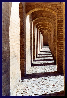
Hi Hugo, when I eas just looking arround in your portfolio, I saw this one. I like it a lot, love arches, but this one with all those shadows and light, is awesome. However not meant as an atmospheric depiction, do I think it was a very hot afternoon over there, that's what I sense when I look at this one. Very good shot IMO.
Regards,
Klaas
|
|
|
|
|
Farsad Ghaffarian
{K:87} 10/30/2005
|
Hi Hugo, very well done!
I take same photo of this location.
please see that in my photos.
thanks.
|
|
|
|
 aLI .
{K:2468} 12/29/2004
aLI .
{K:2468} 12/29/2004
|
33 pol....good pic
|
|
|
|
 Maja Gligoric
{K:13528} 10/27/2004
Maja Gligoric
{K:13528} 10/27/2004
|
Hello Hugo,
It's fantastic demonstration of shadows and geometry.Great lighting and composition.I like it.Also,maybe it would be interesting if you could keep one person in the end of this?Or one person who will stand in middle with one hand on left column and other on right column.
Best regards
|
|
|
|
|
Helena Gustafsson
{K:417} 9/27/2004
|
A fine composition with a great deep.
|
|
|
|
 Hugo de Wolf
{K:185110} 9/21/2004
Hugo de Wolf
{K:185110} 9/21/2004
|
Thanks for your comment. The bridge was tilted, but the image is straight. Incredible you noticed it; it's ever so slight, not even 0.5 degrees measured in Photoshop....
Cheers,
Hugo
|
|
|
|
|
Ahmed Nadim
{K:437} 9/21/2004
|
Love the depth .
Was the tilt intended ?
|
|
|
|
|
Maria Luisa Vial
{K:36017} 3/27/2004
|
Hi again Hugo!!!! I saw we are in front page... I never expected it... It's nice to be with you at the front... Thanks Teacher!!!!
Great work in this picture, light and shadow are extremely well captured... The angle of view and the perspective are perfect... I feel like I can walk in there... Congratulations!!!!
Maria
|
|
|
|
 Zsolt Radákovits
{K:10376} 3/15/2004
Zsolt Radákovits
{K:10376} 3/15/2004
|
Dear Hugo!
Simple and very nice composition! Interesting it looks like a bit soft, F22 is great to do this with excellent wide DOF, may be the 640x480 is too low for this as for some other too detailed pics.
Very nice!!! Congratulation!
I made a small adjustment transf to B&W -11 Brightness and +4 Contrast and then negative it.
|

|
|
|
|
|
KEVIN TEMPLE
{K:8657} 3/15/2004
|
Hugo my freind
You just dont give up
Great shot again love the arches (built plenty in my time.)
keep up the exelant work
kevin
|
|
|
|
 Aira Manna
{K:11187} 3/14/2004
Aira Manna
{K:11187} 3/14/2004
|
hi hugo,
i will add my humble comment to this long, almost intimidating list...first of all, i agree wth you: i tend to like the inclusion of one/more person/s or silhouette in pictures with lines, shades, geometries and repetion, as they normally break the rithm adding a distinctive character. in this case, though i think it perfectly works as a "clean" shot - the eye i gently directed to the vanishing point- just beautiful. it is maybe a little distracting the large bright light on the wall, before getting interrupted by the first shade. Sunset man's suggestion could be a good hint. and i always wonder abou b&w...
great shot,
am
|
|
|
|
|
John Hatziemmanouil
{K:40580} 3/12/2004
|
.......so this one! The lighting is great! The columns makes great lines at the ground! As you write at the title, the geometry is very good! Even the depth is very nice here, pretty long this 'path'! A pretty impressive subject this one!
|
|
|
|
|
altur .
{K:6087} 3/11/2004
|
Great photo with a beautiful perspective... nice play light & shadow. Good work.
Best regards, Alex
|
|
|
|
|
Hugo Pierre
{K:15692} 3/10/2004
|
Fantastic perspective! Splendid composition, very well done. Best wishes! Hugo.
|
|
|
|
|
MaryBell
{K:32791} 3/10/2004
|
I like this one better - the detail flows through the image better than in some of the previous one...like the diagonal across the arch created by the light and shadows...
|
|
|
|
|
Jeff Cartwright
{K:52046} 3/10/2004
|
Hi! ....Hugo : Excellent Compostion of Decending Archways!...No linear Distortion Here!
Very nice Picture!!!
Regards:
Jeff.
Ps: Thank you, for your comment, for : "Sailing, Victoria."...Jeff!!!
|
|
|
|
 Thamer Al-Tassan
{K:1358} 3/10/2004
Thamer Al-Tassan
{K:1358} 3/10/2004
|
Great perspective and beautiful shadows, they add a lot to the image. The inclusion of a person in this photo doesn't really matter, but it would make another beautiful image.
|
|
|
|
|
Telmo Domingues
{K:9639} 3/10/2004
|
Perfect in everyways...
|
|
|
|
|
Fatma B.
{K:1864} 3/10/2004
|
really fantastic.7+
|
|
|
|
 Emgy Massidda
{K:60358} 3/10/2004
Emgy Massidda
{K:60358} 3/10/2004
|
Wonderful lines and tructures
Love the angle
|
|
|
|
|
Tim Bronkhorst
{K:9391} 3/10/2004
|
Een erg sterke serie, naar mijn opinie valt alleen de eerste foto er een beetje buiten. Dit is de beste foto, een continuiteit die helaas aan het einde bruut verstoord word.
Mooi werk!
Tim.
|
|
|
|
|
CJ Kitts
{K:1607} 3/9/2004
|
Nice!
|
|
|
|
|
Yoshi Enoki Jr
{K:3021} 3/9/2004
|
Wicked mon!
|
|
|
|
|
jon parsons
{K:13639} 3/9/2004
|
Hugo, a beautiful masterpiece my dear friend! it might be your best work ever congratulations!....jon
|
|
|
|
|
Lori Stitt
{K:75282} 3/9/2004
|
To me, a lot of texture and motion ! I love it Hugo! Of course this puts me in 'Arch Heaven'...LOL...I do love arches and this is glorious! Lighting is very nice, and as usual, you composition is excellent! Very nice work!
Lori :)
|
|
|
|
 神 風
{K:10665} 3/9/2004
神 風
{K:10665} 3/9/2004
|
Now that 'almost' everything has been said and done and the audience has gotten a bit quiet now for me ... I say we make it a 'Real Abstract' per the attached ... Yes/No?
|

|
|
|
|
|
Andrej V
{K:6693} 3/9/2004
|
Hi Hug,,,... it?s me again...
Can't get rid of me?
Well just this one... then I go.
EOS 30 has synchronization to 1/125 for flash. I always shoot in complete manual mode and flash only works if I lift it up.... I didn't do so from following reasons:
I was quite some meters away and I had to use full zoom, because trees were too far.
I guessed flash wouldn't bring the efect.
Because of zoom I had to use short time (1/180s; no tripod around again...), so I decided to overexpose it. Instead of f4.5 as camera measured I used fi8 what came out as +1.5.
WAS I AT LEAST ON THE RIGHT WAY PROFFESSOR? .....:) (please, say YES)
|
|
|
|
 Rocco T
{K:4130} 3/9/2004
Rocco T
{K:4130} 3/9/2004
|
good perspective, splendid work!
|
|
|
|
|
Naty Z
{K:16436} 3/9/2004
|
great perspective and shadowplay!
|
|
|
|
|
Kees and Carolyn
{K:15193} 3/9/2004
|
Perfect composition! Excellent shot!
Carolyn
|
|
|
|
 Hermen Pen
{K:9168} 3/9/2004
Hermen Pen
{K:9168} 3/9/2004
|
The perspective is really great! You did well to choose the long focal point.
Including a person could give a better impression of the size of the building, or act as a point of attraction (the latter is not really necessary here because you already heve a point of attraction due to the converging lines). As you are making a triptych in which the architecture is most important, I would say you made the right choice not to include persons. Small remark: the image seems a bit tilted. I think the lens was pointing a little bit downwards. Did you notice it? Could be that you needed the downward direction to get a better composition. Would be interesting to know...
|
|
|
|
 Jan Symank
{K:22030} 3/9/2004
Jan Symank
{K:22030} 3/9/2004
|
Here I was walking one year ago, and several times before ( you asked for that )
A beautiful place and composition ( a figure would be nice inside, but not necessary. And if, only one interesting, this needs hours..... )
I like all the bridges in Isfa, and hope to see more,
Ghodahfez :))
Jan
|
|
|
|
|
Ursula L.
{K:1125} 3/9/2004
|
This is just great Hugo. Congratulations to this one and the well deserved ?Today's Hot Topics?
I whish I would sometimes be more patient to wait for the right moment to :-)
May be one day I will. Regards Ursula
|
|
|
|
|
Francesca May
{K:6877} 3/9/2004
|
very beautiful photo!
|
|
|
|
|
Andrej V
{K:6693} 3/9/2004
|
Hey Hugo!
Very well done!
I have a very much the same shot... I ll put up that you can judge it!
It's not as good as this one but still... I'll read about it, when you see it!
PS: MSTIFIED; No I didn't use flash! It was quite a bright day, due to a lot of snow and clean airin the alps! You can see I used 1/180s timing! Do you suggest that I should go to 1/60 and increase the f to f22, that I could use flash?
Greets
Andrej
|
|
|
|
|
Dan Lightner
{K:12684} 3/9/2004
|
The repeating geometric shapes of the arches are outstanding , the lines formed by the shadows are exceptional, great work
|
|
|
|
|
sandy c. hopkins
{K:17107} 3/9/2004
|
this is fantastic! a true work of art..
|
|
|
|
 Paul's Photos
{K:35235} 3/9/2004
Paul's Photos
{K:35235} 3/9/2004
|
excellent photo Hugo.. nice perpsective.. love the lighting.. good work
|
|
|
|
|
Gerhard BuschEFIAP/AFIAP
{K:18382} 3/9/2004
|
Successful one graphic composition. Thanks for your note to thepicture Katamaran. It was not photographed with a pole filter. Smaller exposure of the photo is the reason for these colors. GreetingGerhard
|
|
|
|
 Roy V
{K:13082} 3/9/2004
Roy V
{K:13082} 3/9/2004
|
Hugo,
Again, Excellent and Perfectly Done! Great framing, angle, light and depth.
Best Regards,
Roy
|
|
|
|
|
Raamses Ortiz
{K:4408} 3/9/2004
|
Great depth, Hugo. The color and definition is really good. I think you are right about having someone in the photo. I think that two kids playing hide and seek, having one hiding behind at the right of the second arch and another about to find him would be nice and both with happy faces ofcourse. Well thats my humble opinion, but it is a very good picture. I like it a lot!!!
Congrats,
Raamses.
|
|
|
|
|
Cas Poldermans
{K:1080} 3/9/2004
|
i don't miss any person in this picture: the depth effect and especially lighting would be disrupted if another object was in the picture. therefore, i really like this picture and i understand why you call this a 'clean shot'. i will call it a 'great shot'! :)
|
|
|
|
 Roberto Arcari Farinetti
{K:209486} 3/9/2004
Roberto Arcari Farinetti
{K:209486} 3/9/2004
|
..Hi Hugo.. in my last photo.. I used an orange filter of the cokin to increase the already orange coloration of the sky.. how you see use still the film and the scanner above all on the photograph "monochromatic" often is troubled from the grain. compliments still for the yours last photograph.. very simple like consistency and attractive also for this. To soon roby
...
|
|
|
|
 Ameed El-Ghoul
{K:42215} 3/9/2004
Ameed El-Ghoul
{K:42215} 3/9/2004
|
Wonderful composition and angle Hugo, you got it perfictly, it is like if its designed by a computer not caputred by a camera, regards,
|
|
|
|
|
Danish Abadi
{K:1468} 3/9/2004
|
|

|
|
|
|
|
Danish Abadi
{K:1468} 3/9/2004
|
Dear Hugo!
I am very interested of photos of Iran; maybe because of I am Iranian!
I have very nice memories from Ispahan and you are lucky that could be there.
Anyway something interesting about reading a photo is that we people who write from left to right read pictures from left to right and for those who write from right to left they read pictures from right to leave,
A roll which I use when I compose a picture is that if you draw a line from a corner of picture diagonally and draw another line from other corner which could make an 90 degree angel with the first line then you can put your interesting part of you picture on that line, then it will be perfect, you will see from those attachment which I send it to you, first I tried to crop your image to achieve what I mean but the result was a hard cropping which wasn?t good, but did flip horizontally you image and it seems that important point of picture goes to right place, have a look, if you have any question just e-mail me to dan@rsp.nu
best regards
Danish
|

|
|
|
|
|
Panos Asproulis
{K:36} 3/9/2004
|
Wonderful perspective.
|
|
|
|
|
Riny Koopman
{K:19998} 3/9/2004
|
hi hugo, als je het niet erg vind schrijf ik het in het nederlands,want mijn engels is niet zo sterk.
geometrisch is het een perfecte foto wat ik mooi vind in het gang pad is de schaduw en niet te vergeten het licht en dat maakt de foto zo intressant hugo!!
vak werk hoor!!
groet riny.
|
|
|
|
 Roger Williams
{K:86139} 3/9/2004
Roger Williams
{K:86139} 3/9/2004
|
I think this was a very good choice, although as you say certainly not the only one. I love stereoscopic photography despite the pain of ancient and temperamental equipment and the fuss and bother of processing two images at a time... and this would be a wonderful subject for 3D photo. As it is, you've made a two-dimensional photo look almost three dimensional. Quite a trick. You did well to get the depth of field at 80mm. I reach for the wider angle lens, exaggerate the perspective, and rely on the greater DOF. You did it the hard way! Well done...
|
|
|
|
|
Kaj Nielsen
{K:15279} 3/9/2004
|
Excellent composition, great perspective, excellent light..................regards kaj Nielsen
|
|
|
|
 John Loreaux
{K:86210} 3/9/2004
John Loreaux
{K:86210} 3/9/2004
|
Very well composed photo here Hugo. It looks as though You took Your time composing this photo and it shows. My best, John
|
|
|
|
|
Richard Thornton
{K:26442} 3/9/2004
|
The single point perspective and strong diagonals make this a riveting graphic.
|
|
|
|
|
Bikramadittya G. Roy
{K:7202} 3/9/2004
|
Great disposition of the geometry created by the shade and light. Nice tone. Excellent tight shot. No need to add people. That would kill the stony silence. Cheers.
|
|
|
|
|
B:)liana
{K:30945} 3/9/2004
|
Wow.. Hugo, i just love itttttttttt! wonderful in texture and shadows ;-) great effect and composition ;-)
Kiss, BIliana
PS. My new hallogen is 500 Watts, but it is some commun one for street light or in caffee ;-) not particulary for photography, cause it is very expensive ;-)
|
|
|
|
|
Stephen Bowden
{K:64141} 3/9/2004
|
Brilliant photo Hugo, superb perspective
|
|
|
|
 Verena Rentrop
{K:15233} 3/9/2004
Verena Rentrop
{K:15233} 3/9/2004
|
in this the empty lifeless decision was absolutetly the best...
eye of a genius ;)
the first of the triptych was ok, but this is amazing...
nervously waiting on the third ;)
Cheers,
Verena
|
|
|
|
|
Fabio Keiner
{K:81109} 3/9/2004
|
geometrically perfect
|
|
|
|
|
Roberto Arcari Farinetti
{K:209486} 3/9/2004
|
oh woow dear friend!
a perfcet perspective and angle of view... an excellent shot for my humble opinion.. but you are a great photographer...
another fantastic photo!
bye bye
roby
7+
|
|
|
|
|
Sandro Bier
{K:99} 3/9/2004
|
Hi Hugo, very well done!
Light is the secret, aha!, and you've got it.
Congratulations, a good photo starts in the sensitivess and then goes to the image.
Hope to hearing from you
Sandro
|
|
|
|
|
Lou Dina
{K:12194} 3/9/2004
|
Great shot, Hugo. I like it without people, but it could be just as good, possibly even better, with a person in the proper spot. Good one just as it is. Lou
|
|
|
|
 Clifton Jones
{K:10688} 3/9/2004
Clifton Jones
{K:10688} 3/9/2004
|
I love the lines and shadows....excellent shot.........
|
|
|
|
|
Gerhard Hoogterp
{K:4863} 3/9/2004
|
Bravo.. A very nice repeating image. And a series of it too.. Nice shot!
|
|
|
|
|
Graham Mulrooney
{K:15728} 3/9/2004
|
Love the geometry and shadows, and the great depth the converging arches give to this image. I feel a waiting sensation which does create tension. This maybe due to expecting a figure perhaps hostile appearing unexpectedly from one of the many arches.
Best regards,
Graham.
|
|
|
|
|
Lorenzo Conserva
{K:2415} 3/9/2004
|
Lovely perspective, Hugo, and interesting considerations.
Thanks for sharing, I like this photo as is with no persons.
Bye,
Lorenzo
|
|
|
|
|
Paolo De Maio
{K:34932} 3/9/2004
|
WOOOOOOOOOWWWWWWW!!
Hugo I have a shot similar to this but your is better than mine!!
Your speach is correct (description in about)but in my opinion the only thing i'd modified it could be the choice between colors and B/W.
This kind of shot is ideal for B/W,to enphasize shadows and lights (black and white)and the geometrical shapes maded by.
About a human presence? yes i agree with you but in this case you made an architectural shot so that a human presence could be suggest another feeling to the general atmosphere.
perhaps a light unsharp mask could be improve a bit the intire scene but I'd be curious to see in in B/W...can I try to do it?
All the best
Paolo
|
|
|
|
|
Carmem A. Busko
{K:48785} 3/9/2004
|
Hugo, there is a decisive moment in this picture!
Shadows and lighting wouldn?t compose such an expressive effect a few minutes laters (or earlier).
Wonderful shot turned into a powerful composition.
Congrats,
Carmem
|
|
|
|
|
pippo giuseppe
{K:16421} 3/9/2004
|
Eccellente composizione!!Una grande simmetria con una luce splendida!!Ottimo il contrasto!!Complimenti!!
|
|
|
|
|
Roger Cotgreave
{K:15892} 3/9/2004
|
very good capture Hugo just great the way you have caught the light and shadow...roger
|
|
|
|
|
Tommaso Razzano
{K:8073} 3/9/2004
|
What a great shot !
I love this repetition of shadows ... of shapes...
Wonderful ... dear friend... wonderful indeed !
ciao !
Tommy.
|
|
|
|
 NN
{K:26787} 3/9/2004
NN
{K:26787} 3/9/2004
|
Excellent!
|
|
|
|
 Saeed Al Shamsi
{K:47735} 3/9/2004
Saeed Al Shamsi
{K:47735} 3/9/2004
|
With such great overlapping image you don`t need to add any thing more (my opinion),contrast,shape,tone,and lights works as architectural elements jostle for dominace..great day with great art ..Saeed
|
|
|
|
|
sunrise
{K:6651} 3/9/2004
|
excelent, and nice the light
|
|
|
|
|
Salvo Valenti
{K:17038} 3/9/2004
|
FANTASTICA PROSPETTIVA COMPLIMENTI SALVO
|
|


")


