|
|
 Nick Karagiaouroglou
 {K:127263} 12/6/2008
|
Thanks a lot Andreas!
Indeed Bern is very good for street images. And a very nice city too!
Cheers!
Nick
|
|
|
|
|
Andreas Droussiotis
{K:4757} 11/18/2008
|
Nice street photograph.Bern is a great place for photos.
A.
|
|
|
|
|
Nick Karagiaouroglou
{K:127263} 7/15/2008
|
This exactly is the very question, Dave! To have the walker as the central point of the image or not?
I tend to second Avi's and Joggie's suggestion for waiting a bit more, until he is a bit closer, but not closer than reaching the fountain. Still the "necessary" distance has to be there too. So, the "truth" seems to lie somewhere "unbetween", as we say so often. But exactly where that "inbetween" is... that's perhaps also never to be answered perfectly.
Just thoughts, ey?
Nick
|
|
|
|
|
Nick Karagiaouroglou
{K:127263} 7/14/2008
|
A very interesting thought for which I thank you very much, Saad! Until now I didn't think of that!
I tend to second Joggie's and Avi's view but now I also know that the absolute limit for waiting perhaps until he comes a bit closer, would be the fountain. No nore wait would be good, I guess too!
Thanks a lot for the very useful additional remark, that surely helps very much judging about the image!
Cheers!
Nick
|
|
|
|
|
Nick Karagiaouroglou
{K:127263} 7/14/2008
|
Thanks a lot for the nice detaield comment, Avi!
I also think that you and Joggie are completely right considering the better choice to wait some seconds until the man comes a bit closer. Not much, but for just getting a better glimpse of his expression.
Well, asking questions is the first step for getting answers, ey?
Cheers!
Nick
|
|
|
|
|
Nick Karagiaouroglou
{K:127263} 7/14/2008
|
You make sense, actually very very much so, Joggie! And I thank you for the in depth going comment! It helps also clarifying some things in my mind about what I find so good in such "unclean" images. Hard to explain, but you gave a good description: "A human being in its environment". It's the scene as a container of some protagonist and as a producer of such relationships between the elements as you referred to. Perhaps as a metaphor, you can play the same main melody (=protagonist) supoorted by many different chord lines (=the scene) and for each different chord line you get a completely different song (=the image).
I also tend toward having them man somewhat closer. I guess that a bit more of his expression would really add much here. His face is quite small for really seeing any expression, as it is now. One perhaps can only assume some expression since he looks to tha ground. So I should wait for a second before shooting.
Thanks a lot again!
Nick
|
|
|
|
 Dave Stacey
{K:150877} 7/14/2008
Dave Stacey
{K:150877} 7/14/2008
|
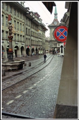
I like the composition with the curve of the street, and the texture of the cobblestone, Nick! I thinks the man is good where he is, as you don't want him to be the central interest in the image.
Dave.
|
|
|
|
 Saad Salem
{K:89003} 7/13/2008
Saad Salem
{K:89003} 7/13/2008
|
hi Nick,the position of the man is perfect,if he is closer to the fountain,he will be distracted,if he he is further, he will be to small to form the main subject of the photo,his direction of walking antagonizing the direction of the traffic,lets the eyes concentrate upon him,regards
Saad
|
|
|
|
 Avi
{K:70138} 7/13/2008
Avi
{K:70138} 7/13/2008
|
yes, you sure ask questions. and that is the best part. here, I feel probably I would have waited a couple of seconds more for the man to come a bit closer, but then, who knows, there could be a cyclist zooming into the frame, spoiling the setup (or creating a completely different image). So, what I feel is this: this shot has a balance. Whether the purists like it or not, it DOES.
And that, for me, is enough !!
Cheers !!
Avi
|
|
|
|
 Joggie van Staden
{K:41700} 7/13/2008
Joggie van Staden
{K:41700} 7/13/2008
|
Hi Nick, always testing the boundaries! The position of the man - I would prefer it closer but still on the same side of the fountain on the left. What strikes me most is your inclusion of elements in the foreground (railing, wall, piece of roof)which most would try to exclude in order to create a more artistically "clean' photograph. I see your photos functioning at a different level - more as an intepretation of man in his environment, thereby including as many elements as possible to provide meaning. Almost the opposite of the minimalist approach, but with purpose. In this framework the elements make sense, speaking of boundaries or doors the person walking has to cross or pass through. Looking at the direction of the sign on the right and the direction all other people are following, he also seems to represents one of the few that go against the stream, making the foreground elements more meaningfull. Hope I make sense at all!
Joggie
|
|