|
|
|
Naren Kunhody
{K:1339} 5/29/2003
|
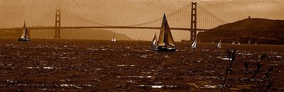
Excellent picture.. The panaromic crop has come out well. Just as it in these tones, the flowers in the right corner are a bit distracting...
|
|
|
|
 rory rory
{K:1840} 5/10/2003
rory rory
{K:1840} 5/10/2003
|
Excellent photo.. Compliment.. bye rory
|
|
|
|
|
Marcio Cabral
{K:12496} 5/9/2003
|
Excellent pan and tones Subha, regards!
|
|
|
|
|
anna wolf
{K:2366} 5/9/2003
|
love the way it is toned and strong sepia as well, very good shot and beautiful composition !!!
|
|
|
|
 Gregory McLemore
 {K:35129} 5/8/2003
|
Splendid scenic capture.
|
|
|
|
|
Patrizio Grimaldi
{K:406} 5/8/2003
|
wonderful shot!!!
|
|
|
|
 PK- Photos
{K:13099} 5/8/2003
PK- Photos
{K:13099} 5/8/2003
|
I like the grain and the sepia Effect, the Golden Gate looks very beautiful, its my favorite city:)
Regards,
Pia /Germany
|
|
|
|
|
Ameet Mallapur
{K:1575} 5/8/2003
|
WOW....this is great work Subha!!!!
|
|
|
|
|
Subha Pindiproli
{K:10108} 5/7/2003
|
for those of you who asked whether this image is cropped or not.. here is the original image.. i used color gels.. for the shot.. enjoy..
|

|
|
|
|
 Jim Hanes
{K:57} 5/7/2003
Jim Hanes
{K:57} 5/7/2003
|
The boats and whitecaps really add to the photo, making it soo much more interesting than the zillions of Golden Gate potcard wannabe shots. This is cropped to make it look like a panoramic, right?
Jim Hanes
|
|
|
|
|
JoydipSuchandra Kundu
{K:582} 5/7/2003
|
The panoramic cropping says it all. Also encouraging that PS has not been used. Good one !
|
|
|
|
|
Razvan Toma
{K:787} 5/6/2003
|
Good work Subha,nice portfolio also.
|
|
|
|
|
Vicki Bentley
{K:5080} 5/6/2003
|
A very lovely composition. Your horizon is indeed tilted. Like the grain quite a bit. Good coloring, gives a nice effect. Regards.
|
|
|
|
|
Andre Cajot
{K:7793} 5/6/2003
|
Agree with the others about the look, the mood, the tone (even about the plant in the foreground). The main problem IMO is that the level of the sea is seriously tilted. Not rated by me.
|
|
|
|
|
Nancy Liu
{K:1903} 5/6/2003
|
there's a wonderful aged look and mood to this photo, the tinting worked beautifully here.
|
|
|
|
|
SarahM none
{K:7836} 5/6/2003
|
I love the sepia and the grain in the photos. I agree with others that this really worked well. You might consider cropping off just a bit on the bottom and leaving a bit on more on the top, just above the bridge span. Also, you might consider cloning out the plant (?) that is in the bottom right corner. I can't decide if I think it adds to the image or if it is distracting. I did have to look very closely to figure out what it was. I really like the light on the sails.
|
|
|
|
|
Scott Ostrom
{K:672} 5/6/2003
|
I love this shot, and the panoramic adds to the intent of the photo. Sometimes that's risky, but I think you've done it excellently. And the grain makes the picture that more beautiful, I'm a big fan of that.
|
|
|
|
|
Marco Grandi
{K:16680} 5/6/2003
|
Great dramatic image,Subha!Nice format!
Bye Marco.
|
|
|
|
|
Siddharth Siva
{K:3327} 5/6/2003
|
hi subha..thanks for your comment!
I like this photograph a lot..i think both the grain and the crop work wonderfully for this image...
|
|
|
|
|
Ronny Van Eeckhoutte
{K:12734} 5/6/2003
|
Very good use of grainy effect,nice color too.
|
|
|
|
|
Dirck DuFlon
{K:35779} 5/6/2003
|
Great shot, Subha! The sepia toning really works well to give this a 'period' feel, as did the graininess. I like how the sails and the whitecaps provide little accents to the photo. The horizon is a little tilted to the right, but otherwise the crop is really nice.
|
|
|
|
|
Cristina Mantovani
{K:972} 5/6/2003
|
very good image. Ciao Cristina
|
|
|
|
|
Rodrigo Castro
{K:12} 5/6/2003
|
Very interesting. Congratulations!
|
|
|
|
|
Eric Peel
{K:136} 5/6/2003
|
Very engaging panoramic shot. It is interesting to look at and technically very well done. The grain does enhance the fog, and the well-lit sails provide beautiful contrasting whites with the darker sky and water.
|
|
|
|
 Roberto Arcari Farinetti
{K:209486} 5/6/2003
Roberto Arcari Farinetti
{K:209486} 5/6/2003
|
beauiful.. ciao roberto
|
|
|
|
|
- simos -
{K:9354} 5/6/2003
|
Great! good work.
regards, simo
|
|


")