|
|
 Hugo de Wolf
{K:185110} 10/20/2004
Hugo de Wolf
{K:185110} 10/20/2004
|
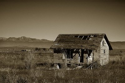
Hi Michel, I find it difficult to say if the second verison is better than the first. The tone is a bit colder, mainly changing the atmosphere. The tonal range is quite good in both of them, but the level correction you applied in the third version is definately an improvement; it creates a much stronger contrast and depth... It does look more natural and appealing.
In all fairness, what I really meant in my first comment, is that I think a colour version would be more suitable for such a shot. In many cases, a b&w or sepia conversion give an image a timeless look, but I also think it should be handled with care. It's not a guarantee for an artistic image, nor for a appropriate atmosphere. In other words, generally speaking, I feel it's applied too often. In this case, I can imagine the colour version is quite stunning, too.. Obviously, that's a personal opinion, and especially the third one strikes a chord.
Cheers,
Hugo
|
|
|
|
 Michael Kanemoto
{K:22115} 10/20/2004
Michael Kanemoto
{K:22115} 10/20/2004
|
Hugo -
You have a fantastic eye. I went back into the image and realized I had not set the brighness or contrast. So the photograph is dark. Try this one on for size.
Same toning, corrected levels.
|

|
|
|
|
|
Michael Kanemoto
{K:22115} 10/20/2004
|
Hugo:
Better? I "turned down" the tone by 50%. Or is the photograph maybe overall too dark? Thanks for the comments, I'll adjust to any suggestion.
|

|
|
|
|
|
Hugo de Wolf
{K:185110} 10/20/2004
|
Hi Michael, very well composed as well as exposed, but I feel the sepia toning is a bit "forced". Looking at the lighting and the gradient in the sky, I can imagine the colour version could also be awesome, given enough saturation....
Cheers,
Hugo
|
|
|
|
|
Romulo Lubachesky
{K:11836} 10/19/2004
|
Beautiful work, my best regards!
7/7
|
|
|
|
 Howard M. Parsons
 {K:3496} 10/18/2004
|
Beautiful shot
|
|
|
|
|
Michael Kanemoto
{K:22115} 10/18/2004
|
Thanks - if you want to partner sometime on a photograph let me know. mkanemoto at gmail dot com. I've tried it once now, and it was a fun experience to try to tweak out someone else's work.
|
|
|
|
|
Michele Berti
{K:14921} 10/18/2004
|
Another great one Michael. Really nicely composed ant the sepia tone add a lot here. Congrats my firend!
|
|