|
|
 Thilo Bayer
{K:50358} 10/28/2004
Thilo Bayer
{K:50358} 10/28/2004
|
Hi Fokstrot,
thanks a lot for the kind words.
take care,
Thilo
|
|
|
|
 fokstrot .
{K:6560} 10/22/2004
fokstrot .
{K:6560} 10/22/2004
|
Great composed, great tones. I like this picture so much.
regards
|
|
|
|
 Gabriella Carta
{K:22879} 10/20/2004
Gabriella Carta
{K:22879} 10/20/2004
|
wowwwwwww... wonderful!
|
|
|
|
|
Thilo Bayer
{K:50358} 9/21/2004
|
Hi Ursula,
ja, das kenne ich mit dem hinterherhinken. zuviele friends machen einem ganz schön stress beim kommentieren ;-)
danke fürs feedback,
thilo
|
|
|
|
 Ursula Luschnig
{K:21723} 9/21/2004
Ursula Luschnig
{K:21723} 9/21/2004
|
Hi Thilo,sehr cool...und wirkungsvoll!
Ich bin hoffnungslos hintendran mit comments,versuche grade nachzuholen..:)
Liebe Grüsse,Ursula
|
|
|
|
|
Thilo Bayer
{K:50358} 9/21/2004
|
Dear Blue Sky,
many thanks for the kind words. and it's an honor to be on your faves list.
take care,
thilo
|
|
|
|
|
Thilo Bayer
{K:50358} 9/21/2004
|
Dear Hugo,
I noticed your break for sure... hard times at usefilm without the master of comments. no flattering ;-)
As for your rework... it's different than my version ;-)
As for the technical aspects, I like your work. It's a more plain and straight version of my idea, the three planes are better connected.
However, regarding the title... I have to say that your version is not so strong as mine, at least in my opinion ;-) The glow separates the two geometry contestants. that's what I tried to succeed with the glow =)
anyway, I always appreciate reworks. Few people spend time on that - it's kind of a pity, because I really love to think about different ideas. so thanks for your time.
hope to see you more often at UF.
take care,
thilo
|
|
|
|
|
Cosimo Ronzi
{K:243} 9/21/2004
|
Direct to my favorites 7+, all your work are great.
Greetings from Italy
Regards
|
|
|
|
 Fadel J
{K:13974} 9/21/2004
Fadel J
{K:13974} 9/21/2004
|
Fantastic tones and details! the perspective is realy great!
|
|
|
|
 Hugo de Wolf
{K:185110} 9/20/2004
Hugo de Wolf
{K:185110} 9/20/2004
|
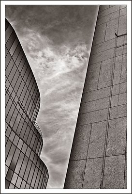
Hi Thilo, As you might've noticed, I've been away for a while.... Needed a longer brake, I guess.....;o)
As for this photo, I think you did a very good job in the toning, the composition with the angle and the balance and atmosphere.
Reading your comment, I notice you applied the glow around the skyscrapers deliberately, but I don't quite see why, and that intrigues me.
I think it emphasises the distance between the sky and the buildings, and giving it a feeling that it was pasted in, which, IMO, removes the harmony between the two. I find it rather difficult to explain precicely what I mean, but I do hope you understand what I'm getting at.
I've been trying to picture what the image would look like without the glow, but I couldn't, so I took the liberty of reworking it a bit. Except for maybe a slight blur, the unity between sky and skyscrapers is a bit bigger, but it does affect the atmosphere you created a bit. (So now I see why you did that, maybe not my choice, but it does serve a purpose...;o)
Good shot, and a very creative rework, quite unusual, which makes it as good as it gets!
Cheers,
Hugo
|

|
|
|
|
|
Thilo Bayer
{K:50358} 9/20/2004
|
Dear Stefan,
the glow in this case just comes from playing around with middle tone contrast. Not sure how the menu is called in the English PS CS, but in the German one, there is a slider called bolds/lights where you can change just the light parts, the bolder parts and the middle tone contrast.
in other images, I make an additional layer and from a vignetting with a gradient around the objects.
|
|
|
|
|
Thilo Bayer
{K:50358} 9/20/2004
|
Hi Uwe,
danke für die blumen. hatte eine sehr abstraktes wochenende, wird wieder zeit für normale aufnahmen ;-)
Grüße,
Thilo
|
|
|
|
|
Thilo Bayer
{K:50358} 9/20/2004
|
Dear Gayle,
LOL on the guy thing! haven't seen it that way =)
as for the halos: you're not alone in NOT liking them. okay for me ;-) I added them to give a more surreal look.
take care,
thilo
|
|
|
|
|
Thilo Bayer
{K:50358} 9/20/2004
|
Dear Pedro,
thanks for the constructive words. As for the photo concept: the differences between the original image and my rework is not so huge as you might think. I didn't change anything on the actual subject, just the colors and the mid tones values are changed.
take care,
thilo
|
|
|
|
|
Thilo Bayer
{K:50358} 9/20/2004
|
Dear Peter,
you're right with that. Even in Nuremberg, the architecture is torn between lines and rounds.
take care and thanks for the critics,
Thilo
|
|
|
|
|
Thilo Bayer
{K:50358} 9/20/2004
|
Dear Ken,
thanks for the honest feedback. as for the halos: I deliberately opt for them, and yes: they're artifical (as I bring them into the picture) ;-)
take care,
thilo
|
|
|
|
|
Thilo Bayer
{K:50358} 9/20/2004
|
Hi Verena,
die idee mit den puzzle-teilchen ist wirklich klasse. habe ich gleich bei meinem neuen bild aufgegriffen. danke!
LG,
Thilo
|
|
|
|
|
Thilo Bayer
{K:50358} 9/20/2004
|
Dear Steve,
thanks for the elaborate and precious comment. your support is really great.
take care,
thilo
|
|
|
|
|
Thilo Bayer
{K:50358} 9/20/2004
|
Dear Harry,
thanks for the distinct feedback. The whale is probably a bit more special =)
take care,
thilo
|
|
|
|
|
Thilo Bayer
{K:50358} 9/20/2004
|
Dear Jan,
great that you also see the V shaped sky. you have a great eye.
thanks for the critics,
thilo
|
|
|
|
|
Thilo Bayer
{K:50358} 9/20/2004
|
Dear Paul,
thanks for the constructive comment. sometimes, the thumb tricks the eye =)
take care,
thilo
|
|
|
|
|
Carlheinz Bayer
{K:14220} 9/20/2004
|
Very cool abstract! Smart comp and excellent details. Good work!
C.
|
|
|
|
|
Stefan Engström
{K:24473} 9/20/2004
|
Great edits overall. I would be interested in hearing how you accomplished the glow in particular. No offense if you want to keep your technique to yourself...
|
|
|
|
|
Uwe Bachmann
{K:10222} 9/20/2004
|
sehr schöne perspektive und gelungene bearbeitung thilo, schönes spiel der linien....
vg, uwe
|
|
|
|
 Paul's Photos
{K:35235} 9/20/2004
Paul's Photos
{K:35235} 9/20/2004
|
nice angle.. like the tone..you have some perspective distortion but I like it.. I like how buildings contrast each other.. good work
|
|
|
|
 Gayle's Eclectic Photos
{K:91109} 9/19/2004
Gayle's Eclectic Photos
{K:91109} 9/19/2004
|
hmmmm...girth vs. length/height..must be a guy thing!..LOL..sorry,couldn't resist with THIS image!...not sure i like the halos as kinda severe contrast with building edges,but like the dramatic sky...like concept,daring perspective and tone..well seen,Thilo..regards,gayle
|
|
|
|
 Maja Gligoric
{K:13528} 9/19/2004
Maja Gligoric
{K:13528} 9/19/2004
|
Good work!
|
|
|
|
|
Maria José Barres
{K:11276} 9/19/2004
|
Excellent work Thilo.... I love it!
Greetings.
|
|
|
|
 Pedro Libório
{K:53861} 9/19/2004
Pedro Libório
{K:53861} 9/19/2004
|
quite impressive image my friend ...absolutly great composition and tones ...I just love also the contrast...my only thing about this type of images is that we are crossing the barrier of photo concept..this could be a drawing instead of a photo...but 7 anyway because I really like the result!
regards.
|
|
|
|
 Peter De Rycke
 {K:41212} 9/19/2004
|
Great work Thilo .. rectilinear against rounded shapes .. often a source of conflict inside a city .. well seen to confront these 2 .. regards, Peter
|
|
|
|
|
Ken Alexander
{K:3905} 9/19/2004
|
Very good composition and toning. The only thing that maybe doesn't quite work is the halo, it looks a little artificial.
|
|
|
|
 Verena Rentrop
{K:15233} 9/19/2004
Verena Rentrop
{K:15233} 9/19/2004
|
Hi Thilo,
es erinnert mich an zwei Puzzle Teile die gerne zusammengehören würden, aber das wird wohl nicht klappen ;)
Klasse finde ich den Gegensatz von sanften Kurven und strikten Parallelen.
Ungewöhnliche Perspektive unterstützt die Gesamtidee.
lg
Verena
|
|
|
|
|
Stephen Bowden
{K:64141} 9/19/2004
|
The composition is very good and extremely clever Thilo. The buildings really do appear to be opposing each other :-)
You have definitely succeeded with a glow around each of the skyscrapers and the toning is superb.
The angle between them is just great !
Best wishes,
Steve
|
|
|
|
 Harry Eggens
{K:14804} 9/19/2004
Harry Eggens
{K:14804} 9/19/2004
|
For me the competion has been won by the whale Thilo. I like his form and lines more than those of the building on the right side of the image. Youv'e got a great eye. Excellent composition with wonderful lines and tones....Best regards, Harry
|
|
|
|
|
laura diaz
{K:863} 9/19/2004
|
me gusta la textura y el juego de lineas
|
|
|
|
 Jan Symank
{K:22030} 9/19/2004
Jan Symank
{K:22030} 9/19/2004
|
Beautiful graphic composition with the contrast of curved lines on the left against the straight ones on the right.
The V- shaped, dramatic sky enhances the impression.
Excellent work, Thilo !
Grüsse
Jan
|
|
|
|
 Lilywhite Lilith
{K:1809} 9/19/2004
Lilywhite Lilith
{K:1809} 9/19/2004
|
sehr schoene arbeit. gefaellt mir ausnehmend gut!
gruesse, ekkehard
|
|
|
|
 Paul Lara
{K:88111} 9/19/2004
Paul Lara
{K:88111} 9/19/2004
|
This is VERY cool.
Because of what my mind saw on the thumbnail, I opened it to have a complete figure/ground reversal, and saw it as a textured slab of metal in the corner. :)
|
|
|
|
 Teunis Haveman
{K:53426} 9/19/2004
Teunis Haveman
{K:53426} 9/19/2004
|
Thilo, great compositie
Teunis
|
|


")
")


