|
|
|
Kristina Kohut
{K:49990} 8/30/2004
|
All the three in this serie looks fantastic and so original! I really love how you composed them and think that they would also work so well as a put together triptych. I think this one is my favourite, because I can feel more depth in it.
|
|
|
|
 Jose Ignacio (Nacho) Garcia Barcia
{K:96391} 8/10/2004
Jose Ignacio (Nacho) Garcia Barcia
{K:96391} 8/10/2004
|
stunning. 7.Thanks Hugo for your advice. I like . please you may sent the image to jignaciogarcia@aemail4u.com in full size. have a nice day.
|
|
|
|
 John Loreaux
{K:86210} 8/10/2004
John Loreaux
{K:86210} 8/10/2004
|
Hello Hugo!
Of the three photos from this series this one has the most somber mood to it.I guess its the green that gives Me that feeling but it is still a very striking piece of photography My friend!
An enjoyable series! Thanks!
Congrats on The staff choice on the first photo!
My best always,,,,,,,,JOHN
|
|
|
|
Raamses Ortiz
 {K:4408} 8/9/2004
|
Hi Hugo,
I like the green color here. It very good to see the creative mind turning something ruing into art, the way you did here. I specialy love the detail of having your name clearly visible. This is really cool my friend.
Congrats,
Be seeing you...
Raamsses.
|
|
|
|
 Hugo de Wolf
{K:185110} 8/5/2004
Hugo de Wolf
{K:185110} 8/5/2004
|
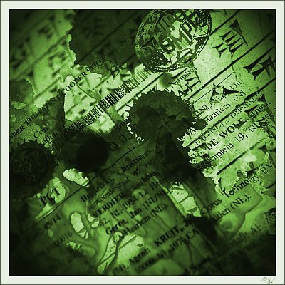
Hi Emgy, thanks for your comments on this series... Quite a surprise to see so many new comments on my photographs and digigraphs this morining....
The decision to create three different tonal variations on the same theme was made before even photoshopping the first one. Not only to accenture the differences between the three, but also to add a different mood and feel to the images. (and to see how that worked out... ) )
The choice of tone was done in the spur of the moment, I guess you can say affected by my mood at that time... The red one turned out a bit dark, as the lighting in the room was rather poor, and I was rather frustrated that I couldn't sleep.
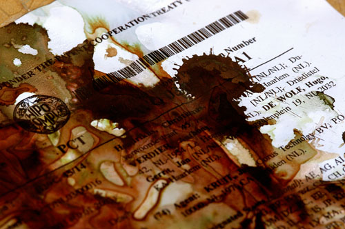
Also conserning the red one, there's no blur applied in that image. The blur you see originates from the original shot (posted below the image) and is actually a gradient.
Once again, thank you for your elaborate comments, I always appreciate them alot.
Cheers,
Hugo
|
|
|
|
 Emgy Massidda
{K:60358} 8/5/2004
Emgy Massidda
{K:60358} 8/5/2004
|
Last but not least, dear Hugo
I love it and I think that by this, I've said it all. There is only one thing that makes me curious about this series. Is there a reason behind your choice of colours for the three images?
Hugs - Emgy
|
|
|
|
 Di Ciuccio Maurizio
{K:57398} 8/4/2004
Di Ciuccio Maurizio
{K:57398} 8/4/2004
|
dettagli e luce veramente eccezionali..complimenti caro hugo..molto piacevole da ammirare..a presto
|
|
|
|
 Rob Ernsting
{K:8899} 8/4/2004
Rob Ernsting
{K:8899} 8/4/2004
|
Hugo, a very nice and creative concept. Regars, Rob.
|
|
|
|
|
Hugo de Wolf
{K:185110} 8/3/2004
|
Hi Lori, thanks for your comment. I agree it's a very good thing we are all different. Not only because we wouldn't have anything to show, but also because we would abruptly stop our progress....) The first seems to be favoured by most. I think the 2nd appeals to me the most, but I, like you, can't quite put my finger on it.... Weird, isn't it?
KRUIT is a fairly common Dutch name, literally translated as "Spice". Another weird coincidence....)
Cheers,
Hugo
|
|
|
|
|
Lori Stitt
{K:75282} 8/3/2004
|
How did this escape me? Here is the final piece of the puzzle! This does remind me of a piece of a jigsaw puzzle! (from the thumbnail anyways)
I just realized something that just blew me away! I saw your name and thought, 'nice touch'...then below, I saw the name 'KRUIT'...this is what blew me away. That was then name of my first husband! A very unusual name in this country, never see it at all. WILD HUH? lol
OK...back to the image. You have completed a very interesting series. I can certainly see you put much thought into this, all of them actually! They are nice Hugo, you do apply yourself a great deal.
I like the whole series, but I think I'm partial to the first one. Don't ask why, just what appeals to the eye, and we are certainly all different. And it's GOOD that we all are different, otherwise we wouldn't have anything to show each other! :)
Nice work, Hugo,
Lori :)
|
|
|
|
 Paul's Photos
{K:35235} 8/3/2004
Paul's Photos
{K:35235} 8/3/2004
|
interesting image..this image definitely looks very abstract... nice work
|
|
|
|
|
Hugo de Wolf
{K:185110} 8/3/2004
|
Hi Max, Thanks for your comment. It means a lot to me... I do favour the second one too, but it seems we're a minority here. Most favour number one.
Cheers,
Hugo
|
|
|
|
 Massimo Di Maggio
{K:-53658} 8/3/2004
Massimo Di Maggio
{K:-53658} 8/3/2004
|
This is one of your best triptych, you joined the power of words and colours in a very creative series (#2 my favourite, but don? ask me why, I don? know) with a great evocative value, I seem to see old documents and sometimes some documents from the future? I hope that there is good news ;) Bye Max
|
|
|
|
|
Riny Koopman
{K:19998} 8/2/2004
|
Excellent in every way.....Riny
|
|
|
|
|
Jorge Vasconcelos
{K:33746} 8/2/2004
|
I like the look,I?m not so good as you in PS- layers still are out of my skill- you did a great job just for the pleasure to do a very well done job.
This matters.
Regards
jorge
|
|
|
|
|
Ahmet Baki Kocaballi
{K:13618} 8/2/2004
|
Hi Hugo,
very original and creative serie..
i very like the efects,diagonal positioning,and tones,
very good work
Regards
Baki
|
|
|
|
|
Maria Luisa Vial
{K:36017} 8/2/2004
|
Hi Hugo,
Excellent shots!!!! I like very much this one (eventhough the first one is my favorite). Love the way you merged both shots here. It is as if in the previous ones the mergin was taking place, and in this one one past and present are merged as one... Love the green color you gave it and not distracting blur as in the previous one... ;)
About moving to 'genuine'photography, you know that I have the same opinion as you about using tools like PS, but sometimes it's a tool worth to be using, if you are going to create things, like this tryptich of yours... It was really excellent and enjoyable...
Cheers,
Maria
Cheers,
Maria
|
|
|
|
|
B:)liana
{K:30945} 8/2/2004
|
Love this green dear Hugo and letters. very strange like burning paper
Kisses, Biliana
|
|
|
|
 Jan Symank
{K:22030} 8/1/2004
Jan Symank
{K:22030} 8/1/2004
|
Very creative idea and composition.
The mixed documents are great symbols for a journy through diffrerent times.
Jan
|
|
|
|
 Angelo Villaschi
{K:49617} 8/1/2004
Angelo Villaschi
{K:49617} 8/1/2004
|
I love the hues in this tryptych, Hugo.
Very good PS work throughout.
|
|
|
|
 Hermen Pen
{K:9168} 8/1/2004
Hermen Pen
{K:9168} 8/1/2004
|
Hi Hugo,
I see you made the patent a bit more recognisable in this image :) In my opinion the blend is a bit less balanced than in the previous images of the triptych (the Sanskrit part deserves a bit more attention I would say). So I still like the second image best! And for its colour I like the first one best :)
|
|
|
|
|
jon parsons
{K:13639} 8/1/2004
|
dear Hugo, very artistic work my friend! your skills with Photoshop are incredible!....jon
|
|
|
|
|
Carlheinz Bayer
{K:14220} 8/1/2004
|
I go for the comp of the first one and the color of the second one. But from the standpoint of the PS the third one is the best. You already have my comments on the framing. Good work, Hugo! C.
|
|
|
|
 Ursula Luschnig
{K:21723} 8/1/2004
Ursula Luschnig
{K:21723} 8/1/2004
|
Hi Hugo,very diffucult...the most subtle treatment is the first one..only my opinion...but the most attractive...the third one.This catched my eyes,though I decide...to not decide between version 2and 3.Too difficult,as your work it that stunning,I get dizzy,reading your description....
regards,Ursula
|
|
|
|
 Thilo Bayer
{K:50358} 8/1/2004
Thilo Bayer
{K:50358} 8/1/2004
|
Dear Hugo,
strong finish with your series. The color is for sure appealing and attracting. So no objection to this part.
I also like the way you combined the two pieces of "paper" here. the sanskrit part shines through where it makes sense to give a good illusion to the viewer. Two minor things tend to destroy the illusion: the noisy upper left edge, and the bold part on the lower left/right. It's just my personal opinion that the layer composing would be even more convincing if you removed that noise and lightened up these two parts a bit.
A more conceptual question is that the sanskrit parts looks a bit less dominant against the patent part. But that's your choice. ;-)
Stay tuned for your "art of blurry writing"-series ;-)
take care, Thilo
|
|
|
|
|
Hugo de Wolf
{K:185110} 8/1/2004
|
Dear Carmem, Thank you for your elaborate comment. With Genuine Photography I refer to a thread in the forum that started a while ago. In rough lines, it comes down to photography being an image that can be achieved in a dark room using photographic techniques (or it's Digital counterpart) and Digigraphy is generating images electronically. There's no value assessment in this one, only my view on the difference... The tread is:
http://www.usefilm.com/photo_forum/11/434252/
Thanks!
Cheers,
Hugo
|
|
|
|
|
Hugo de Wolf
{K:185110} 8/1/2004
|
Apparently I've uploaded the same image twice. Here's the second shot again....
Cheers,
Hugo
|

|
|
|
|
|
Hugo de Wolf
{K:185110} 8/1/2004
|
Hi Stephen, Thanks for your comment. Just as an additional bit of info, I didn't add my name to it, it's already there in the original shot....)
Cheers,
Hugo
|
|
|
|
|
Hugo de Wolf
{K:185110} 8/1/2004
|
Hi Regina, Thanks for your comment. About my name, I didn't add it.... It's already there in the original shot, I only included it....) Thanks for the compliments, I appreciate it alot!
Cheers,
Hugo
|
|
|
|
 Fadel J
{K:13974} 8/1/2004
Fadel J
{K:13974} 8/1/2004
|
Fantastic artwork Hugo! all of them are very creatively done, but I would order them: first one, this one, and then II.
|
|
|
|
 Saeed Al Shamsi
{K:47735} 8/1/2004
Saeed Al Shamsi
{K:47735} 8/1/2004
|
It is a matter of taste, but every single work is highly appreciated, as this one is the last I put them in this order(to me) or of my preference, the first, second and the third, I think the last image has got more fantasy colour and a bit busy and crowded elements, although it got a very clear letters, but the dark spots to me a very strong as of spoiled by liquid. Conclusion, very original work and elegant artistic touch especially the first and the most creative one, Saeed
|
|
|
|
|
Sergio Brunetto
{K:2583} 8/1/2004
|
Fantastic...great series and fine art...
congrats.sergio
|
|
|
|
|
Castillion .
{K:1570} 7/31/2004
|
Very well done my friend, Version 2 is excellent. Cheers.
|
|
|
|
|
Stephen Bowden
{K:64141} 7/31/2004
|
Fabulous work Hugo and I do like the inclusion of your name in this one. It makes it even more personable !
|
|
|
|
|
Regina Rianelli
{K:24147} 7/31/2004
|
Dearest Hugo,
i agree with both Chris Spracklen and Carmem Busko's Comments... i enjoyed the in-depth ellaborated PS technique, the colors are very appealing to me and in this one, Your choice of adding Your name to it makes it veeeery unique, my Friend!
my Compliments for such creative mind and the richness of Your Artistic Composition!!!
7/7
my Best,
Regina
Rio de Janeiro, Brazil
|
|
|
|
|
John Bohner
{K:8368} 7/31/2004
|
Hugo - this project is interesting. I think I like the first one the best. I think it was the simplicity of the first one that makes it stand out for me. The color also suited me more. The reddish one left me a bit flat and that may have had as much to do with overall darkness and lack of contrast. Still in all its good stuff. JB
|
|
|
|
 Lukasz Kuczkowski
{K:14687} 7/31/2004
Lukasz Kuczkowski
{K:14687} 7/31/2004
|
lovely triptych, Hugo and interesting vision;
I must admit that the blue part is the best one;
well done
|
|
|
|
|
Rawabi Al-Nuaimi
{K:15659} 7/31/2004
|
very beautiful colors.. love it 
|
|
|
|
|
Marion Luijten
{K:6141} 7/31/2004
|
I knew it! That the 3rd one would be green I mean.
This is a very good triptych, Hugo. Very good PS job too. I can't exactly explain what it is I like about it so much....the whole atmosphere I guess.
Groet, Marion
|
|
|
|
|
John Hatziemmanouil
{K:40580} 7/31/2004
|
Impressive texture, great the effect of backlighting Hugo, nice scales and darker parts.
|
|
|
|
|
Richard Thornton
{K:26442} 7/31/2004
|
Well executed, Hugo. And you managed to get your name in the image!
|
|
|
|
|
Carmem A. Busko
{K:48785} 7/31/2004
|
Hi, Hugo, as I?ve said before, excellent work you did in this triptych. And I don?t what do you mean genuine photography. Is it "clicking and done"?
There?s only one "equipment" able to do it: the human body, receiving light with eyes and processing in brain...Even so, this proccessing is subjective and unique.
When our intention is to share this captured light with other people, we need more help...cameras, softwares... (and hability to manage them).
You did a fantastic work, here. I realize how hard this job was, since the goal was to let us experience what was going on with light processed in a very creative mind: yours.
Congrats!
Your friend and admirer,
Carmem
|
|
|
|
|
Chris Spracklen
{K:32552} 7/31/2004
|
High quality PS work, Hugo, and I especially like the inclusion of your name.
The colour works well for me ~ I think the whole series has been excellent. Very creative.
Kind regards, Chris
|
|
|
|
|
Hugo de Wolf
{K:185110} 7/31/2004
|
LOL! Yeah, this one bears my name... But that doesn't mean I understand it myself....) Thanks for your comment, Elisa!
Cheers,
Hugo
|
|
|
|
|
Hugo de Wolf
{K:185110} 7/31/2004
|
Wheeeee! Verena! You're back....) Thanks for your comment, I appreciate it alot! Each one in this triptych was made within an hour, with 30 minutes as minimum. I would appreciate it alot if ýou could tell me which one you prefer...
How've you been? Looking forward to your next one...
Cheers,
Hugo
|
|
|
|
 NN
{K:26787} 7/31/2004
NN
{K:26787} 7/31/2004
|
Hi Hugo! My favourite is version II. This is too comprehensible; it?s all about HdW ;-)
|
|
|
|
 Verena Rentrop
{K:15233} 7/31/2004
Verena Rentrop
{K:15233} 7/31/2004
|
Dear Hugo,
I started today to be online, so I check first the last of this triptych and this is a gorgeous result, the strong colour and the combination of totally different motives.
Regardless how many hours you spent with PS, it was a great job!!
Cheers,
Verena
|
|
|
|
|
Hugo de Wolf
{K:185110} 7/31/2004
|
And, ofcourse, the second.
Cheers,
Hugo
|

|
|
|
|
|
Hugo de Wolf
{K:185110} 7/31/2004
|
As with the previous two, here are the original two photos that were superimposed.
Cheers,
Hugo
|

|
|
|
|
 Predrag Sudar
{K:5075} 7/31/2004
Predrag Sudar
{K:5075} 7/31/2004
|
great! beautifull!
Just excellent!
All the best,
Pedja
|
|