|
|
|
Mary Slade
{K:40338} 8/13/2006
|
This is brilliant! Great idea and it works so well. Very unique and beautiful.
|
|
|
|
|
Kay McIntire
{K:11787} 4/13/2006
|
This is really cool- I LOVE the frames and of course, who couldn't love beautiful Hawaii? Really creative and looks like fun os work- I think I am gonna try it!!
|
|
|
|
 Hugo de Wolf
{K:185110} 4/7/2006
Hugo de Wolf
{K:185110} 4/7/2006
|
Hi Sam, sorry; made a typo: the bg colour should be RGB 243, 243, 243... I believe that's much closer...
Cheers,
Hugo
|
|
|
|
|
digoy
{K:-478} 4/6/2006
|
haha, great PS.
nice photo.
|
|
|
|
|
Salvatore Rossignolo
{K:13559} 4/6/2006
|
Wow this is creative and a very cool idea. The pale saturation is very compelling.
Sal
|
|
|
|
 Sam Graziano III
 {K:14064} 4/6/2006
|
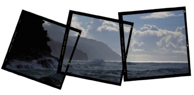
Hi Ya Lisa, ok....ya confuzzed me...If I mixed up the order of the images then it wouldn't be the shot.
What I did to make this was.
I created a med format frame, Placed it over one part of the whole image. Rotated it, I did that a total of three times and when I got what I was looking for. I erased the parts of the image that were not inside of the frames.
I can send you a Frame and a tutorial of how to do what I did if you would like?
Did you get the images I sent you the other day?
Best Regards
Sam Graziano III
|
|
|
|
|
So Cal Photograhper
{K:18529} 4/6/2006
|
I like the framing, it's different.
The only thing I am thinking is that maybe I would have mixed up the order of the images in each frame. I can picture it in my head, but not exactly sure how it would look on paper.
|
|
|
|
 Jason Mckeown
{K:22200} 4/5/2006
Jason Mckeown
{K:22200} 4/5/2006
|
beautifully put together Sam, the frames are perfect in this situation
|
|
|
|
|
Hugo de Wolf
{K:185110} 4/5/2006
|
Hi Sam,
First, like I thought, the previous one in colour is porobably even better than the b&w version.... But that's beside the point here, I think.
I dig the frame, Very creative. Over the top? Don't really think so, the the MF feel in combination with the photos works well.
The only thing I'd really like to change is the white background; as the UF page colour is off-white (RGB 234,234,234) I think such presentation works best if it would really blend in with the page. That also means, I believe this is an excellent way of portraying photographic skills (combining graphic design and photography) for representaional purposes...
As a stand alone, I think the photo itself is probably too good to be masked by such an elaborate presentation. The framing is probably more important here than the photo itself, and as such a great tool to mask the flaws in a "mediocre" photo. In other words, I wouldn't consider printing this, but it's superbly creative in it's presentation.
A great find, and very well executed!
Cheers,
Hugo
|
|
|
|
 Chris Hunter
{K:25634} 4/5/2006
Chris Hunter
{K:25634} 4/5/2006
|
I like the photo, but it seems the presentation is taking center stage, which is fine as it's creatively done,
Chris
|
|
|
|
 j esford
{K:13518} 4/5/2006
j esford
{K:13518} 4/5/2006
|
very attractive presentation
|
|
|
|
 Kambiz K
{K:37420} 4/5/2006
Kambiz K
{K:37420} 4/5/2006
|
very creative and beautiful capture with great composition and tones
|
|
|
|
 Nicole Marcisz
{K:10268} 4/5/2006
Nicole Marcisz
{K:10268} 4/5/2006
|
No, I like the presentation. It's good to be different. the left is a bit darker than I like it.
cheers,
nicole
|
|
|
|
|
Sam Graziano III
{K:14064} 4/5/2006
|
Hi Mattia,
Thank you for your comment and taking the time to view my image. Yes this was taken on the North shore of Kauai. At a beach named Ke'e Beach.
Kind Regards
Sam
|
|
|
|
 Mattia L.
{K:7625} 4/5/2006
Mattia L.
{K:7625} 4/5/2006
|
Great and original idea, congrats! Hawaii?
|
|
|
|
 Rashed Abdulla
{K:163889} 4/5/2006
Rashed Abdulla
{K:163889} 4/5/2006
|
the frame is wonderful and so the image, a great job, all of the best my friend
|
|
|
|
|
Tabitha Borges
{K:728} 4/5/2006
|
coll layering and what great pictures..love the clouds...
|
|