|
|
Critique By:
michaelle . (K:3807)
1/14/2004 8:32:51 PM
Donna,
I think I like the black and white tiles... it adds to the very retro graphic feel that the neon gives to the image. Taking out the tiles would not be hard, but the image would have a very different feel to it. Attached it the same thing in all black except for the neon (and a crop). This was a quicky job, but you can see how the overall tone of the image changes...
After looking at both, i still think I prefer the tiles, but with the crop as suggested. Really a cool shot - especially considering you did not have a lot of options.
|
| Photo By: Donna Johnson
(K:9906)
|
|
|
Critique By:
michaelle . (K:3807)
1/14/2004 8:18:46 PM
Alisa,
Maybe the title, "its a dog's world" would be more appropriate - lends itself to the fact that the window and what is outside of the window is in focus rather than Harley. I would agree that seletive focus on Harley would have been nice, but then this would have been a totally different image then. More of a doggy portrait rather than looking ou the window with Harley and trying to see what he sees....
Just a thought...
Michaelle
|
Photo By: Alisa Mudge
(K:7511)

|
|
|
Critique By:
michaelle . (K:3807)
1/12/2004 4:57:52 PM
I really like the arrangement you chose - its random enough to be believable, but still organized to carry the eye around the frame. I would have to second the opinion on the image being a touch bright for the subject - maybe lowering the values in PS and then selectively dodging in critical texture into the shadows? Also, not to be commonplace, but this might look very nice in a sepia tone to go with the "old" feeling of the "found things".
Again, the arrangement is perfect, and this image is definately worth exploring. Very nice.
|
| Photo By: Robert Stokes
(K:4509)
|
|
|
Critique By:
michaelle . (K:3807)
1/12/2004 4:52:25 PM
Donna,
The DOF is perfect on this... You nailed the subject and left enough depth of field for the ocean to place him in his element, yet not compete with him as the central figure. Excellent!
|
| Photo By: Donna Johnson
(K:9906)
|
|
|
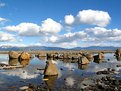
Critique By:
michaelle . (K:3807)
1/12/2004 5:11:28 AM
Donna,
I really like the graphic representation in this image, the sillouettes are wonderful. I would have to agree, however that the image is a tad dark, with no real light greys or whites, therefore making it appear flat. You do not have to go for the high contrast black and white everytime, but with this image, it is inherently higher contrast (light sky and black silouettes. I do this a couple of ways, the first is to just dodge in selective areas to make them a little lighter (this would retain the full black silouettes of the boats) or secondly, I apply a levels adjustment layer and bring up the midtones and highlights a tad (this will give some details in the boats) and then selectively dodge and burn items that you feel are still not falling in the correct exposure range.
I really like the composition of this image and the pelican "looking over things" is the perfect touch. Very well seen!
|
| Photo By: Donna Johnson
(K:9906)
|
|
|
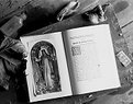
Critique By:
michaelle . (K:3807)
1/9/2004 4:13:41 PM
Since I had several comments on the crop, I am posting a tighter crop in response. Comments?
|
| Photo By: michaelle .
(K:3807)
|
|
|
Critique By:
michaelle . (K:3807)
1/9/2004 4:02:08 PM
Facinating details... for something sooo cold, it is quite calming to just look at and ponder the bubbles and the cracks. Very nice lights and darks... well seen!
|
| Photo By: Donna Johnson
(K:9906)
|
|
|
Critique By:
michaelle . (K:3807)
1/6/2004 3:58:44 PM
Hey! I know this place!!!! Seem like I was there just the other day  I would have to agree with Steve's assesment, a little tighter crop would make all the difference. However, the colors and the exposure are great, you saw good! I would have to agree with Steve's assesment, a little tighter crop would make all the difference. However, the colors and the exposure are great, you saw good!
|
| Photo By: Alisa Mudge
(K:7511)
|
|
|
Critique By:
michaelle . (K:3807)
12/18/2003 4:55:31 AM
Thank you everyone for you wonderful comments. I don't get a chance to go down this back road that often anymore, which is a pity because there are some really great old houses that have so much to tell about what this area was like before strip malls and McDonald's. This house once stood om 60 acres of land - or at least that is what I am told - over the last 25 years or so it has been whittled down to about 3/4 of an acre to make way for modernization. Over the course of that time, the owners abandoned the house.
Again, thank you for your kind words.
Michaelle
|
| Photo By: michaelle .
(K:3807)
|
|
|
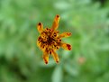
Critique By:
michaelle . (K:3807)
12/17/2003 9:50:22 PM
Welcome to Usefilm! I really like how you chose to isolate the subject... it really makes the flower special. I would so love to see this cropped so that the flower were not quite dead center however... Possibly something like the attached....
|
| Photo By: Soumya Simanta
(K:0)
|
|
|
Critique By:
michaelle . (K:3807)
12/17/2003 8:49:50 PM
I would have to say that Chris said it all... print out his response and use it as a checklist... it will help dramatically!
|
| Photo By: Teena Bacon
(K:35)
|
|
|
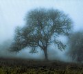
Critique By:
michaelle . (K:3807)
12/17/2003 8:33:40 PM
Donna,
The colors and mood to this image are really great... you definately brought to us a moment in time. I have one little nit (I guess I am going against the grain of the other 24 comments with this one) but, the vertical post that creates a straight line behind the tree is not in synch with the rest of the very fluid feeling of the image and it continues to pull my eyes to it. Depending on how much of a purist you are regarding PS, you can either clone it out or possibly go back and shoot from a slightly different angle so that the post is more hidden behind the main trunk of the tree. Like I said, it's a nit, but a very correctable one. Other than that, this is a beautiful image, very well done.
Michaelle
|
| Photo By: Donna Johnson
(K:9906)
|
|
|
Critique By:
michaelle . (K:3807)
12/4/2003 10:38:06 PM
That's it! Just ruuuubbbbb it in!!!
The color of the rocks compliments the blue sky and clouds perfectly... And I really like the off center composition.
So, how are the skies in Ontario these days? LOL
(Next time, I go with... ok?)
|
| Photo By: Chelsea Burke
(K:5750)
|
|
|
Critique By:
michaelle . (K:3807)
12/1/2003 2:20:09 PM
How fun!!! Add a glowing red ball to the end of the pelican's nose and he could be Rodolf the Red Nose pelican! Really happy image - it made me smile! Thank you!
|
| Photo By: Donna Johnson
(K:9906)
|
|
|
Critique By:
michaelle . (K:3807)
12/1/2003 2:05:41 PM
Donna,
The contrast between the sky color here and the straw color of the foreground is wonderful... and the lines of the mountains and clouds in the background very complimentary to the composition. I like the little wisp of cloud at the top right frame, but for me it might make a stronger presentation if the image was cropped so that the tractor was not so central frame. Maybe an inch off of the right frame and 1/2 inch off of the top. That then sets the tractor on a diagonal with the mountains and clouds in the background and gives a little more tension to the image. Try it out and let me know what you think. Very well seen!
Michaelle
|
| Photo By: Donna Johnson
(K:9906)
|
|
|
Critique By:
michaelle . (K:3807)
11/26/2003 12:17:55 AM
Donna,
Here is the edit that you suggested... I like it!
|
| Photo By: michaelle .
(K:3807)
|
|
|
Critique By:
michaelle . (K:3807)
11/25/2003 5:08:51 AM
Wonderfully graphic! I think if you had chosen to show more details the color would have been too bright, but because you went with a more graphic presentation of the flowers, the color is right on. Very, very pretty!
|
| Photo By: Donna Johnson
(K:9906)
|
|
|
Critique By:
michaelle . (K:3807)
11/25/2003 5:05:26 AM
Donna,
First, I would like to thank you for your time on my images and inviting me to look through your portfolio. I appreciate the effort that you are putting into learning how to give solid critiques, and am honored that you would be willing to critique my portfolio. Thank you, again...
Now, onto this wonderful image. The pastel colors of this sunset are just gorgeous and you have done a wonderful job of capturing them. The dark area on the right frame in in the foreground seem to compete unfavorably with the lightness of the sky... giving the image a heaviness that does not seem to go with the colors and the more whimsical boats in the left frame. Possibly changing the angle to remove some of this area, or using an ND grad to give more equal exposure and bring out the details in the foreground would help to balance the light and the dark. You are so lucky to have such beautiful landscape to work with... I am looking forward to seeing more of your work!
|
| Photo By: Donna Johnson
(K:9906)
|
|
|
Critique By:
michaelle . (K:3807)
11/25/2003 4:50:46 AM
Donna,
I like the subtle tones you have captured in this image, they are absolutely beautiful. The masts of the ships crossing the center horizon line give what could be a potentially static image a very wonderful lift... And of course, the birds in the foreground are a bonus! Very well seen and captured!
Michaelle
|
| Photo By: Donna Johnson
(K:9906)
|
|
|
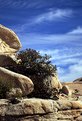
Critique By:
michaelle . (K:3807)
11/25/2003 4:46:04 AM
Donna,
This is really beautiful country! You have done a wonderful job of capturing the stillness of the moment. As you have noted, the boulders compete with the clouds, however, I personally find the boulders a little more interesting. Possibly angling the camera down just a tad to put the sky in the top 1/3 or so of the frame would have given the benefit of the beautiful sky in the image, but not caused so much attention. Also, that last boulder in the far right frame kind of wanders out, you might think about cropping him out to keep the viewers eye central to the image. Overall, very well seen! I hope you have a chance to go back and take more!
Michaelle
|
| Photo By: Donna Johnson
(K:9906)
|
|
|
Critique By:
michaelle . (K:3807)
11/24/2003 2:40:43 PM
Al,
You absolutely know that I love this picture! Everyone has already said all there is to be said - it's wonderful! So when do I get my copy???
Michaelle
|
| Photo By: al shaikh
(K:15790)
|
|
|
Critique By:
michaelle . (K:3807)
11/19/2003 5:27:34 AM
Priscilla,
The look is priceless, and how did you manage such a quiet time with a young boy??? :-)
The shadows are very deep, especially under his eyes and they make him look a little tired. In conjunction with that, the right eye is so hidden by shadow that it is hard to see. Possibly using a reflector low and to the dark side of Kevin would help to lighten those shadows a tad. Another thing that would help to perk this up would be a slight catch light in his eyes - that adds life to the subject. Finally, a light sharpening would help to pop the details in his eyes as well. I hope you don't mind, but I tried to do a little work on your image to demonstrate some of what I have suggested. It is attached below.
Overall, this setup has lots of promise! Good luck!
|
| Photo By: Priscilla ciccilla
(K:48)
|
|
|
Critique By:
michaelle . (K:3807)
11/18/2003 9:14:06 PM
Fun fun picture - the side light gives alot to this image and captures the personality perfectly.
From a personal side - I have the priviledge of owning one of these monsters and I wish you all the luck! They are wonderful and funny dogs - but ohhhh so stubborn unless you have a treat. LOL
Attached is a picure of Bagel - my beagle monster - again I wish you much fun with your new friend.
Michaelle
|
| Photo By: Peter De Rycke
(K:41212)
|
|
|
Critique By:
michaelle . (K:3807)
11/18/2003 2:45:13 PM
The colors are wonderful... they give it that older warm feeling. I really like the DOF, and it works well with the composition. The spiderweb is a bonus! Very nice.
Michaelle
|
| Photo By: Matt Norman
(K:133)
|
|
|
Critique By:
michaelle . (K:3807)
11/17/2003 4:53:10 PM
This just tickles me... I don't know the story behind the image, but the image says it all! To me that is very important. Wonderful shot.
|
| Photo By: Ivan N. Prgonjic
(K:3053)
|
|
|
Critique By:
michaelle . (K:3807)
11/11/2003 10:15:13 PM
Harry,
I really like how you captured the light on the water, it is very magical. I would have liked a little more separation between the shadow of the boat and the boat itself, but doing that could have been a little tough. The silouettes of the buildings in the back really compliment the drama of the sky well, however the central placement in the frame gives a more static feel to the composition. Overall, very well seen.
Michaelle
|
| Photo By: harry reid
(K:73)
|
|
|
Critique By:
michaelle . (K:3807)
11/11/2003 8:34:36 PM
Elizabeth,
Wonderful image to learn from for "saving in PS"... I have uploaded a version that I tried to keep very true to your original, just evened out the shadows and highlights a bit and gave it some softness. This was a quick fix on the low res copy, and I'm sure would have much better results with some time and the higher res image.
In the future, to help avoid having to do all of this post processing, a diffused secondary light source opposite the window (even a light through a bed sheet) will help to even out the exposure a little. Even just using a white bed sheet might throw enough light back onto the shadow side of her face to help.
Let me know if you would like more info on the PS steps I took.
Good Luck!
Michaelle
|
| Photo By: Elizabeth Miller
(K:2766)
|
|
|
Critique By:
michaelle . (K:3807)
11/9/2003 8:04:49 AM
I really like this image, the contrast and strong DOF throughout is wonderful! The tilted composition takes what could be a very static image and gives it life. I am not sure about the light falloff in the upperleft frame, and think I would have prefered to see equal lighting all the way through. Overall, a great visual image.
Michaelle
|
| Photo By: Barry Walthall
(K:5312)
|
|
|
Critique By:
michaelle . (K:3807)
11/2/2003 5:10:42 PM
Marianne,
I think all of the suggestions above are right on... however, there is some "magic" that can be done in the digital darkroom to help with the problems. I understand that it depends on how much a purist one is on how much editing they do, but for the most part, with simple adjustments in curves and levels, and a little selective adjustment in some of the darker areas of the childs face, this picture can be salvagable.
I believe that we need to learn to shoot to get what we want right out of the camera, however, sometimes a little bit of light editing in PS can't hurt.
I have attached an edited version (hopefully the edits will show up after the image compression). I have also cropped and added some selective focus to the image as well, but those are to my taste, and I would understand if you think they are just silly.
|
| Photo By: Marianne Gordon
(K:507)
|
|
|
Critique By:
michaelle . (K:3807)
10/4/2003 8:06:01 PM
I agree with the comments on the PS... I think the texture is a bit too much.... The conrast and lighting are wonderful, however. My little nit would be the pacifier... to me it takes away from the otherwise very peaceful scene.
|
| Photo By: Debra Griffin-Ibrahim
(K:7119)
|
|
")