|
|
Critique By:
Eric Nolan (K:777)
7/19/2007 7:20:39 PM
Michael - Once again, nice shot. I would have to agree with Mr. Adams, I like the color version a better. The colors seem to help the photo "pop" more. Also, thank you for always putting in a little description on how you processed your photographs. I know that it makes me think on how I can improve my work.
|
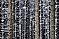
| Photo By: Michael Kanemoto
(K:22115)
|
|
|
Critique By:
Eric Nolan (K:777)
7/19/2007 7:06:21 PM
Michael, Thank you for your post. I wanted to get more of the sky and the ground, but when I found out that my cheap little tripod would only let me sit at landscape. I put as much of the ground as I could, but still clipped the top of the fireworks.  ( That'll teach me. I'll bring my better tripod next time. I really lucked out with the quality since this was my first real stab at fireworks. ( That'll teach me. I'll bring my better tripod next time. I really lucked out with the quality since this was my first real stab at fireworks.
|
| Photo By: Eric Nolan
(K:777)
|
|
|
Critique By:
Eric Nolan (K:777)
7/13/2007 6:51:40 PM
Here is an example of what I was talking about. I just adjusted you levels a little bit.
|
| Photo By: John Hatz
(K:156973)
|
|
|
Critique By:
Eric Nolan (K:777)
7/13/2007 6:39:07 PM
John - Great shot! I love the detail that you were able to capture and your crop is spot on. One critque... it looks like your B&W is a little muddy and dim. You may want to modify your levels in PS to make you whites whiter. That might lighten up your shot. Keep up the good work.
|
| Photo By: John Hatz
(K:156973)
|
|
|
Critique By:
Eric Nolan (K:777)
7/13/2007 6:32:36 PM
Thank you for you comments John... I too was impressed that I was able to cature such detail on my first time shooting fireworks and on a new camera to boot. I just lucked out. I have to give thanks to all the posts I read on UF.
|
| Photo By: Eric Nolan
(K:777)
|
|
|
Critique By:
Eric Nolan (K:777)
7/13/2007 6:27:03 PM
Thank you for your comments Mike... I too am bothered by the "frame". When I got to Powell Gardens, I noticed that my mini tripod only gave me the option for landscape, so I did the best that I could. It also didn't help that my 3 year old kept kicking my tripod. ;o)
|
| Photo By: Eric Nolan
(K:777)
|
|
|
Critique By:
Eric Nolan (K:777)
7/5/2006 10:22:36 PM
Very Cool! Thanks for the photo, it helps. I'll look around. )
|
| Photo By: Eric Nolan
(K:777)
|
|
|
Critique By:
Eric Nolan (K:777)
6/30/2006 3:42:00 AM
Sadly... No. I need to find something. Maybe B&H has something cheap. )
|
| Photo By: Eric Nolan
(K:777)
|
|
|
Critique By:
Eric Nolan (K:777)
6/29/2006 7:39:51 PM
Very creative shot! Nice detail, lighting and placement. The "slight" angle of the sign kind of bugs me (not too much). Wonder what it would do if you tilted your photo clockwise a tad? Hmmm...
I would have to disagree with Phillip about your "act of defiance". The sign obviously states that you cannot ride your bicycle to the right. It is obvious that your Cannondale is facing the opposite way.
|
| Photo By: Jinggoy Montenejo
(K:7736)
|
|
|
Critique By:
Eric Nolan (K:777)
6/29/2006 7:30:39 PM
Jinggoy - Thank you for your comments. Now that you mentioned it, I should have cropped out the rail. Ooops. As for the shadows... well, this is actually a "negative" of my original B&W. I agree, I need to mess with the levels a little better.
|
| Photo By: Eric Nolan
(K:777)
|
|
|
Critique By:
Eric Nolan (K:777)
6/29/2006 7:27:54 PM
James - thanks for your comments. Actually, this is a "negative" of my B&W shot. There was no sun, just a windowless room. Kind of creepy. The white spot is actually my black camera. I thought I kept myself out of the shot, then I uploaded. (
I agree with your opinion on the DOF, unfortunatly I didn't have my tripod with me. There was not enough light to prevent blur (darn my shakey hands).
|
| Photo By: Eric Nolan
(K:777)
|
|
|
Critique By:
Eric Nolan (K:777)
6/29/2006 7:20:25 PM
Beautiful Blue! Amazing color and texture. Don't think I would change a thing.
Congrats on the the DiD and the Gallery Showing! You'll have to post when and where your showing will be or drop me an e-mail ;o)
|
| Photo By: Michael Kanemoto
(K:22115)
|
|
|
Critique By:
Eric Nolan (K:777)
6/29/2006 5:06:22 AM
Very nice! You may be right. I've heard that when you're abducted that "THEY" sometimes alter your memory. Maybe this wasn't really a light.... Hmmmm
|
| Photo By: Eric Nolan
(K:777)
|
|
|
Critique By:
Eric Nolan (K:777)
6/23/2006 4:41:16 PM
I was thinking the same thing. This shot is missing something. Anyway... Thanks for your kind words.
|
| Photo By: Eric Nolan
(K:777)
|
|
|
Critique By:
Eric Nolan (K:777)
6/23/2006 4:30:20 PM
Oh yeah... Congrats on the Award!
|
| Photo By: Michael Kanemoto
(K:22115)
|
|
|
Critique By:
Eric Nolan (K:777)
6/23/2006 4:29:46 PM
Great eye!
Great title! - Reminds me of an e-mail signature I saw some time ago: "There are 10 people in this world. Those that know binary and those that do not"
Anyway, Beautiful colors and textures. I like this original better than your alternate shot (it wasn't bad, just didn't do it for me like the original). Not sure what else you could do to modify. Excellent work. This is going in my Favs.
|
| Photo By: Michael Kanemoto
(K:22115)
|
|
|
Critique By:
Eric Nolan (K:777)
6/23/2006 4:18:16 PM
I really like this shot! Excellent lines and colors. The title is a Plus  Another Kanemoto Classic! Another Kanemoto Classic!
|
| Photo By: Michael Kanemoto
(K:22115)
|
|
|
Critique By:
Eric Nolan (K:777)
6/1/2006 3:37:31 PM
WOW, Great DOF! I love this shot! Once again, the childs expression is priceless! Looks like I need to take some notes from your portfolio.
|
| Photo By: Louise Vessey
(K:13862)
|
|
|
Critique By:
Eric Nolan (K:777)
6/1/2006 3:33:00 PM
Adorable! Your lighting and soft focus is right on! The childs expression is priceless. This shot might be more dramatic if you placed the childs face on the Third line on the left instead of dead center. None the less, great shot. The thing I struggle in is taking photos of people. Kudos
|
| Photo By: Louise Vessey
(K:13862)
|
|
|
Critique By:
Eric Nolan (K:777)
3/13/2006 8:28:48 PM
Nice composition. The child's eyes really pull you into this shot! Lots of emotion! Your lighting seems to be spot on. Nice use of DOF, however if you were to reduce your aperture just a little, the other eye might have more detail and there would possibly make the line around the jaw a little less blurry.
|
| Photo By: Pat Fruen
(K:12076)
|
|
|
Critique By:
Eric Nolan (K:777)
12/29/2005 1:58:14 PM
Wow! Absolutely BEATUIFUL! I love the detail that you were able to capture here. Nature can be amazing. If you dont mind me asking, what were your shutter speed and aperture settings? What ever they were
Perfection!
|
| Photo By: Frits Selier
(K:455)
|
|
|
Critique By:
Eric Nolan (K:777)
12/1/2005 9:56:45 PM
Wonderful! I love the emotion emanating from the man?s face. The background reminds me of the Hitchcock thriller, ?The Birds?.
|
Photo By: luis pereira
(K:26013)

|
|
|
Critique By:
Eric Nolan (K:777)
12/1/2005 9:45:18 PM
I'm really enjoying your "Urban Abstracts" portfolio. I LOVE the bricks in this shot!
Good to see you back on UF!
|
| Photo By: Michael Kanemoto
(K:22115)
|
|
|
Critique By:
Eric Nolan (K:777)
11/7/2005 4:20:04 PM
I like the original too. Thanks for your comments )
|
| Photo By: Eric Nolan
(K:777)
|
|
|
Critique By:
Eric Nolan (K:777)
11/1/2005 6:38:58 PM
This shot has very warm tones. You might want to shift the boat to be more on the lines of third, but it really isn?t too bad where it is. As for the blur, it is a little too blurry. It might be better if the focus was tighter on the water instead of the faint background. All in all, a good shot.
|
| Photo By: Uri Lidsky
(K:4932)
|
|
|
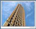
Critique By:
Eric Nolan (K:777)
11/1/2005 6:25:58 PM
Very interesting perspective... You?re right; the building really does look flat. That?s one way to save on building costs; use less bricks! This wouldn?t be one of those ?Trump? buildings would it? ;o) I love the blue sky with the swirling, wispy clouds. Fine composition.
|
| Photo By: Ron Wilson
(K:18362)
|
|
|
Critique By:
Eric Nolan (K:777)
11/1/2005 6:06:57 PM
Thanks for your comments. The color in this shot was pretty much on. The lighting made it look a little pale.
As for your "quick play", I don't see it posted. Could you please repost if all possible? I'm always up for learning cool PS stuff!!! 
|
| Photo By: Eric Nolan
(K:777)
|
|
|
Critique By:
Eric Nolan (K:777)
11/1/2005 4:15:50 PM
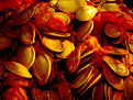
Ron,
Thanks for you comments. I only changed the levels in PS, making the lighing darker to make the orange look red and a little gorish. Please check out "Pumkin Guts" for the original and let me know which you like better.
|
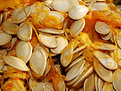
| Photo By: Eric Nolan
(K:777)
|
|
|
Critique By:
Eric Nolan (K:777)
10/17/2005 5:36:23 PM
Happy Halloween back at ya! Very Creative! There?s something about this shot that reminds me of Homer Simpson (the episode where Bart was drawing on Homer?s head). Anyway, I?m very impressed that everything found focus since you were shooting your own head. (How many tries did it take?)
|
| Photo By: Brian Watters
(K:244)
|
|
|
Critique By:
Eric Nolan (K:777)
10/3/2005 4:56:23 PM
I love the detail that you were able to capture in this photograph. Excellent lighting and composition. Absolutely Beautiful!
|
| Photo By: Maria van de Langenberg
(K:28)
|
|