|
|
Critique By:
Greg Urban (K:224)
2/9/2014 5:04:24 PM
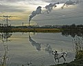
This surpasses the ordinary by the presence of your Dalmation. I have taken such images before of industrial areas but have all be rather pedestrian. I like this.
|
| Photo By: Sam Andre
(K:12484)
|
|
|
Critique By:
Greg Urban (K:224)
9/5/2006 6:43:01 PM
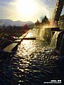
Very lovely shot Mohammad. The perspective is wonderful. The quality of the light though is what drew me in while looking at your portfolio. Just terrific. It almost feels like Heaven has opened up....wow!
|
| Photo By: Mohammad Porooshani
(K:20765)
|
|
|
Critique By:
Greg Urban (K:224)
7/2/2006 6:59:44 PM
Wow! I recently uploaded a horse racing shot in which I panned a group of horses with my camera. I thought it was good but it was really just documentary.
Your shot transcends the documentary and is really otherwordly. I love the high contrast combined with the blur of the action.
|
| Photo By: David Mihoci
(K:450)
|
|
|
Critique By:
Greg Urban (K:224)
4/21/2005 2:41:27 PM
This subject reminds me of a certain album cover (you probably know the one). I like the contrasting textures of the water and pebbles. Nice.
Greg
|
| Photo By: Mathieu Rolland
(K:94)
|
|
|
Critique By:
Greg Urban (K:224)
4/21/2005 2:33:37 PM
Hmm...I think I've eaten this in a school cafeteria...
-Greg
|
| Photo By: Mathieu Rolland
(K:94)
|
|
|
Critique By:
Greg Urban (K:224)
4/21/2005 2:31:19 PM
Greetings,
Thanks for your comment! One thing I learned shooting B&W negative film is that when shooting in full sunlight one should use a light to medium yellow filter on the lens. This helps greatly with the tones, especially the sky. It is a little strange shooting with a colored filter on an SLR but one can get used to it. I use rangefinder 35mm cameras so it isn't an issue.
Thanks!
Greg
|
| Photo By: Greg Urban
(K:224)
|
|
|
Critique By:
Greg Urban (K:224)
4/17/2005 4:00:02 PM
Greetings Alper,
That smoke/smog makes the sky appear to have been painted by sponge. Wonderful effect, and to me it adds an oppressiveness that hightens the sense of isolation I feel in the scene. The fact that there are children playing/chasing the sea birds adds a dramatic touch to an otherwise static scene and emotionally draws me in.
Regards,
Greg
http://www.oddservations.com
|
| Photo By: Alper Tecer
(K:7007)
|
|
|
Critique By:
Greg Urban (K:224)
4/17/2005 3:54:27 PM
Greetings Alper,
Thanks for the comment. I don't pose anyone. The familiy in particular is used to me lurking about with a camera so I just wait for the "decisive moments" and shoot.
Thanks!
Greg
http://www.oddservations.com
|
| Photo By: Greg Urban
(K:224)
|
|
|
Critique By:
Greg Urban (K:224)
4/17/2005 3:51:01 PM
Greetings Michael,
Thanks for the comment, the little Bichon looks quite vicious there.
I had a look at your portfolio, good stuff there! I like the "snapshot" asthetic, you have something good there. You should concentrate on your framing a bit, but otherwise keep it up !
Thanks,
Greg
|
| Photo By: Greg Urban
(K:224)
|
|
|
Critique By:
Greg Urban (K:224)
3/8/2005 4:18:07 PM
Sorry Judita, I addressed the comment to someone else, but I meant it for you! --Greg
|
| Photo By: Judita Sendak
(K:600)
|
|
|
Critique By:
Greg Urban (K:224)
3/8/2005 4:15:38 PM
Hello Karel,
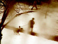
You captured an interesting moment in time. There is a sense of tension I think. Could the dogs just be looking at each other and move on? Could something sinister occur? The fact that it appears to have been taken through a window presents the viewer with a "sheild" of sorts and the fogging adds a sense of surreality.
In short, very nice indeed!
Later,
Greg
|
| Photo By: Judita Sendak
(K:600)
|
|
|
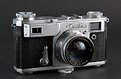
Critique By:
Greg Urban (K:224)
1/9/2005 8:42:31 PM
Hello Roger, This camera should not dissapoint as long as the shutter is not gummed up with old Yak-snot grease. The lens is a Zeiss Sonnar design and should provide pleasing images.
When I decided to get back into photography after about 11 years I needed "new" equipment as I got rid of almost everything. I wanted a Leica or Contax rather than an SLR but the prices were nuts. I accidentally found the Kievs and fell in love, so to speak.
I use the Kiev 4-A which is a simplified version of the Kiev-2A that you have. The other lenses are Zeiss designs and are not expensive and there is a turret multi-focal length viewfinder available.
Enjoy!
Greg
http://www.oddservations.com
|
| Photo By: Roger Lyden
(K:15)
|
|
|
Critique By:
Greg Urban (K:224)
1/9/2005 2:30:50 PM
Well lit product shot. I use a Kiev-4A and Jupiter-12 lens for most of my shooting. Wish I could afford a Kiev-2 or a Contax II .
|
| Photo By: Roger Lyden
(K:15)
|
|
|
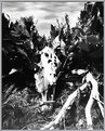
Critique By:
Greg Urban (K:224)
1/9/2005 2:25:36 PM
Very mysterious. It could be foliage or something else. I used to experiment with Quaker Oats boxes years ago.
|
| Photo By: Fred Warren
(K:155)
|
|
|
Critique By:
Greg Urban (K:224)
1/9/2005 2:13:15 PM
This image gives me a sense of tension...not that it is bad, what I mean is that it shows a prelude to action. I like the composition and you have nice B&W tones from the digital capture. Did you just "desaturate" to get B&W? It might have been possible to get a better range of tones in editing, but the higher contrast you have here gives a definite sense of bright sun. Good work.
|
| Photo By: Rachel Leah
(K:26110)
|
|
|
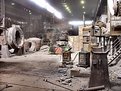
Critique By:
Greg Urban (K:224)
1/2/2005 2:25:49 PM
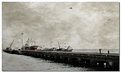
An old iron or steel works, yes? Wonderful space to photograph, and the light is diffuse enough to "soften" the machinery. Very nice photo, and I think using film kept the mood created by the light. Good work!
|
| Photo By: Jure Kravanja
(K:690)
|
|
|
Critique By:
Greg Urban (K:224)
1/2/2005 2:21:39 PM
The metallic tonality is wonderful, the perspective is evocative of an Escher drawing. The woman brings life to an otherwise sterile environment and makes this so much more interesting.
|
| Photo By: Jure Kravanja
(K:690)
|
|
|
Critique By:
Greg Urban (K:224)
1/1/2005 5:15:16 PM
This image just glows. The sharpness, color and depth makes me feel that I am in the place, not just looking at a photo. I can see this blown up to poster size.
|
| Photo By: Jure Kravanja
(K:690)
|
|
|
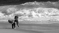
Critique By:
Greg Urban (K:224)
12/26/2004 2:59:17 PM
Walt, nice shot of a disspearing relic.
Something I am guilty of is not going in close for the details. I would like to see some clost shots of details/textures on something like this.
Still, the contrast between nature, the structure itself being reclaimed and the obviously synthetic blue tarp is good. Very nice!
Greg
|
| Photo By: Walt McNeil
(K:2146)
|
|
|
Critique By:
Greg Urban (K:224)
12/19/2004 8:24:04 PM
Wow! I don't do much night photography anymore but this might inspire me to do some again. I like the texture in the sand and the blue tone. I also feel that the tree is essential to the image. Without it there would be an otherwise "empty" or sterile feel to the image. Great work!
|
| Photo By: AAT SA
(K:4565)
|
|
|
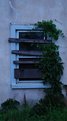
Critique By:
Greg Urban (K:224)
8/18/2004 1:43:18 AM
Hello Matt,
This closeup is the best of the three I think. Perhaps either a more pulling back and shooting at a more oblique angle to show down the wall more would be nice. Or a straight on shot would be good. Something about this particular angle gives it some "tension" I think.
Nice work, it does stand out. I like the light on the inside illuminating leaves from behind, adds depth. I have a similar shot on my website in the current work section that is dead on, but lacks the depth of your photo.
Later,
Greg
www.oddservations.com
|
| Photo By: matthew hoffman
(K:658)
|
|
|
Critique By:
Greg Urban (K:224)
7/19/2004 2:27:58 PM
This is digital? Good focus and depth at close range. Did you use a tripod? I probably would have gone manual and used a small aperture and focused closer to get better close in depth. Nice lines.
|
| Photo By: matthew hoffman
(K:658)
|
|
|
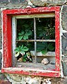
Critique By:
Greg Urban (K:224)
7/19/2004 2:25:07 PM
Matt, I agree with Matej that the photo looks better with levels adjusted. I do like the image, or the idea of it. There is a lot of texture in the wall, the boards and the ivy. I normally do not crop, but I can see where cropping might help, also slight rotation to the right (maybe 1 or 2%) to make the window edge parallel to the border of the image.
|
| Photo By: matthew hoffman
(K:658)
|
|
|
Critique By:
Greg Urban (K:224)
7/6/2004 5:45:37 PM
Odd image, I like it. There is a feeling like the tires (they aren't Uniroyal Tiger Paws?) are crouched in the grass like predators awaiting the next meal. I guess you had to lay on your stomach for this shot?
|
| Photo By: matthew hoffman
(K:658)
|
|
|
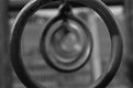
Critique By:
Greg Urban (K:224)
7/6/2004 5:42:46 PM
Hello Matt. Nice image, I would take something like this . Serisously, the impression of distance combined with the shallow depth is nice. Too bad the top and bottom of the first ring is cropped. This would be perfect in a square format.
|
| Photo By: matthew hoffman
(K:658)
|
|
|
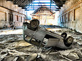
Critique By:
Greg Urban (K:224)
6/18/2004 10:34:40 AM
Matt, I like old abandoned places and this factory appears to have possibilities. Slow down and try to imagine what the final print would look like before pressing the shutter. I intentionally limit myself to short rolls of film, but mostly shoot hand held. I am more mobile this way, and am forced to consider whether a composition is a keeper before shooting. I think B&W would be a better choice for the subject too, but try both and see what you like.
|
| Photo By: matthew hoffman
(K:658)
|
|