|
|
Critique By:
Roderik Koenders (K:2740)
10/26/2011 9:49:34 PM
Thank you all very much for your comments! I really appreciate the feedback.
|
| Photo By: Roderik Koenders
(K:2740)
|
|
|
Critique By:
Roderik Koenders (K:2740)
10/25/2011 11:05:11 AM
Hello Vehbi,
Thanks for your comment. I just looked at your abstract alphabet series and it is very inspirational. Keep up the good work!
|
| Photo By: Roderik Koenders
(K:2740)
|
|
|
Critique By:
Roderik Koenders (K:2740)
10/25/2011 11:03:57 AM
Thank you very much Freidoon. I hope you also like my follow up to this series.
|
| Photo By: Roderik Koenders
(K:2740)
|
|
|
Critique By:
Roderik Koenders (K:2740)
10/25/2011 11:02:30 AM
Thanks for your nice comment. I must say after looking at your portfolio you have a very unique style. Very powerful.
|
| Photo By: Roderik Koenders
(K:2740)
|
|
|
Critique By:
Roderik Koenders (K:2740)
11/15/2008 10:05:33 AM
Thank you Indranil. I made a lot of pictures at that event and I only noticed this one when I took another look at the pictures I discarded. It was a bit dark, hence the grain. But I liked how it turned out.
|
| Photo By: Roderik Koenders
(K:2740)
|
|
|
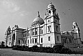
Critique By:
Roderik Koenders (K:2740)
11/15/2008 8:54:38 AM
Hi Arijit,
I think this is a really nice shot of an intriguing building. I do think the perspective distortion is a bit strong, you could try to adjust that a little bit by using the perspective tool in the GIMP/photoshop, or a tool like Hugin. Also, I would clone out the person on the right, it is a little bit distracting. And maybe you can bring out the clouds a little bit more.
|
| Photo By: Arijit Chakraborty
(K:447)
|
|
|
Critique By:
Roderik Koenders (K:2740)
11/15/2008 7:52:43 AM
Wow Paul! Indeed this is an even better crop than the other. I really like how the hair in the top right and bottom left corners are balanced. Furthermore a really beautiful, natural expression. Thanks for sharing!
|
Photo By: Paul Lara
(K:88111)

|
|
|
Critique By:
Roderik Koenders (K:2740)
11/14/2008 4:37:19 PM
PS... Maybe you could also work a little bit on the perspective, I am not sure whether I like that now that you are not looking straight at the wall but with an angle. You could use this technique to do that: http://hugin.sourceforge.net/tutorials/perspective/en.shtml
|
| Photo By: Claudia Perilli
(K:31090)
|
|
|
Critique By:
Roderik Koenders (K:2740)
11/14/2008 4:34:25 PM
Hi Claudia,
È davvero molto bella. I would however take away a little strip from the bottom, so the green on the left doesn't distract from the main subject (now it seems to draw my eye away).
Maybe also bring out the greens a little bit more in the top left corner, so they contrast more.
|
| Photo By: Claudia Perilli
(K:31090)
|
|
|
Critique By:
Roderik Koenders (K:2740)
11/14/2008 4:29:11 PM
Hi Abtin,
Great moment shot. However, next time you see them hanging together (...) think about the background, because that is very distracting right now. Also learn how to take shots in lower light conditions with a high shutter speed (use higher ISO and if you shoot in raw underexpose while in Av mode with the EV adjustment). If it is your thing, you could try to make the background much much darker in GIMP/Photoshop or whatever you use. It will be tricky though.
|
| Photo By: Abtin Atbin
(K:2052)
|
|
|
Critique By:
Roderik Koenders (K:2740)
11/14/2008 4:20:12 PM
Excellent, beautiful use of depth of field and colours. The only thing I would like to see is that the image is not that centred around the horizontal by shifting it a bit down so the stems are more aligned according to the rule of thirds. I don't know whether you cropped this image already but otherwise maybe a shift to the left, just a bit, might help a bit as well.
|
| Photo By: Paolo Dalprato
(K:441)
|
|
|
Critique By:
Roderik Koenders (K:2740)
11/14/2008 10:18:22 AM
Maurizio,
I have been playing with street photography a little as well and have found it difficult. I like the idea about this picture, but it can be more powerful by cropping away the right 1/3 of it. It would of course have been nice if the old lady would have looked the other way, further linking the two subjects on the shot, however street photography is usually about moments, so you don't always have that power.
The old lady seems like a small woman, so maybe you should have gone down a little (maybe you did already :-) ) to get the picture from a little below her eye level.
|
| Photo By: Maurizio Massetti
(K:30463)
|
|
|
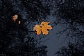
Critique By:
Roderik Koenders (K:2740)
11/14/2008 10:07:08 AM
Really nice shot of autumn leave, Anastasia. To me it seems a bit unbalanced though because the reflection on the water doesn't match up with the main subject. It would have been nice to match up the white circle all around the leave evenly. That way you could have made it maybe even into a square crop where the other leaves didn't distract from the main subject.
|
| Photo By: Anastasia R.
(K:778)
|
|
|
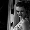
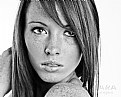
Critique By:
Roderik Koenders (K:2740)
11/14/2008 10:01:51 AM
Paul,
Very well done again. I really like it in B&W. Did you do any manipulation on it? I don't know because it is of the B&W but did you enhance the eye whites, and or selectively sharpen the irises? In fact, I would be interested to know your take in general on image manipulation. The latest picture I posted I enhanced a bit from raw, but I struggle with what is too much enhancement or not.
Just one small gripe coming back to the image, her head is slightly tilted and that makes the picture seem a bit unbalanced. What happens if you rotate it a bit and level the eyes?
|
| Photo By: Paul Lara
(K:88111)
|
|
|
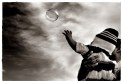
Critique By:
Roderik Koenders (K:2740)
11/11/2008 7:41:39 PM
Excellent shot. I love how the kid is trying to 'understand' the bubble by trying to touch it.
Did you use a polarising filter or did you do all the effects afterwards in photoshop?
|
| Photo By: soumya
(K:13087)
|
|
|
Critique By:
Roderik Koenders (K:2740)
11/11/2008 6:42:05 PM
Hm, I am sorry, I can't seem to find it. Did like the sunglass shot though! Or did you mean that one?
|
| Photo By: Paul Lara
(K:88111)
|
|
|
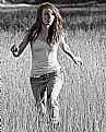
Critique By:
Roderik Koenders (K:2740)
11/11/2008 6:09:51 PM
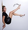
Very strong shot. I really like the attitude. Maybe it would have been even more powerful if shot from a slightly lower position, with her looming over the camera a bit more?
|
| Photo By: Paul Lara
(K:88111)
|
|
|
Critique By:
Roderik Koenders (K:2740)
11/11/2008 5:52:51 PM
Hi Paul,
I like this one better too. I think it fits better with the whole scene. Did you selectively blur everything but the hand or is that just the depth of field very carefully placed? It is really funny how that sharp hand really seems to pop out of the photo trying to escape.
Also on this shot the tear in her pants don't show up that harsh, I found it distracting in the other shot.
PS I wouldn't classify this as being in the project 'innocence'... Or maybe that is just my interpretation..
PPS I love looking through you portfolio! :-) You seem to have taken the path I want to head down to as well.
|
| Photo By: Paul Lara
(K:88111)
|
|
|
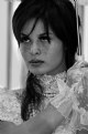
Critique By:
Roderik Koenders (K:2740)
11/11/2008 5:43:40 PM
Another really nice portrait!
The empty space on the left is a bit distracting to me (drawing my eye away from her). It seems just a bit out of balance with her looking to the other side.
I love the natural light though. Great job.
|
| Photo By: Paul Lara
(K:88111)
|
|
|
Critique By:
Roderik Koenders (K:2740)
11/11/2008 5:40:25 PM
Hi, I see you already found it, but luminous-landscape also had a great essay on it: http://www.luminous-landscape.com/tutorials/expose-right.sh tml (I am in no way affiliated to that site, other than an avid reader :-) ). Let me know when you do some experiments with it! Have fun.
|
| Photo By: Roderik Koenders
(K:2740)
|
|
|
Critique By:
Roderik Koenders (K:2740)
11/11/2008 5:35:54 PM
Excellent idea and very well executed. I agree with the first commenter that you could make it look more real by having her hair flow 'down'. And maybe have the colour of her lips match the colour of her toe nails? But that is just nitpicking.
|
| Photo By: Paul Lara
(K:88111)
|
|
|
Critique By:
Roderik Koenders (K:2740)
11/11/2008 5:31:37 PM
Hi Paul Lara,
Yes, I actually noticed that after I uploaded the photo. Sometimes you stare at it a bit too long, when I saw the little thumbnail I noticed there was no white in it at all! :-).
It was a difficult subject though with a lot of backlighting.
Thank you for you constructive criticism, I will be posting a few more of this event.
|
| Photo By: Roderik Koenders
(K:2740)
|
|
|
Critique By:
Roderik Koenders (K:2740)
10/9/2008 11:18:46 AM
Hi Agata,
Great shot. I really like how the model looks into this empty space. It gives me a great feeling of freedom.
I really like how you used the background as well.
|
| Photo By: agata faraś
(K:155)
|
|
|
Critique By:
Roderik Koenders (K:2740)
10/8/2008 4:02:54 PM
Hi Vera,
Yes, this is already a bit better. I think however that the track underneath are a bit distracting from the little guys smile. That's why I cropped it even tighter. Also consider making the hallway a bit darker to make him stand out more.
|
| Photo By: Vera Paulin
(K:117)
|
|
|
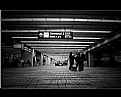
Critique By:
Roderik Koenders (K:2740)
10/7/2008 5:14:17 PM
Hi Vera,
Wow, this image really works for me. The moment you captured is really great. I really like how so many of the elements in this picture point at the main subject.
You could think of a few ways to make the image more dramatic though. I think first of all a crop to focus more on the main subject would be nice. Also by cropping you can remove the subject from its very central position and put him in a more dramatic composition by putting him on a third of the image.
Then you could also make the hallway behind him a bit darker to make him pop out more.
I have attached an image to show you what I mean. I simply cropped, adjusted the levels and tweaked a bit the curves dialogues. After that I desaturated a bit. Of course you have the original so you can do that much better. It is just to give you an impression, hopefully well received :-).
|
| Photo By: Vera Paulin
(K:117)
|
|
|
Critique By:
Roderik Koenders (K:2740)
10/6/2008 3:11:08 PM
Very nice shot, Hussain.
Even though the photo doesn't 'adhere' to the rule of thirds it is interesting due to the really clear distinction between colours.
I do think the contrast in the hill is a bit distracting. From what I can see this picture seems to be taken at a very bright moment in the day. I have found that during these times of the day black and white can really make your shot pop more. B&W is a bit more unforgiving for high contrast. In photoshop/gimp if you use the channel mixer you could even make the main subject really stand out by taking primarily the red channel or vice versa.
For the rest a great image of a great subject. Do you live around there or were you on holidays?
|
| Photo By: Hussain Hindi
(K:183)
|
|
|
Critique By:
Roderik Koenders (K:2740)
10/6/2008 1:27:49 PM
Ania,
Great shot. I really like how you darkened the edges a bit to keep the focus on the two central figures. You have used the low depth of field very well, with the high aperture value. What ISO did you shoot at?
I think you already darkened the sky a bit already, but I think it is still a bit too overpoweringly bright. Also the figure on the right draws my eye away from the main subjects.
The composition is very nice though, with the big sister being protective of her little brother. I really love how you managed to get the trust of these kids to shoot them in this way. Is this a street photography shot or are these kids you know? If the former I would love to hear how you approached the situation and got your shots. I am experimenting with street photography myself a little, and it always makes me a bit nervous to just go and take picture of people :-).
|
| Photo By: Ania Blazejewska
(K:23981)
|
|
|
Critique By:
Roderik Koenders (K:2740)
10/6/2008 1:03:11 PM
Wow, this picture has a great amount of colour depth. Really cool how this picture has such a nice balance of red, green and blue.
Even the large picture is really blurred though, I guess the original is not that unsharp. Did you upload the image full size or did you resize it yourself? I find that the algorithm used when uploading a larger image here at usefilm makes the image a bit blurry.
|
| Photo By: Paul Harrett
(K:791)
|
|
|
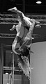
Critique By:
Roderik Koenders (K:2740)
10/6/2008 12:56:14 PM
Hi Udayan,
Wow, really impressive battle going on there. The main subject is moving a bit but that might even add a little to the photo (I would be interested in seeing your shutter and aperture). I think this shot would also be a really good candidate for black and white. With all the subjects in black and white I think the green of the trees in the background is a bit distracting. Maybe you could leave the eyes of the main subjects in colour as a really subtle reminder of what this picture is about.
I also think the goat would be even more impressive if you would have gotten even lower with your camera, so the goat would really tower out above us.
Really nice shot for the rest, thanks!
|
| Photo By: Udayan Kapur
(K:709)
|
|
|
Critique By:
Roderik Koenders (K:2740)
10/6/2008 12:47:53 PM
Hi Ania,
Wow, what a nice shot. I really like the low point of view. The black and white really adds to this picture. Can I ask you whether you took this by hand and with what shutter speed?
It would maybe be nice if the lens distortions are corrected. The first lines on the top and bottom are now a bit curved, I think a simple edit in photoshop/gimp can correct for that.
For the rest, great shot!
|
| Photo By: Ania Blazejewska
(K:23981)
|
|