|
|
Critique By:
Spencer E. (K:4032)
9/19/2006 6:07:41 AM
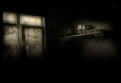
John,
This is great work! Great details/lighting..the reflection is great.
|
| Photo By: John Pitman
(K:8473)
|
|
|
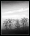
Critique By:
Spencer E. (K:4032)
6/26/2006 3:28:09 PM
I love the eery feeling to this shot... very nice. It seems to me like it could use a little clockwise rotation and it would be perfect!
|
| Photo By: pan g.
(K:16899)
|
|
|
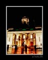
Critique By:
Spencer E. (K:4032)
6/26/2006 3:16:53 PM
Great shot... it's too bad they don't have lights on the tower, but it's a nice picture anyhow!
|
| Photo By: Paul Stockley
(K:1067)
|
|
|
Critique By:
Spencer E. (K:4032)
6/16/2006 7:56:48 PM
Great lighting and lines in this shot. Nice job!
|
| Photo By: Riham Essam
(K:4931)
|
|
|
Critique By:
Spencer E. (K:4032)
6/16/2006 7:42:52 PM
I love this shot.. it's like an optical illusion! Like Dave said, it look like it could be taken from 15,000 feet in the air! Or possibly standing on the edge of a very steep cliff... Amazing capture!
|
| Photo By: Joggie van Staden
(K:41700)
|
|
|
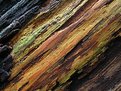
Critique By:
Spencer E. (K:4032)
6/16/2006 7:35:43 PM
Great capture. The colors are great, seem like it could stand to have a little magneta removed from the midtones to make them pop more. Excellent shot!
|
| Photo By: Rodrigo Morales
(K:1147)
|
|
|
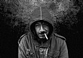
Critique By:
Spencer E. (K:4032)
6/16/2006 7:25:35 PM
This is a great portrait. I love that you can see the crooked line of his nose, almost paralleled with the cigarette. Nicely done!
|
Photo By: luis pereira
(K:26013)

|
|
|
Critique By:
Spencer E. (K:4032)
6/13/2006 10:29:49 PM
Nice shot...
|
| Photo By: OMran Isso
(K:1723)
|
|
|
Critique By:
Spencer E. (K:4032)
6/13/2006 8:02:03 PM
I wouldn't like to be in her spot. Great capture, I like the toning.
|
| Photo By: Kambiz K
(K:37420)
|
|
|
Critique By:
Spencer E. (K:4032)
6/13/2006 5:39:08 PM
I hate spiders.
But this is a very nice shot. 
|
| Photo By: Mohammed Alshaikh
(K:346)
|
|
|
Critique By:
Spencer E. (K:4032)
6/13/2006 4:55:22 PM
Cute picture Sheila. Childhood intrigue!
|
| Photo By: Sheila Carson
(K:5924)
|
|
|
Critique By:
Spencer E. (K:4032)
6/13/2006 4:51:33 PM
Good shot Mohamed.. it makes me feel nervous for him.
|
| Photo By: mohamed ahmed abd el rahim
(K:5753)
|
|
|
Critique By:
Spencer E. (K:4032)
6/13/2006 4:46:37 PM
Very nice selective coloring Marco, great capture!
|
| Photo By: Marco Maresca
(K:14418)
|
|
|
Critique By:
Spencer E. (K:4032)
6/9/2006 2:48:47 PM
This is a very nice portrait! I like the youthful look on her face--the "I have the world figured out" look.
What was your winning photography for the 20D? I'd love to see it!
|
| Photo By: Paul Lara
(K:88111)
|
|
|
Critique By:
Spencer E. (K:4032)
6/9/2006 2:42:47 PM
Very nice picture; I love that they both have an intrigued look on their face. Great expressions!
|
| Photo By: D e b
(K:9399)
|
|
|
Critique By:
Spencer E. (K:4032)
2/24/2004 6:50:26 AM
Excellent Shot Emrah! Very nice.
|
| Photo By: emrah soylemez
(K:577)
|
|
|
Critique By:
Spencer E. (K:4032)
2/24/2004 6:49:52 AM
Great shot Sandy--I like the pastel colors.
|
| Photo By: sandy c. hopkins
(K:17107)
|
|
|
Critique By:
Spencer E. (K:4032)
2/23/2004 6:42:30 AM
This is a great shot.. I like the bold tones.. Nicely done.
|
| Photo By: In Transit
(K:29432)
|
|
|
Critique By:
Spencer E. (K:4032)
2/23/2004 6:39:49 AM
Funky abstract.. It almost looks like Stained Glass...
|
| Photo By: Paul Lara
(K:88111)
|
|
|
Critique By:
Spencer E. (K:4032)
2/23/2004 6:38:53 AM
This reminds me of how cold it has been here in SLC! I'm glad it's been warmer lately! Nice shot!
|
| Photo By: Christine Campbell
(K:2693)
|
|
|
Critique By:
Spencer E. (K:4032)
2/23/2004 6:28:36 AM
funky abstract.. I like it! Well done.
|
| Photo By: Sun Shine
(K:6225)
|
|
|
Critique By:
Spencer E. (K:4032)
2/23/2004 6:15:16 AM
Excellent shot, I like the overall tone of this shot.
|
| Photo By: Sebastian Duda zolo2
(K:41)
|
|
|
Critique By:
Spencer E. (K:4032)
2/23/2004 6:12:27 AM
Kim, This is a beautiful shot. I love the IR glow you immitated, excellent composition/lighting.
|
| Photo By: Kim Culbert
(K:37070)
|
|
|
Critique By:
Spencer E. (K:4032)
2/23/2004 6:09:07 AM
I really like the angle on this one sandy.. makes me feel dizzy almost.
|
| Photo By: sandy c. hopkins
(K:17107)
|
|
|
Critique By:
Spencer E. (K:4032)
2/23/2004 6:02:29 AM
Very cool shot roby.. It's been a long time since i've looked at your portfolio.. it's lookin' good!
|
| Photo By: Roberto Arcari Farinetti
(K:209486)
|
|
|
Critique By:
Spencer E. (K:4032)
2/23/2004 6:00:39 AM
Hey Stuart, for being "new at this" you are doing great!! Nice PS work! I like the presentation here that you used.
It's all a matter of opinion of course, I am of a minimalist standpoint...I think if you must use a border, then use a thin, black border, as you would in a darkroom; Otherwise, I feel that the 'borders' should be created by matting after you print. You're borders are aesthetic to their subjects, I just don't like borders.
|
| Photo By: Stuart Mackay
(K:4551)
|
|
|
Critique By:
Spencer E. (K:4032)
2/22/2004 9:30:02 PM
Aye.. that makes me feel ill. nice capture.
|
| Photo By: Tilakia Deh
(K:507)
|
|
|
Critique By:
Spencer E. (K:4032)
2/22/2004 9:14:30 PM
I like that it's on concrete... almost like a homeless persons "SOS to the world" I really like the idea... Very creative, well done.
|
| Photo By: Aira Manna
(K:11187)
|
|
|
Critique By:
Spencer E. (K:4032)
2/22/2004 9:12:34 PM
Great colors & texture.. Excellent abstract, welcome to usefilm!
|
| Photo By: Jim Hemminger
(K:4)
|
|
|
Critique By:
Spencer E. (K:4032)
2/22/2004 9:11:46 PM
Nice abstract and texture.
|
| Photo By: Brian Steele
(K:620)
|
|