|
|
Critique By:
Nigel Cliff (K:1560)
9/26/2005 7:53:59 PM
A scene that could really be anywhere with the old lady on her own with her feeble bags of shopping,it tells a story and is also technically good.The mono treatment is good because this would be little more than a snap in colour
|
| Photo By: Xunilek
(K:717)
|
|
|
Critique By:
Nigel Cliff (K:1560)
9/26/2005 6:33:07 PM
The composition and colours are good and complimentary but I feel there is a lot of noise that does let it down.
|
| Photo By: axmet ozturk
(K:16)
|
|
|
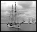
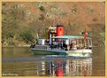
Critique By:
Nigel Cliff (K:1560)
9/26/2005 6:23:26 PM
Technically spot on Greg and beautifully composed,If you could have cloned oiut the ropes on the boats hull it would have been perfect
|
Photo By: Gregory McLemore
(K:35129)

|
|
|
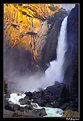
Critique By:
Nigel Cliff (K:1560)
9/25/2005 7:34:49 PM
The composition colours and low viewpoint have potentially made this a stunning landscape,however I feel that the drastic over sharpening has made it very unreal
|
| Photo By: Gregory McLemore
(K:35129)
|
|
|
Critique By:
Nigel Cliff (K:1560)
9/25/2005 7:29:46 PM
This shot really does bring home the violence of boxing with the blood and the look of desoplation on the fighters face.From a technical point though the flash has really burned out the left hand fighters face and overall it does lack sharpness.
|
| Photo By: Danny Brannigan
(K:19523)
|
|
|
Critique By:
Nigel Cliff (K:1560)
4/16/2005 10:16:35 AM
Maybe a touch to much contrast but otherwise a super shot,the warmthof the light brings out the texture in the brickwork and the placement of the boat balances the shot really well.
|
| Photo By: Mark Evans
(K:17428)
|
|
|
Critique By:
Nigel Cliff (K:1560)
4/14/2005 8:44:11 PM
A beautiful boat with super sharpness and the black and white treatment works well.I like the offset composition and also the inclusion of the boats in the background.Maybe a touch more exposure though would add a little more sharpness.
|
| Photo By: Marek Jakubowski
(K:539)
|
|
|
Critique By:
Nigel Cliff (K:1560)
4/14/2005 8:24:35 PM
Beautifully seen Chris with a nice mix of colours and I love the contrast between the symetry of the plough lines and the rough area of trees and shrubs.
|
| Photo By: Chris Spracklen
(K:32552)
|
|
|
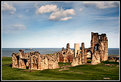
Critique By:
Nigel Cliff (K:1560)
4/14/2005 8:22:33 PM
In the height of its powers in the 1950's it would have been well maintained but near the end of steam in the 1960's it would have been covered in grease and grime.
|
| Photo By: Nigel Cliff
(K:1560)
|
|
|
Critique By:
Nigel Cliff (K:1560)
4/14/2005 8:20:37 PM
The bootom half of the shot is really good woth the cobwebs adding to the barbed wire and all of it standing out well against the rich green colours.The oiut 0of focus trees do not however work for me and I would have preffered the single colour background throughout.
|
| Photo By: Dennis Mundt
(K:2)
|
|
|
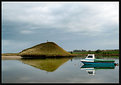
Critique By:
Nigel Cliff (K:1560)
4/11/2005 11:46:16 AM
Nice building in a pleasant tranquil scene whith the boat also niceleley positioned.The shot does thow appear a touch washed out so I would have been tempted to up the satuartion and contrast to give a bit more impact
|
| Photo By: Studio East
(K:3349)
|
|
|
Critique By:
Nigel Cliff (K:1560)
4/11/2005 11:41:31 AM
The idea is good but he look on the victims face is rather inamimate and I would have expected a more active pose as she is about to join the ranks of the undead
|
| Photo By: Tegwin Deacon
(K:224)
|
|
|
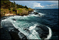
Critique By:
Nigel Cliff (K:1560)
4/11/2005 11:40:02 AM
Good composition and the swirling white water looks good aginst the blue sea
|
| Photo By: Tim Schumm
(K:29196)
|
|
|
Critique By:
Nigel Cliff (K:1560)
4/11/2005 11:34:09 AM
Another superb image Chris that is so totally Enlish village in its feel.Dont know if its a straight r photoshop shot but whatever it really is brilliant
|
| Photo By: Chris Spracklen
(K:32552)
|
|
|
Critique By:
Nigel Cliff (K:1560)
4/11/2005 11:26:39 AM
Sadly Den it was just a fleeting visit whilst staying over in Scarborough on business.Having said that I did notice the hotel and might take the wife there someday
|
| Photo By: Nigel Cliff
(K:1560)
|
|
|
Critique By:
Nigel Cliff (K:1560)
3/28/2005 3:43:06 PM
Nice composition good reflections and pretty sharp.However the underexposure does make the shot very dull and lacking in sparkle.
|
| Photo By: Mark Evans
(K:17428)
|
|
|
Critique By:
Nigel Cliff (K:1560)
3/28/2005 3:40:10 PM
I love the composition and technically it is spot on,however for me that filtered sky is way over the top and really spoils the shot.
|
| Photo By: Luís Lobo Henriques
(K:9002)
|
|
|
Critique By:
Nigel Cliff (K:1560)
3/25/2005 6:24:20 PM
The compostion is a good one but sadly it is let down by the technical quality.The exposure needs balamcing between light and shade some contrast and quite a lot of sharpening also need adding.
|
| Photo By: Rob Graziano
(K:6678)
|
|
|
Critique By:
Nigel Cliff (K:1560)
3/25/2005 6:20:23 PM
I like the idea but I would have prefferred a few changes.I feel it is about 1/2 a stop underexposed and also in need of some sharpening.In addition I would have had the car facing the camera which would I feel have made a better overall shot.(Especially if its a Frog Eye Sprite)
|
| Photo By: Robin Dripps
(K:1148)
|
|
|
Critique By:
Nigel Cliff (K:1560)
3/25/2005 2:37:13 PM
Technically the shot is cwell composed and exposed but thats an incidental because the real message is that he died for all of us .
|
| Photo By: Chris Spracklen
(K:32552)
|
|
|
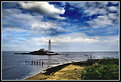
Critique By:
Nigel Cliff (K:1560)
3/25/2005 2:17:04 PM
Loveley composition and a cracking sky but for me to much contrast across the shot and a lack of detail in the shadow areas
|
| Photo By: Mark Evans
(K:17428)
|
|
|
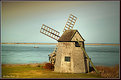
Critique By:
Nigel Cliff (K:1560)
3/21/2005 10:48:38 AM
Thanks for the comments Femke,I did consider a mono treatment for this bit I still prefer the colour version because of the mixed and muted shades
|
| Photo By: Nigel Cliff
(K:1560)
|
|
|
Critique By:
Nigel Cliff (K:1560)
3/20/2005 8:03:30 PM
I like the combination of colours and the
more I look at the shot the more I see the figures in the rocks.I would though have eased down the contrast a touch and lightened the shot about 1/2 a stop just to give some detail in the shadow areas
|
| Photo By: John Lamb
(K:9687)
|
|
|
Critique By:
Nigel Cliff (K:1560)
3/20/2005 6:44:20 PM
Beautiful colours good reflections and a loveley crisp sharp image.I do however always prefer boats to be front end on in my shots.
|
| Photo By: Bob Aldridge
(K:14758)
|
|
|
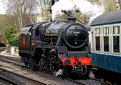
Critique By:
Nigel Cliff (K:1560)
3/18/2005 7:37:27 PM
The peak of bthe action well captured and good exposure for an indoor athletics shot.However I would have cropped tighter and also it is need of substatial sharpening.
|
| Photo By: Massimiliano Vitez
(K:41)
|
|
|
Critique By:
Nigel Cliff (K:1560)
3/18/2005 7:35:55 PM
Pretty good composition with plenty of action and colour.The lack of sharpness though really lets this down.
|
| Photo By: Danny Brannigan
(K:19523)
|
|
|
Critique By:
Nigel Cliff (K:1560)
3/16/2005 8:40:28 PM
Great use of converging verticals and a nice contrast between the blue sky and the warm browns of the brickwork.I would have prefferred to see more of the arch but still a nice image
|
| Photo By: Robert Lloyd
(K:9943)
|
|
|
Critique By:
Nigel Cliff (K:1560)
3/16/2005 7:21:35 PM
Technically its fine with spot on exposure and pin sharpness.For me this sort of shot needs eye contact and the lack of it lets down the overall image.
|
| Photo By: . Icerock
(K:4873)
|
|
|
Critique By:
Nigel Cliff (K:1560)
3/16/2005 7:20:24 PM
Clever bit of work Chris and a loveley English chocolate box scene,maybe a bit less contrast would have helped but otherwise an excellent shot of its type (Photoshopped or not)
|
| Photo By: Chris Spracklen
(K:32552)
|
|
|
Critique By:
Nigel Cliff (K:1560)
3/16/2005 7:14:59 PM
The idea is good and the colours bright and vibrant but for a shot like this to work you need at least part of the image really pin sharp and this lacks that element.
|
| Photo By: Teunis Haveman
(K:37426)
|
|