|
|
Critique By:
César Matamoros II (K:270)
1/27/2004 10:56:08 AM
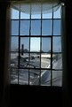
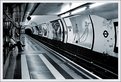
Fabio,
Gracias por el comentario. Trate unas cuantas combinaciones sobre la luz. No queria usar 'flash' asi es que esto es lo que quedo...
César
|
| Photo By: César Matamoros II
(K:270)
|
|
|
Critique By:
César Matamoros II (K:270)
1/27/2004 10:53:48 AM
Hanna,
Yes the colored glass is probably drew me to it. The other windows in the place did not have colored glass.
You are the first to actually comment on my name too. The Moors are safe for the moment.
|
| Photo By: César Matamoros II
(K:270)
|
|
|
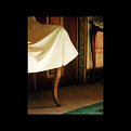
Critique By:
César Matamoros II (K:270)
4/9/2003 7:36:38 AM
Excellent photo. Great eye to see the shot. The only thing that would make it any better, for me, is to see a little less of the chair. The white draping is a little overbearing - if I sit down and think about it. It is very minor, an awesome shot.
|
| Photo By: Gisela Francisco
(K:233)
|
|
|
Critique By:
César Matamoros II (K:270)
4/9/2003 7:27:55 AM
Very smart to focus on the front of the fountain. It draws the viewer right to it. A good selection of time exposure to get the water shape. An excellent shot. Well thought out. Congratulations.
|
| Photo By: Megan Forbes
(K:4617)
|
|
|
Critique By:
César Matamoros II (K:270)
4/1/2003 4:44:57 AM
Great shot! Even if it took a few rolls to get this one shot, I think it would be worth it. The emotion, the expressions... Wish I had taken it.
|
| Photo By: Miguel Dias
(K:1)
|
|
|
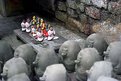
Critique By:
César Matamoros II (K:270)
4/1/2003 4:38:28 AM
I like the thought of the photo. The colors definitely catch the eye. The one thing that I really do not like of this photo is the amount of darkness behind the figurines. Even placing the upper corner of the frame right up to them would work for me. Did you try different focal points? Overall an excellent shot that I keep going back to.
|
| Photo By: Partha Sen
(K:478)
|
|
|
Critique By:
César Matamoros II (K:270)
1/11/2003 8:21:21 PM
A nice concept, but it is too soft. It just takes away from the image for me. I would try it again.
I have taken shots there and also from the travelling wall and focused on the wall and the reflection.
|
| Photo By: J. Alberto Abreu
(K:1190)
|
|
|
Critique By:
César Matamoros II (K:270)
1/11/2003 8:13:51 PM
Good choice of removing the color. I think it would have been too busy with all the advertisements. I have taken shots like this one. I have done them in color and usually without any distracting ads.
The patterns and lines are good. I wonder if I would have picked another focus point to remove the softness on the far wall.
Good job.
|
| Photo By: Aiman Nassar
(K:11961)
|
|
|
Critique By:
César Matamoros II (K:270)
1/11/2003 8:08:23 PM
I like the shot, but I would have not used the VS film. It is too saturated to my liking. The concept is good as is the composition. It is just a little to disturbing, too busy in color saturation to my eye.
I once had gotten a brick of VS film. I couldn't wait to use it up. It does not work for me for general use.
A great job and a good eye for composing.
|
| Photo By: Gustaf L Bjerne
(K:245)
|
|
|
Critique By:
César Matamoros II (K:270)
1/11/2003 8:03:26 PM
Excellent! This is nicely metered. I like the fact that the brick wall is not underexposed and you can still get detail from the building on the left.
I like the fact that there are people in the shot. I have seen too many urban shots without people present.
An enjoyable photo.
|
| Photo By: Daniel Jarrett
(K:612)
|
|
|
Critique By:
César Matamoros II (K:270)
1/11/2003 7:35:46 PM
An excellent photo. The lighting works well in the shot. I often enjoy taking shots like this. I am on the fence about the garbage receptacles. I am against removing the graffiti only because this image captures what you saw. It is not a true photograph with editing of this nature. It is more of an artwork...
Also if you moved beyond these, who is to say that you would not have graffiti on the other ones?
Still a great job. You give me something to shoot for...
|
| Photo By: Ninfa Z. Bito
(K:245)
|
|
|
Critique By:
César Matamoros II (K:270)
12/29/2002 12:47:15 AM
Nice exposure. Some will complain about the lack of detail in the room, but you can't have it all. I like the idea of this shot.
I like the man in this one. The woman just doesn't quite fit in. It would be interesting to see what other outside influences could be introduced to this shot, but then you probably would not have the man in this pose.
Nice shot.
|
| Photo By: Christopher Chen
(K:21)
|
|
|
Critique By:
César Matamoros II (K:270)
12/29/2002 12:41:29 AM
Nice compostion. Looks like a postcard. Unfortunately, something keeps me from really liking this shot. It is the extreme contrast range in the image. It is the houses against the foilage that throws my eye off the shot.
The foreground is excellent.
|
| Photo By: Nigel Keel
(K:23)
|
|
|
Critique By:
César Matamoros II (K:270)
12/29/2002 12:30:03 AM
Seems like a painting. The exposure is right on the mark!
Very pleasing to look at. Well done.
|
| Photo By: Miguel Lasa
(K:62)
|
|
|
Critique By:
César Matamoros II (K:270)
12/29/2002 12:25:49 AM
Nice eye to find these colors. I would prefer to see a little more space at the top. You are on the verge of cutting the top boat out. Very distracting.
The horiaontal is fine, though I probably would have put a little more water in front if possible.
|
| Photo By: Nigel Keel
(K:23)
|
|
|
Critique By:
César Matamoros II (K:270)
12/29/2002 12:15:35 AM
I can see your point. One of the things I have to work on is cropping. I don't tend to. As to the exposure on the sand. It is hard to avoid. The sand is white on these beaches. I used an incident meter to set the exposure compensation for the people.
I will have to try your crop. Thanks.
|
| Photo By: César Matamoros II
(K:270)
|
|
|
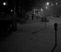
Critique By:
César Matamoros II (K:270)
12/29/2002 12:12:23 AM
Seeing that this was done for the Grainy Film for Effect project, I would have to say that you have achieved the feeling of the snowy evening.
It would look good up on a wall, but it would have to fit into the decor. I like this shot, something I would like to call my own.
|
| Photo By: Con Tendem
(K:269)
|
|
|
Critique By:
César Matamoros II (K:270)
12/29/2002 12:00:29 AM
I don't know who you are referring to. I think the person on the upper deck of the bus makes the picture for me. I like the shot as a look at a particular ordinary time. The man is peering below, the woman is napping. The condensation of the window showing how cold it is. The pedestrians just reinforce this.
So, from the title, I gather your viewpoint is on the pedestrian. I see it in another light.
|
| Photo By: Christopher Chen
(K:21)
|
|
|
Critique By:
César Matamoros II (K:270)
12/28/2002 11:48:28 PM
A very nice image. The lighting is in your favor. Some may wish for softer lighting, I think it works for the image. The only thing I find distracting is the greenery being out of focus in the foreground. It would not be as distracting if there were less of it. After the initial look at the image, it begins to creep into my view.
I like this shot.
|
Photo By: Rose Hooper
(K:899)

|
|
|
Critique By:
César Matamoros II (K:270)
12/27/2002 8:00:29 AM
I understand the comment about the shadow. I wonder if it was an avoidable shadow. It almost looks like the photographer's shadow. If unavoidable, then oh well.
I enjoy the shot. The colors are great and I really like the shading of the opposite side of the boat. This is the type of shot I would take.
I tried some different croppings, some would remove a little from the bottom. I think it is fine as it is. Good eye.
|
| Photo By: Austin
(K:12)
|
|
|
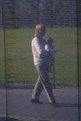
Critique By:
César Matamoros II (K:270)
12/26/2002 11:06:14 AM
I have tried much the same as you, both at the Memorial in Washington, D.C. when it first opened, and most recently with the scaled-down touring replica.
I think that by leaving out everything but the wall and the reflections you would have a tighter and more powerful picture. The leaves on top and the floor at the bottom are too distracting for me. It is the overexposure that does it.
|
| Photo By: Eric Richard
(K:2987)
|
|