|
|
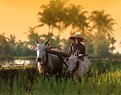
Critique By:
ian (K:354)
12/30/2003 9:23:19 PM
great idea. love the white contrasting with her bright face.
|
| Photo By: Verna Absolutestockphoto
(K:2836)
|
|
|
Critique By:
ian (K:354)
12/30/2003 8:40:37 PM
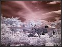
infrared pics always amuse me. dont think i can use it with my camera though...someone said. im not big on excessive PS use but i especially liked the original idea of the plane...
|
| Photo By: Uchin Mahazaki
(K:205)
|
|
|
Critique By:
ian (K:354)
6/3/2002 1:28:52 PM
this owuldve been great if they were taken together...but it is still good..nice job. nice placement of the tree, but the grass is hot...
|
| Photo By: dennis fowler
(K:58)
|
|
|
Critique By:
ian (K:354)
6/3/2002 1:22:51 PM
nice sidelighting to illuminate the colors. dark bg complemtns the colors...good job
|
| Photo By: Kristupa Saragih
(K:1031)
|
|
|
Critique By:
ian (K:354)
5/17/2002 1:41:16 PM
nice job with the flash. at first i was thinking cuz it didnt stop the action, it shuldve been stronger, but now im thinking that it works well cuz it shows the rider is moving...this shot makes me want to get back to BMXing. hey, did you use a tripod for this?
|
| Photo By: Aaron Johnson
(K:-16)
|
|
|
Critique By:
ian (K:354)
5/14/2002 4:05:34 PM
nice capture here. i like the DOF and think the lines on the bottom are fine.
|
| Photo By: Aaron Johnson
(K:-16)
|
|
|
Critique By:
ian (K:354)
5/11/2002 1:04:26 AM
nice job jason. love the colors. taken during sunrise? do you have any info on teh exposure? and how come it is slightly blurred?
|
| Photo By: Jason McClendon
(K:19)
|
|
|
Critique By:
ian (K:354)
5/11/2002 1:00:33 AM
good job findign this shot and moving to take it. the slow film shows in the blurred movement. i wouldve liked the background more out of focus. also, did you use ps to focus the girl? because it looks really fake. as if you cut and pasted this image....
|
Photo By: Tony Smallman
(K:23858)

|
|
|
Critique By:
ian (K:354)
5/10/2002 1:53:23 PM
i like everything about it. gj jason.
|
| Photo By: Jason Frey
(K:6)
|
|
|
Critique By:
ian (K:354)
5/10/2002 1:48:43 PM
nice job with the water leadign toward the sun. very nice pic
|
| Photo By: Chris VenHaus
(K:30)
|
|
|
Critique By:
ian (K:354)
5/8/2002 9:14:18 PM
very nice idea here. very imaginative. next shot: same but on fire!
|
| Photo By: Steve Chong
(K:814)
|
|
|
Critique By:
ian (K:354)
5/8/2002 9:13:49 PM
|
| Photo By: Steve Chong
(K:814)
|
|
|
Critique By:
ian (K:354)
5/8/2002 9:12:06 PM
nice composition and good capture of a nice sunset
|
| Photo By: Chor Wong
(K:0)
|
|
|
Critique By:
ian (K:354)
5/6/2002 3:28:43 PM
this is a fine picture you rhave here. other than a little cropping off the bottom to make it little better maybe this is good. the composition is fine...shows you know not to put in center all teh time.
|
| Photo By: Robert Uptain
(K:86)
|
|
|
Critique By:
ian (K:354)
5/3/2002 3:19:00 PM
i think this image is perfect. was thus taken outside or indside? alos, the figures look like wire...
|
| Photo By: Bill Krul
(K:5597)
|
|
|
Critique By:
ian (K:354)
5/3/2002 3:15:39 PM
beautidful colors. is it always this color or did you expose for a while?
|
| Photo By: R Pires
(K:445)
|
|
|
Critique By:
ian (K:354)
5/3/2002 3:14:24 PM
i like this versaion more. the purple in ure other one was too "fake." beautiful picture
|
| Photo By: Kristupa Saragih
(K:1031)
|
|
|
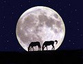
Critique By:
ian (K:354)
5/3/2002 3:12:07 PM
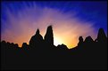
when i first saw this i was like "wow" that couldnt be...then i see you put it with ps...hahah nice job. i wouldve luiked juts the moon and horses tohugh the stars normally dont appear so bright
|
| Photo By: dennis fowler
(K:58)
|
|
|
Critique By:
ian (K:354)
5/3/2002 12:02:27 PM
pretty good to get this close with a 200mm. i wouldve liked more of a porfile shot of the flamingo though. good eye focusing though.
|
| Photo By: Ken Boghani
(K:0)
|
|
|
Critique By:
ian (K:354)
4/29/2002 2:40:18 PM
good eye bill. love teh colors...was this taken on a sunny day? cuz it looks to me it wasnt...
|
| Photo By: Bill Krul
(K:5597)
|
|
|
Critique By:
ian (K:354)
4/27/2002 9:03:25 PM
great shot david. i like the angle. its looks pretty grainy though. dont know how the 8x10 usually looks like, but your 100 film should be ok. is it just me? also, 45 apertture! dang, crazy
|
| Photo By: David N. VanMeter
(K:552)
|
|
|
Critique By:
ian (K:354)
4/27/2002 8:58:22 PM
great shot jason. good focus and composition. pretty good to get this close wwith a 200mm. only thing taht makes it imperfect is the branch sticking out from the bottom right
|
| Photo By: Jason Mckeown
(K:22200)
|
|
|
Critique By:
ian (K:354)
4/24/2002 4:06:04 PM
awesome shot. i like the different perspective with teh fisheye lens. about the sun, i love it in there but it sorta hurts my eye just looking at it. dont know if using a faster shutter wouldve helped...do you know if it does?
|
| Photo By: Jake Sieg
(K:673)
|
|
|
Critique By:
ian (K:354)
4/24/2002 3:59:55 PM
ggreat idea here but the title is about the palace and it looks like the flowers take up more space than the buildign so i wouldve tilted the camera up a little so taht there werent so many flowers and a little more sky. also, i wouldve stood up a little more...
|
| Photo By: Bill Akata
(K:2929)
|
|
|
Critique By:
ian (K:354)
4/24/2002 3:55:47 PM
well when i looked at this i didny know what it was so i ad to comment on this. where is this from? also, the focusing looks little hoopooie. i wouldve tried a larger aperture to blur the baclground more though, but maybe with a 5 0 0 lens (wow) tahts the largets you could go. good job on getting on same eye level
|
| Photo By: Shailesh Master
(K:38)
|
|
|
Critique By:
ian (K:354)
4/24/2002 3:52:37 PM
lovely picture. i wouldve liked a tiny bit more yellow in the leaves though so taht it really shot out at me. maybe a 1/2 stop over?
|
| Photo By: Christine Malenfant
(K:17)
|
|
|
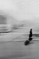
Critique By:
ian (K:354)
4/24/2002 3:50:00 PM
first off, what does the title mean? and referring to yoru roller blader idea, i think that wouldve been great. too bad one didnt show up huh? well, this image is interesting as it is. i wouldve cropped the top and left side. that thing in the middle left is weird and isnt necessary. also, im not sure i agree with the vertical framing. maybe a horizontal? also, i think a longer shutter wouldve been beneficial to show more "streak" of the woman's black clothing and bag. sorry to be so hard on your photos, just ,my opinion. nothing personal haha.. at least im commenting though huh?
|
| Photo By: Halid Izzet
(K:373)
|
|
|
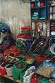
Critique By:
ian (K:354)
4/24/2002 3:44:17 PM
how would i have approached it? i wouldve taken a pic of just the fetuses!!! haha ok well since you liked the colors of the bags and all the medicinal potions, i tihnk myabe a pic with you moving to the left of where you were here would be better. i wouldve included in teh frame the foreground, as you have here, and the shelves. from your angle, the wall detracts from the colorful reds and greens. yeah so a tight shot of the foreground herbs and the shelves i tihnk wouldve made it better
|
| Photo By: Halid Izzet
(K:373)
|
|
|
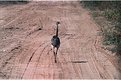
Critique By:
ian (K:354)
4/24/2002 3:39:15 PM
well it looks like you werew chasing this guy or he didnt like your company huh? well, the obviuos fault is the view. im sure it was running 10000mph and you couldnt get it to turn its head...too bad. also, of course, getting closer wouldve been better, but you know taht. i wouldve liked a vertical crop of this though. with what you have, maybe the road leading towards the rhea wouldve looked better.
|
| Photo By: Halid Izzet
(K:373)
|
|
|
Critique By:
ian (K:354)
4/24/2002 3:36:02 PM
this is a nice idea and can be taken over and over and still look good. but i think your panning job here is a little incorrect. it looks as if the person who has the football is teh one in the middle, and he is hard to see. i know focusing moving targets is hard, im not good at it at all, but the blurriness takes away from the runner. also, the guy on the right side i wouldve cut out if the guy with teh football was in focus a little more. gj
|
| Photo By: Sean McCafferty
(K:0)
|
|