|
|
 Fadel J
{K:13974} 7/24/2005
Fadel J
{K:13974} 7/24/2005
|
Seeing the original color here and the final result in the other post, you've done a remarkable job Angelo!
|
|
|
|
|
svend videbak
{K:7376} 6/12/2005
|
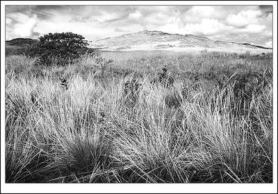
Hello Angelo. I see you have been home, and brought back a suitcase of pictures to remind yourself of home when the mood strikes you! I like this one the most I think, for its range of textures, and sense of open space and light. I disagree with the others about the need for a dramatic sky. I generally don't like red-filter, "dramatic sky" photographs at all, they're tonally top-heavy and overworked. It's not a matter of "the sky doesn't look like that", it's a matter of graphical appearance. Tonality can be very very subtle and still be powerful. I think you have worked this well. It's all a matter of taste, though. Rgds, Svend
|
|
|
|
 Jeanette Hägglund
{K:59855} 6/2/2005
Jeanette Hägglund
{K:59855} 6/2/2005
|
Oh yes - the other one are much more dramatic then this one.
For the sky - other one - i would try a transparent layer, grey, to put EVEN more highlight to the foreground.
Jeanette
|
|
|
|
 Angelo Villaschi
{K:49617} 6/2/2005
Angelo Villaschi
{K:49617} 6/2/2005
|
Thanks for the honest comment, Danny.
I'll see what further work I can do on this.
|
|
|
|
 Trish McCoy
{K:15897} 6/1/2005
Trish McCoy
{K:15897} 6/1/2005
|
tones are gorgeous. stunning landscape shot. 7+++++++
|
|
|
|
|
Danny Brannigan
{K:19523} 6/1/2005
|
Sorry Angelo but I'm afraid I agree with Thilo.I find the image very informative but un - exciting and if that is what you intended you did well, but sometimes I believe we have to show the viewer something he wants to see rather than something he does see. We want to be excited rather than informed.
|
|
|
|
|
Zannoni Matteo
{K:12211} 6/1/2005
|
ottimo scatto,
Pace e salute, M.
|
|
|
|
|
brandy bailey
{K:3509} 6/1/2005
|
very well done
|
|
|
|
|
Angelo Villaschi
{K:49617} 6/1/2005
|
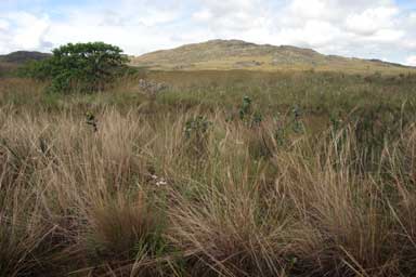
Hey, Thilo.
Well, I honestly don't know what you mean by "low contrast" and high-key. The tonal range is all there, from fairly dark to white.
All I tried to do here is simulate the effect of a red filter. I did burn in the sky a little (it was fairly cloudy and almost overcast, very little blue) but didn't create anything which wasn't really there. My Sigma does not take filters, so no chance to use a grad...
For me the main elements are the foreground grasses (fairly contrasty there, the red "filter" makes them light against a darker soil), the hill (rocks and light grass) and the sky (fluffy clouds and a little sky).
With different weather (cloud cover etc) it would have looked different.
I considered cropping that small tree out, but decided against it.
Here's the original, unprocessed...
|

|
|
|
|
 Paolo Corradini
 {K:59552} 6/1/2005
|
an amazing landscape, you draw nature with a pencil with your work!
Paolo
|
|
|
|
|
Roberto Okamura
{K:22851} 6/1/2005
|
Belo documentário do cerrado você vem fazendo Angelo!
Mais uma bela foto mostrando os campos do cerrado, sob um lindo céu!
Parabéns pelo trabalho!
Roberto.
|
|
|
|
 Thilo Bayer
{K:50358} 6/1/2005
Thilo Bayer
{K:50358} 6/1/2005
|
Hi Angelo,
Now you grab in the PS toolkit, don't you? =)
I see some good work here. But I have to ask one question: is the high key (low contrast) look done by intention? I was wondering why you give up some impact here. I guess especially the sky need some more bold elements to really shine.
stay tuned for your infos =)
Thilo
|
|


")