|
|
 saad alqasem
{K:1202} 2/16/2007
saad alqasem
{K:1202} 2/16/2007
|
wow b&w :) :) :) good
|
|
|
|
|
Jozsef Dotzi
{K:582} 12/27/2006
|
this is really cool
|
|
|
|
 fokstrot .
{K:6560} 7/17/2006
fokstrot .
{K:6560} 7/17/2006
|
Really fantastic picture and lovely model
regards
|
|
|
|
 Steve Aronoff
{K:18393} 12/6/2005
Steve Aronoff
{K:18393} 12/6/2005
|
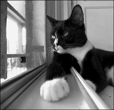
Cats are very photogenic, but this is an especially terrific shot. Super!
|
|
|
|
|
Rudy H
{K:136} 12/6/2005
|
First I apologize for butchering your photo. As many others have said, great shot. I love it.
Now about what I did to your photo. This is an exaggeration to show that there was more detail in the jpg image, at least in the blacks. Using curves only (I?m sure there are better ways to bring out detail) I increased the contrast in the blacks. This also pushed up the mid tones but I was more interested in showing the detail lost in the blacks. JPG images throws away a lot more information in the blacks. If you want to get the most out of the image then shoot RAW. There is more information and it allow you to do more manipulation before it starts to look bad.
I believe to get what you are looking for is increased local contrast. Not the whole image but tonal areas in the image. The problem we have is that the reproducing media we have can not capture real life. So in order to not loose details in the highlights or the shadows we reduce contrast. Then our picture looks flat.
This is a even bigger problem for reproductions in magazines (compared to lab results on photographic paper). I have not looked into how the graphics arts industry currently work their magic with photoshop. The last time I looked at the issue was over 20 years ago and that was working with film, lithographic, screen solutions to the same problem. Now we should have a lot more control with the tools we have as long as we have the information to play with.
Your question reminds me of some pictures I took with some B&W agfa 25ASA film. The results looked great. I was playing with a halftone screen and some lithographic film to produce a positive. Looked good holding the positive image against a white sheet. I then held it up to the light and saw all the extra detail in the blacks that I didn?t know was there. I didn?t know halftone screens could produce so much detail. The trick though is to not loose it.
I doubt if this has helped much. I?m sure there are those that could give you more practical suggestions.
|

|
|
|
|
 Hanggan Situmorang
{K:37833} 12/6/2005
Hanggan Situmorang
{K:37833} 12/6/2005
|
Tamara, I think you've successfully managed the contrast very well. The black furr still shows some details, and so is the white one, and that makes this photo looks so fine. Beside that, the angle and his pose is soo cute and cool. Looks like he owns the house..:) Congratulations for the achievement. Very well deserved award!
|
|
|
|
|
Malak Rashad
{K:643} 12/5/2005
|
lol
i thought the title was what you imagined the cat would be saying.. u know, sitting by the window giving advice like an old man.
love it! :)
an i think your b/w is good although i would've increased the contrast a little but i still like yours
congrats on both awards
best regards
malak
|
|
|
|
 Patrick Ziegler
{K:21797} 12/5/2005
Patrick Ziegler
{K:21797} 12/5/2005
|
I found this technique a few month ago. It is just over half way down the pagee and called photo toner technique. It is really great!!
Replace the 0's wit dots and the slash with a slash. There a little paranoid about sending adresses around here ??
www0russellbrown0com slash tips_tech0html
|
|
|
|
|
Nichol Rose
{K:1020} 12/5/2005
|
Nice shot! I like the cat's expression; It's like a guy I know waiting impatiently for his beer at the bar.
|
|
|
|
 Ordilei Caldeira
{K:2545} 12/5/2005
Ordilei Caldeira
{K:2545} 12/5/2005
|
Great pic! i love cat?s. I have one, his name is legolas.
|
|
|
|
 Sheila Carson
{K:5924} 12/5/2005
Sheila Carson
{K:5924} 12/5/2005
|
Congratulations on being on the front page. I remember seeing this photo and I love it. The angle that you used here is beautiful! Great job!
|
|
|
|
 Roberto Arcari Farinetti
 {K:209486} 12/5/2005
|
my prefer....
roby
|
|
|
|
|
Savinelli Lorenzo
{K:2844} 12/5/2005
|
incredible work.-
|
|
|
|
|
Graham .
{K:2487} 12/5/2005
|
First off, the lens or any equipment has precious little to do with the image?s contrast of brightness of anything else ? it merely resolves photons to a CCD which are then translated to bits of tone. All they may do is offer better acutance, but light is light. Always work in 16-bit wherever you can. Your default is 8-bit. Dodging and burning are techniques that make the technical aspects of the image worse, not better, and are purely aesthetical, not technical. Conversely, if the area is void of tone in the first place, it is gone forever. Correct exposure is the ONLY way to overcome this. The most effective way of working with this image is first of all to set it to 16-bit, and then desaturate the image, i.e. remove the color component so you are left with a ?true? black and white negative. In PS (there is a small arrow about 1? in from the bottom status bar ? click that to see all the info on the file you are working with). Then, the most effective manner of working with this file is the LEVELS utility. Do some research on this (I have several CS2 manuals for this) to learn how to use levels to maximum effect. Channel mixer is OK, but unless you really know what you?re doing, will probably make the image worse. Remember; always work in TIFF format as it is a lossless process with much higher resolution. You will lose image quality EVERY time you open and close an image in JPG format (which is why it is not used professionally ? it is for display purposes only, and technically very poor quality). I cover all of these (and more) techniques in my photo tuition course if you?re interested. I cover a great deal of digital technicalities for those who really are interested in becoming better photographers. Ideally, work with RAW images and you have all the control you need, but this again is subject to a plethora ?standards? and will probably fall by the wayside in years to come as a universal standard is not likely to be agreed upon by hardware manufacturers. Also, UF limits file size to 360K and 800 pixels ? mostly useless for displaying any kind of quality image. Looking at the image, the EV differences between the sky outside and the cat?s midtones (never mind shadows) are beyond the realm of ANY current photographic technique, even Kodachrome. So, simply put, what you ask can NOT be done, period. Not yet, anyway. Remember, our eyes are infinitely more sensitive than any camera, so we compensate for this discrepancy with our eyes and brain. Cameras can not do this and their latitude is extremely limited in comparison. Hope this helps. All the best, Graham.
|
|
|
|
 Guido Tweepenninckx
{K:20076} 12/5/2005
Guido Tweepenninckx
{K:20076} 12/5/2005
|
he is good
|
|
|
|
 Hubert Mackiewicz
{K:661} 12/5/2005
Hubert Mackiewicz
{K:661} 12/5/2005
|
one of the best cat's portraits ;)
|
|
|
|
|
Renato Renato
{K:4759} 12/5/2005
|
congrate with you,a very nice B&W,great!
ciao Renato
|
|
|
|
 marco "dheim" orciuoli
{K:4467} 12/5/2005
marco "dheim" orciuoli
{K:4467} 12/5/2005
|
wonderful portrait! i think BW works greatly, you might have just increased the contrast a bit
|
|
|
|
 Roger Williams
{K:86139} 12/5/2005
Roger Williams
{K:86139} 12/5/2005
|
Well, you are setting yourself a very high standard, because most people would be happy to achieve a B&W photo of this quality. But I personally find playing around with PS channels an exercise in frustration and very, very time consuming. I use the Power Retouche plug-in called Black & White Studio, which allows me to use Ansel Adams zone-based approach to creating B&W images or to emulate various popular film emulsion and printing paper characteristics. This pulls every tool you need into one screen, with very subtle and flexible control over each detail. It is therefore a good time-saver as well as producing good results, and I recommend it. (No commercial interest, just a satisfied user.) Of course this assumes you have a fairly strong background of wet-process darkroom work. Difficult to advise you if you are coming into the hobby knowing only digital photography. (I mean difficult for me to advise you because that's all I know, not that you would have any difficulty following--you obviously wouldn't!)
|
|
|
|
 Gayle's Eclectic Photos
{K:91109} 12/5/2005
Gayle's Eclectic Photos
{K:91109} 12/5/2005
|
hi, congrats for both awards!...well deserved for this simple but oh so cool shot of your kitty...love the perspective,B/W tone and that FG paw!.....i shoot film and convert color shots to B/W in paintshop pro8 via desat and then hit greyscale...you can also just hit the greyscale,but using the desat first seems to look better...a great setting in paintshop is the "Black n' white pts." which give you true blks. whites and midtones depending on what settings you choose....regards,gayle
|
|
|
|
|
ricardo longhi-frantz
{K:9628} 8/15/2005
|
wow! great pose! he seems like a big boss looking over his business!
|
|
|
|
 John Loreaux
{K:86210} 7/17/2005
John Loreaux
{K:86210} 7/17/2005
|
Teriffic photo Tamara!!! Love the angle of this shot!!!!Excellent dof and expression captured on the kitty's face!!! I like the look of anticipation! Very well Done!Congrats on the well deserved double award!!!My best...John
7 !!!!
|
|
|
|
|
Dmitriy Margolin
{K:2351} 7/17/2005
|
It is definitely one of the best!Great moment, capture and composition! I really like this black and white photo! Thoughtful and concetrating! VERY WELL DONE!
Best to you !
Dmitriy
Thank you for your comment
|
|
|
|
|
Alessandra Frediani
{K:2445} 6/19/2005
|
Wonderful... compliments for award!
Alessandra
|
|
|
|
|
Jeff Cartwright
{K:52046} 6/19/2005
|
Well...Tamara!...You Got the "Staff Choice"...!
...a Simple way..to Get B&W...is to Desaturate...the Picture in PS...and Then...use the Contrast Control...to your Satisfaction!!!
Best Regards:
Jeff.
Thank you, Tamara!...for your Visit...and Comment!!!
|
|
|
|
|
Judy Bodden
{K:1694} 6/9/2005
|
I gotta tell you Tamara, everytime I look at this photo it just makes me laugh. Cats are so funny. They think they are all mighty. I love it. Great photo. B&W conversion looks fine to me. I typically convert using the desaturate function and the adjust the curves to my liking. But it looks good to me. This is one of my absolute favorites. Congratulations of Staff Choice.
|
|
|
|
|
Salvatore Rossignolo
{K:13559} 6/3/2005
|
Coolest cat shot! We love our pets and sometimes post pics out of love and not art, but here you have conquered both fronts handily. Congrats!
Sal
|
|
|
|
|
Roberto Arcari Farinetti
{K:209486} 6/1/2005
|
hello tamara, only one word!
SUPERB and congrats for the SC well deserved it!
roby
|
|
|
|
|
marmur-Marek Urbanski
{K:2307} 5/31/2005
|
In photography the most essential is lens, lens and once more lens :) It "decide" about contrast, details, sharpness and depth. Especially in B&W. For every true photographer lens is like "paintbrush". Just lens - no photoshops, channels, digital filters etc. My advice for you : the first - give up digital camera, the second - buy classic camera, good lens,and professional films and the third - begin to take very good photographs ;))
|
|
|
|
|
David Hofmann
{K:22223} 5/30/2005
|
Hi Tamara,
you can change the image you work on in PS to different modes (Image -> Mode -> 16bit/channel)
This number is the resolution of how many variations of brightness each channel has. Normal is 8 bit per channel which means you have 256 different levels of brightness in each channel/color. You can imaging this as a large stairway with 256 steps. The lowest one is black, the highest one pure red or gree or blue. Combined there are three channels so 256 * 256 * 256 = 16.7 million. Wow that is a lot of colors, so why would anyone go higher?
Imagine a part of the image is very low light. This area might only use 50 steps of your entire range. Any tool you use might squeeze this part into a smaller range that represents only 30 steps and thats the moment where you lost brightness and color resolution. Any other editing you do will not be able to get that lost info back.
By changing the image to 16 bit before you do any editing you simply inrease the possible steps to 512 (twice the resolution). This way, even when some areas get squeezed (in dynamic range) you will not loose resolution since you always have more steps, more levels of definition available.
In reality it doesn't make a big difference but when you work with fine, subtile tones this method is helping you preserve the most.
of course the best thing to do is shoot in RAW format and convert to 16 bit/channel TIFF format when you know you will edit a lot. Although the image will look exactly the same as a normal JPG (which is 8bit/channel) you actually have twice the resolution in color/brightness and can edit tones much much better. Visual effects for movies are all done in 16 bit/channel.
Sorry for all the technical stuff. It is not the key to good photo editing (it is still very much about creativity) but sometimes it helps a little to understand whats going on.
|
|
|
|
|
Gaja Snover
{K:4462} 5/30/2005
|
Tamara, this is great! Congrats on the staff choice. i love this shot, he does look so tough and lazy, just as Jeanette said. such a great angle and the window sill even frames him. great work!
|
|
|
|
 pan g.
{K:16899} 5/30/2005
pan g.
{K:16899} 5/30/2005
|
Very nice shot Tamara !!! you got the can in a beautifull pose !
|
|
|
|
|
Tamara N
{K:2617} 5/30/2005
|
Thanks David for your really helpful comment.
I think you're right about not trying to get the contrast right in the Channel Mixer, but it can be really hard sometimes to set it and hope to fix contrast later! But I've been making adjustments to layers more recently, and your comment made me realize today that I shouldn't worry too much about the channel mixing because I can adjust contrast separately. And then, if I want, I can even go back and change the channels if I need to.
The only thing I didn't understand in your comment was the part about converting to 16 bit... what am I starting with? How do I change this, and what does it do?
|
|
|
|
|
Tamara N
{K:2617} 5/30/2005
|
Thanks for the link. That's really helpful!
|
|
|
|
|
Tamara N
{K:2617} 5/30/2005
|
Thanks Roland! I started playing around with the burn and dodge tools today and I was thrilled to discover the control I had over various sections of the image. I always applied a converstion to the entire image, but I didn't realize I could work on selected areas. Now I will really have some fun.
|
|
|
|
|
Sameer Patil
{K:356} 5/29/2005
|
I am not expert in BW so cant really comment on the suggestions you have asked for. But let me tell you, I liked this photograph for cats posture. She is so powerful! And this perspective makes her more mighty.
|
|
|
|
|
David Hofmann
{K:22223} 5/29/2005
|
Wonderful angle and idea. Well deseved Staff Choice!
Regarding the B&W conversion. I use the channel mixer myself a lot since it allows me the give the photo very different characteristics depending on how I mix the colors. But at the same time it very easy to blow out highlights or lose detail in dark areas. Just like most tools in PS it works linear.
To get detail in bright areas you must first have them in your original file. If the white part of the fur is already very close to the possible maximum there is nothing you can do to get any detail back. Pulling it down will just make the bright areas look gray but still lack of detail.
Just like in real B&W photography you have a negative that has an extremely wide dynamic range. When you do prints you select a part of that huge range for that print. Depending on the paper you can get different contrast and so on.
When you work in digital you should basically use the same method. You start with a photo that has the widest possibel dynamic range (ideally RAW format). It will look dull and even kind of foggy. Once in PS the part of "making the print" begins. I always use the curve editor to adjust contast because you can simulate the non-linear behaviour of film. The level editor will clip away things.
Starting with digital just adds another set which is converting from color to B&W. Again, don't try to get the contrast right in the channel mixer doing the B&W conversion. Just get the weighting of the channel right, do the contrast later. Sometimes I can't find one setting that works for the entire image so I do two versions (like one of the face, one for the background) and combine them using layer masks. That really makes a big differnce.
Since all the editing meas we are pushing brightness and color values around a lot it is a good idea to convert to 16 bit as a first step (before you do anything else) to make sure we don't loose subtile color or brightness variations.
|
|
|
|
|
Tyler Robbins
{K:904} 5/29/2005
|
Convert to Lab color, and then delete the a and b channels, then convert to grayscale, that was what I was told by a professor.... of course good black and white is subjective. With film, some people like grade 2, some like grade 4....
|
|
|
|
 sonny saenz
{K:2423} 5/29/2005
sonny saenz
{K:2423} 5/29/2005
|
wonderful photo..
|
|
|
|
 Efisio Mureddu
{K:13104} 5/28/2005
Efisio Mureddu
{K:13104} 5/28/2005
|
IMHO is a great BW.
about toning look at the link in the about of my last shot, i can't past in this message :(
PS: compliments for the award
E.
|
|
|
|
|
Luther Chong
{K:3585} 5/28/2005
|
Great shot. The big paw creates a feeling of a "powerful" personality ready to deliver a profound statement...
Have you tried the "desaturate" control to create to b/w effect??
Aloha .... Luther
|
|
|
|
 Roland Lacson
{K:12214} 5/28/2005
Roland Lacson
{K:12214} 5/28/2005
|
Dodge tool for the blacks when contrast is increased, I didn't mention in the previous comment.
|
|
|
|
|
Lea Mulqueen
{K:7396} 5/28/2005
|
It looks great to me! I love the perspective distortion that gives the cat his big paw! Very creative.
If you want to try another conversion method, type "virtual photographer" into Google. There is a web site called (I think) Optik Labs that has a FREE PS plugin that does a very nice job of B&W conversion...plus lots of other special effects.
|
|
|
|
|
Roland Lacson
{K:12214} 5/28/2005
|
Interesting perspective of your feline friend Tamara. My opinion is the image could use a little more contrast & doing so will increse the density of both blacks & whites. You will indeed start losing detail in the process & the remedy to that is utlizing the burn tool to get as much of it back on the area that's critical. I hope this answeres your question, but on top of all that great capture, cheers.
|
|
|
|
 Paul's Photos
{K:35235} 5/28/2005
Paul's Photos
{K:35235} 5/28/2005
|
great capture... think the b&w looks great as is.... good work
|
|
|
|
 Jeanette Hägglund
{K:59855} 5/28/2005
Jeanette Hägglund
{K:59855} 5/28/2005
|
COOL cat, he seems so tuff and lazy at the same time so i think i want to "hire" him :)
Really a fantastic capture Tamara!
Jeanette
|
|
|
|
|
Carolyn Wiesbrock
{K:14051} 5/28/2005
|
I think your results to B/W are perfect and this is an excellent capture!
|
|
|
|
|
Mila Croft
{K:6038} 5/28/2005
|
Il BW mi sembra perfetto, dettagliato e equilibrato.
Il soggetto è molto "serio" con quella zampa che si impone su tutta la foto e il suo sguardo altero rivolto alla finestra, ottima foto :)
|
|
|
|
|
vito lentini
{K:13130} 5/28/2005
|
nice perspective well done ciao vito++++
|
|
|
|
 Hans MADARIAGA
{K:4341} 5/28/2005
Hans MADARIAGA
{K:4341} 5/28/2005
|
Jajaja, hermoso gato, y con gran personalidad, casi parece un personaje de historieta.
H.
|
|


")