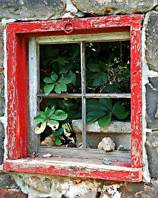
This closeup is the best of the three I think. Perhaps either a more pulling back and shooting at a more oblique angle to show down the wall more would be nice. Or a straight on shot would be good. Something about this particular angle gives it some "tension" I think.
Nice work, it does stand out. I like the light on the inside illuminating leaves from behind, adds depth. I have a similar shot on my website in the current work section that is dead on, but lacks the depth of your photo.
this is my favorite of the series,matthew,and a beautiful image indeed! it's the kind of subjects you can't leave without taking some pictures of it ;-) the PS enhancing is ok with me. regards, kostas
Thanks, Jason, for your comments! I just posted a third in this particular window series. I agree with you, I like this one the best. The color does look more natural in the first, and I know some people would not enhance the color, but I feel the dramatic power of the shot is, at least in part, the play between the colored wood and the bleaker stone. IMHO! Regards, Matt


")
