|
|
|
Christian Barrette
{K:21125} 5/2/2004
|
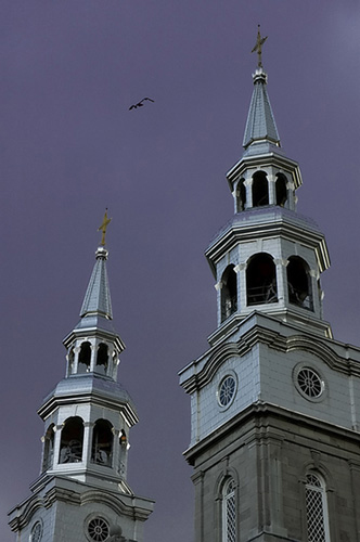
I've attached the final interpretation of this particular image.
Don, the dark sky is taken from your suggestion.
|

|
|
|
|
|
Mike Marcotte
{K:3948} 4/28/2004
|
I like the addition of the birds, but your last post is still my favorite of this series.
|
|
|
|
 Hugo de Wolf
{K:185110} 4/28/2004
Hugo de Wolf
{K:185110} 4/28/2004
|
Interesting thread, Christian, I have to ponder on this one....
Cheers,
Hugo
|
|
|
|
|
Christian Barrette
{K:21125} 4/28/2004
|
There is a follow up with an answer to Matej...
|
|
|
|
|
Christian Barrette
{K:21125} 4/28/2004
|
Ha !
Did I play with the birds ? Whence you have the "right" to install them at your conveniance, you bet I did. My first option was to nail them in the UL third. It would fit the option of filling that gap in the sky. But birds just don't stand on an imaginary line. I thought it'd felt just too artificial. Then I thought of dropping them within the space between the two steeples - the third option proposed by Hugo. That would have been closer to reality as these pigeons kept flying around the right tower where they are nesting. Finally decided for a solution in the middle, not in line, but rather forming a triangle with the crosses.
"Ring the LIght" is a transformation of "Ring the Bells" - to insist here that my eye was caught by the shining light against the ominious sky. Then, may you ask - "What are these birds here for " ? My answer : my very first post...
|
|
|
|
 Matej Maceas
 {K:24381} 4/28/2004
|
The bit about the subject meant to be static was just a silly civil-engineering joke on my part. You know, big buildings, one expects them to be very stable :-)
Anyway, it's interesting to watch how the overall image changes as the position of the birds is altered.
Christian?
|
|
|
|
|
Hugo de Wolf
{K:185110} 4/28/2004
|
Hi Matej, I'm glad you read the comment, as it was also addressed to you, but I remembered too late that I clicked on "Reply to Christian".
My initial thought was to place the birds in the top left corner, as I think that breaks the composition a bit open; emphasising the atmosphere I described, or at least widen the attention span of the image. Another reason for placing the birds in the top left corner is that it creates a hint at objects and events occuring outside the frame, something I like to refer to as the tension of an image.
On the other hand, I'm still not quite sure what Christian intended with this shot, and I don't quite understand what the title refers to either. Reading your comment, and I quote again:
"but hey, the subject is *meant* to be static :-) ",
it might also be very well possible, that the additional space / sky is not the issue here. Keeping the viewers attention to the "interaction" between the two towers, (Ring the Light?) the current placement of the birds close the composition more (in other words, create a more concise composition), and in that case, I think the position is well chosen.
A third option would be to place them even more to the center, but I feel that would somehow unbalance the photo.
Bottom line is, IMO, it's up to Christian to decide.... ) (The easy way out) so I would like to pose / pass this question back to Christian.... ) (The easy way out) so I would like to pose / pass this question back to Christian....
Cheers,
Hugo
|
|
|
|
|
|
Matej Maceas
{K:24381} 4/28/2004
|
How about shifting the birds a bit to the left?
|

|
|
|
|
|
Hugo de Wolf
{K:185110} 4/28/2004
|
Yep, getting increasingly more interesting. I didn't comment on the frame before, but in contrary to Matej's comment, I actually like the way the photo blends in with the frame.
I always enjoy reading Matej's comments, and I'm almost glad I don't always agree with him, as this subject is, again, touching on taste. And his fresh look on things do make me see different things, but also make me see things differently.
He has a good point about the sky, I think (change of mind, here!) But I think the atmosphere is the key element, and not that the image is meant to be static; I obviously don't know what you intended with this shot, though, but I do believe that a static image also removes part of the atmosphere (at least the one I perceive, one of a building up power, as if a thunderstorm is approaching)
I like the placement of the birds in this shot. It's very coincidental that they overlap so perfectly.... I also like the fact that the photo is a full frame.
Concluding, I think the last alternative is the one I prefer most.
Cheers,
Hugo
|
|
|
|
 Don Loseke
{K:32503} 4/28/2004
Don Loseke
{K:32503} 4/28/2004
|
I like the toning on the other picture. The bird does make a nice addition. Now looking down I see the twin towers. It fills the space better. How about a dark blue sky with the steel colored towers. ???? Don.
|
|
|
|
|
Christian Barrette
{K:21125} 4/28/2004
|
Thank you for making this so interesting.
What you suggest is something available...
I wonder how you will react. I think I know how Matej will though.. still he should be pleased to learn that it is at least a full uncropped frame.
|

|
|
|
|
|
Don Loseke
{K:32503} 4/28/2004
|
I like the toning on the other picture. The bird does make a nice addition. Don.
|
|
|
|
|
Matej Maceas
{K:24381} 4/28/2004
|
I like this better than your previous post of the tower. The toning is much more natural (but I'd recommend an even stroke around the image, because on the right the sky almost blends with the frame). Less empty sky is definitely an improvement; the composition in the previous image just didn't work IMO. The centered composition here might be static - but hey, the subject is *meant* to be static :-) - however, it's not symmetric and also the birds are there, so I don't find it static in the sense of hurting the image.
Now there's a funny thing about those birds. At first glance, while the eye is concentrating on the tower, I clearly and without any hesitation interpret them as birds. But once I start inspecting them closer, they start looking like a stray piece of thread that got between the photo and the scanner (even though there was no scanner involved here).
|
|
|
|
|
Hugo de Wolf
{K:185110} 4/28/2004
|
Hi Christian, You are right, the birds and the twist in the vertical perspective do compensate the centered lay out of the shot. But only to a certain extend. I think it is not a choice of either / or, but a matter of "both". The effects just add up, resutlting in a "dramatically powerful" shot, if both the asymmertric placement, the birds, as well as the perspective would've been there.
The alternative image has even more of that; the two towers create an evern stronger element of perspecive, and add a (more clearly visible) third vanishing point to the composition. The diagonal (top right - lower left) between the two towers also add to the tensin / dynamism of the shot. Then again, a few birds would make this alternative even more powerful / overpowering. Even a tad more sky to either the left or the right side would do no harm....
Mind you, this is my opinion, and as we're discussing a subjective thing, there's obviously no right nor wrong. I think I like the alternative photo with the two towers best.
Cheers,
Hugo
|
|
|
|
|
Christian Barrette
{K:21125} 4/28/2004
|
I agree upon the risk of having a more static effect if the main vertical element is straight in the middle as it is, but would it be correct to say that its upward perspective, and its slightly asymetrical twist, plus the presence of the birds, could compensate that weakness ? I'm just sharpening my criterias here, not sure at all.
The tone is much closer to the original. The sepia toning in the previous post was an attempt to accentuate the graphical effect.
No, no horizontal of the same view available. I do have this other one though that has its intrest too, I think.
|

|
|
|
|
|
Hugo de Wolf
{K:185110} 4/28/2004
|
Hi Christian, I think the centered tower removes a bit of the tension in the shot, and would've made it rather static, if not for the birds. They are a very good touch.
I prefer the blue tone over the brownish tone in the previous one, but I think the placement of the tower to the right in the previous one is better. That's a personal thing, though. I think the sky creates the atmosphere. Have you any similar shots taken in landscape format?
Cheers,
Hugo
|
|