|
|
 NN
{K:26787} 9/22/2003
NN
{K:26787} 9/22/2003
|
Again these lovely green tones! I looked at the first version and compared it with this one. Both are beautiful; it?s hard to choose which one is better. The dark, calm water with its reflection looks quite interesting here :)
|
|
|
|
|
Audrey Reid
{K:5872} 9/21/2003
|
Christian, as you so rightly stated, it was only my personal take and vision. (Much as I would love to sometimes, I almost never play with others images, so this was good fun - thank you)
Your attachment brings home the fact how much 'darkroom' process work kicks in after the camera click. However, at the end of the day, good composition holds the key - you have that gift.
|
|
|
|
|
Christian Barrette
{K:21125} 9/20/2003
|
Thank you Audrey for generously investing your time and genious. I think you are proposing an interesting and personal vision, which I find rather flattering. What I like most is the degree of abstraction you get to. You have this ability to frame closely to what matters in the scenery, something I still have to learn to do. It's notable too to see how you have treated the shimering reflections on the water.
I thought I'd post the original - as is ; just to let you see from where we've started.
|

|
|
|
|
|
Audrey Reid
{K:5872} 9/20/2003
|
Christian, Just for fun, here's my vesion. I would very much like to learn what you think of it, and sorry for messing with your work.
I cropped it to a near square. Converted it to grey scale, added duotone(grey). Kept the foreground dots, dodged them lighter. Would like to darken the grey low bush in the far background, but the jpeg was breaking up.
|

|
|
|
|
|
Christian Barrette
{K:21125} 9/19/2003
|
Please, do make your comments and suggestions ; that's the real point in this circle of friends, to learn from each others. So Audrey, if you feel, please go ahead with your post.
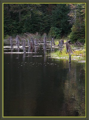
Matej, I agree with your comment about the emptiness of the large lower 2/3. I'm so bothered too by the white specks, they look like dust or hot pixel even; I've cloned out a few but there would be so much more to take care of. What I found pleasing in the original shot was a kind of opalescence in the emerald water that is extremely hard to port here. That's no excuse, only a measure of the flaw : from the intention to the partly failed result.
|
|
|
|
|
Audrey Reid
{K:5872} 9/19/2003
|
Christian, I think I agree wtih Matej that the horizontal version of this is more striking.
Please don't hate me, as you know, I just love the composition, an...d, so pulled this image and played with it in the hope that you may like my changes (I hope). Let me know and I'll post it here, otherwise tell me to get lost and I'll junk it.
|
|
|
|
 Matej Maceas
 {K:24381} 9/19/2003
|
I think I prefer the horizontal version. Here the vast amount of water at the bottom of the image feels rather empty, there aren't really any reflections or water texture to make that part of the image interesting. The white bits on the water surface, I can't tell whether they are bubbles or something floating on the water or just reflections of light - this uncertainty, combined with their relative brightness, makes them distracting for me.
Perhaps if there was a piece of wood very near your position, so that it would be included at the bottom of the image (even if it meant that the woods at the top would be right beneath the top edge), maybe that would give a more balanced composition.
|
|
|
|
 Don Loseke
{K:32503} 9/19/2003
Don Loseke
{K:32503} 9/19/2003
|
Very nice Christian. I do feel that I like the horizontal format the best. Both are very good, just a matter of personal preference. Don.
|
|
|
|
|
Getulio Melo
{K:6481} 9/18/2003
|
Excellent colour and composition! Congrats.
|
|
|
|
|
Brian Hynes
{K:522} 9/18/2003
|
Great photo - good eye for detail
|
|