|
|
|
David Cohen
{K:1759} 4/19/2004
|
I see lots of great potential in this shot including rotating the image slightly to allow for better cropping. I beleive that something can be highlighted with the purple colors that blend toward blue and then turn to orange as you scan across the photo from left to right.
As for Hugo's comments I hate the flower pots and would leave hem out as much a possable.
|
|
|
|
|
Chris Spracklen
{K:32552} 4/17/2004
|
Hi Roger,
I'm with you now! I did see the other two pictures, it's just that wasn't my understanding of a tryptich. No matter, your explanation helped, as did Keith posting.
I'm just back from a wedding where I shot 200 pictures, so I've a bit of work to do!
Kind regards, Chris
|
|
|
|
|
Brad Morris
{K:3307} 4/17/2004
|
Roger, Suggest that you crop in even closer than the image in your comment. Try cropping off the pots and letting the flowers ad the sign take up the whole frame.
I think you will end up with A nice texture with a riot of colour
|
|
|
|
 Roger Williams
 {K:86139} 4/17/2004
|
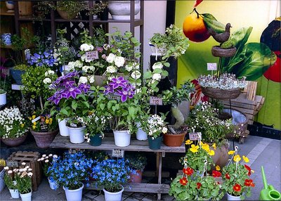
You have to remember, Keith, that I'm a holiday snapper who evolved into a "take it like it is" journalistic photographer-of-record. So I don't necessarily look for drama or anything more than an "I liked this, what do YOU think?" kind of picture. I really liked the colours of these flowers but I just KNEW the original photograph would look like a jumble. Cropping into two such different images was like an epiphany to me... and I hoped I could communicate this. Thanks for your thoughtful comments.
|
|
|
|
|
Enjoy
{K:16125} 4/17/2004
|
I love the color in this..its beautiful...I like the one you posted the best.... myself...
|
|
|
|
|
Keith Naylor
{K:13064} 4/17/2004
|
Hi Roger,
I see what you are driving at here, and its good to follow your thoughts. In my view the original image is too cluttered and doesn't have a unifying theme or a central point of interest. However each of the two sibling images have a more unfied colour theme, each different of course.
My worry here is that the siblings are nicer images because of the themed colour, but there is still little there to provide a resting place for the eye. The most interesting element is that they originated from a single parent and are so different .... is that enough?
I don't want to discourage you in any way, because other people will see more than I can, i just doesn't quite hit the spot for me. Maybe I'm just in one of those moods today (sorry).
Regards
Keith
|
|
|
|
|
Roger Williams
{K:86139} 4/17/2004
|
Chris, I don't know whether that's a real question, or perhaps you're kidding, but would you have preferred me to call it a Dyptich? The "three" are the entire picture plus the two sections of it shown below (hope you noticed those or there was no point to the exercise). It may be cheating a bit to call this a "tryptich," and I did have my tongue in my cheek, but it does give THREE closely related pictures, and the astonishing thing to me was how very different the left- and right-hand crops are. Let me know if you "get it," now.
|
|
|
|
|
Antonella Nistri
{K:21867} 4/17/2004
|
Extra sharpness and fantastic colors for this beautiful composition,wonderful Roger! Antonella
|
|
|
|
|
Chris Spracklen
{K:32552} 4/17/2004
|
Beautiful array of flowers, Roger!
I'm probably being very dense, but I can't make out the tryptich element. I thought that meant a picture in three parts? i.e. all attached?
Kind regards, Chris
|
|
|
|
|
Myrdden
{K:228} 4/17/2004
|
Hi roger. as i look at your photo it strikes me that the flowers in this picture are cool colors on the left side and warm colors on the right. If the warm flowers were surrounded by the cool and yet off center it might draw your eye in and make for a easier focus.
|
|
|
|
|
Roger Williams
{K:86139} 4/17/2004
|
Roger, a tryptich is a set of three... in churches it's a set of three pictures on screens that stand in front of the altar. In Usefilm it's three pictures on the same theme, an idea for which I believe Hugo de Wolf is responsible. Anyway, you'll see lots of good examples in his portfolio.
|
|
|
|
|
Roger Cotgreave
{K:15892} 4/17/2004
|
this is beautiful rog, so vibrant..what is a tryptich? thanks for your comments rog
|
|
|
|
 Teunis Haveman
{K:53426} 4/16/2004
Teunis Haveman
{K:53426} 4/16/2004
|
Roger, Beautiful Flowers
Teunis
|
|
|
|
 Hugo de Wolf
{K:185110} 4/16/2004
Hugo de Wolf
{K:185110} 4/16/2004
|
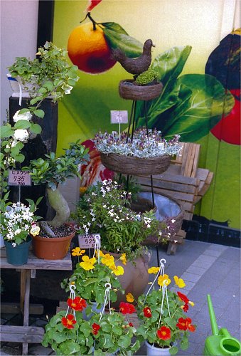
Hi Roger, Now I see what you mean with posting them as alternative trims. I like the idea, it sure is something else! If I had to pick a favourite, I think I'd go for the second one. the blue tone is very consistent and complementing to the photo itself, whereas the others are a bit more strained by the larger range of colours. In the first one, however, there's a beautiful gradient from the blues on the left to the yellow/green tones on the right, with just a tad of red in it.
Still, I'd go for the second one. I probably would've preferred if the pots where completely included into the composition though.
Very succesful experiment, if you'd ask me.... My compliments!
Cheers,
Hugo
|
|
|
|
|
Michael Sean Fleming
{K:2267} 4/16/2004
|
I look forward to seeing the rest of the tryptich. I can understand you desire to "get it all in", this scene has some many appealing elements. Your initial posting isn't a bad shot in itself, but the re-crop is much more composed and harmonious.
|
|
|
|
|
Roger Williams
{K:86139} 4/16/2004
|
And here is the other crop. Three quite different pictures! I think this could be fun! (Thanks for the inspiration, Hugo.)
|

|
|
|
|
|
Hugo de Wolf
{K:185110} 4/16/2004
|
Hi Roger, I'll keep it brief until I've seen numbers II and III. Looks promissing, and I do feel flattered....;)
Cheers,
Hugo
|
|
|
|
|
Roger Williams
{K:86139} 4/16/2004
|
Here's the first alternative crop. Looks like a completely different scene. And this is probably why the picture I actually took is so lacking in impact.
|

|
|