|
|
|
Scott Jones
{K:1093} 3/26/2002
|
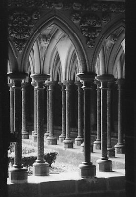
Saw this in randoms and like it as well. It does seem to lack life in the tones however and perhaps more local contrast would give it more life. Perhaps a shot for an unsharp mask or some reworking with dodging and burning. I really like the composition and the repeated columns and think this would make a great print with some tweaking...
Scott
|
|
|
|
|
Debbie Groff
{K:9569} 11/11/2001
|
Very well framed. A bit "hot" at the bottom of the front columns but still very well seen and framed.
|
|
|
|
|
David Meiland
{K:1820} 9/22/2001
|
Very fine image. On my screen it appears to have dark vertical bands at the edge--I would probably crop in a bit sides and bottom. The lighting is fine for me (it looks like it would look...) and I really like the quality of lighting on the carving at the top. The hedge outside is a bit out of place but I realize there is zero you an do about that. Again, a great shot!
|
|
|
|
 Martin Mora
{K:4666} 8/10/2001
Martin Mora
{K:4666} 8/10/2001
|
I was browsing through the Ramdoms, when this one caught my eye, had to check it out, and HEY, its my buddie davids :) fantastic shot dave, Id love to see it abit contrastier, but you know how I love contrast :) really well done bud :) Love it
|
|
|
|
|
Artie Colantuono
{K:12275} 7/24/2001
|
I like the play of lines here David and the chosen perspective....this could use a bit of lighting however...you still have room in the upper range before it gets hot....nice idea.......
|
|