For a bit of both kinds of geometries (hopefully) on one and the same image. The idea behind it: Nature uses selfsimilar sets/mappings in its architecture. Our geometry was invented out of obeservations and *idealisations* of natural things. So, a straight line could be the abtract definition of the property of, say a stick, to be... straight. Based on this geometry we build many things, and all these things share a common property: They are recognizable as artificial!
If some naturally shaped stone falls from the sky, we say it's a meteor. But if a perfect spherical rock falls down from the sky, we know it was "E.T". ;-) Easy, isn't it? Or what?
The question is, how much "human" geometry must be present in some object, in order for it to be recognizable as artificial?
And futhermore, what if we simply oversee artificial objects shaped by their makers the natural way?
We make good progress in understanding the "other" geometry, the fractal geometry, that is similar to itself and has many properties defined only "at the limit".
About the image, once again, is there anything I could do better? Feel free to say, and feel free to devastate me if it has to be.
It is not about "willing" to devastate me, it's only about *in case* somebody finds the image not as good, etc. In such a case, of course, it must be also said and if it has to be shred the image verbally. The purpose of that is exchange and letting me know if there are things to do better - a very photographical purpose.
But if you find it so good I am very glad for that. It allowed me also to separate my good from my bad shots of natural things, and so I perhaps get a small step ahead.
I don't retouch images except if cropping could be counted to that. Saturating and similar things are not for me. I find the idea much better to get vivid colors right out of camear/lens.
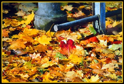
That kind of blue color on the metal parts is what they use in St. Gallen in some regions of the city for protective painting of poles, railings, etc, and "mimicking" at the same time an aged look. There are many old buildings at that part of the city with that blue/green patina of copper alloys, and so they try to make the region look "uniform" in age. (That is to fake age and so perhaps "boost" tourism! ;-)) There is actually also a restrictive law about building houses here: If you build a new house it has to be "consistent" with the overall look that all the other houses generate. Go figure.
But I was happy with that on this image since it brought a good contrast against the yellows of the leaves. To tell you the truth I would wish to get even more of that pole and railing but if I remember well the leaves layer didn't extend so much in the depth. It was my color period, you see.
great fall colors,accentuated by the central leaf red color,the presence of the blue color is the feature of the shot,fall is devoid from such color,the lighting is good,as well as composition,regards, Saad.
Hi Nick. Who is willing and who could devastate you and for what purpose ? In my eyes, this image is perfect. Mainly for its colour collage, and adequate saturation. Composition is very good as well. Health and happiness Aziz