|
|
|
Hussam AL_ Khoder
{K:79545} 12/22/2007
|
amazing!!!
and
fantastic!!!
and
beautiful!!!
|
|
|
|
 taran
{K:1284} 12/19/2006
taran
{K:1284} 12/19/2006
|
Hi Andree, I really like the warm tones here... all the best in 2007... t
|
|
|
|
 Joggie van Staden
{K:41700} 9/18/2006
Joggie van Staden
{K:41700} 9/18/2006
|
Superb shot with great tones and excellent contrast between the old and the new, straight lines and the curvatures of the car etc. Creative thinking and profesional excecution Andree!
Joggie
|
|
|
|
|
Tiger Lily
{K:10966} 9/5/2006
|
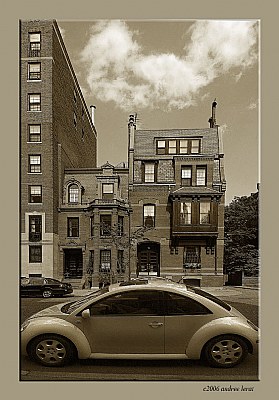
The overall picture is so good (compo, sharpness, message) that the car being a tiny bit cropped at the bumpers does not take much away from it. You composed & shot this while that car was moving! Great job. About the contrast, I like a combination of yours and Salvatore's. The car pops out in his example which is good and I like the sky and buildings better in yours.
|
|
|
|
 Roberto Arcari Farinetti
 {K:209486} 8/29/2006
|
a crazy view...
|
|
|
|
|
Mary Slade
{K:40338} 8/26/2006
|
This is very elegant and great colour Andree. I like the way it is cropped. The perspective and the building framing the left is brilliant.
|
|
|
|
 Jimmy Piper
{K:5742} 8/26/2006
Jimmy Piper
{K:5742} 8/26/2006
|
great shot. love the sepia tone, works great. comp is also a winner!
|
|
|
|
|
Mark Drago
{K:10902} 8/25/2006
|
excellent. great treatment.
|
|
|
|
 andree lerat
{K:17476} 8/25/2006
andree lerat
{K:17476} 8/25/2006
|
Yes, it's very nice Sal. Thanks a lot. :) Andree
|
|
|
|
|
Salvatore Rossignolo
{K:13559} 8/25/2006
|
OK Andree, this is a subtle change but I think you'll like it. I did it exactly as in my critique.
Sal
|

Version 2 |
|
|
|
|
Salvatore Rossignolo
{K:13559} 8/25/2006
|
I'll try!
|
|
|
|
|
andree lerat
{K:17476} 8/25/2006
|
Thanks Sal for such a detailed suggested correction. Can you show me by changing my picture? :) Andree
|
|
|
|
 Marcus Armani
{K:36599} 8/25/2006
Marcus Armani
{K:36599} 8/25/2006
|
I actually am not bothered by the crop of the car as the scene as a whole comes togeather nicely, I actually would prefer to see the black car across the street out of the frame, but I really like the nice perspective..
|
|
|
|
 Hanggan Situmorang
{K:37833} 8/25/2006
Hanggan Situmorang
{K:37833} 8/25/2006
|
I think it's okay, Andree. I don't aim for the car, but the overall composition; and the curved shapes of this car get along very well with the boxes in the background.
|
|
|
|
|
Salvatore Rossignolo
{K:13559} 8/25/2006
|
The crop is OK but I'd have tweeked the levels a bit to have achieved a more natural contrast balance. I would have selected from the bottom of the picture to slightly below the top of tree on the right all the way accross the shot then feathered to about 80-100 px and adjusted the levels to taste so that the transition of the levels adjustment from the tops of the buildings to the sky isn't abrupt and you'd not be changing the already natural looking contrast of the sky and clouds, IMHO. I love the composition here.
Sal
|
|
|
|
 AJ Miller
{K:49168} 8/24/2006
AJ Miller
{K:49168} 8/24/2006
|
Call that a car?!
I don't mind the VW being cropped, but I do find the second second car behind detracts a little from the overall effect.
But I do like the contrast of the shape of the VW and the buildings, the old and the new.
John
|
|
|
|
|
andree lerat
{K:17476} 8/24/2006
|
... and I love the idea of a toddler on a trike...:)
|
|
|
|
|
andree lerat
{K:17476} 8/24/2006
|
Thank you Martin. If I had found a stray dog, I probably would not be posting this shot, I'd be too busy taking care of it. Cheers, Andree
|
|
|
|
|
andree lerat
{K:17476} 8/24/2006
|
Thank you Karina for sharing your thoughts. All the feedback is helpful. :) Andree
|
|
|
|
|
andree lerat
{K:17476} 8/24/2006
|
Pas the choix cher Fabrice. La voiture noire etait my "bete noire"... :) Andree
|
|
|
|
|
andree lerat
{K:17476} 8/24/2006
|
Thank you dear Kiarang. I'm glad you liked it. Cheers, Andree
|
|
|
|
|
andree lerat
{K:17476} 8/24/2006
|
I also did not like the car parked in front of the building. I will try to take it out and see which version stands up. Thank you. :) Andree
|
|
|
|
 G G
{K:61359} 8/24/2006
G G
{K:61359} 8/24/2006
|
Jolie teintes sepia et j'aime beaucoup sur l'immeuble derrière, cela donne effectivement un coté retro. Dommage qu'il y ait la voiture noire a gauche.
Beau travail Andree
|
|
|
|
 Karina Brys
{K:16541} 8/24/2006
Karina Brys
{K:16541} 8/24/2006
|
The car should have been complete, but otherwise, very nice! The second car in the background provides balance.
|
|
|
|
 Kiarang Alaei
{K:49415} 8/24/2006
Kiarang Alaei
{K:49415} 8/24/2006
|
Just : Perfect.
no words needs!
|
|
|
|
 Billy Bloggs
{K:51043} 8/24/2006
Billy Bloggs
{K:51043} 8/24/2006
|
For me, the end crops on the car works well and I don't think the VW is too prominent. I like the idea of old and new (and shiny car vs. dull building)you're trying to portray and especially the choice of wide angle lens. I do find the other car distracting, however, taking attention away from the VW.
Regards, Gary
|
|
|
|
|
Martin Woudstra
{K:1084} 8/24/2006
|
I think the car is to prominent. The framing itself is just great as well as the toning. I guess a stray dog or a toddler on a trike in the foreground in stead of the VW would have been more in balance but I know you can't get those on cue:)
Regards,
Martin
|
|
|
|
|
andree lerat
{K:17476} 8/24/2006
|
Thank you so much Chris. Cheers, Andree
|
|
|
|
 Chris Sitter
{K:2345} 8/24/2006
Chris Sitter
{K:2345} 8/24/2006
|
I tend to agree with your feelings that perhaps the symetry would have been better had you been able to frame the entrire car but that being said I love the composition. The contrast of old and new, the conflicting lines, the sepia colour, well done.
|
|