|
|
 James Cook
{K:38068} 11/13/2006
James Cook
{K:38068} 11/13/2006
|
Giuseppe - Thanks.
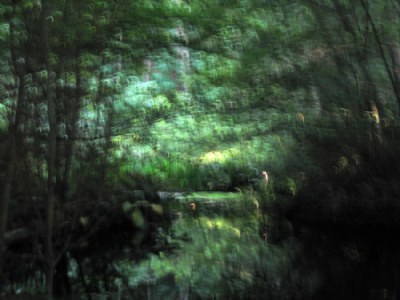
Since there is a lot of light and I cannot control my aperture much on this camera, I have to make very swift movements when I shoot in daylight conditions.
This one is a little hook-shaped twitch of the wrist which is apparent in the shape of the brushstrokes in the photograph.
Hope that helps.
|
|
|
|
 Giuseppe Guadagno
 {K:34002} 11/12/2006
|
What kind of mouvement have you done James? I like this photo as much as the previous.
Giuseppe
|
|
|
|
|
James Cook
{K:38068} 9/28/2006
|
Thank you, Ennio.
|
|
|
|
|
Eligiusz Langner (ennio)
{K:3006} 9/28/2006
|
very good work, interesting image
|
|
|
|
|
James Cook
{K:38068} 9/22/2006
|
Andre - Thanks for the tips. I'll check out these images. Mostly I am interested in what I can on camera, but these other techniques will indubitably be useful.
|
|
|
|
 Andre Denis
{K:66327} 9/22/2006
Andre Denis
{K:66327} 9/22/2006
|
When you have some time James, see what you think of these.
http://www.usefilm.com/Image.asp?ID=1081504
http://www.usefilm.com/Image.asp?ID=1072501
http://www.usefilm.com/Image.asp?ID=1093682
http://www.usefilm.com/Image.asp?ID=1064831
They were all done by creating a duplicate layer and applying various degrees of soft blure to one layer. Then the two images are merged together to make one.
The results are subtle on some, but not so subtle on others.
I know another method to get a similar photoimpressionistic look is to take two or more shots on a tripod with the wind blowing in the scene. Then merge those shots together as one in Photoshop (or on the enlarger)
Andre
|
|
|
|
|
James Cook
{K:38068} 9/20/2006
|
Andre - Could take me some time to get through your entire collection, but if there are a couple specific examples I should look at just drop in the URL's here. Thanks. See you.
|
|
|
|
|
Andre Denis
{K:66327} 9/20/2006
|
Hi James,
Just looking through all your interesting Luxagraphic work! Great stuff!
This one is particularly attractive. I like it when you really have to spend a little time with an image to get the most out of it. This one falls into that category.
About six or eight months ago, I was looking through a Photo Impressionist book and was inspired to try something similar to this image. I got some really interesting results with dead flowers, landscapes and even a couple with some animal skulls. (creepy I know) Some are in my Darker Side portfolio and some are in Florals and some in Landscapes.
The way that I did my versions was to open duplicate images of the pic and experiment with creating a blurred version in Photoshop. The blurred layer was then placed over the straight layer and the opacity was then adjusted to taste. After I saved the double layered image, I would then do some additional changes to bring out some nice glow to the shot.
Not exactly Luxagraphia, but I liked the results. Sometimes the best results were the subtle ones. I have a couple of some plants and of a racoon skull that almost came out looking three dimensional.
Now I might have to try a couple more :)
Andre
|
|
|
|
|
James Cook
{K:38068} 9/10/2006
|
Mark - Thanks. This scene was a tough one to shoot. I visited twice and shot dozens of photographs. I only have a handful that I'm very satisfied with. It is, like you say, about getting the balancing the reality of the subject against its luxagraphic abstraction.
|
|
|
|
 Mark Longo
{K:12760} 9/10/2006
Mark Longo
{K:12760} 9/10/2006
|
Lovely work. Color pallette is beautiful and you deftly walk the line between reality and abstract. Facinating shot.
Mark
|
|
|
|
|
James Cook
{K:38068} 9/7/2006
|
Teemu - Ok, yeah, that makes more sense. Thanks for coming by. See you around.
|
|
|
|
 Teemu Luoma
{K:647} 9/7/2006
Teemu Luoma
{K:647} 9/7/2006
|
Oops! Did I say Matisse? I meant Monet (Claude Monet)! :) The association is due to the deep shades of green, 'brush strokes', symmetry and reflecting water.
|
|
|
|
|
James Cook
{K:38068} 9/5/2006
|
Teemu - Thank you for your kind words. Is there a specific Matisse you had in mind?
|
|
|
|
|
Teemu Luoma
{K:647} 9/4/2006
|
This reminds me of Matisse somehow. I like it very much (and the works of Matisse too). It has a beautiful texture and deep shades of green. The picture is both relaxing and activating, which I find very interesting. The green-black combination is very effective.
|
|
|
|
|
James Cook
{K:38068} 8/13/2006
|
Barbara - Thank you. I was very happy with shooting this scene. I will shoot it again next time I make it over to Discovery Park.
|
|
|
|
 {K:12494} 8/13/2006
|
WOW, This is beautiful, and it looks like a master piece, very seen and taken, excellent job.
|
|
|
|
|
James Cook
{K:38068} 8/9/2006
|
Thanks, Raquel. Your images are so bright, I wouldn't have guessed you'd pick this one. Keep me guessing.
|
|
|
|
|
Radmila Gorjanovic
{K:3113} 8/9/2006
|
Wonderful impressionistic picture!
Greetings
R...
|
|
|
|
|
James Cook
{K:38068} 8/8/2006
|
Robin - Thank you. I don't know if you saw this image, but it is also more subject oriented:
http://www.usefilm.com/Image.asp?ID=1130249
Thanks for stopping by. See you again.
|
|
|
|
 Robin W
{K:16308} 8/8/2006
Robin W
{K:16308} 8/8/2006
|
In all of luxagraphia land, this is my favorite. I like that landscape is recognizable, the color and contrast are gorgeous...it is a beautiful "painting"!
Thanks for the comment, I'm glad you like.
Take care...Robin
|
|
|
|
|
James Cook
{K:38068} 8/8/2006
|
Thank you, Michele. I'll keep making them.
|
|
|
|
 Michele Carlsen
{K:146013} 8/8/2006
Michele Carlsen
{K:146013} 8/8/2006
|
Well done james. IMO you accomplished your goal. I like it very much.
thank You for sharing and explaining
|
|
|
|
|
James Cook
{K:38068} 8/7/2006
|
Thanks, Mattia.
|
|
|
|
 Mattia L.
{K:7625} 8/7/2006
Mattia L.
{K:7625} 8/7/2006
|
Impressive work! Congrats!
Thanks for your kind comments.
|
|
|
|
|
James Cook
{K:38068} 8/7/2006
|
Kamran - Thank you for your kind comments.
|
|
|
|
|
James Cook
{K:38068} 8/7/2006
|
Thank you, Galal. See you around.
|
|
|
|
 Kamran Bakhtiari
{K:24054} 8/7/2006
Kamran Bakhtiari
{K:24054} 8/7/2006
|
poetic and dynamic,very well done,cheers
|
|
|
|
|
Galal El Missary
{K:84569} 8/7/2006
|
Great composition & effects James .
Galal
|
|
|
|
|
James Cook
{K:38068} 8/7/2006
|
Tuna - I was tempted to leave the contrast alone on this one, but lightening up brought out a lot of detail. I think if I were to print it out I would not have to adjust the contrast and so the tones would be darker and moodier.
I am still working to perfect control over the brushstrokes. Glad you like the kind of blur I've made in this one.
Thanks and I'll see you around.
|
|
|
|
|
James Cook
{K:38068} 8/6/2006
|
Thanks, Phil.
|
|
|
|
 Tuna Esener
{K:-2953} 8/6/2006
Tuna Esener
{K:-2953} 8/6/2006
|
good work,like the dark-green tones and blurity.
|
|
|
|
 Phillip Minnis
{K:13131} 8/6/2006
Phillip Minnis
{K:13131} 8/6/2006
|
Oh, yes, I agree with you - it does look similar to Carot's Vue de Mantes. You have created a work of art with this one! Top notch!
Cheers
Phil
|
|