|
|
 Roberto Arcari Farinetti
 {K:209486} 5/29/2007
|
well my friend.. very well composed!
cheers
roby
|
|
|
|
 Leo Régnier Я£
{K:67696} 5/16/2006
Leo Régnier Я£
{K:67696} 5/16/2006
|
Excelent abstract here!!!
Leo
|
|
|
|
 Maurizio Massetti
{K:30463} 4/16/2006
Maurizio Massetti
{K:30463} 4/16/2006
|
Excellent shot! Very nice composition...
|
|
|
|
 Paul Lara
{K:88111} 4/9/2006
Paul Lara
{K:88111} 4/9/2006
|
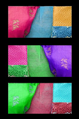
Great title for a strong, colorful and wonderfully exposed tryptich.
|
|
|
|
 Fatemeh Rahimi
{K:13523} 4/3/2006
Fatemeh Rahimi
{K:13523} 4/3/2006
|
you have nicely framed these colors!
well done Danny and congratulation!
|
|
|
|
 Jeanette Hägglund
{K:59855} 3/31/2006
Jeanette Hägglund
{K:59855} 3/31/2006
|
Beautiful materials and so nicely merged together into a collage -triptych. Materials and materialism...... yes interesting title, i was listening to a program where they had followed how much we throw away every year and what happends with it. I could never guess that it´s so much.
Jeanette
|
|
|
|
|
Danny Brannigan
{K:19523} 3/30/2006
|
Yes Hugo You are correct about the frame etc. And yet another of my senior moments.
|
|
|
|
|
Renato Renato
{K:4759} 3/30/2006
|
great compose,tone and colors,congrate.
ciao
|
|
|
|
 Kathy Hillard
{K:25721} 3/30/2006
Kathy Hillard
{K:25721} 3/30/2006
|
Very clever title, Danny! It put a smile on my face! Well done collage, with beautiful colors!
Kathy
|
|
|
|
 Phillip Minnis
{K:13131} 3/30/2006
Phillip Minnis
{K:13131} 3/30/2006
|
Congratulations, Danny, on your award! A striking image!
Cheers
Phil
|
|
|
|
|
Laura E.
{K:5598} 3/30/2006
|
Hi Danny,
I like this shot very much, including the black background. It's a great way to set off the bright colors in the images. The overall effect is also a bit reminiscent of a Rothko paiting...
Very nice work, and congratulations on your award!
Laura
|
|
|
|
|
Danny Brannigan
{K:19523} 3/29/2006
|
Yes you arequite right John. It is simply down to pure carelessness. Unfortunately thats the way i am.
Thanks for commenting.
Cheers
Danny
|
|
|
|
 Hugo de Wolf
{K:185110} 3/29/2006
Hugo de Wolf
{K:185110} 3/29/2006
|
Good post-processing indeed... I opened the image before Dennis posted his comment, and I finally see how you did it... Missed that!
Cheers,
Hugo
|
|
|
|
|
Hugo de Wolf
{K:185110} 3/29/2006
|
Hi Danny,
What an outstanding arrangement; I like the thought you put into this shot, arranging the colours to cross the individual images in this triptych is just great, it creates a unique sequence of photos, that cannot be rearranged without loosing the impact. Also, the fact that the symmetry is broken by the intricate shift in patterns is a very strong element.
Just a very small thing with the black frame; I believe it's a bit too heavy to match completely with both the subtlety of the images and textures, as well as a bit off balance, as the sides seem wider than top and bottom.
But that's rather inferior to the very impressive composition and arrangement. Great stuff!
Cheers,
Hugo
|
|
|
|
 AJ Miller
{K:49168} 3/29/2006
AJ Miller
{K:49168} 3/29/2006
|
Oh yes, so you did! Thanks for pointing that out Dennis. It works beautifully. But something seems to have happened to the top of the first and, more seriously, bottom images: they both appear to have become a little distorted.
John
|
|
|
|
 Claudia Perilli
{K:31090} 3/29/2006
Claudia Perilli
{K:31090} 3/29/2006
|
Great series! Excellent colors.
Claudia
|
|
|
|
 Bob Aldridge
{K:14758} 3/29/2006
Bob Aldridge
{K:14758} 3/29/2006
|
Very colourful Danny, cant think of anythink els
to say lol but well done all the same....Bob.
|
|
|
|
|
Anne Grindle
{K:842} 3/29/2006
|
Love this photo. The visual is great. It's so intriguing, I just keep looking at it
|
|
|
|
 Dennis Hendricksen
{K:4817} 3/29/2006
Dennis Hendricksen
{K:4817} 3/29/2006
|
Fun title for a colour image. An interesting use of the same image to create 3 different colour combinations. I had to look closely before I discovered that's what you did. A creative and visually pleasing triptych!
|
|