|
|
|
Sam Oppenheim
{K:3362} 9/18/2005
|
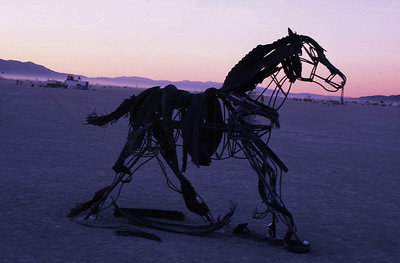
You're absolutely correct, if the horizon was at 1/3 instead of 2/3 horizontal it would probably be more striking as a silhouette. The horse's detail would stand out better, like my previous photo fo the mother and child. Unfortunately this is the best one i got of one of my fav/ art objects... maybe next year!
|
|
|
|
Warren Simons
 {K:741} 9/18/2005
|
Hi Sam, Like the subject of this photo a lot. I wonder how it would look if you shot it from a lower angle, with the sky taking up most of all of the background?
|
|
|
|
 Ameed El-Ghoul
{K:42215} 9/16/2005
Ameed El-Ghoul
{K:42215} 9/16/2005
|
Another nice capture Sam, What I like the most is the fading sun rays,
Very well seen and captured,
Reagrds,
|
|
|
|
 Mohamed Banna
{K:34237} 9/15/2005
Mohamed Banna
{K:34237} 9/15/2005
|
amazing art wor
nice shot
great Silhouette
may be need a lower angle
|
|
|
|
 Nikki A
{K:247} 9/15/2005
Nikki A
{K:247} 9/15/2005
|
Well it might look good with him right at the front, you never know! Overall I love it though.
|
|
|
|
 Steve Spencer
{K:-551} 9/15/2005
Steve Spencer
{K:-551} 9/15/2005
|
This is a neat find, indeed!
|
|
|
|
|
Sam Oppenheim
{K:3362} 9/15/2005
|
yeah I thought about it... I kinda like it this way, but I think in my gut i have to agree with you... was kinda lazy, better photos tomorrow... If I rotate it tho I will lose some of the foreground and he will stand right at the border... unless i photoshop in some ground...
|
|
|
|
|
mundh
{K:3974} 9/15/2005
|
what a catch
|
|
|
|
|
Nikki A
{K:247} 9/15/2005
|
I like the colors and composition in this one... the only thing I might reccomend is to straigten out the horizon... it makes me want to lean to the right.
|
|