|
|
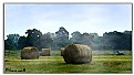
Critique By:
Jeroen Wenting (K:25317)

5/26/2006 4:59:32 PM
I'm not too happy with the large centered subject, but apart from that it's a well executed scene.
You shouldn't have added the smoke effect, it detracts. Would have been better to try and get the existing haze and capture that more strongly.
|
| Photo By: Laura Spell
(K:24080)
|
|
|
Critique By:
Jeroen Wenting (K:25317)
5/26/2006 4:56:41 PM
Nicely done closeup, though the background is a bit cluttered.
Maybe a different angle (or choosing another flower) might have provided for a smoother background.
|
| Photo By: Alexis Polegaev
(K:379)
|
|
|
Critique By:
Jeroen Wenting (K:25317)
5/12/2006 5:28:11 AM
yup, it's the new place in Almere.
And the concrete is already cracking in places, despite it having been open for only a few weeks...
|
| Photo By: Jeroen Wenting
(K:25317)
|
|
|
Critique By:
Jeroen Wenting (K:25317)
4/18/2006 7:32:10 PM
Strong image, reminds me of Hitchcock.
The highlight in the top is a bit of a shame, a tighter crop there would have been better.
Slight underexposure helps set the gloomy mood which makes this image.
|
| Photo By: Michael Rydh
(K:111)
|
|
|
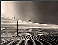
Critique By:
Jeroen Wenting (K:25317)
4/12/2006 6:53:15 PM
Nice tranquil scene.
Maybe a tad lacking in colour saturation, but that somehow adds to the overall impression of peace and tranquillity.
Would work well as an advertising poster for a tourist board, or just to hang on the wall in the office or at home.
|
| Photo By: Kiarang Alaei
(K:49415)
|
|
|
Critique By:
Jeroen Wenting (K:25317)
4/5/2006 6:53:20 PM
Cropped maybe a bit too tight, I'd have liked to see some more of the surroundings to bring the scene to life.
But not bad, exposure is good.
The noise doesn't do the image justice though. Were this shot on high ISO black and white film it would have looked a lot better, or else smooth out the noise (or remove by shooting at a lower EI setting on your camera).
|
| Photo By: Mariusz Sprawnik
(K:114)
|
|
|
Critique By:
Jeroen Wenting (K:25317)
4/3/2006 8:47:49 PM
the ruddish yellow light lends a good atmosphere, though IMO the large dark area at the top is a bit too much of a good thing (some detail there would have been better).
Nothing wrong with your composition or choice of subject, both are well done.
|
| Photo By: t marie
(K:302)
|
|
|
Critique By:
Jeroen Wenting (K:25317)
3/28/2006 9:06:07 PM
Looks like a bit of a weird blueish colour cast over the entire image.
Very good composition indeed, but those blues look quite artificial. I'd not want to swim in water that colour 
|
| Photo By: Jose Ignacio (Nacho) Garcia Barcia
(K:96391)
|
|
|
Critique By:
Jeroen Wenting (K:25317)
3/23/2006 9:40:46 PM
Good composition here, but sadly the sky looks somewhat washed out (especially compared to the rich greens in the fields).
|
| Photo By: Ace Star
(K:21040)
|
|
|
Critique By:
Jeroen Wenting (K:25317)
3/14/2006 9:53:30 PM
I wonder where you got this image.
A bit of research has shown that it must have been taken between 1975 (maybe late 1974) and 1978.
Before that the aircraft was stationed on USS America as 603 with another squadron, in 1978 it was decomissioned to NAS China Lake and placed in unflyable storage as an intended museum piece.
I'd also be highly interested in the conditions that caused you to have permission to use a camera on a carrier during flight operations, when normally access to the flight deck during operations is strictly limited to duty staff only and use of cameras for non-official purposes banned at all times except sometimes during portcalls.
Posting images you don't own the copyright to isn't allowed, as you should know.
|
| Photo By: Gregs Images
(K:553)
|
|
|
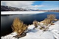
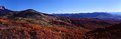
Critique By:
Jeroen Wenting (K:25317)
3/11/2006 7:19:19 AM
Well done, good combination of colours and excellent composition.
Maybe stopping down a bit more would have presented more details in the mountainsides, they look slightly blurred at the moment.
|
| Photo By: Tim Schumm
(K:29196)
|
|
|
Critique By:
Jeroen Wenting (K:25317)
3/5/2006 9:32:00 PM
shame, mutilation of what looks to have been at some point a possibly (though it's quite impossible to tell by now) interesting image.
Prime example of the overuse of digital manipulation.
|
| Photo By: Joe Ciccone
(K:3684)
|
|
|
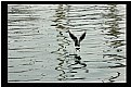
Critique By:
Jeroen Wenting (K:25317)
3/4/2006 3:32:56 PM
A moment well caught. Shame you couldn't get closer to make the bird fill the frame more, but as it stands it's not bad either.
|
| Photo By: Sinan Goksel
(K:1010)
|
|
|
Critique By:
Jeroen Wenting (K:25317)
3/4/2006 3:10:02 PM
Nice picture of a very shy little critter.
Sadly it seems a bit soft and the tail is blown out, loosing some of what could have been a very good capture indeed.
|
| Photo By: ivor cross
(K:345)
|
|
|
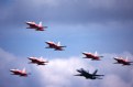
Critique By:
Jeroen Wenting (K:25317)
2/28/2006 7:06:52 PM
Thanks for the comments.
It's actually the Patrouille de Suisse flying at Fairford in formation with a Swiss F/A-18.
Yes, I know and love the Frecce. Sadly I've not been lucky photographing them lately.
|
| Photo By: Jeroen Wenting
(K:25317)
|
|
|
Critique By:
Jeroen Wenting (K:25317)
2/12/2006 8:05:53 AM
Good capture, especially for a camera in that class.
Digital point and shoot cameras are notorious for being extremely slow to respond, making accurate composition of fast moving subjects next to impossible.
A tad more light would have been better probably, letting the white aircraft appear white instead of grey.
Given your camera, a tighter crop would likely have been impossible (don't know its capabilities in that regard), at the moment the aircraft look a bit lost (but not so much as to make them disappear).
Overall a good image taken using limited means, maybe an incentive to go hunting for a DSLR with some long teles if you do this work regularly.
|
| Photo By: Bill Smith
(K:9)
|
|
|
Critique By:
Jeroen Wenting (K:25317)
2/11/2006 9:34:30 AM
Very well done moody image.
Maybe a bit too much space at the bottom, just a sliver of ground might have been even better.
And as said, if everything that has been done before were not allowed we would all have to destroy our cameras immediately.
|
| Photo By: Gayle's Eclectic Photos
(K:91109)
|
|
|
Critique By:
Jeroen Wenting (K:25317)
2/7/2006 6:25:29 PM
Well done, good detail in the snow without loosing too much shadow detail.
Only thing I'm not that happy with is the ring around the sun, makes it look weird.
|
| Photo By: aa as
(K:63)
|
|
|
Critique By:
Jeroen Wenting (K:25317)
2/5/2006 12:56:17 PM
It's a tad soft because 1) my lens isn't the best wide open and 2) I used it of necessity handheld ballancing it on the door of my car.
Light isn't the best, but you take what you can (light was from the right and slightly backlit).
|
| Photo By: Jeroen Wenting
(K:25317)
|
|
|
Critique By:
Jeroen Wenting (K:25317)
2/5/2006 10:34:25 AM
Another of your mediocre images Ann?
Really nicely done, well lit and composed. Maybe a tad too tight, but I don't know the scene and it's quite likely given your skills that this is the best composition given the surrounding terrain.
|
| Photo By: Ann Nida
(K:45248)
|
|
|
Critique By:
Jeroen Wenting (K:25317)
1/26/2006 8:00:50 PM
Great shot of a classic aircraft.
Despite the backlighting you have a lot of detail in there, well executed.
|
| Photo By: hdw Photography
(K:6630)
|
|
|
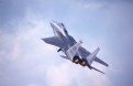
Critique By:
Jeroen Wenting (K:25317)
1/24/2006 9:55:25 PM
Yes, it is the main landing gear coming up.
I caught the aircraft during takeoff for a display flight.
|
| Photo By: Jeroen Wenting
(K:25317)
|
|
|
Critique By:
Jeroen Wenting (K:25317)
1/22/2006 9:06:19 PM
Nice rich colours.
Sadly the small size causes loss of detail, leaving the entire image look cluttered.
|
| Photo By: al shaikh
(K:15790)
|
|
|
Critique By:
Jeroen Wenting (K:25317)
1/22/2006 12:23:52 PM
I agree with Derek, the cut off legs makes it look incomplete.
I'd also have gone for a tad more exposure as the subjects are clearly underexposed, yet not so much as to become silhoutted (which wouldn't work in this scene in my opinion).
To achieve that greater exposure you might need to provide some means of darkening the sky to prevent the clouds from being blown out (which is already starting in your picture as posted) and the sky becoming a white/grey mess.
|
| Photo By: Ibrahim Adiguzel
(K:12)
|
|
|
Critique By:
Jeroen Wenting (K:25317)
1/22/2006 12:04:21 PM
Looking good, but (there always is a but is there?) I'd go further to the right to eliminate that bright triangular patch on the left (and the little bit of blown out sky at the same time).
|
| Photo By: KEVIN TEMPLE
(K:8657)
|
|
|
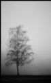
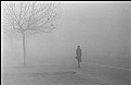
Critique By:
Jeroen Wenting (K:25317)
1/22/2006 12:02:02 PM
Classic street image using a classic camera.
Spontaneous, yet well composed and exposed.
Excellent use of fog to get rid of extraneous details.
|
| Photo By: Tai Dao
(K:416)
|
|
|
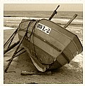
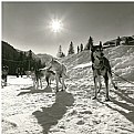
Critique By:
Jeroen Wenting (K:25317)
1/22/2006 11:54:08 AM
Good potential here.
I'd have liked to see more sky though, so a lower camera position.
Maybe move the boat almost up to the right border of the frame too.
And shoot on high lattitude black and white film to bring out shadow details.
|
| Photo By: Tiago Estima
(K:179)
|
|
|
Critique By:
Jeroen Wenting (K:25317)
1/20/2006 6:15:51 PM
Well executed minimalist landscape, and good conversion to black and white too.
Wouldn't change a thing.
|
| Photo By: Pawel Cz
(K:981)
|
|
|
Critique By:
Jeroen Wenting (K:25317)
1/16/2006 10:18:10 PM
Well done, nicely composed and exposed.
Sadly it still looks digital, nothing can recreate the true look of film.
|
| Photo By: Dierk Kruse
(K:315)
|
|
|
Critique By:
Jeroen Wenting (K:25317)
1/15/2006 1:51:36 PM
Thanks for the comments.
By ugly I mean mainly too stylised and too little detail close up for something that size to enjoy at close quarters.
It's the best I could get out of 20 year old film that's been stored at room temperature all that time after going through some half dozen 1960s era X-ray machines.
|
| Photo By: Jeroen Wenting
(K:25317)
|
|