|
|
Critique By:
Kevin Greggain (K:2572)
1/2/2004 11:21:37 AM
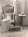
This is a beautiful portrait with just the right amount of high-key light. Not only is this a beautiful model, with an expression which makes the photo, but the light is perfect.. Warm and soothing.
Very nice work. What ps work did you actually do the image ?? I'm curious
|
| Photo By: herwig b
(K:558)
|
|
|
Critique By:
Kevin Greggain (K:2572)
12/23/2003 8:34:44 AM
I'm just curious. Are these women giving permission for these photos? I see a lot where they are turned away and it makes me think you are just snapping them.
|
| Photo By: Lucas L
(K:12145)
|
|
|
Critique By:
Kevin Greggain (K:2572)
12/13/2003 7:41:03 PM
A splendid enchanting photo. I would love to see this exact shot in high contrast as well.
I took the time to view your site and was very impressed by your work. You obviously put a lot of heart and soul into your work.
Great shot.
|
| Photo By: Syrie Kovitz
(K:1349)
|
|
|
Critique By:
Kevin Greggain (K:2572)
12/11/2003 1:24:29 PM
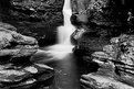
Hello Joshua, I have a couple of comments for you.
The low light (shaded light) is providing a blueish tone to the photo. Also, some of the details in the lower part of the image are lost (or are pretty near lost). I recommend using a warming filter (81A in this instance) to offset a bit of the blueish tone, and as well, I might recommend (and this is given that I do not know your distance to the falls) F8-F11 with an overexposure of 1 - 1 1/2 stops for what the meter tells you.
As well, you can bracket +-1/2 stop for slide, and 1-1/2+- for print to ensure you get a good snapshot of this.
I love the vertical in this shot because it gives a great sense of height to the photo. I just think with a bit more work this will be a definate wall hanger.
|
| Photo By: Joshua Rainey
(K:5069)
|
|
|
Critique By:
Kevin Greggain (K:2572)
12/2/2003 4:31:45 PM
It's marvelous and mystical, like the sulfur pools at the dawn of earth's beginning. That S2 is a magnificent camera, but of course credit goes to the one who saw this in their mind before they took the photo.
Very nice work.. going straight to my favorites.
|
| Photo By: Andre Knudsen
(K:124)
|
|
|
Critique By:
Kevin Greggain (K:2572)
11/18/2003 3:10:04 PM
Very nice to see a fellow Provia shooter using slides and not digital. Congrats on a great photo as well. I have a couple of Ball Pythons who I have photographed eating in the past, but this is great.
Depth of field and composition is great.
The only unhappy part of this photo is the mouse. He forgot to smile 
|
| Photo By: Harry Eggens
(K:14804)
|
|
|
Critique By:
Kevin Greggain (K:2572)
11/12/2003 7:35:08 AM
This photo can be taken as melancholy or as a photo of showing someone at peace with themselves. Either way, I absolutely love it ! The highlighted ligthing on the face, the expression, tones and the composition is excellent. Welcome to usefilm and keep those great photos coming..
|
| Photo By: Cagri A.
(K:45)
|
|
|
Critique By:
Kevin Greggain (K:2572)
11/5/2003 7:12:34 AM
Beautiful.. and the whole elbow is there too .. Great, just like the last one.. Good work.
|
| Photo By: Simon Pang
(K:-41)
|
|
|
Critique By:
Kevin Greggain (K:2572)
11/5/2003 7:11:51 AM
Great photo.. awesome depth of field.. My only beef is the elbow being cut off, otherwise this is perfect !! Great work.
|
| Photo By: Simon Pang
(K:-41)
|
|
|
Critique By:
Kevin Greggain (K:2572)
10/31/2003 10:40:19 AM
Great photo.. repeating patterns are great and what better time than halloween? I love the shot, but it is a little flat. I used Photoshop with an unsharp mask, and pulled the colors out with contrast and variations (it is attached). Compare them and see how the differences bring a little extra out of the image
|
Photo By: Harlan Heald
(K:15732)

|
|
|
Critique By:
Kevin Greggain (K:2572)
10/31/2003 4:27:02 AM
Unhappy looking frog, excellent depth of field, and great and unique composition. Love it.
|
| Photo By: Lenny Boguslaw
(K:243)
|
|
|
Critique By:
Kevin Greggain (K:2572)
10/27/2003 9:48:23 AM
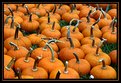
The contrast is hardest to deal with and with this image (which has really great potential), it loses a bit in composition, and most definately in lighting.
A polarizer might have cut down on some of the light, but not the harsh contrasted shadows etc. This would be a perfect shot in diffused sunlight (either overcast, or as the sun is setting, giving more ambient lighting).
I might have moved the little one more into the intersections of the rule of thirds method and perhaps come down more to her height to give a better perspective into the cute face and eyes.
Tis the season of the pumpkins.. Keep shooting, and you will have a real winner on your hands.
|
| Photo By: Marianne Gordon
(K:507)
|
|
|
Critique By:
Kevin Greggain (K:2572)
10/27/2003 9:43:49 AM
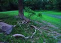
The photo appears quite bluish to me, (cold coloring). Perhaps a warming filter on the end of the lens would correct the tone which I am criticized so often for having in my photos.
Compositionaly, the image seems tilted based on how my eyes see the perceived centerline through the image. Most likely this is because of the geometry of the hiltop and the road and how they converge.
I think with a bit more tilt (which would bring the tree up vertically) and a little warmer colors, this could be a good image.
|
| Photo By: Jenny Brown
(K:2859)
|
|
|
Critique By:
Kevin Greggain (K:2572)
10/15/2003 6:24:08 PM
What's up with usefilm that I can't upload images ? .. Gee..
|
| Photo By: Robert Whiteman
(K:2201)
|
|
|
Critique By:
Kevin Greggain (K:2572)
10/15/2003 6:22:42 PM
grr.. try that one again
|
| Photo By: Robert Whiteman
(K:2201)
|
|
|
Critique By:
Kevin Greggain (K:2572)
10/15/2003 6:21:29 PM
This is a great photo. The lighting is what makes it so great. This is a bit of extra space on the left and such so I cropped the pic down to give you an alternate view of the photo. I just had a slide entered in a competition and one of the comments they gave me was to look around the viewfinder.
Excellent photo. Great eye ..
|
| Photo By: Robert Whiteman
(K:2201)
|
|
|
Critique By:
Kevin Greggain (K:2572)
9/26/2003 5:29:31 PM
Everything looks in order as far as exposure goes. The image crop at the top kind of distracts me, I wonder how it would look with more breathing room up top.
The Delta 400 looks great. I use Delta 100, and am actually going to Rickett's Glenn tomorrow (ironically). Because of the narrower tonal range of black and white film, I find that center weighted metering forces me to add 1 - 1 1/2 stops to compensate for the mistake the meter makes on the white of the falls.
You have inspired me to shoot b/w tomorrow as well as my 100 Velvia. Keep the great photos coming.
|
| Photo By: Paul Sanders
(K:744)
|
|
|
Critique By:
Kevin Greggain (K:2572)
9/26/2003 8:21:47 AM
I have just begun to re-appreciate black and white. I saw the color version of this and was definately more impressed with the black and white conversion.
The image is framed, composed and lit nicely. The way the house roof angles, as well as the truck appears as if the earth is consuming everything in sight, while the weeds are helping to pull everything down.
It is a great photo. Congrats.
|
| Photo By: Rodney Johnson
(K:742)
|
|
|
Critique By:
Kevin Greggain (K:2572)
9/18/2003 2:50:10 PM
She's beautiful, the photo is beautiful.. So all I can say is.. beautiful
|
| Photo By: herwig b
(K:558)
|
|
|
Critique By:
Kevin Greggain (K:2572)
9/18/2003 1:48:25 PM
There is a look of deep sadness on her face, the colors and the atmosphere this sets for the photo is excellent. It's as if you can hear her calling for help.
Nice work.
|
| Photo By: Pawel Topolski
(K:215)
|
|
|
Critique By:
Kevin Greggain (K:2572)
9/14/2003 12:07:40 PM
Welcome to Usefilm. Your love for your daughter shows in the care you took in the capturing of this great photo. She's gonna be a heartbreaker some day (if not already).. I have a 23 year old daughter who never lets me take photos, so consider yourself lucky.
The pic to me is flawless. Perfect sharpness, great lighting (the fill flash really helped here). Perfect depth of field for a portrait, and of course a great model.
Congrats and keep the great photos coming.
|
| Photo By: Ze'ev Kantor
(K:0)
|
|
|
Critique By:
Kevin Greggain (K:2572)
9/13/2003 2:42:14 PM
It's a great try. I too am just getting into filters and BW film. This is a great shot. I'm not sure the red filter wouldn't blacken the wood too much. I find an 81C gives me just the right amount of darkening, but again, I"m still learning too.
Great shot.
|
| Photo By: Rodney Johnson
(K:742)
|
|
|
Critique By:
Kevin Greggain (K:2572)
9/13/2003 2:39:34 PM
This is excellent. Looks almost like an above atmosphere shot. Very nice. Great color. Dreamy photo.
|
| Photo By: Teunis Haveman
(K:37426)
|
|
|
Critique By:
Kevin Greggain (K:2572)
9/12/2003 11:56:16 AM
Impressive photo. Great contrast and lighting.
|
| Photo By: herwig b
(K:558)
|
|
|
Critique By:
Kevin Greggain (K:2572)
9/12/2003 9:48:26 AM
I have to agree, it's a great photo. An attractive model always helps too, but the lighting and sharpness of the photo is what does it for me.
Some digital photos I see here are quite obviously digital, this does not take on the digital look. Very nice work.
|
| Photo By: peta jones
(K:12615)
|
|
|
Critique By:
Kevin Greggain (K:2572)
9/12/2003 7:57:46 AM
How about Dark Offering ? or The Offering..
This is a great shot.. Almost a religious iconified image there. Very nice.
|
| Photo By: PIOTR KOWALIK
(K:1185)
|
|
|
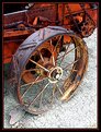
Critique By:
Kevin Greggain (K:2572)
8/31/2003 7:23:11 AM
This a great shot. Coming from a farm of the 60's we visited many agricultural museums and saw much in the line of old equipment. The rustic colors leap off the photo. and the white textured ground looks great.
I think this would also make a great black and white shot (see attached).
Very nice work
|
| Photo By: Bill Ciavarra
(K:10216)
|
|
|
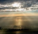
Critique By:
Kevin Greggain (K:2572)
8/31/2003 7:18:05 AM
Beautiful Verna, what a tranquil and yet stormy shot. My only comment might be to give a neutral density graduated filter a try. It drops the sky about one stop and allows the foreground a little mor lighting. Maybe not on this shot, but I saw some of your others (also great), and just wanted to see a tad more light on the foreground.
Nice work.. great shot.
|
| Photo By: Verna Absolutestockphoto
(K:2836)
|
|
|
Critique By:
Kevin Greggain (K:2572)
8/31/2003 7:12:30 AM
I normally don't comment on Digital images because they have that "look" to them, but this is a fine piece of work, worthy of comment. Excellent use of the 1/3's method and great color and composition work here. The horizon is straight (bothers me when they are crooked), and as well, the horizon looks infinite (as it should)
The gold tone is what first caught my eye. Great work.
|
| Photo By: Rena Tsiflidou
(K:2606)
|
|
|
Critique By:
Kevin Greggain (K:2572)
8/28/2003 7:18:10 PM
This is an amazing and emotionally splendid photo. The tone, the clarity and the depth really draw you into the photo. It would have been nice to know your settings to capture this masterpiece, but regardless, congratulations on a great photo.
|
| Photo By: Pedro Gilberto
(K:15)
|
|