|
|
Critique By:
Nick Karagiaouroglou (K:127263)

12/8/2009 9:33:23 PM
Good exposure balance and it must have been hard under these conditions, Dave! And even harder when I also consider your wide DoF. Even the texture of the back of that chair is well visible. The one on the foreground seems to have suffered a bit from overexposure there, but this is a small price to pay for the good balance everywhere else.
Ony those red berries at the left seem to not match the rest of the image so well. But this would be a very small problem to solve.
A good one again.
Nick
|
| Photo By: Dave Stacey
(K:150877)
|
|
|
Critique By:
Nick Karagiaouroglou (K:127263)
12/8/2009 9:25:42 PM
Extremely well done, Andre, both for composition as also for tonal range and contrast. The latter, BTW, didn't disturb the good gradients at all, and so the boats and the houses look so strongly 3D and also in a scene that looks itself 3D. This one has a very strong sense for depth and anaglyph of objects.
The details in the boat look great with only a minimal pisxelation of contours, which gets a bit stronger on the contours of the roofs of the houses at the depth. Not as a bog problem though.
The overall atmosphere really rocks here. For some reason I find that pole to the right of the center of the image a bit problematic but when I leave it out of consideration the image gets even quieter and stronger.
Very good work!
Nick
|
| Photo By: Dave Stacey
(K:150877)
|
|
|
Critique By:
Nick Karagiaouroglou (K:127263)
12/8/2009 9:17:20 PM
Thanks a lot, Ryca!
It is quite nice in its original version too! It appears a bit different, however, when I open it in PS. I assume different color profiles. Anyway, I also attack one version with a bit of dodging the guy at the left. The rest looks already very nice to me.
Cheers and thanks again!
Nick
|
| Photo By: Ryca C.R.
(K:3895)
|
|
|
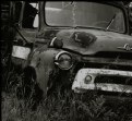
Critique By:
Nick Karagiaouroglou (K:127263)
12/8/2009 9:10:32 PM
The way the different surfaces of metal represent their own "quality! is incredibly well taken, Andre! From the shining reflecting chrome up to the rusty areas, it shows up all so well! So I think that both your focus and the xpsoure balance were great here! On the latter, I notice how real the anaglyph of the whole shape of the vehicle looks. Right clear to be not only seen but also felt.
The small loss of focus at the very right doesn't matter at all - quite the contrary, I would say! It adds some subtle "leading" towards the rest of the truck and especially towards its front left, which seems to me to be the main attraction here.
The plants and the grass add very good tension against the old iron and steel. This seems to enhance the typical "atmosphere" of such an image in B&W.
Very well done, indeed!
Nick
|
| Photo By: Andre Denis
(K:66407)
|
|
|
Critique By:
Nick Karagiaouroglou (K:127263)
12/8/2009 8:49:51 PM
Same with me Andre. That "motion blur" filter has a very obvious result in the sense that one can really see that it is not quite... "motion blur". It doesn't convince me at all but of course it is also a matter of exercise and working methods. I would rather prefer something like narrow DoF or real motion.
BTW, moving objects get a very "thin" and "airy" look when captured with slow speeds, especially humans, animal, etc. I don't see that coming so well formed from using that filter. This is just because the filter will apply a "uniform speed" to all parts of the obkect over the whole amplitude of motion and this doesn't happen this way with lovong beings. For example, the legs of a cat move much faster than the cat does itself when it is going quickly, and so the legs would appear more blurred than the body, and so on. I hope I was understandable here.
Nick
|
| Photo By: Andre Denis
(K:66407)
|
|
|
Critique By:
Nick Karagiaouroglou (K:127263)
12/4/2009 10:23:55 PM
Which will probably also include comments that are not "nice" at all, Kenan. ;-)
Cheers!
Nick
|
| Photo By: Kenan Pajević
(K:3169)
|
|
|
Critique By:
Nick Karagiaouroglou (K:127263)
12/4/2009 10:15:54 PM
Except for some slight tiny loss of sharpness on the face of the woman at the right, I find your focus quite reasonable here, Shyv. Perhaps she moved right when you pressed the shutter, but still there is also enogh detail on her face to see. The exposure balance was very very good, as it retained the nice gradients that build-up the releif and thus also the very nature, the shape of the face and the expression. But at the same time it also retained a reasonable strength of the reflections of the faces on the table. The combination of both is remarkable since the exposure balance must have really been a dance on the rope. The good vivid but not exaggerated colors put the finla finish on this one.
Good work, very carefully done!
Nick
|
| Photo By: Shiv Kumar Surya
(K:17362)
|
|
|
Critique By:
Nick Karagiaouroglou (K:127263)
12/4/2009 10:02:16 PM
Such a good, straight and powerful portrait, Stan! Marty excelled in this discipline! Not only because the details and the light balance are so strong but still natural, no. It is more than that. It is to use light for making it possible for the spectator to "extract" a 3D-shape out of a physically 2D-image. The power of that lighting is exquisite! Marty should give us some good lessons in real portrait photography, I guess. So... where is he? Come on man, help us!
As about your work in Silver Efex, it reaally seems to have only enhanced what must have been powerfull right out of the shot. The hard contours and the very silent expression are perfect. BTW, Stan, you have a strong face, do you know that? I don't mean simply "photogenic" but a face that implies that the his owner has felt the passage of many hard times.
Could that cooperation of Marty and Stan be continued, form time to time at least? I think we could all learn some good things from it. Anyway, one that *must* be awarded!
Hat off to you both!
Nick
|
| Photo By: Stan Hill
(K:35352)
|
|
|
Critique By:
Nick Karagiaouroglou (K:127263)
12/4/2009 9:41:30 PM
Very string, very powerful plasticity of the relief of the face, Aziz! It retained the expression extremely vivid, living, real! In this discipline you really excelled here, which means that your exposure balance was just about perfect. The string gradients are preserved so well, that turn the flat image to something that one might also touch!
The composition is just about perfect too. No obstacles, nothing too much and nothing too little. Straight and powerful!
And your focus worked also like a charm! In combination with the contrast of lighting between the main subject and the background the details achieve another level of quality and expressive power! BTW, the pixelations almost disappeared! Sharp but much much less stair-stepping effects than on previous postings of yours. Some of them are still there, like for example on some hairs of the beard, but they don't disturb.
Go further, continue!
Nick
|
| Photo By: aZiZ aBc
(K:28345)
|
|
|
Critique By:
Nick Karagiaouroglou (K:127263)
12/3/2009 9:10:13 PM
I just try to avoid the typical nonsensical three-words-messages of people that would say "wow wonderful" for any, but any image posted. When I comment, I try to transfer some content too with the message, Kenan. That's all, and it doesn't have to do with "success" and the like. It has to do with choosing between a conscious mind and the typical behavior of chicken gacking without a meaning all the time. Too many do the latter here, unfortuantely... :-(
But therea re also some really good guys with a mind for real exchange instead of smiles and lols all the time.
Cheers!
Nick
|
| Photo By: Kenan Pajević
(K:3169)
|
|
|
Critique By:
Nick Karagiaouroglou (K:127263)
12/3/2009 9:05:10 PM
And wweeeeeeet-wweeeeeeet thanks, Shiv!
Nick
|
| Photo By: Nick Karagiaouroglou
(K:127263)
|
|
|
Critique By:
Nick Karagiaouroglou (K:127263)
12/3/2009 9:04:07 PM
And excellent thanks too, Shiv!
Nick
|
| Photo By: Nick Karagiaouroglou
(K:127263)
|
|
|
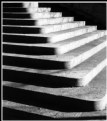
Critique By:
Nick Karagiaouroglou (K:127263)
12/3/2009 9:03:16 PM
A very nice concept and quite an absorbing pattern made up of lines, Aziz! The good exposure balance and the nice vivid colors put much life into it, and the contrasts between the highlights and the shadows add good tension.
Only problem, as so often... you don't seem to realize when oversharpening is simply too much, or do you? Look at the lines, they are not lines anymore but rather stairsteps and pixel groups! Those groups of pixels are visible already with the eye - they build patterns like skew checker boards on the leaves...
For heavens sake, could you attach the original? It is such a pity to contonue destroying good images just for never getting enough of PS sharpness.
Cheers!
Nick
|
| Photo By: aZiZ aBc
(K:28345)
|
|
|
Critique By:
Nick Karagiaouroglou (K:127263)
12/3/2009 8:47:41 PM
Hi Yazeed!
I hardly can see any "spirit" on such images, especially when the re-touch intoduces such bad artefacts. The highlights of the wood look much like "metal". The textures were blown up to such a degree that their conbtrasts are unnatural - this is what I see on the post. Less re-touch would be more in this case.
The image that ypu uploaded to photo.net looks much better than this one here. It lacks the "metallic" sharpness of this one but it looks way more like wood. This one here is almost aluminium, Yazeed.
Cheers!
Nick
|
| Photo By: M jalili
(K:69009)
|
|
|
Critique By:
Nick Karagiaouroglou (K:127263)
12/3/2009 8:27:57 PM
A very strange one and indeed a case of its own, Visar! You walk more and more the paths of the theater of the absurd, generating images that manage better and better to present surreal scenes out of familier subjects.
The composition and the whole design here could be really an image of some scene of such a theater play, or also a surreal image of some surreal piece of art. Some kind of a study of the humanum as an android embedded in the realms of "normal", which at the end turns out to by anything else than "normal". And the ballistic curve that is built by the three echos of that sphere makes it even stranger. The rather "negative-like" appearance adds much to that overall "strangeness" like when one can't understand the "usual" world at all. BTW, was that the result of the method that you told me about? Anyway, I inverted colors and the image is still good, but in not as a "surreal" way. (Attachment)
Very distinct work!
Nick
|
| Photo By: absynthius .
(K:20748)
|
|
|
Critique By:
Nick Karagiaouroglou (K:127263)
12/3/2009 8:09:09 PM
so, do you mean that this is not the original image, Ryca? If so, do you still have the original shot? Or what do you mean with "processing"? Anyway, in case you have the original, could you please attach it?
Cheers!
Nick
|
| Photo By: Ryca C.R.
(K:3895)
|
|
|
Critique By:
Nick Karagiaouroglou (K:127263)
12/2/2009 10:46:00 PM
Oh yes, indeed there are many good people here, Srna!
I really wonder... perhaps we could suggest some additional forum thread where they tell us about their methods and intentions for their great images? I know that this is always connected with additional work for the crew of the UF but then again, it could bring some life in this otherwise "soooooo friendly" place. OK, I was too ironic again but the thing is, it is such a pity to not have a common pot of knowledge, spiced up with all the excellence of such good people here...
Another idea could be some regular meeting, be it real or online. We really have to start exchaning minds in some more substantial way than the eternal "ooohh, great image"..
All these things I think about and still I have no real viable idea.
Cheers!
Nick
|
| Photo By: Srna Stankovic
(K:172232)
|
|
|
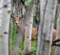
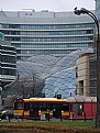
Critique By:
Nick Karagiaouroglou (K:127263)
12/2/2009 10:37:52 PM
Really, very very authentic the way you shot it, Dave! This one goes much more into the very "real", "natural" representation of the animal itself, but much more than that too. It makes ots own world so clearly visible. Much like exchaning the idea of a "living room" of a human with that of a deer. (Is that a deer, BTW?)
The sudden and repeating changes of focus and sharpness between the tree trunks and the animal itself, especially towards its head/face, make it look as a view with the own eyes rather than with the camera. And the timing also did much here, I guess. A split second later it might also look somewhere else and the power of the details of its expression might also have been lost.
The exposure balance must have been really hard here, having so many "problems" on the way. The truks have a much higher reflectivity and so alone the fact that you still managed to get a good exposure of the animal is by itself amazing. And the focus must have been hard too but you still got not only the details of the face. I see also good details on its greatly colored fur.
This one is another small class of its own for me. Nature, yes, but really very very rough and unspiled just the way it is in such woods.
Such a good job!
Nick
|
| Photo By: Dave Stacey
(K:150877)
|
|
|
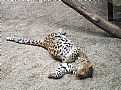
Critique By:
Nick Karagiaouroglou (K:127263)
12/2/2009 10:28:33 PM
It could have been much much more than "juat a nap", Ania! The timing (and also the luck) was great, to have the leopard lying this way. Surely it was a must to try a shot.
A bit of a closer frame would have doen better, as well as a bit of less exposure. The starting effects of overexposure are visible when you take a look at the histogram, and in this image the presence of so much light colored earth starts getting problematic when overexposing.
Then, I have to ask, did you apply sharpening aftewrads? If so, then the typical raising of the contous' brightness by sharpening could also have contributed to the rather "unnaturally hard" contrasts here.
BTW, how did you meter light in this case? Anyway, the attachment could perhaps be some hint for a better shot.
Cheers!
Nick
|
| Photo By: Ania Zielińska-Hoşaf
(K:61374)
|
|
|
Critique By:
Nick Karagiaouroglou (K:127263)
12/2/2009 10:18:50 PM
BTW, what was your focal length here, Ania? The wider angle end of your lens could prove very very useful.
Anyway, keep on going and keep the pot on the flame, as we say in Greek. (E.g., continue, continue "cooking" your photography.)
Cheers!
Nick
|
| Photo By: Ania Zielińska-Hoşaf
(K:61374)
|
|
|
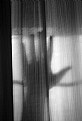
Critique By:
Nick Karagiaouroglou (K:127263)
12/2/2009 10:15:38 PM
Hmm.. very good idea for an abstract of a somewhat "theatrical" attitude, like so many things I see coming from the friends in Iraq... The ideas are there, certainly they are. But the "translation" of ideas into images still suffers from some things.
First of all composition. Too many unrelated things, here, I think. Too much content that doesn't have to do with the subject. A tighter crop?
Then, some more contrast wouldn't do bad at all. It would enhance that "theatrical" attitude of symbolism.
And then... wouldn't it be much more expressive to spread the fingers as wide as possible?
Anyway, just an attachment as a suggestion.
Nick
|
| Photo By: M jalili
(K:69009)
|
|
|
Critique By:
Nick Karagiaouroglou (K:127263)
12/2/2009 8:14:35 PM
Hi Andre!
Indeed, glare can be a nuicance but it can also turn to a bog help for enhancing the "metallicity" of the object. So, in case the are enough details it seems to be rather a helper than a problem. And here we have way more than "simply enough" details so that the glare is an additional plus for the image. Now I also see that it enhances another difference between the car and the rest of the scene. The car seems so "glossy" while the rest of the scene is rather "matte".
As about having also some panned images, well, at least for myself I don't worry at all. I know you will be at such rallies time and time agaon, so I just sit and wait in happiness. ;-) On the other hand, sometimes it is also advantageous to have a consistent style through all the photographed event - at least for all the part one was present at. And I am also glad to not see you adding "natural motion blur" made in PS, I must say. ;-)
Cheers!
Nick
|
| Photo By: Andre Denis
(K:66407)
|
|
|
Critique By:
Nick Karagiaouroglou (K:127263)
12/2/2009 8:06:48 PM
Very very well done, Kenan! The tension between the highlights of the distant sky and the black silhouettes on the foreground is quite string and attarct interest immediately. The good focus and the sharp contours on the foreground seem to stand in exactly the same spatial tension against the softer and diffuse background. The two things complement each other in the best way.
Perhaps some few unfinished things on the edges, but not anything really problematic, and as the composition also serves so well to making visible all those shines and dispersions on the leaves at the top, it seems to me that it fits exactly the purpose. The transition from shadows to diffuse highlights under the fog in the middleground is great too.
A good job!
Nick
|
| Photo By: Kenan Pajević
(K:3169)
|
|
|
Critique By:
Nick Karagiaouroglou (K:127263)
12/1/2009 11:01:00 PM
Thanks a lot for the info and the attachment, Yazeed!
Well, the original is definitely a case of strong underexposure. The histogram will tell you about that. It was such a strong underexposure that even the contrasts were diminished and so the focus looks even less sharp than it really was. In such cases it is very hard, if not impossible, to turn it to a "normal looking" exposure wothout introducing all the artefacts I was talking about in my last message. So we forget about "leveling to a normal degree".
A good compromise seems to be to partially adjust levels for some good contrast, still in the domain of underexposure but not as dark and contrastless. Then we also apply a slight little bit of USM, and we get the attached result. It does look dark but now the wooden textures and the browns are better, I guess.
Cheers!
Nick
|
| Photo By: M jalili
(K:69009)
|
|
|
Critique By:
Nick Karagiaouroglou (K:127263)
12/1/2009 10:53:38 PM
OK, I am waiting for that, Yazeed!
Cheers!
Nick
|
| Photo By: M jalili
(K:69009)
|
|
|
Critique By:
Nick Karagiaouroglou (K:127263)
12/1/2009 10:17:33 PM
Well... but beautiful thanks too, Shiv.
Nick
|
| Photo By: Nick Karagiaouroglou
(K:127263)
|
|
|
Critique By:
Nick Karagiaouroglou (K:127263)
12/1/2009 10:11:43 PM
Surely you didn't lose the day, Diego. I spoke about "could be", not about "must be". The image is already very very good the way it us.
BTW, it reminds me also of some of the timeless images of street and people photography. I think it got much less attention than it deserves until now.
Cheers!
Nick
|
| Photo By: Diego Bullita
(K:17017)
|
|
|
Critique By:
Nick Karagiaouroglou (K:127263)
12/1/2009 10:05:26 PM
Very good tonal range and exposure balance, Ryca! The composition in such a wide angle did contribute a lot for the good persoective and composition and it did also kept the grandiosity of the place. The water and the clouds seems to absorb the eyes of the spectator into the scene, right into its very own character. I am very glad to see that you used a wide angle lens here, quite in contrast to the many so many almost flat images of landscapes that we see so often here.
A little bit of clipping here and there is visible but at such hard light conditions it is already a small eye magnet for itself, to be able to retain good details both on highlights as also on shadows. Still the image seems to need a small bit of additional "bite" for my taste. Or perhaps I should visit it some more times and let it grow on me. Let's see.
Cheers!
Nick
|
| Photo By: Ryca C.R.
(K:3895)
|
|
|
Critique By:
Nick Karagiaouroglou (K:127263)
12/1/2009 9:51:41 PM
The only small problem I can see here is the little loss of definition on the very foreground, the head and the beak, Dave. perhaps a bit of motion blur? But even there we still can see well formed details. Of course the rest of the bird is of much much higher quality regarding details and exposure balacne. The rich and mature colors fit the textures of the feathers so well too. And all that in such a good contrast against the water surface. The latter seems to augemnt the good image by the captured wavelets and the progessive loss of focus into the depth.
Very well done again!
Nick
|
| Photo By: Dave Stacey
(K:150877)
|
|
|
Critique By:
Nick Karagiaouroglou (K:127263)
11/29/2009 9:38:38 PM
Quite clever, Aziz, and the exposure balance was also very adequate for enhancing your intention for the image. The railing stands in verys good contrast against the light background and the partial DoF helps it standing out strongly too.
There has been more potential here. The additional railing at the right is somehow too much for getting a good view of the (suggested) pentagram. It cancels a bit of the clarity and simplicity of concept. The not exact positioning of it also seems to take some additional of the possible power of this simplicity. Holding the lens exactly perpendicularly onto the railing and the street, and also in such a way that the "pentagram" is horizontal, would "straighten it out". The people at the background are good as "notes" - perhaps they needed some focus too.
Interesting idea and it has much potential.
Cheers!
Nick
|
| Photo By: aZiZ aBc
(K:28345)
|
|