|
|
Critique By:
Adam E. J. Squier (K:9803)
3/26/2003 3:13:41 AM
I, too, immediately thought of the Rush album when I saw this. I think it's obvious where the idea came from. Still, it's a good concept and executed well, if not original.
|
| Photo By: Mark Blanchette
(K:0)
|
|
|
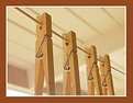
Critique By:
Adam E. J. Squier (K:9803)
3/23/2003 12:54:34 PM
I like the repitition of the clothespins. I just wish we could see the bottoms of them -- it would make the image perfect. The extreme DOF you get with a digicam always makes me do a double-take. I'm just not used to it, yet.
|
| Photo By: Kim Dodge
(K:109)
|
|
|
Critique By:
Adam E. J. Squier (K:9803)
3/22/2003 7:15:43 AM
Just beautiful. I can't see anything to improve this.
Regarding Gary's comment about "real" B&W film, I wouldn't really call T400CN that. It's closer to color film than some "real" color film. Heh heh.
I have mixed feelings about this (and other C41 B&W films), now. At first they were amazing, but now that most prints are made on a digital printer (Frontier, etc) you can just request a B&W print and get a very similar result. And with digital manipulation, the possiblities are even greater.
|
| Photo By: AGUS DWIANTO
(K:-14)
|
|
|
Critique By:
Adam E. J. Squier (K:9803)
3/22/2003 5:00:47 AM
There are a lot of puns today, eh? I would've recognized that wheel anywhere. But where's the emblem on the hubcap? ;-)
It would have been nice to see your face. Just "shoot from the hip" and it would have worked out.
|
Photo By: Wayne Harridge
(K:18292)

|
|
|
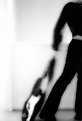
Critique By:
Adam E. J. Squier (K:9803)
3/22/2003 4:52:07 AM
Good shot. You got the right moment, here. My only gripe is there isn't enough space for the heads of the guitar. Looks cramped a bit. Also on top.
But it's certainly a covet-worthy guitar. ;-)
|
| Photo By: Ed Boardman
(K:53)
|
|
|
Critique By:
Adam E. J. Squier (K:9803)
3/22/2003 4:30:13 AM
What immediately drew me to this image was that it's in the same palatte as many of the watercolors I did in college. Well, not immediately as it's been a year and a half since it was uploaded, but anyway....
I think you've made a great image here. I love the vision. Just enough reality to be familiar, but abstracted enough to be fantasy. I love it.
|
| Photo By: Chris Whaley
(K:3847)
|
|
|
Critique By:
Adam E. J. Squier (K:9803)
3/22/2003 4:22:29 AM
Oh my. Thanks, Todd. I didn't catch the pun until you pointed it out. Clever, indeed.
Of course, if might have been funnier if the bass were a fish. ;-)
|
| Photo By: Poppy Blue
(K:249)
|
|
|
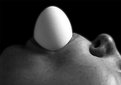
Critique By:
Adam E. J. Squier (K:9803)
3/21/2003 12:08:39 PM
Next time you do this, try not to think of where the egg came from. ;-)
I like this idea, but I don't know why there's a halo around the egg (and face). If it was a "natural" effect, I'd like to know how it was done. If digitally altered, I guess I'd like to know why it was added.
|
| Photo By: Hans-Christian Stoltz
(K:331)
|
|
|
Critique By:
Adam E. J. Squier (K:9803)
3/20/2003 3:58:51 AM
One of the hardest things about getting this picutre was making sure his hands stayed in the frame. They're always moving.
Yes, he is the master of baby expressions right now. We'll see how he is in a few months. I've got to say, it's fun having a baby around again. Well, at least most of the time. ;-)
|
| Photo By: Adam E. J. Squier
(K:9803)
|
|
|
Critique By:
Adam E. J. Squier (K:9803)
3/20/2003 3:30:10 AM
How was it composed? Not very well. ;-)
I was on a hike with my son and some other folks. I took a few photos of the other side of the canyon. This was the best of the lot. None were that good. This shot is fairly representative of my landscapes -- that is, not all that great.
This is in Southern California, near Redlands. Kind of between there and Big Bear. Beginning of July, high altitude, about 10:00 in the morning. I've almost removed this image several times.
|
| Photo By: Adam E. J. Squier
(K:9803)
|
|
|
Critique By:
Adam E. J. Squier (K:9803)
3/19/2003 8:00:56 AM
The building in the background is too distracting. A shallower DOF might have fixed this. The tree doesn't add anything, either.
For a shot like this to work, you either need more of the surroundings or none of them. As it is, it looks like a typical tourist shot of something weird they saw while on holiday.
|
| Photo By: Joffre Swait
(K:626)
|
|
|
Critique By:
Adam E. J. Squier (K:9803)
3/19/2003 7:55:34 AM
The nicks and dings in the body make this image something more than a catalog detail. It actually has been played. I think it would be stronger if the tremelo bar (or whatever that is) weren't in there. At first I thought it was a left-haded guitar because of it. I see now that it's just swung up to the top.
The glare is nice, but a bit too bright on the right side. I'd try this again without the tremelo bar and with a bit softer light. Maybe warm up the light, too.
|
| Photo By: Dario Diament
(K:83)
|
|
|
Critique By:
Adam E. J. Squier (K:9803)
3/18/2003 11:41:25 AM
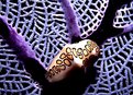
I like the mystery of this. At first I thought the "P" was a Japanese character "ka" -- more and more mystery. Nice job.
|
| Photo By: Yvon Loyer
(K:1449)
|
|
|
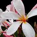
Critique By:
Adam E. J. Squier (K:9803)
3/18/2003 11:07:57 AM
I like the image, but it seems a bit cramped. Cropped a little too much.
The colors and water drops are exceptional. Looks like something out of "Closeups in Nature" or somthing. ;-)
|
| Photo By: Venicia L
(K:196)
|
|
|
Critique By:
Adam E. J. Squier (K:9803)
3/13/2003 11:57:08 AM
From the thumbnail, I thought this was in a toilet, which would have been really funny. I still like it. What did you use for the colors? Is that food coloring or dye?
|
| Photo By: Molly Walters
(K:1284)
|
|
|
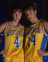
Critique By:
Adam E. J. Squier (K:9803)
3/13/2003 8:26:04 AM
Looks like we're missing a comment here. Was that Gary B?
In any case, the "don't mess with us" attitude is almost there, but the makeup on the girl on the left doesn't really fit the mood.
But what do I know? I also think there should be a hairlight.
|
| Photo By: Phillip Filtz
(K:1792)
|
|
|
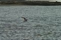
Critique By:
Adam E. J. Squier (K:9803)
3/13/2003 8:20:24 AM
There isn't enough of the shore showing to be of any use in the image, and you can't see the gull very well because of the backlighting.
This might work better if you cropped in real close to the gull and brightened it up a little.
|
| Photo By: Richard Heid
(K:71)
|
|
|
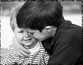
Critique By:
Adam E. J. Squier (K:9803)
3/13/2003 7:58:51 AM
This is nice. My kind of photo. One that people will look back on in 20 years with good memories. As a portrait, there are lots of things that could be better. But as a meaningful photograph, it's perfect. I wouldn't change a thing.
Except, maybe, the border you have on there. I don't think it adds much. This photo really stands on its own. A simple border would work much better.
|
| Photo By: Clarissa DeMauro
(K:54)
|
|
|
Critique By:
Adam E. J. Squier (K:9803)
3/12/2003 1:27:11 PM
There isn't really much going for this image. It looks like there was some camera shake, the figures are too dark, and the sun too bright. There isn't much you could do to get this shot correctly, though. Maybe use a tripod, but you'd still have the issue of the people being too dark. Fill flash might have worked but it looks like you were pretty far away from them so that's out.
With some photoshop work you may be able to get the exposure evened out, but the shakiness would still be there.
I'd try this again with a tripod (if you can). Unless, of course, it's a memorable shot for you and you don't care about any of the technical stuff. ;-)
|
| Photo By: Kim Barke
(K:278)
|
|
|
Critique By:
Adam E. J. Squier (K:9803)
3/12/2003 1:21:12 PM
This is two photos put together, right? I love the lines but there are some "jaggies" in the curves. Almost like the digital image was too small and then was upsampled. The pickups make it look like it's a Strat.
I'd like to see this as just one image without the "pseudo-reflection" that's here, now. Unless this is a straight photo. But I can't figure how that could be.
|
| Photo By: Antonio napoli
(K:0)
|
|
|
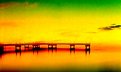
Critique By:
Adam E. J. Squier (K:9803)
3/12/2003 3:53:18 AM
There seems to be a little contrast problem. Probably because it was hazy that day. You could try using a polarizer but you might not have been able to get a sharp image, depending on how bright it was that day.
I imagine you had your lens zoomed out to the max, which also can cause you to lose contrast.
The good thing is that with a little Photoshop, you could probably get this to pop a little more, that is, to have more contrast.
About the image, now. It looks like a postcard. Someplace I'd love to visit, but probably won't unless someone wants to pay for the ticket.
My brother and sister-in-law and nieces have lived in Leysin for a few years and I keep hoping someone will say "here a ticket, go for a visit" but that hasn't happened, yet. ;-)
|
| Photo By: Christoph Schleiss
(K:87)
|
|
|
Critique By:
Adam E. J. Squier (K:9803)
3/12/2003 3:44:05 AM
I can't really tell what's going on, here, so I'll treat it as an abstract. The forms aren't really strong enough to stand on their own. I think if they were sharper, it would work better, but something just doesn't seem right. For some reason it reminds me of a person with their hands stretched in front with their palms up. Almost like they're carrying a big ball or in an act of worship.
|
| Photo By: Michal Wojciechowski
(K:1279)
|
|
|
Critique By:
Adam E. J. Squier (K:9803)
3/12/2003 3:39:34 AM
I like this. The fence going over their faces adds a sense of mystery. Almost like they're afraid of coming closer (I know that's not the case, but it looks that way).
The warm tones work well. The really make their skin glow. Very nice.
|
| Photo By: Dana James
(K:191)
|
|
|
Critique By:
Adam E. J. Squier (K:9803)
3/3/2003 3:28:37 AM
Beautiful, almost angelic, expression. My only gripe is that there's no definition under his chin, but that's probably the scan.
|
| Photo By: John O
(K:298)
|
|
|
Critique By:
Adam E. J. Squier (K:9803)
3/3/2003 3:25:21 AM
I don't know about this one. This effect got done so much it became cliche. Haven't really seen it in a while, though. It sort of gives the impression of speed, but not really. It's an interesting shot, but since it's been done so much, not all that special. Especially since it's so easy to do in Photoshop.
|
| Photo By: Danie van Jaarsveld
(K:148)
|
|
|
Critique By:
Adam E. J. Squier (K:9803)
2/27/2003 6:09:31 PM
Oh my, this is wonderful. I was going to say "nice lines" judging from the thumbnail, but those textures really make this one work well.
The silver nut at the top seems a little incongruous, but that could just be my trying to find _something_ wrong in an otherwise perfect image.
Really, on second thought, there's nothing you could do to improve this. Thanks for sharing.
|
| Photo By: Wallace Rollins
(K:149)
|
|
|
Critique By:
Adam E. J. Squier (K:9803)
2/27/2003 6:05:59 PM
Check. Isn't that the name of a computer? Heh heh. The colors here are fabulous, but there isn't much of a central subject. My eye wants to go all over the place. It doesn't land anywhere. Nor is it led anywhere.
This would be a good backdrop to something. I could see it as a background of a computer screen.
The bottom center flower could be the subject, but it needs to stand out a little more.
Also, you may want to upload a bigger (dimension) file.
|
| Photo By: Rena Schild
(K:2)
|
|
|
Critique By:
Adam E. J. Squier (K:9803)
2/27/2003 6:01:44 PM
I really like the way the river winds its way through this image. My only gripe is that it seems to have that usual west coast high altitude "look." A little harsh, probably because of the altitude and the rock colors.
It is beautiful.
|
| Photo By: Molly Walters
(K:1284)
|
|
|
Critique By:
Adam E. J. Squier (K:9803)
2/26/2003 3:50:42 AM
This is really pretty, but a little over exposed. There isn't enough contrast to really make it pop. It would look good as a decorator piece for someone's home
|
| Photo By: Aiman Nassar
(K:11961)
|
|
|
Critique By:
Adam E. J. Squier (K:9803)
2/25/2003 12:01:47 PM
Wow! Using an extension tube on a zone-focus camera. How in the world do you focus that? Does it use one of those frames that stick out from the lens?
Beautiful image.
|
| Photo By: Bob Jarman
(K:3145)
|
|