|
|
Critique By:
Gabriela Tanaka (K:16594)
4/9/2006 5:16:00 AM
I believe it is faithful to what the title says it is: a drawing from nature, but made with a camera!The rather stern, upright position is countered by the gracious shape of the flower, which flower is so elegant!The folds and turns and the colour stand for class!And the word that comes to mind when looking at it is: BEAUTIFUL!
Gabriela
|
Photo By: Giuseppe Guadagno
(K:34002)

|
|
|
Critique By:
Mary Brown (K:71879)
4/9/2006 4:29:38 AM
This is beautiful, Pierre. The elongated presentation works so well with this. The textures are superb and that little patch of light behind his head is very effectively placed. Your framing is very complimentary. Wonderful.
MAry
|
| Photo By: Pierre Martin
(K:3355)
|
|
|
Critique By:
Steve Aronoff (K:18393)
4/9/2006 12:41:45 AM
I love this photo, Dominik. The composition and tones are great. The nearly dog level perspective is quite fine, too. The only thing you might consider is to make the photo a bit more intimate and even more at dog level by cropping the photo to the bottom of the dark triangle in the upper right corner. On the other hand, the triangle adds a bit of balance. Nice work!!
Steve
|
| Photo By: good bye!
(K:-694)
|
|
|
Critique By:
Yahya El Hosafy (K:8369)
4/2/2006 8:16:20 AM
This is really a perfect Composition, if you set it up, it won't get better than this.
the big tree on the right, the trunk on the left, the little tree at the background and even the empty sky area at the top has some transparent branches.
All this surrounds this amazingly tones barn.
Perfect.
is this the barn that you posted before? the one with the ceiling or the side trick? 
well done.
|
| Photo By: Kathy Hillard
(K:25721)
|
|
|
Critique By:
Kevin Lanthier (K:3477)
4/8/2006 11:33:53 PM
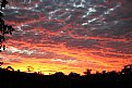
I'm going to take what Nicole and Edward said, and go one step further and suggest that this is about half of a really stunning image. I know, I myself have taken many pictures of amazing skies and wished there was something more worthy in the foreground. I think without that, you've got a nice background... but it's not a complete image unto itself, at least not enough to be a high-rated shot on a forum like this with so many great images and so many great photographers. Yes, this is a great sky, but until you put something equally spectaular in front of it, I'm afraid that to me, it's just an unused backdrop.
|
| Photo By: matthew morgan
(K:1539)
|
|
|
Critique By:
Hugo de Wolf (K:185110)
4/8/2006 10:52:41 PM
Hi Steven, Good High Key image, and a very good tonal range, and it's a very well balanced composition on its own.
Just thinking out loud: In high key images, I think it's essential to preserve a white space all around the image, as it boxes it in, and prevents a visible edge of the photo when presented against a white background. By capturing a section view, close up or part of a product, the cut edges always indicate the edge of the photo. reducing the functionality of the High key. But then again, how often is a photo placed against a white background? The background of Usefilm isn't white, that's for sure.
Still I think cutting off the any part of a high key image makes the edge of the photo more apparent. And as this is also a horizontally orientated image, it creates an rather large emptiness on top and below the image compared to the non-existent margin on the left and right, which also leads to a slight unbalance in the composition, I believe, but that's a subjective observation.
I do like the metaphore with man and woman you describe, though. It fits well. I think if you'd captured the knife and fork at an angle, with the pointy bits of the fork closer by than the stem, the perspective would've added to the composition without compromising the metaphore, and it would've also solved the edge-issue.
Looking at the panoramic format, I think the material is well captured using a combination of highlighs without blowing them out, and some specular yet non-descript reflections. But there's also some dust (I think, it doesn't look like noise) visible in the mid tones; maybe polishing the cutlery prior to shooting them could solve that, maybe it's something that occured during scanning.
I like it when a photo invites me to ramble on, and it's a good shot, and an even better idea. Good work!
Cheers,
hugo
|
| Photo By: Steven vanHaaster
(K:888)
|
|
|
Critique By:
Mary Brown (K:71879)
4/8/2006 9:50:58 PM
Hi again, Todd. I just showed Paul your gorgeous picture as he is a bird man. Of course, he agrees it is a terrific picture.
Do you mind if I make a suggestion? Before you print this out larger, take a look just to the right of his beak. His beak is pointing right to a small whitish spot. There is another one just up from it. Maybe I'm being over pernickity, but they seem to catch my eye as he does point to it. I'm just thinking that you might want to consider removing those two so there is nothing to distract from the beauty bird. Or, maybe I'm being a little too weird.
MAry
|
| Photo By: Todd Weeks
(K:7636)
|
|
|
Critique By:
Yahya El Hosafy (K:8369)
4/8/2006 8:07:34 AM
very nice composition Kike, the vertical lines are cool, i find the man at the forground the most interesting, as he looks like a diver preparing to take the jump, another man looking at him too as if he is watching.
well done.
|
| Photo By: kike Calvo
(K:11291)
|
|
|
Critique By:
Giuseppe Guadagno (K:34002)
4/8/2006 8:40:27 PM
Monika, since I admire your beautiful flowers in a white background I am often thinking about my background, quite inverted. I am considering to experiment your way.
The picture, splendid once again: a dreamy image of flighing tulips made of pure trasparent lights. Another photo of yours in My Favorite Images.
Have an happy Sundays Monika.
Giuseppe
|
| Photo By: narabia
(K:9563)
|
|
|
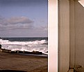
Critique By:
Steve Aronoff (K:18393)
4/8/2006 8:33:43 PM
A very nice composition, Romy. The step down of the wall is great. In the "about" you speak about how warm the water is here compared to further south, but I don't feel the heat. At least on my screen the colors seem muted. Not what I would expect in a hot area. I think enhancing the contrast and brightness would go a long way to bringing about more a feeling of heat while still being true to the title. My own personal taste finds the simplicity of the lines of the wall, bench, horizon, and shadows somewhat abused by the small, rather indistinct boat. I've appended a rough example of what I think would be a nice solution.
Steve
|
| Photo By: Romy Fabian Garmaz
(K:17105)
|
|
|
Critique By:
Bob Brins (K:4130)
4/8/2006 3:33:55 PM
I like this as its so strongly graphic. The regular repeated diagonal striping give life with pattern and bright tones. Thye play well against the insistently centered diagonal of the crack.
But, for me, the image goes beyond being only patterned graphic. The uncertainty in the upper left anc center have an interestingly menacing presence.
Bob
|
| Photo By: Simone Tagliaferri
(K:28180)
|
|
|
Critique By:
Ash (K:9427)
4/8/2006 12:15:21 PM
You have managed to get a crisp photograph while creating a soft tone, making this quite unique. The crispness shows off the detail in the flower, while the soft tone gives the photograph an intimate feel. Nice capture.
|
| Photo By: narabia
(K:9563)
|
|
|
Critique By:
Alice Ewing (K:2418)
4/8/2006 1:41:01 PM
Hi Ashley,
Clever use of perspective. I love the colours and detail of the tulip in the foreground. Well seen and captured.
One thing I think that would improve the image would be to crop some off the top of the photo.
Otherwise, clever use of having two features to fade in and out of as a viewer.
Cheers,
Alice. (thanks for your comment)
|
| Photo By: Ash
(K:9427)
|
|
|
Critique By:
Pr. Persikoff (K:664)
4/6/2006 11:01:40 PM
Wow! What a color. Is this for real or just a statement of an artistic impression? . Cheers.
|
| Photo By: Mike Bonsall
(K:79)
|
|
|
Critique By:
Joel Aron (K:14920)
4/6/2006 9:49:04 PM
Jill,
Very nice image. My comment is about the gradiant box. It took a beautiful image of a magnolia, and upstaged it. For my taste, the image would of looked better against a solid black background. The details, and DOF is so nice with this, that it does not have the power that it should have. Know what I mean? Even the fact that the branch is screened over by the white grad takes the depth away for me. The flower against black would look so elegant.
The flower itself is beautiful! Very well composed and exposed!
cheers,
-Joel
|
| Photo By: Jill Bartlett
(K:8130)
|
|
|
Critique By:
stingRay pt.4 . (K:250401)
4/6/2006 11:29:23 AM
Hi Kelly.....Canon do a very good macro ring flash, not sure how it would work with florals and their natural colours though. Had use of one nearly 20 years ago but not my cup of tea.
I like this lovely composition sweetie with it's delicate colouring and wonderful details. I feel that altering your ISO as Rina suggests might be the better alternative as flash can be too fierce on some images and PS work is time consuming and fraught with complications. I am so pleased that I have reached a posting from yesterday....I'm catching up at long last...My very best wishes to you as always sweet Kelly.....Ray
|
| Photo By: Kelly Duntley
(K:13889)
|
|
|
Critique By:
Del Metheny (K:25617)
4/4/2006 9:36:19 PM
Hi, your concept of showing just a part of the head form the back is great. I think the perspective here is excellent. Did you consider reducing the light sky in the upper left corner just a little so the eye was not drawn away form the center of the photo. Another alternative would but to crop off a bit of the top. I took the liberty of showing what I mean about reducing the brightness. Let me know what you think. I looked at several of your photos and am impressed. Del.
|
| Photo By: Laura Haw
(K:2696)
|
|
|
Critique By:
Sam Graziano III (K:14064)
4/2/2006 9:46:15 PM
Douglas, I do like the colors of the sunset. I am going to try and offer some suggestions.
1. composition, Well this shot is lacking a focal point. The foreground that you left in this shot is much to dark and much to tiny to be left in.
You have a boat in the shot, but you failed to seperate it from the darkness.
I have a work flow that would correct that problem. I would be happy to email you a tutorial on how to do it, or I can give you step by step instructions on here on how to do it.
I would have done something like my following example to get the most out of this shot.
Frist thing I would have done was to make a dup copy of it. Then create a new fill or adjustment layer and find the threshold points of the whites and blacks. when I found then I Marked the spot by using the color sampler. Spot#1 would be for the whitest point and spot#2 would be for the darkest part. so what you do to find the hottest point of your photo is open a threshold layer. move the slider all the way to the right until you only have a few tiny white dots. enlarge the image to a space big enough to use the color sampler. after you mark the spot a circle with the #1 will be on the layer. move the threshold layer to the trash and repeat the process to find the darkest point. after you disgard the black threshold layer. click on the create a new fill or adjustment layer and choose curves. when the curves diolog box opens, select the white color sampler on the lower right hand side of the curves box. While it is selected move it over the center most part of the white sample(#1) and click. next you would choose the black sampler and click in the dead center of the #2 sample on the image. then click ok. Next you would merge the curves layer down with layer#1 copy. Next you would do a levels adjustment layer and do the same process and merge it down when finished.
Next thing I did was to do a Channel Mixer adjustment layer. When the Channel mixer opened I type the following values into each of the channels.
Red source channel
red=144
green=-22
blue=-22
Green Source Channel
Red=-22
Green= 144
Blue = -22
Blue Source Channel
Red=-22
Green=-22
Blue=144
After you imput those figures click ok and merge it down. Or you can adjust the opacity of change the layer style.
After I did a Minor work Flow to your shot. Here is what I came up with.
Let me know if you could follow what I was talking about, I could send you screen shots and a pictured step by step tutorial if you like.
Thanks for Sharing and Keep up the good work.
Regards
Sam Graziano III
|
| Photo By: 神 風
(K:10665)
|
|
|
Critique By:
Steve Aronoff (K:18393)
4/2/2006 8:18:32 PM
Edgar, I think your idea is quite good. The composition is very nice. There are a few things that would enhance this photo to my mind.
' One is the composition. From your title I gather that this is about you and one other person. It might be nice to crop the photo in such a way as to include the flower and only one "star". This would make a more intimate scene.
' My personal taste would have more saturation and contrast to the flower. At least on my screen the appearance is dull.
' Finally, I think the green stem is fine but that its impact should be reduced by darkening it a bit.
' I've included a rough idea of what I mean.
So, I think a little more work would produce a photo with more dramatic impact and intimacy. But all this is just my opinion. It is a very nice photo.
Steve
|
| Photo By: Edgar Monzón
(K:827)
|
|
|
Critique By:
Csaba Molnár (K:5732)
4/2/2006 8:36:45 AM
A very nice and unique perspective dear Ali, I like it the colours and how clear the capture in spite of the fact you used ISO3200!
Congratulations!
Csaba
|
| Photo By: Ali Naghizadeh
(K:19600)
|
|
|
Critique By:
Dr. Rafael Springmann (K:89517)
4/2/2006 9:43:47 AM
I can see no trace of P.S. work. dear Marilyn, which seems to mean that it was done perfectly. The result must have been very good to begin with, the kid sillhuetted by the flame & taking many shots is what I also often do. Someone once said that if something is worth taking a photo of, it's worth taking several.
Thank you for your very kind comment on my "UFOs."
Best regards,
Rafi
|
| Photo By: Marilyn Nagy
(K:6008)
|
|
|
Critique By:
Matej Maceas (K:24381)
4/2/2006 10:01:56 AM
I also think it merits a print. The crop on the left is not a problem, but do consider printing with a black border to keep the eye in the photograph - I think this is extremely useful and effective when you have a lot of white areas like here, it will close the photo in a natural way. Also consider printing with a softer grade and/or do some burning to do away with all those blown highlights (shirt, balloons; sky as well but that's optional - it probably wouldn't hurt if you could get some hints of cloud detail out of the negative, but it won't ruin the photo if it stays as it is).
|
| Photo By: Roland Lacson
(K:12214)
|
|
|
Critique By:
Markus Scholz (K:23722)
4/2/2006 10:29:08 AM
Hi, Elisa, it's marvelous. There are similarities, but this one is much better. The strong geometric element of the road, leading to the dark mystery of the trees to the left, and this beautiful row of birches is a well balanced and beautiful composition. What we see here, is a real picture and not just patterns, like in mine.
Kind regards, Markus
|
| Photo By: NN
(K:26787)
|
|
|
Critique By:
Joel Aron (K:14920)
4/2/2006 10:14:14 AM
João,
wild composition. my first thought in viewing it, was that it reminded me of my childhood. Like an old memory of looking out a window at the ocean as a child, and this is my lasting image of that moment.
I love the dirt, the grain, the colors, and that grad on the top and bottom that give the feeling of an old photograph. very nice!
well done in my book!
cheers,
-Joel
|
| Photo By: João F * Photography
(K:41945)
|
|
|
Critique By:
Joggie van Staden (K:41700)
3/30/2006 8:10:32 PM
Not the same level of talent as most of the previous uploads but a very intersting abstract with great colours and a 3d layered effect. Great series Nigel. I would suggest the city farthers must appoint some photographers to record the ever changing face of these creations for safekeeping - since they are an important facet of each city's history. It might even make a very interesting project for the usefilm guys in your city or even some local camera clubs. Regards
Joggie
|
| Photo By: Nigel Watts.
(K:5236)
|
|
|
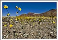
Critique By:
Joggie van Staden (K:41700)
3/30/2006 8:54:42 PM
The vastnessof desrt landscapes make it often very difficult to find a point of interest to anchor the shot in the foreground. You were fortunate here. A week or two earlier/later would have left you with a very monotonous foreground. I like the low angle and the bright yellow that ofsett beautifully with the dul grey and brown of the foreground. It also softens up some of the harshness of the area - inviting you to explore more. The one thing I wonder about is the time of day. This must have been taken closer to midday rather than morning/evening. A shot erly in the morning/late afternoon might have add a lot of mood and impact (e.g. yellow flowers turning gold against the lower light). But thats just nit picking - I know we dont always have time to stay or come back for that light conditions. Kind regards.
Joggie
|
| Photo By: Hugo de Wolf
(K:185110)
|
|
|
Critique By:
Jim Goldstein (K:21230)
3/29/2006 5:47:04 AM
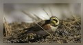
Cute shot. The one bit of constructive critisism that I can provide is to give a little more space between the bottom edge of the frame and the dogs paw. Oh and a little more depth of field to get the nose in focus would be on the wishlist, but I know all too well getting a dog up close in sharp focus is a tall order. They never sit still. Otherwise I think this is great.
|
| Photo By: Dan Lightner
(K:12684)
|
|
|
Critique By:
Eric Simpson (K:2348)
3/25/2006 2:30:39 PM
There are a couple of things you can do here. If you have photoshop or some other photo manipulation program, you might try adjusting the curves. In PS, you would open a curves dialog box, and hold down CTRL to click on the sky for example. This will put a "dot" on the curve at the appropriate place. You can pull the curve up or down to either bring down the exposure of the sky or bring it up. Then, do the same thing with the trees to bring that part of the curve up or down.
Another thing you can do is bracket your shot such that one is underexposed (to get good sky detail) one that has the proper exposure (for all the mid-range stuff) and one that is overexposed (to help capture those shadow areas). You can then merge 2 or 3 of the images into one to get awesome dynamic range. PS CS2 actually has this capability built-in in order to create a 32-bit image. Worth checking out.
|
| Photo By: Pam Heisler
(K:4032)
|
|
|
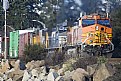
Critique By:
Doyle D. Chastain (K:101119)
3/24/2006 2:31:44 AM
Ty:
This is a nice capture with a great DOF, wonderful colors and a great subject that I would venture to say many people will enjoy. I especially like the three main areas, the rocks (with their colors and textures), the train, and the tree-lined backdrop. Each brings a fresh dimension to the overall composition.
The only critical suggestions I have would be that the blurry area above the first orange engine is a tad distracting. If it's steam or heat vapors, that's not quite clear and could probably be made more clear if the crop wasn't so low into it. The leading edge of the blurred area one can see a grey metal object with an oval, reminescent of a rear view mirror though it's probably an exhaust pipe, it's not clear what it is. I would seriously consider raising the ceiling (so to speak) and cloning out the circular area above the pipe.
You have a great capture here. Congratulations!
Regards,
Doyle I <------
|
| Photo By: Ty Olson
(K:37)
|
|
|
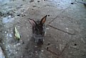
Critique By:
Inji Amer (K:22997)
3/21/2006 6:56:41 AM
what a funny shot Abdelrahman !!
on seeing this photo in thumbnail
I thought it for a donkey )
but for fun it was a rabbit !!
& you have shown us here a
fantastic way for shooting
& losing weight at a time !!
Bravo my friend !!!
Inji Amer
|
| Photo By: Abdelrahman Elwassimy
(K:3707)
|
|