|
|
Critique By:
Alisa Mudge (K:7511)

2/13/2004 3:06:14 PM
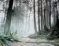
Hi Kim -
Here is my "enchanted forest" version. The greens are just a bit too frosty for me, but I love how the tilt of the composition leads you into the path and toward the light.
I added contrast and color by going to enhance/hugh*saturation/colorize and then playing with the color tones.
AM
|
| Photo By: Kim Culbert
(K:37070)
|
|
|
Critique By:
Alisa Mudge (K:7511)
2/13/2004 3:06:14 PM
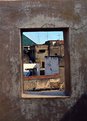
The inclusion of the tags gives some personality. Almost like a "group" trying on clothes.
Wonderful texture and color. You might want to try dodging the darkest part of the image.
Another shot like this by Phil Cohen:
http://www.usefilm.com/showphoto.php?id=2174
AM
|
| Photo By: Michal Wojciechowski
(K:1279)
|
|
|
Critique By:
Alisa Mudge (K:7511)
2/13/2004 3:06:14 PM
The sharpness to this is impressive. My eye bounces between the car and the person, enjoying the mood of the scene.
AM
|
| Photo By: Wallace Rollins
(K:149)
|
|
|
Critique By:
Alisa Mudge (K:7511)
2/13/2004 3:06:14 PM
A very nicely balanced design.
AM
|
| Photo By: Elizabeth van Hulst
(K:283)
|
|
|
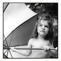
Critique By:
Alisa Mudge (K:7511)
2/13/2004 3:06:14 PM
Another issue of Martha is on the way.
I'm thinking more DOF as well. I'd like to see the shrimp more in focus. Hmm .. maybe that's just my stomach speaking.
AM
|
| Photo By: Elizabeth van Hulst
(K:283)
|
|
|
Critique By:
Alisa Mudge (K:7511)
2/13/2004 3:06:14 PM
Like something out of a dream.
AM
|
| Photo By: Ian T
(K:114)
|
|
|
Critique By:
Alisa Mudge (K:7511)
2/13/2004 3:06:14 PM
I'm a big fan of the holga.
This one I would like to see in b&w. The conflicting colors are just too choatic for me.
The movement with the vegnetting however, catches the eye.
AM
|
| Photo By: Ian T
(K:114)
|
|
|
Critique By:
Alisa Mudge (K:7511)
2/13/2004 3:06:14 PM
What caught my eye is how the bench just blends in with the trees and somehow gets lost with the matching.
I just wish I could see more footprints or texture surrounding the bench. However, when the frame rests against the bottom of my screen it doesn't bug me.
AM
|
| Photo By: Petra Engle
(K:1282)
|
|
|
Critique By:
Alisa Mudge (K:7511)
2/13/2004 3:06:14 PM
I have a serious case of photo-envy Mickey.
The tonality to this is perfect.
AM
|
| Photo By: michaelle .
(K:3807)
|
|
|
Critique By:
Alisa Mudge (K:7511)
2/13/2004 3:06:14 PM
Mickey!!!
For the love of all creation, this is gorgous!
Oh. I must be constructive.
That tiney little black speck (this is getting beyond picky) should be cloned out. The one to my lower left.
AM
|
| Photo By: michaelle .
(K:3807)
|
|
|
Critique By:
Alisa Mudge (K:7511)
2/13/2004 3:06:14 PM
Floyd ?
Where did you go? I would like to see some of the 2 years of photos that we have missed of this cutie.
You were using that camera last time I saw you :P
AM
|
| Photo By: Floyd Vaughan
(K:12)
|
|
|
Critique By:
Alisa Mudge (K:7511)
2/13/2004 3:06:14 PM
I think the tilt adds character.
The warm colors and shapes make this very pleasing.
AM
|
| Photo By: AJ Haselwood
(K:2148)
|
|
|
Critique By:
Alisa Mudge (K:7511)
2/13/2004 3:06:14 PM
Such a wonderful mood with character to this.
I am just wishing the hole on the top wasn't there, and that the side of her shape was tac sharp.
The angle you choose sets it apart from the rest.
AM
|
| Photo By: Fahredin Spahija
(K:98)
|
|
|
Critique By:
Alisa Mudge (K:7511)
2/13/2004 3:06:14 PM
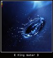
What a concept, just the splash without the drop.
Fun and unique. The toning is splendid.
AM
|
| Photo By: Sebastian Duda zolo2
(K:41)
|
|
|
Critique By:
Alisa Mudge (K:7511)
2/13/2004 3:06:14 PM
My vote is for the original. The tension/perspective makes it stand apart from other bug shots.
Pungent color and sharpness! Love it.
AM
|
| Photo By: Atamanka Agnieszka
(K:747)
|
|
|
Critique By:
Alisa Mudge (K:7511)
2/13/2004 3:06:14 PM
Very nicely put together. Not sure why this has not gotten more attention.
AM
|
| Photo By: rosemeire todao
(K:467)
|
|
|
Critique By:
Alisa Mudge (K:7511)
2/13/2004 3:06:14 PM
Ok.. It's good to know that I'm not the only one that saw something in this. This is an old shot that I found and thought I would try to improve somewhat.
Thanks everyone for your comments.
Maybe the next project could be recyling old photos.
Here is the eye sore that I started out with.
|
| Photo By: Alisa Mudge
(K:7511)
|
|
|
Critique By:
Alisa Mudge (K:7511)
2/13/2004 3:06:14 PM
If you shot this at a different time of day the light would of not been so harsh. The compostion works fine with her in her environment. The light should reflect the character of the person you are shooting. I would love to see this with warm inviting colors.
Hope this helps.
AM
|
| Photo By: Anindya Maity
(K:7880)
|
|
|
Critique By:
Alisa Mudge (K:7511)
2/13/2004 3:06:14 PM
Anne -
I miss your style. Where did you go?
Alisa
|
| Photo By: Anne Brown
(K:833)
|
|
|
Critique By:
Alisa Mudge (K:7511)
2/13/2004 3:06:14 PM
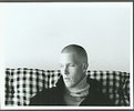
The simplicity of the minimalistic composition is quiet nice. Just wish you were in focus.
AM
|
| Photo By: jason grover
(K:90)
|
|
|
Critique By:
Alisa Mudge (K:7511)
2/13/2004 3:06:14 PM
I just love it when flowers are done like this. Yes, might be gorgous in b&w as well, but damn this is rich!
The DOF fits very well. This is art.
AM
|
| Photo By: rosemeire todao
(K:467)
|
|
|
Critique By:
Alisa Mudge (K:7511)
2/13/2004 3:06:14 PM
Oh beth!
Woman you are rockin' with your food project. The bold colors in this really make this sing. The dof is perfect. The one thing that bugs is that I would like to see more shadow detail to my left instead of the black hole.
This far superior to the ones I have seen hanging in Taco Bell.. Hmmm.. not really sure if that is a compliment, but you know what I mean :p
AM
|
| Photo By: Elizabeth van Hulst
(K:283)
|
|
|
Critique By:
Alisa Mudge (K:7511)
2/13/2004 3:06:14 PM
This is something else Larry. Interesting how the sepia gives this a movie set feel. Like the head is just a discarded prop. Nice work.
AM
|
| Photo By: Larry Edwards
(K:843)
|
|
|
Critique By:
Alisa Mudge (K:7511)
2/13/2004 3:06:14 PM
I love the simplicity and emotion in this.
AM
|
| Photo By: Bart Pogoda
(K:0)
|
|
|
Critique By:
Alisa Mudge (K:7511)
2/13/2004 3:06:14 PM
I have never done this because I think it borderlines rude, but this is my vision for this photo. I think that there are so many conflicting patterns that it distracts the viewer from the emotion felt by the boys. The image (to me) is all about the conversation this boy is having with his friend. I burned and blured the background. I'm sure that lessing the dof would be sufficiant on location.
Please tell me if consider this much editing to your lovely photo disrespectful. I may of over-dramatised my point.
AM
|
| Photo By: Bart Pogoda
(K:0)
|
|
|
Critique By:
Alisa Mudge (K:7511)
2/13/2004 3:06:14 PM
Being a preschool teacher I have taken a ton of photos of children. None of which have come out as impressive (and as filled with character) as this.
Thanks for the inspiration.
AM
|
| Photo By: Cheryl Jacobs
(K:122)
|
|
|
Critique By:
Alisa Mudge (K:7511)
2/13/2004 3:06:14 PM
The perspective of this is interesting. The lingerie looks like it would fit a doll. The sharpness of the textures is very pleasing to the eye. Makes me want to curl up and take a nap :P
AM
|
| Photo By: Cheryl Jacobs
(K:122)
|
|
|
Critique By:
Alisa Mudge (K:7511)
2/13/2004 3:06:14 PM
I see you went ahead and did the bottle project.
And boy did you ever! The colors on this are strong and the lighting just tops it off.
I think I'm with Eric, I would like to see all the writing going on behind the scenes.
|
| Photo By: Chelsea Burke
(K:5750)
|
|
|
Critique By:
Alisa Mudge (K:7511)
2/13/2004 3:06:14 PM
Thanks. I was very happy that the birds happend to land in the right spot. This was actually the first shot I took as I stepped out of the car. All the others lacked in luster.
Burim - No film, this was digital.
AM
|
| Photo By: Alisa Mudge
(K:7511)
|
|
|
Critique By:
Alisa Mudge (K:7511)
2/13/2004 3:06:14 PM
Interesting. I'm wishing there were more clouds.
I'd love to see this blow up filling an entire wall.
AM
|
| Photo By: Sean Fitzgerald
(K:310)
|
|