|
|
Critique By:
Kevin Collier (K:19076)
8/4/2005 8:17:50 PM
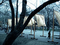
A very unique portrait - I like the compo..K
|
| Photo By: A. A
(K:1987)
|
|
|
Critique By:
C W (K:4458)
3/27/2005 1:54:22 PM
Have you manipulated this in Photoshop? I ask because the color seems a bit flushed. I do not see the bright vibrant orange associated with The Gates. Please check out my Gates photo.
http://www.usefilm.com/image/718237.html
|
| Photo By: A. A
(K:1987)
|
|
|
Critique By:
C W (K:4458)
3/25/2005 3:46:43 AM
This is absolutely beautiful! Great work!
|
| Photo By: A. A
(K:1987)
|
|
|
Critique By:
drilan P drilan (K:12030)
2/15/2005 8:44:53 PM
Bonne composition.
drilan
|
| Photo By: A. A
(K:1987)
|
|
|
Critique By:
Trish McCoy (K:15897)
2/5/2005 9:27:25 PM
gorgeous little one. I too love the cropping here. nice shot.
|
| Photo By: A. A
(K:1987)
|
|
|
Critique By:
Rachel Leah (K:26110)
2/4/2005 10:28:28 PM
Excellent shot! Her eyes are gorgeous and I love the angle you took this at! The cropping looks great as well! Nice work 
~Rachel~
|
| Photo By: A. A
(K:1987)
|
|
|
Critique By:
c c (K:13449)
2/4/2005 4:06:18 AM
This is wonderful. I love the tight crop and the intense angle. Wonderful!
|
| Photo By: A. A
(K:1987)
|
|
|
Critique By:
Bradley Prue (K:30678)

2/3/2005 11:45:48 PM
This is a thoughtful expression that you have captured, and cropped wonderfully! The tones are outstanding, and deserving of MANY comments and accolades! Bravo.. ...Brad
|
| Photo By: A. A
(K:1987)
|
|
|
Critique By:
Sai Siv (K:-265)
12/15/2004 4:55:27 AM
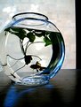
This is almost there! I think you have the concept dexactly right, you must reshot, it'll be a great stock photo!
Now this is what I'd humbly suggest, given the camera you are shooting with. I like the edge of the window on the right, leave it there. The angle is almost dead on, just needs to be a bit wider so you can see the left side of the bowl. The fish is too dark, if you wantt silhouette - then the fins show be too in shadow as well, but I suggest you get a desk lamp, better if its a halogen lamp and shine it from the top, thru the water, now see if you can get a blue plastic sheet or a mug or something of that sort to shine the light thru, as you don'w want to picture losing the blueish tone, its great. you might have to cut out a hole in a pieve of black cardboard to make sure the light does not spill over the glass and create a horrible shadow on the table surface. you'll have to move the light up and down to get the ratio between the ambient light and the halogen lamp right.. Good luck if you attempt it!
Sai.
|
| Photo By: A. A
(K:1987)
|
|
|
Critique By:
A. A (K:1987)
12/12/2004 4:05:19 AM
Thank you! It's funny, because I took this picture without almost thinking about it. It was one of those times when I was compelled to shot and did, but wasn't sure why and only took one shot, because the moment was over. Thanks again!
|
| Photo By: A. A
(K:1987)
|
|
|
Critique By:
Joshua Rainey (K:5069)
12/11/2004 8:05:30 PM
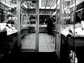
I nominate this pic as "officially amazing". One of your best for sure. Everything about it is absolutely perfect!
...
|
| Photo By: A. A
(K:1987)
|
|
|
Critique By:
Kevin Collier (K:19076)
12/11/2004 2:10:19 PM
wow - those dark eyes are spectacular . nice como. K
|
| Photo By: A. A
(K:1987)
|
|
|
Critique By:
Reynaldo Guimaraes (K:2422)
12/7/2004 11:11:52 AM
Wonderful photograph, AA.
Beautiful contrast, tones, model, all.
I loved this one.
|
| Photo By: A. A
(K:1987)
|
|
|
Critique By:
Steve Rosenbach (K:8338)
11/16/2004 1:39:41 AM
Hello A.A.,
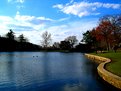
Your image here is beautiful and evocative. Excellent creative use of flare and dramatic backlighting. The diagonal flow of the scalloped shoreline in the foreground is a very strong design element.
Best regards,
SteveR
|
| Photo By: A. A
(K:1987)
|
|
|
Critique By:
Steve Rosenbach (K:8338)
11/16/2004 1:37:19 AM
Hello A.A.,
The s-curve of the stone embankment is such a strong diagonal that I agree with Steven H's suggestion on cropping.
Your original is very nice indeed, and with the cropping it's breathtaking.
Best regards,
SteveR
|
| Photo By: A. A
(K:1987)
|
|
|
Critique By:
bb mollins (K:1236)
11/7/2004 11:22:23 PM
allucinate!!!!wonderful!
|
| Photo By: A. A
(K:1987)
|
|
|
Critique By:
Roger Williams (K:86139)
11/6/2004 10:57:30 PM
Hi, A.A. Which program do you use for your photos? I'd be surprised if there isn't a "resize" button in there somewhere. Try the "help" forum; if you ask the question, someone's sure to know the answer. Usefilm is such a great resource!
|
| Photo By: A. A
(K:1987)
|
|
|
Critique By:
A. A (K:1987)
11/6/2004 8:46:02 PM
hi! thanks for the input, very much appreciated. i've tried to put some of my panoramic shots on usefilm, but they are too large and i don't know how to format them to meet the size requirement.
|
| Photo By: A. A
(K:1987)
|
|
|
Critique By:
Roger Williams (K:86139)
11/6/2004 8:11:36 PM
That's an interesting play of light in the hair around her face. Two thoughts: you could well have trimmed away some of the sky to increase the focus on the figure, and--always--try to get the feet in! The lack of over-saturated colour is refreshingly rare, and works well. By the way, I thought you were going to try panoramas!!
|
| Photo By: A. A
(K:1987)
|
|
|
Critique By:
CorrieLynn Jacobsen (K:9882)
10/10/2004 3:19:12 AM
Love the grain! Too bad her eyes arnt really showing...but its something beyond your control if you didn t want her to know you were photographing her.
|
| Photo By: A. A
(K:1987)
|
|
|
Critique By:
Kevin H (K:22502)
10/8/2004 1:18:57 AM
Great composiion with beautiful colors. It's too bad that you don't get any details from the woamn, as she's the main focus. Also I think a horizontal shot would be nicer. Keep up the good wokr.
|
| Photo By: A. A
(K:1987)
|
|
|
Critique By:
c c (K:13449)
6/27/2004 3:34:39 AM
Love the perspective...and that tongue sticking out slightly
|
| Photo By: A. A
(K:1987)
|
|
|
Critique By:
Don Loseke (K:32503)
6/14/2004 8:52:15 PM
Beautiful colors and well composed. Don.
|
| Photo By: A. A
(K:1987)
|
|
|
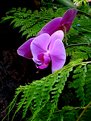
Critique By:
Paul Lara (K:88111)
6/13/2004 7:22:34 PM
This is a splendid Lily photo! I just posted one myself, and I love the way the lillies make my bedroom smell!
|
| Photo By: A. A
(K:1987)
|
|
|
Critique By:
waldemar ebner filho (K:5242)
6/12/2004 10:24:34 PM
A.d.A.,
Tanks for your comments, I like this picture,I would don?t crop like was to suggest,but maybe just after the 2 duck at left side,but never mind,is a very beautiful picutre.Hug
|
| Photo By: A. A
(K:1987)
|
|
|
Critique By:
giorgio ruffinengo (K:10623)
6/12/2004 10:19:16 PM
Also this one is very nice.
Well done
I love your job
see you soon
giorgio
|
| Photo By: A. A
(K:1987)
|
|
|
Critique By:
giorgio ruffinengo (K:10623)
6/12/2004 10:17:10 PM
wonderful, very nice!!
congrats
giorgio
|
| Photo By: A. A
(K:1987)
|
|
|
Critique By:
Richard Dong (K:1738)
6/12/2004 3:48:13 AM
Cool! I think I like it better with the bottom part cropped out but it's hard to tell by viewing this on the web. Looks like there is a lot of shadow detail that's not quite visible. Bet a print of this would look great.
|
| Photo By: A. A
(K:1987)
|
|
|
Critique By:
Paul Lara (K:88111)
6/12/2004 3:36:06 AM
Nice!
Now that is a VERY fresh view of something we see all the time!
|
| Photo By: A. A
(K:1987)
|
|
|
Critique By:
Kevin Collier (K:19076)
6/12/2004 3:33:29 AM
Great tones and composition .. K
|
| Photo By: A. A
(K:1987)
|
|