|
|
Critique By:
Bob Tomerlin (K:5460)
8/2/2003 6:23:43 PM
Cute - I think the features that really make the shot are your focus on the baby's face, and also the reflections on the wall.
I don't know anything about your camera, but sometime you might want to try this again and zoom in a bit more on her face - although the overall view with those pudgy arms reaching up is retty cool, too.
BTW - check out my shaking dog - its pretty good for a chuckle!
|
| Photo By: Nancy Armstrong
(K:84)
|
|
|
Critique By:
Rodney Glover (K:460)
8/2/2003 3:44:16 PM
Well done Nancy. Good exposure in a tricky situtation. Go shoot some photos. 
|
| Photo By: Nancy Armstrong
(K:84)
|
|
|
Critique By:
Karen Siebert (K:12076)
8/1/2003 10:16:02 AM
Cute! I like the edge effect you have used.
|
| Photo By: Nancy Armstrong
(K:84)
|
|
|
Critique By:
Karen Siebert (K:12076)
8/1/2003 10:12:52 AM
I had not read Leslie's comment - but she makes a very good point on how to improve what you have here. I believe it would improve the composition of this alot. You will probably be surprised. Just make sure to do the crop above the knee not at the knee.
|
| Photo By: Nancy Armstrong
(K:84)
|
|
|
Critique By:
Karen Siebert (K:12076)
8/1/2003 10:09:55 AM
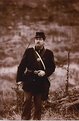
All in all - a pretty nice shot (especially considering you are new to photography. Basically, what Bob said really hits the nail on the head. Rule of thumb to any portrait is you can zoom in as close as you want but you generally dont want to cut someone off at any joint. (wrists, ankles, etc. If more than 3/4 of a persons body is in the frame; you want to make sure all limbs are fully in frame. In this case - you had plenty of room at the top; adjusting your frame would have made this an excellent portrait. I really like the toning. And dont feel bad, I have been into photography for about 2 years and I still do things like this from time to time, especially in dealing with children and looking for that special expression. You are off to a good start and it looks like your brother in law is giving you good, sound and constructive advice. You are fortunate. Will be looking forward to seeing some new uploads from you.
|
| Photo By: Nancy Armstrong
(K:84)
|
|
|
Critique By:
Anna Dill (K:3872)
7/31/2003 11:17:12 AM
Very cute photo. Nice capture of the baby. Lighting here is good.
|
| Photo By: Nancy Armstrong
(K:84)
|
|
|
Critique By:
Leslie Cohelan (K:20807)
7/30/2003 11:44:29 PM
Hi Nancy and welcome!...nice and sharp and a warm feeling with the sepia tones...my first question to you would be do you use any post editing software?...the feet have been mentioned...but a little cropping could improve what you have...bring the top down ...crop some from the right and a bit off the left...then crop up above his knees...I know it sounds like a lot but I think the end result is a better composition
|
| Photo By: Nancy Armstrong
(K:84)
|
|
|
Critique By:
Kristina Kohut (K:49990)
7/28/2003 1:28:27 AM
Thanks for you kind comment, Nancy! :-)) I think this photo is so great and very interesting! The only problem is the chopped feet, it would have been excellent if you kept them. But the rest... just so great! It feels so old, especially with this nice sepia toning! Maybe a tiny bit dark, but it could be just my screen.
|
| Photo By: Nancy Armstrong
(K:84)
|
|
|
Critique By:
T Glow (K:14955)
7/27/2003 10:23:41 PM
very good work.. with nice details. like this sepia. Regards,T.
|
| Photo By: Nancy Armstrong
(K:84)
|
|
|
Critique By:
Bob Tomerlin (K:5460)
7/27/2003 8:10:44 PM
Hi, Nancy - a nice picture, but just a couple of comments.
First, somebody shot off his feets!!
Also, since he's looking to the left, the picture might look a little bit better if he was positioned more to the right of the frame. But, that plant to the right adds a bit of interest, too. Finally, the sepia tone is a nice choice of this picture.
It's nice and sharp, and an image not many of us get a chance to photograph.
(I have to be relatively nice to her - she's my sister-in-law)
|
| Photo By: Nancy Armstrong
(K:84)
|
|