|
|
Critique By:
Ade Rixon (K:223)
1/17/2006 9:14:26 PM
Beautifully caught and treated, and not the kind of shot I would ever expect from a digital compact! Excellent work. The softness of the lighting is wonderful and the various elements come together so well.
|
| Photo By: Cristina D
(K:8080)
|
|
|
Critique By:
Ade Rixon (K:223)
1/17/2006 9:10:03 PM
Nice shot, well seen or set up. Appalling pun though. ;-)
|
| Photo By: Barrie Cranston
(K:172)
|
|
|
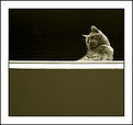
Critique By:
Ade Rixon (K:223)
1/17/2006 9:06:48 PM
This is great for an informal portrait. Obviously grainy and caught on the hop, it captures an emotion and a moment well.
|
| Photo By: David Mongeau-Petitpas
(K:2068)
|
|
|
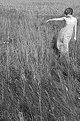
Critique By:
Ade Rixon (K:223)
11/27/2005 9:13:19 PM
Andrea, you left a kind comment on my "Dreaming in the meadow" picture. I feel this picture is almost a counterpart, if that isn't doing it a disservice. Great pose and composition - very well conceived. Pat's sepia version adds some pleasing warmth and brings out the tones more.
|
| Photo By: Andrea Elizabeth
(K:20)
|
|
|
Critique By:
Ade Rixon (K:223)
11/27/2005 9:02:12 PM
Paula,
Always good to receive some constructive alternative suggestions. I feel that the black foreground helps stop the eye sliding off the bottom of the picture, while the shadow across the table follows and emphasises that cast by the glass. However, it's obviously subjective. Many thanks for your comment.
|
| Photo By: Ade Rixon
(K:223)
|
|
|
Critique By:
Ade Rixon (K:223)
11/9/2005 8:56:24 PM
Great subject and light, Tracey. Yep, Holgas are addictive.
|
| Photo By: Tracey MacLeod
(K:3244)
|
|
|
Critique By:
Ade Rixon (K:223)
9/26/2005 8:42:19 PM
Can't figure out any part of this, but I love it. Great tones and textures, with effective contrast.
|
| Photo By: Paula Grenside
(K:2811)
|
|
|
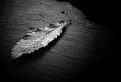
Critique By:
Ade Rixon (K:223)
9/8/2005 9:00:21 PM
An excellent spooky and atmospheric shot - great shadows. I take it you did some postprocessing to get the "lo-fi" feel? The lone figure is particularly effective.
|
| Photo By: Michael Rydh
(K:111)
|
|
|
Critique By:
Ade Rixon (K:223)
9/8/2005 8:58:44 PM
A really nice, minimal composition yet with plenty of detail to absorb.
|
Photo By: Efisio Mureddu
(K:13104)

|
|
|
Critique By:
Ade Rixon (K:223)
9/8/2005 8:54:45 PM
Likewise, excellent tones and detail.
|
| Photo By: Jeno Apu
(K:1318)
|
|
|
Critique By:
Ade Rixon (K:223)
9/8/2005 7:36:24 PM
Just wonderful. The bike half in shadow makes it.
|
| Photo By: Jeno Apu
(K:1318)
|
|
|
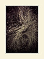
Critique By:
Ade Rixon (K:223)
9/2/2005 11:52:26 AM
Superb. Nice use of the shapes in the grass and a real intimacy.
|
| Photo By: Jeno Apu
(K:1318)
|
|
|
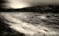
Critique By:
Ade Rixon (K:223)
9/2/2005 11:51:15 AM
Great clouds, a real maelstrom. Have you seen any of Lee Frost's Northumberland shots? He's done several of Dunstanburgh and Bamburgh castles similar in composition to this.
|
| Photo By: Mark Evans
(K:17428)
|
|
|
Critique By:
Ade Rixon (K:223)
9/2/2005 11:45:04 AM
Great moment, especially the expression and the reduced contrast on the girl behind due to the water. Are they related? Could almost be a "trick shot" of the same child!
|
| Photo By: Tim Morgan
(K:1023)
|
|
|
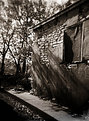
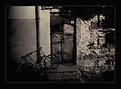
Critique By:
Ade Rixon (K:223)
9/2/2005 11:39:14 AM
Lovely shot, tone and atmosphere. Not sure what the object on the right of the frame is - wonder how it would look if you cropped most or all of it out and went in tighter on the broom and wall?
|
| Photo By: david george
(K:481)
|
|
|
Critique By:
Ade Rixon (K:223)
8/31/2005 11:49:24 AM
This picture has been hanging on my wall for over a year and I hadn't noticed the spots! Must use my eyes a bit more often. Thanks for your comment, I'll bear it in mind.
|
| Photo By: Ade Rixon
(K:223)
|
|
|
Critique By:
Ade Rixon (K:223)
8/30/2005 11:44:49 AM
I'm not qualified to comment on the visual arrangement, but you've chosen some great shots here and put them together in the right order. I like the similarities across the diagonals, and yet the way they also flow in a sequence left to right.
|
| Photo By: Tracey MacLeod
(K:3244)
|
|
|
Critique By:
Ade Rixon (K:223)
8/29/2005 2:05:07 PM
Great abstract, good arrangement of tones.
|
| Photo By: sherif abuzaid
(K:24)
|
|
|
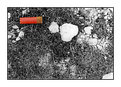
Critique By:
Ade Rixon (K:223)
8/27/2005 1:21:36 AM
Title, composition and technique have come together nicely here. It does make you pause for reflection. I see the stones as somehow symbolic of the bird, next to the cartridge.
On a minor practical note, could do with darkening the stone intruding on the bottom right corner, as it seems to lead the eye away from the centre.
|
| Photo By: Simone Tagliaferri
(K:28180)
|
|
|
Critique By:
Ade Rixon (K:223)
8/27/2005 1:15:19 AM
Very minimal and slightly off-the-wall - I like it a lot, particularly the lone bird in the sky. Good title too.
|
| Photo By: o spaske
(K:291)
|
|
|
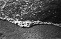
Critique By:
Ade Rixon (K:223)
8/27/2005 1:07:39 AM
There's a nice, peaceful mood about this shot. I agree that there may be too much space in the left half of the frame, but a simple crop might improve this. Everything else - colours, ripples, reflection - works really well.
|
| Photo By: Sean Carleton
(K:63)
|
|
|
Critique By:
Ade Rixon (K:223)
8/27/2005 1:04:54 AM
Obviously a common choice of viewpoint, Sean! You clearly had better weather though, although the changeability when we were there helped add some drama to the sky. Have you tried desaturating your shot? Thanks for commenting.
|
| Photo By: Ade Rixon
(K:223)
|
|
|
Critique By:
Ade Rixon (K:223)
8/25/2005 1:55:41 AM
Many thanks for all your kind comments, and for the thoughtful suggestion, Sally. I tried the crop but can't decide whether or not it unbalances the image.
|
| Photo By: Ade Rixon
(K:223)
|
|
|
Critique By:
Ade Rixon (K:223)
8/25/2005 1:45:02 AM
Sharp, well-composed and executed - what's not to love?
|
| Photo By: Sally Morgan
(K:9219)
|
|
|
Critique By:
Ade Rixon (K:223)
8/25/2005 1:39:50 AM
You've captured a nice moment here; it's great that the girl is completely unaware of the camera (or anything else in the room!). Maybe crop some of the wall out on the left hand edge?
|
| Photo By: Tracey MacLeod
(K:3244)
|
|
|
Critique By:
Ade Rixon (K:223)
8/24/2005 1:29:54 PM
Lovely soft DOF and sound choice of setting to complement the shapes. Potentially the front edge of the man's ring could be sharper, but you could slice it a number of ways and this works as well as any.
|
| Photo By: Tracey MacLeod
(K:3244)
|
|
|
Critique By:
Ade Rixon (K:223)
8/24/2005 1:01:52 AM
Grain and tone works well with this image. Nice composition between the paving and the tree shadow.
|
| Photo By: antonu stil
(K:-125)
|
|
|
Critique By:
Ade Rixon (K:223)
8/24/2005 1:00:31 AM
Well spotted. I find myself wanting to crop a little more off the bottom, but this may be only a minor subjective point. I like the motion blur on the last pigeon.
|
| Photo By: Rafal Budzowski
(K:51)
|
|
|
Critique By:
Ade Rixon (K:223)
8/24/2005 12:52:55 AM
Very enigmatic, and so well composed.
|
| Photo By: Jeanette Hägglund
(K:59855)
|
|
|
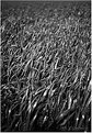
Critique By:
Ade Rixon (K:223)
8/23/2005 12:01:26 PM
Lovely tonal and DOF control. Unfortunately, the bokeh is a little harsh at the top and there are some jagged edges on the sharpest blades, but these minor flaws might be fixable in PS.
|
| Photo By: Christos Giachritsis
(K:38)
|
|


 Das")