|
|
Critique By:
Joe Johnson (K:8529)

8/31/2009 6:38:38 AM
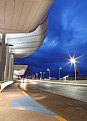
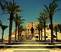
As CC, I'd say that it shows off the technology, very well, with a difficult night photo showing everything is kept within range. The composition is fine, also, because it leads you in to a lower thirds horizon.
|
| Photo By: Dave K
(K:-171)
|
|
|
Critique By:
Joe Johnson (K:8529)
8/31/2009 6:32:30 AM
As CC, I like the texture of the brick, etc. Knowing it's the south of France near Monte Carlo is interesting. But the photo seems to be more of the ship, itself. I can't identify the line or the ship. But I thought if you have sufficient resolution in the original that something more like this would show the frame as frame, and point to the ship, as well.
|
| Photo By: Serge Moscow
(K:-2917)
|
|
|
Critique By:
Joe Johnson (K:8529)
8/11/2009 11:44:25 AM
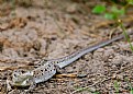
As CC, I think it's a very nice stock shot of a small lizard, caught at what appears to be a sufficiently low angle. But for depth of field, I think I'd just crop a lot of the tail. I like these photos because these little guys are very skittish. Just when you're about to click the shutter, off they scurry.
|
| Photo By: Mohammed Iskhakov
(K:1855)
|
|
|
Critique By:
Joe Johnson (K:8529)
8/5/2009 8:52:14 PM
As CC, I'd say this is a very nice puddle shot. I like shooting puddles come fall and winter precisely for the texture framing the reflection. And here you got the sun behind the tree, as well. The aspect ratio suits the tall tree, and the clouds appear to be laying on the ground. I think it's well done.
|
| Photo By: Tom Ravisé
(K:5082)
|
|
|
Critique By:
Joe Johnson (K:8529)
7/29/2009 4:15:12 AM
As CC, I'd say it's as much PS graphics as a photo. But dead leaves DO make for fine photos. The edge on this suits it. Tough to be a background, because it's interesting. As a booklet or menu cover, I think any lettering would go outside the rectangle, here. Nicely done.
|
| Photo By: Malules Fernandez
(K:54810)
|
|
|
Critique By:
Joe Johnson (K:8529)
7/27/2009 4:45:08 PM
As CC I'd say it's interesting, as in are you going into danger by climbing the berm or are you fleeing it by leaving the pit? The clouds at the top make the photo, giving a sense of dread either way, and also that you incorporate for the dark but still visible shadows. Good photo.
|
| Photo By: James Crotty
(K:2083)
|
|
|
Critique By:
Joe Johnson (K:8529)
7/27/2009 4:34:49 PM
The old strip is under a big canopy some blocks away. I guess this is the 'new strip'. As CC, I think it's fine and shows off a good dSLR. Cloud conditions didn't all for all one might want. But I like it.
|
| Photo By: Mike O'Brien
(K:287)
|
|
|
Critique By:
Joe Johnson (K:8529)
7/24/2009 3:36:54 PM
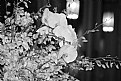
As CC, I don't know but I find the lamps distracting. These flowers really lend themselves to black and white. And you've got a nice little composition curve going there. I'd say, if you like, try a lot more angles, and both close and away. It's a photogenic plant.
|
| Photo By: Theron Williams Sr
(K:1459)
|
|
|
Critique By:
Joe Johnson (K:8529)
7/24/2009 3:33:35 PM
As CC, I'd say all photographers love the bee in flower shots. I've sure got my share. Sharp. Great purple coloring - great colors. And the graphics edge you prepared is really well-suited, and nicely done. Maybe overlay a faded red/pink field on the whole thing, as just one thing. It's basically a card background. Heck - you could frame it in large format. I like it a lot.
|
| Photo By: Gaetan Dery
(K:718)
|
|
|
Critique By:
Joe Johnson (K:8529)
7/24/2009 3:30:29 PM
As CC, I think I might have taken a slightly lower angle. I think there's too much 'dark frame' from the foreground and trees. But it's a fine photo. The little sailboat is a nice touch. Draws the eye right in where you want it.
|
| Photo By: Ali Almossawi
(K:167)
|
|
|
Critique By:
Joe Johnson (K:8529)
7/24/2009 3:27:47 PM
As CC, it's got the diagonal on the face and horns, and the grass just behind. It's almost as if one wants the deer to be just slightly more in the photo. And one does wish the light hit the face differently. But still, what should be in the photo is in focus. And it's good job.
|
| Photo By: Brigitte R.
(K:25989)
|
|
|
Critique By:
Joe Johnson (K:8529)
7/21/2009 3:39:55 PM
For CC, I think it's a fine photo, with the obvious compositional diagonal, good exposure shadow and brights, and no distracting background. It's well done.
|
| Photo By: April the 1st
(K:24)
|
|
|
Critique By:
Joe Johnson (K:8529)
7/16/2009 8:02:01 AM
As CC, I'd say that is definitely one shot you'd want at the show, and with a water foreground. So - very good. I wish the photo was bit larger.
|
| Photo By: Brent Mills
(K:758)
|
|
|
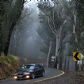
Critique By:
Joe Johnson (K:8529)
7/16/2009 8:00:01 AM
As CC, I'd say it's interesting, and surprising what tones the E-510 can deliver. It's as if the driver feels he's being chased in the 'dark wood'.
|
| Photo By: Wayne Harridge
(K:18292)
|
|
|
Critique By:
Joe Johnson (K:8529)
7/16/2009 7:57:03 AM
As CC, I'd say you really got some good refractions in the drops, which is most of the 'battle' in these water drop stills. I just wish the photo was a little larger, to see just a little more detail.
|
| Photo By: Ibrahim Almulhim
(K:245)
|
|
|
Critique By:
Joe Johnson (K:8529)
7/16/2009 7:54:19 AM
As CC, I'd say - good job on the multiple photos. For action or 'found' shots, which are so numerous, photographers have to do that, or they can waste a great opportunity (even a rare opportunity). One or two of the bunch WILL look just great, right in that focus band. Time you don't have. But you do have skill, knowledge of your camera, of filters and exposures, and just hope it all comes together. And, yes, this is a stock photo that one wishes were typical of stock photos. Good glass and sensor. That D300 is doing a nice job, there, too.
|
| Photo By: Saad Salem
(K:89003)
|
|
|
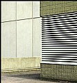
Critique By:
Joe Johnson (K:8529)
7/16/2009 7:47:54 AM
As CC, I'd say about this line and plane abstraction that some might still be distracted by the objects. For me, I like what you've done. But somehow, I sense there's a better angle in there somewhere. But it's a good look at what others might miss. So, good photo.
|
| Photo By: James Fraser
(K:941)
|
|
|
Critique By:
Joe Johnson (K:8529)
7/16/2009 7:45:18 AM
As CC, I'd say it's a good shot and metaphor for children exploring what must seem an oddly shaped world to them. Here the distance suggests height, and seems to distort his ground. The oddness I think suits his curiosity about his world. He just takes it in, as it exists. As for the photo's construction, it's effective the line leads from the corner to the boy, which is what I think is happening, and particularly the less visible worn portion of the road (he's walking right down the line).
|
| Photo By: Carrie RW
(K:-175)
|
|
|
Critique By:
Joe Johnson (K:8529)
7/16/2009 7:40:39 AM
As CC, I'd say that the tilted background might be distracting, that the real shot is either further back (out and away) to catch more of the lance, or chest-high closer up on his face (it looks like a pretty good zoom/telephoto as is). This is sort of inbetween. At any rate, the angle might be wrong in any case. But it's a good record photo, if slightly blurry. I think this sort of 'found' shot is better if you run multiple frames. Just keep the camera clicking. You won't know which is best until you look at them. But it would give you more options. Also, with such bright and shadow, maybe shooting RAW would also give more options. And don't forget polarizing and similar filters.
|
| Photo By: Rui Baess
(K:590)
|
|
|
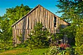
Critique By:
Joe Johnson (K:8529)
7/1/2009 12:11:17 PM
If not for all the bright greenery, I'd think this was shot in Detroit. As CC, I like the photo for the framing, the color. It's difficult to tell the whole story you want with just such a photo. I wonder if there's also a photo from the front of the structure?
|
| Photo By: Gaetan Dery
(K:718)
|
|
|
Critique By:
Joe Johnson (K:8529)
6/26/2009 2:55:58 AM
As CC, I'd say good expression, and she overwhelms any background - because her posture and expression are interesting. She's demanding attention. Still there's a lot there and maybe a crop would isolate things better. It's a classic 'A-frame' composition.
|
| Photo By: Pablo Dylan
(K:63918)
|
|
|
Critique By:
Joe Johnson (K:8529)
6/26/2009 2:50:04 AM
As CC I'd say that you have a yellow tint, perhaps on purpose. It might be interesting, though, to see it in true color. Without a shift/pc lens at the site of the photo, the trees will do that, bend in. It might also be interesting to try to straighten them with a filter, so long as the foreground and object structure aren't noticeably deformed.
|
| Photo By: Ali dewchi
(K:15992)
|
|
|
Critique By:
Joe Johnson (K:8529)
6/21/2009 2:17:18 PM
Is this a geodesic dome inside the NAC building in Ottawa?
|
| Photo By: James Fraser
(K:941)
|
|
|
Critique By:
Joe Johnson (K:8529)
6/20/2009 8:19:24 AM
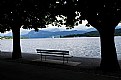
As CC what caught my eye were the shadows. The bench and man could be connected but seem like two photos in one. But the shadows seem to connect better. That blue tint is slight, but you can see it. If one goes in PS, and desaturates, one can slide the fade back and forth to see the slight change from 'gray' to blue. Maybe even a slight green shade would work for me.
|
| Photo By: Paolo Corradini
(K:59552)
|
|
|
Critique By:
Joe Johnson (K:8529)
6/18/2009 5:29:38 PM
Sorry, forget the rework:
|
| Photo By: The Pilgrim
(K:64989)
|
|
|
Critique By:
Joe Johnson (K:8529)
6/18/2009 5:29:12 PM
As CC, I'd suggest that even a snap can be brought out. It's really a close-up, either shoulder up with cropping top of head, or pulled back a bit. But once you have the 'gang signs', you have to get those, so it's most of both torsos. I rotated slightly, and brought out some of the light you could get by overexposing on the shot.
|
| Photo By: The Pilgrim
(K:64989)
|
|
|
Critique By:
Joe Johnson (K:8529)
6/17/2009 1:02:01 PM
For CC, I think it's 'textbook' thirds as a study. You could probably also center between black bars and the bridge of the nose would still be on a 'power point'. Nice job.
|
| Photo By: Chris CC
(K:1510)
|
|
|
Critique By:
Joe Johnson (K:8529)
6/17/2009 12:53:58 PM
It's a nice CC shot as it. But unlike some buildings or portraits, this is a bit too 'static' center framed like this. And I think with water drop on a flower, you either need reflections or something to isolate just drops and flower, or shoot in or crop in close. There's great color, here, and nice exposure. I think it might be better to be 'up in' the flower as it were. And there's no telling with such 'found shots' which is the best angle. You might have to auto-fire at different heights and all around and then review all the photos to find some patch that's particularly appealing.
|
| Photo By: Serge Moscow
(K:-2917)
|
|
|
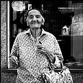
Critique By:
Joe Johnson (K:8529)
6/11/2009 7:56:36 AM
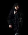
Nice high contrast exposure of kneeling old woman. Contemplative, or so she appears. I thought the background might be cleaned up. And as you pasted it in, as a sort of icon, I though the icon was better represented suggesting a standing position, so I brushed out the knee and shoe, and brought out the reflections off the garments just a bit.
|
| Photo By: Saad Salem
(K:89003)
|
|
|
Critique By:
Joe Johnson (K:8529)
6/11/2009 7:26:28 AM
I think I might disagree with Arup. You actually have two 'power points' in the photo leading one to another. The first is what the driver and horses are 'aiming' at, the lower left point. The grass/ridge line above the road emphasizes this. And I think it's sufficient. But that in turn leads to the tree, not necessarily on a 'point', but still with sufficient space at right to frame it. And that's also the case for the subject, framed with just enough space, though I might slightly trim the bottom.
|
| Photo By: Anthony Lound
(K:6661)
|
|