|
|
Critique By:
Arthur John Grossman III (K:1214)
2/23/2004 3:20:20 PM
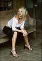
Hey Mark,
Thanks for the comment. I like the 70-200 f4 a lot! It really helps limit the depth of field on portraits and head shots. I can keep a very comfortable working distance between myself and the model as well. I find that most people are intimidated with a lens practically down their throat, so the working distance helps keep people at ease.
The color is great and the focus speed is pretty fast. The only time I miss having the 70-200 f2.8 is when I am shooting runway fashion. The extra stop of light would be nice, but at the time I purchased this lens, twice the price was not worth it for the extra stop.
|
| Photo By: Arthur John Grossman III
(K:1214)
|
|
|
Critique By:
Arthur John Grossman III (K:1214)
8/19/2003 10:07:56 PM
Thanks to everyone for your comments.
Kim! You're right. I am currently putting "AG3 Photography LLC" in motion. Business Plan is being formulated, Articles of Organization are being filed with the state, business license on it's way, etc. etc.
Thank you so much for the encouragement!
|
| Photo By: Arthur John Grossman III
(K:1214)
|
|
|
Critique By:
Arthur John Grossman III (K:1214)
6/12/2003 10:15:09 PM
Hey Alisa,
It's been a while eh? I love the contrast in this one. Nice work. The graphic impact is strong with all of the lines and curves.
|
Photo By: Alisa Mudge
(K:7511)

|
|
|
Critique By:
Arthur John Grossman III (K:1214)
6/12/2003 6:23:52 AM
Larry, I like the light on this. Nice details in the shadows, good looking model, effective casual pose, and good composition.
|
| Photo By: larry white
(K:368)
|
|
|
Critique By:
Arthur John Grossman III (K:1214)
6/10/2003 8:51:12 PM
Nice composition. I think the focus could be sharper.
|
| Photo By: Shawn Kellogg
(K:454)
|
|
|
Critique By:
Arthur John Grossman III (K:1214)
6/10/2003 8:49:14 PM
The expressions are priceless! I really like the perspective as well. Simple and effective.
|
| Photo By: Lenny Boguslaw
(K:243)
|
|
|
Critique By:
Arthur John Grossman III (K:1214)
6/10/2003 8:47:55 PM
Hey Larry, I think the composition would work better if Malin and the post were more on the left side of the frame. I love her expression and the light is nice. Early morning?? Nice work.
|
| Photo By: larry white
(K:368)
|
|
|
Critique By:
Arthur John Grossman III (K:1214)
6/10/2003 6:26:46 PM
Really effective composition and great color. Nice exposure too!
|
| Photo By: Mauricio Favero
(K:415)
|
|
|
Critique By:
Arthur John Grossman III (K:1214)
2/21/2003 7:57:39 PM
Nice effort Phillip, but nothing about this photo makes it "POP" for me. It doesn't grab my attention.
Her nose is a bit on the large side, so I might have shot her from another angle to reduce the size of her nose.
I don't like the position of the hand with the thumb missing...it looks awkward.
The detail in the scarf is nicely captured, but I might have chosen one without sequins...the reflections are bit distracting.
She could have done a better job on her makeup. Specifically, the eye makeup is lacking quite a bit.
Yes, this is a harsh review, but it is honest and ONLY my opinion for what it's worth. Too many people just sit back and say..."oh, nice!" What does that tell ya? Nothing.
Keep shooting Phillip.
|
| Photo By: Phillip Filtz
(K:1792)
|
|
|
Critique By:
Arthur John Grossman III (K:1214)
2/11/2003 10:37:55 PM
Thanks for the comments. Phillip and other's who would like to know, let me answer your lighting question.
First, in my book, there are no lighting "rules", only guidelines. I use my creative license when designing a photograph with a model and use the lighting to achieve the effect(s) I am after. In fashion lighting, as opposed to traditional portrait lighting, I believe it is fairly typical/common to use very flat lighting. The use of two softboxes in front of the model provides the flat lighting I wanted for this image. I was not interested in butterfly, loop, split, or any other "style" of lighting for this image.
Therefore, in order to realize my creative vision for this particular image, I desired to use two softboxes. Yes, there are two catchlights in the eyes. And, yes, I could have photoshop'd them out. Again, for creative reasons, I chose not to.
If you examine the front cover images of magazines like "Style", "Elle", Glamour", and "Vogue" you will see all kinds of catchlights; singles, doubles, and even triples where the model has been surrounded by light.
To some, more than one catchlight is bothersome; for others, no trouble at all. To each his own.
|
| Photo By: Arthur John Grossman III
(K:1214)
|
|
|
Critique By:
Arthur John Grossman III (K:1214)
10/1/2002 7:21:00 PM
The model has a rather large nose, so I might have shot her in a 3/4 pose of the face to reduce the size. Otherwise, this is a nice effort.
|
| Photo By: Rene Asmussen
(K:138)
|
|
|
Critique By:
Arthur John Grossman III (K:1214)
9/29/2002 12:25:23 PM
Hey Stephanie,
What do I like?
The pose is good.
What would I change or do differently?
1. To make it compositionally stronger, I would place the model more to the right side of the frame.
2. I would have waited until later in the day or early morning to reduce the harsh lighting and shadows of mid-day sun.
3. I would place her with her back to the sun and use a gold reflector to fill in the shadows and really make her tanned skin glow.
4. Remove the sunglasses...they don't seem to add anything significant to the image.
5. For a really dramatic effect, you could try a long shutter speed to blur the motion of the water...your model would have to stand motionless during the exposure for this to work.
Nice effort! I'd like to see more.
A.J.
|
| Photo By: Stephanie Tautkus
(K:118)
|
|
|
Critique By:
Arthur John Grossman III (K:1214)
9/12/2002 1:05:09 PM
Wow...now there's a lot of $$$$$ invested in the production of that photograph! Interesting how you left texture in everything except her face. Very creative.
|
| Photo By: Greg Suvino
(K:57)
|
|
|
Critique By:
Arthur John Grossman III (K:1214)
8/31/2002 11:57:45 AM
I like the color and smooth shadow transition and the design element of an odd number of objects. I would like more information behind this photo. For example, how was the reflection created (Plexiglass? - clear or mirrored?) What was the lighting configuration (softbox on right and strobe with snoot from above?
Greg...I think there are quite a few photographers here at Usefilm who like to learn from other's photos, and some technical detail would be wonderful.
Nice work!
|
| Photo By: Greg Suvino
(K:57)
|
|
|
Critique By:
Arthur John Grossman III (K:1214)
8/29/2002 8:02:22 AM
I like the creativity used for this photo. The toning and contrast really seem to add to the emotion/mood of this image. Nice work!
|
| Photo By: Greg Suvino
(K:57)
|
|
|
Critique By:
Arthur John Grossman III (K:1214)
8/27/2002 8:48:27 PM
Greg, nice work except for a few things.
I don't like the lack of detail in the model's hair. I do like the beautiful catchlights in the eyes. Did you use two reflectors, one high and one low?? By the catchlights, it appears as though the lower light source is providing the most illumination. I don't like the strands of hair covering her eye. The detail in the shirt is lost due to blowout. Pretty model and nice composition, but some work needs to be done on the details.
|
| Photo By: Greg Suvino
(K:57)
|
|
|
Critique By:
Arthur John Grossman III (K:1214)
8/27/2002 8:41:14 PM
Something is wrong with the makeup. I think a makeup artist could have really elevated the quality of this shot. I don't like the earring coming out of the side of her face. The gray shirt is an odd choice for an "orient" theme. The eyelashes seem to be a bit too long and her eyebrows need work. Nice catchlights in the eyes.
|
| Photo By: Phillip Filtz
(K:1792)
|
|
|
Critique By:
Arthur John Grossman III (K:1214)
8/27/2002 8:37:47 PM
The focus on the flower is not sharp enough for my taste. The composition could be better by placing the center of the sunflower just a tad more towards the right side of the frame. Nice use of color.
|
| Photo By: Rachel Radcliffe
(K:17)
|
|
|
Critique By:
Arthur John Grossman III (K:1214)
8/20/2002 2:33:09 PM
Terrance,
I would be interested in more detail behind your "harsh lighting" comment. I am not sure what you mean, basically because these flowers were shot in the early morning, using diffused natural light through trees. To me, the flower still appears soft and delicate with great detail. So I am a little confused. Please provide more detail.
|
| Photo By: Arthur John Grossman III
(K:1214)
|
|
|
Critique By:
Arthur John Grossman III (K:1214)
8/16/2002 3:23:34 PM
Kristupa...very nice!
|
| Photo By: Kristupa Saragih
(K:1031)
|
|
|
Critique By:
Arthur John Grossman III (K:1214)
8/16/2002 3:22:08 PM
I don't care for the crop.
|
| Photo By: Rob James
(K:210)
|
|
|
Critique By:
Arthur John Grossman III (K:1214)
8/16/2002 3:18:58 PM
Great color and composition! Nice capture.
|
| Photo By: Kostas Kyriacopoulos
(K:42)
|
|
|
Critique By:
Arthur John Grossman III (K:1214)
8/16/2002 3:10:04 PM
Phillip, thanks for sharing your photo. Here goes...
I like the skin tones...healthy.
I don't like the following:
- Colored gel spill onto models
- Deer in headlights look on male model in contrast to the female model's fearful gaze away from the camera.
- The male model's left arm distracts from the female model's waist line.
- No separation between background and male model's workout pants.
- Not enough detail in the female model's hair closest to the male model.
|
| Photo By: Phillip Filtz
(K:1792)
|
|
|
Critique By:
Arthur John Grossman III (K:1214)
8/14/2002 8:12:21 AM
Petros, thanks for the comments.
As for the comments, I wasn't referring to my own images as much as I was referring to others'. I think I have been pretty good with a ratio of comments left vs. comments received.
Overall, I just don't see many comments being left for anyone. The whole idea of give and take doesn't sit with me very well, but that's just me personally. I don't believe in the principle of "I will only give if I receive something in return". If you like a photo, if it inspires you, if you think you could make it better, please let the photographer know without weighing and judging whether he/she has left enough comments in your estimation.
Just my two cents, no pointing fingers, no ranting or raving...just my perspective. Thanks again Petros for your time, and I do enjoy your work as well. I will try to do better letting you know my thoughts on your work in the future.
|
| Photo By: Arthur John Grossman III
(K:1214)
|
|
|
Critique By:
Arthur John Grossman III (K:1214)
8/5/2002 1:21:07 PM
We tried to duplicate the old-style lighting as much as possible by using similar equipment. Lighting was Tungsten Fresnel spots with key placed high above to produce Paramount/Butterfly shadow under nose. Fill located way back and in front of model to produce catchlights.
|
| Photo By: Arthur John Grossman III
(K:1214)
|
|
|
Critique By:
Arthur John Grossman III (K:1214)
7/13/2002 7:59:44 AM
William,
This studio shoot was carefully planned weeks in advance, so the seamless backdrops and fabrics were color coordinated prior to arriving at the studio.
Thanks everyone for all of your comments.
|
| Photo By: Arthur John Grossman III
(K:1214)
|
|
|
Critique By:
Arthur John Grossman III (K:1214)
7/13/2002 7:57:12 AM
Phillip,
I've sat here for awhile now looking over this image, and there is just something that bugs me about it but I can't really put my finger on it. Some things I do notice are...
Skin tones are good. Detail is good.
The model's split ends should be toned down and are a bit distracting. I don't like the vignette effect...specifically, the area in the lower right corner of the image. I think the cropping could have been a tad bit tighter. I think I would have liked to see more of a butterfly lighting on this model rather than the split lighting you like to use. Using the split lighting on the broad side makes her look a little "round"...not that it's bad, just a different perspective/approach. Her teeth look a little yellow.
Don't get me wrong...I think this is a good portrait and your work is progressing. That is why I am getting more critical of your work now. Just my .02 cents for what its worth.
|
| Photo By: Phillip Filtz
(K:1792)
|
|
|
Critique By:
Arthur John Grossman III (K:1214)
7/12/2002 10:19:33 AM
Mike,
You are 1/2 correct.
One 52" Elinchrom Octogon softbox high and to right of camera. One Photoflex 48" white lightdisc reflector to left for fill.
|
| Photo By: Arthur John Grossman III
(K:1214)
|
|
|
Critique By:
Arthur John Grossman III (K:1214)
7/9/2002 10:29:37 AM
Barry & others...
Thank you for your comments. I do not want to try to defend any particular position (it's meaningless), but I am offering more information regarding my intentions with the creation of this image to help put it in a better context. AND...I do want more critiques, so keep 'em coming!
First, let me share a few items:
1) COLOR - my monitor is calibrated with ColorVision's Photo Suite once every two weeks, so I am pretty confident that my color is good. That would also explain the different comments about the skin tones (e.g. Barry v. Petros)
2) TUNGSTEN LIGHT - Barry, the tungsten light was only casting light on the seamless paper backdrop. The model was significantly forward of the backdrop, so the tungsten light was not affecting her skin tones.
3) WARM TONES - The "warmness" of the photo was produced by the B&W 81b warming filter. Most professional glamour photos that have been published over the years all have warm skin tones. Personally, I like the look of a healthy tan or warmness to a woman's skin, so that is my "artistic license", if you will.
4) STYLE - This particular model wanted images to submit to Playboy, so I reviewed lots and lots of past, contemporary issues (poor me...my eyes got so tired! :-)) The Playboy style almost always displays very very very smooth skin and somewhat flat lighting on head shots. Therefore, I was trying to get as close as I could to that style.
5) LIGHTING - I do think it is a contemporary look for a lot of glamour and fashion shots being produced and published today.
6) With these types of images, I almost never go for natural. Just about everything in advertising or marketing is not natural or realistic. The idea is to show a product in the most flattering way possible, without looking overly fake.
I hope this information is helpful in some small way. This stuff is SOOOO subjective, and what looks good to one, might look like absolute crap to another. C'est la vie with photography and art in general.
Thanks again for all of your thoughts and taking the time to share them with me and others. It is MUCH appreciated.
|
| Photo By: Arthur John Grossman III
(K:1214)
|
|
|
Critique By:
Arthur John Grossman III (K:1214)
7/8/2002 8:22:25 PM
For me, you had the key light up too high. It looks like the shadow under her nose is just about touching her top lip, which, for me, is too much.
Also, the image just too soft for me. You know my style Phillip...I like soft portraits, but for some reason, the amount of softness on this one bugs my eyes.
I would like to see this model with a backdrop that is more complementary to her skin tone. White just doesn't do it for me with this model.
|
| Photo By: Phillip Filtz
(K:1792)
|
|