|
|
Critique By:
ABC 123 (K:677)
10/6/2006 4:13:27 PM
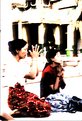
Hi Kursat,
Beautiful capture and I like very much your post-processing. Perfectly well-suited for this mystic atmosphere. I only regret the presence of a ooft/hand?? in the bottom-left corner of your picture. It is nevertheless a great shot. I see that you are scanning from dias? What scanner are you using? Are you happy with it?
Cheers,
Roland
|
| Photo By: Kursat Oner
(K:1580)
|
|
|
Critique By:
ABC 123 (K:677)
10/6/2006 4:02:51 PM
Hi Mark,
nice shot. Was it taken at the Chinese temple in the financial disctrit and which just below the high SingTel tower? Composition is good but IMHO the contrast could be slightly increased and I would try to get rid of the bright thingy on the left side if the picture. Good that you managed to catch some smoke!
Roland
|
Photo By: Mark Julian
(K:36866)

|
|
|
Critique By:
ABC 123 (K:677)
10/6/2006 3:33:48 PM
Again an excellent backlight shot of yours Mehmet! The shaded colours is simply beautiful and we can almost feel the lifeguard walking down the stairs. I amazed by the sharpness of the contours of the shadows! Composition is perfect. Congratulations and I look forward to viewing more of your pictures.
Roland
|
| Photo By: Mehmet Dağ
(K:304)
|
|
|
Critique By:
ABC 123 (K:677)
10/6/2006 3:30:44 PM
Hi Mehment,
Excellent series of sunset in your portfolio. This one is again a very good shot. You perfectly master the backlighting which allows you to achieve such nice shot. The position of the standing man on the jetty is quite essential in your picture. The man seems to be the link between the sun and its reflection.
Well done!
|
| Photo By: Mehmet Dağ
(K:304)
|
|
|
Critique By:
ABC 123 (K:677)
10/6/2006 3:26:36 PM
Dear Michel,
I really like your shot: original combination of checker board appearing in the foreground, on the man's shirt and finally in the pseudo-background, reflection on his glasses. His black and white facial hair very well contributes to recalling the black and white colors of the game. I just regret here the presence of the bicycle right behind the man.
Roland
|
| Photo By: Michel Téo Sin
(K:807)
|
|
|
Critique By:
ABC 123 (K:677)
10/5/2006 7:57:43 PM
Excellent portrait wizard black. The grainy style is really mastered by you! Contrast is excellent. I also like very much her head's position. Personally, I simply regret that we can see her left shoulder. It brings a bright hole right next to her beautiful dark hair and in addition, the average depth of field make this not part not blur enough... it is out of focus. Nevertheless this is a really fantastic portrait of yours! I hope you will continue achieving such great portrait.
Congratulations,
Roland
|
| Photo By: wizard in black
(K:19)
|
|
|
Critique By:
ABC 123 (K:677)
10/5/2006 7:51:32 PM
Dear wizard, yet again another fantastic picture of yours. I like your unique style and every picture of your portfolio is simply just amazing. You manage to create a mixture of ambiance: your female characters all belong to the contemporary style but you choice of colors and post-treatment deliver in the end a vintage style like the Shanghai style of the early 30's! I wish you could share with me some of your skills and more specifically how you manage to create this very specific atmosphere. Again thank you for sharing with us your fantastic photos!
Roland
|
| Photo By: wizard in black
(K:19)
|
|
|
Critique By:
ABC 123 (K:677)
10/5/2006 4:10:23 PM
Hi Ricardo,
I like your picture but IMHO the switch to black and white does not bring much here. I would love to see the fantastic green of these tropical plants. In addition one large leaf is affecting the composition on the bottom-right corner. Otherwise you might try to really force the contrast, burn some highlights and lose some shadows to get something more abstract. I feel like you that there is something beautiful to do with this shot. This is just the view point of an amateur photographer and I might not catch your goal here... Nevertheless it is an appealing picture.
Roland
|
| Photo By: Ricardo Baez-Duarte
(K:666)
|
|
|
Critique By:
ABC 123 (K:677)
10/5/2006 3:58:06 PM
Simply beautiful!
Roland
|
| Photo By: Özgür Ersin
(K:321)
|
|
|
Critique By:
ABC 123 (K:677)
10/5/2006 3:57:02 PM
Hi Laphael,
Colors are very well chosen but I only regret in your picture not to have a larger zone in focus on the nose. In addition, there is a darker spot on the nose which could be due to some dust on your sensor... Cleaning the sensor is such a nightmare... Nevertheless, the idea is very original and I personally like very much the composition.
Roland
|
| Photo By: laphael wang
(K:2318)
|
|
|
Critique By:
ABC 123 (K:677)
10/5/2006 1:50:29 PM
Great shot! I like his skin and the hands position. As you guess, this old man is probably looking back into his life. So many memories.
Congratulations
Roland
|
| Photo By: Haris Calkic
(K:4908)
|
|
|
Critique By:
ABC 123 (K:677)
10/5/2006 1:33:40 PM
Dear Aniko,
You are right this leaf is simply amazing, likewise is your picture of this leaf. The saturation of colors is very well controlled. Personnally, I really appreciate that you have not put the central nerve of the leaf into the principal diagonal or along the vertical axis. I only regret the limited depth of field in the bottom right corner. I regret it because it exist and/or because it only exist there and not in the other corners. It is nevertheless a wonderful shot ! Congratulations.
Roland
|
| Photo By: Aniko Heart
(K:26503)
|
|
|
Critique By:
ABC 123 (K:677)
10/5/2006 12:19:53 PM
Dear Tom,
I really like your picture which perfectly mixes the magenta tones of the sky with the orange ones of the foreground fire. The effect of the fire on the light coming from the sun is simply beautiful and reflects the famous Gladstone-Dale law showing the relationship between the optical refraction index and the density. In this case the fire heats up the air and therefore locally modifies the density which in turn affects the optical refraction index and the path of the light rays coming from the sun ! Sometimes Science is beautiful!
Roland
|
| Photo By: Tom McDonnell
(K:317)
|
|
|
Critique By:
ABC 123 (K:677)
10/5/2006 10:37:31 AM
Great shot. The soft light of the sun rising is very well perceived and delivers very soft magenta tones. The non-centered position of both the sun and the hill covered by trees really makes the difference. Together with the peculiar foreground drawing curved lines, they contribute to this excellent final result. The curved lines in the foreground are symmetric to the line passing by the sun in the sky. I wish the river and the two levels of hills in the middle could have stronger tone difference but at the same time, they simply seem to disappear in the sky. I like very much this shot. Thank you for sharing with us.
Roland
|
| Photo By: In Dokko
(K:289)
|
|
|
Critique By:
ABC 123 (K:677)
10/5/2006 10:04:49 AM
Dear Bobby,
Excellent perspective! Centering is perfect. The Black and white choice happens to be a very good one due I think to the clouds in the sky, and also the white stone and the dark iron doors. The contrast is well balanced and the sharpness allows a good drawing of the contours of the building. Great shot.
Roland
|
| Photo By: Bobby Mun
(K:3709)
|
|
|
Critique By:
ABC 123 (K:677)
10/2/2006 9:39:49 PM
Hi Guili,
Very original shot. It reminds me a picture I have seen in an exhibition with the same very limited depth of field. The only difference is that the photographer had real human beings instead of toys but in the end, with such effect, the human beings looked like toys...
Excellent shot! Congratulations,
Roland
|
| Photo By: Oui Lee
(K:3238)
|
|
|
Critique By:
ABC 123 (K:677)
10/2/2006 3:48:32 PM
Again BEAUTIFUL! I am impressed by your portfolio.
|
| Photo By: Rosan Kador
(K:1276)
|
|
|
Critique By:
ABC 123 (K:677)
10/2/2006 3:47:19 PM
Dear Rosan,
Everything in your picture is great: the soft colours of the sun rising through the dew and the same time we can see the light pointing at the end of the perspective drawn by the trees. Regarding the trees, you managed to have a long depth of field. With so few light in this region, I presume you were using a tripod? Am I wrong? Moreover you managed to have a very wide contrast and no details are lost in shadows which is from my personal experience the most problematic aspect with these kind of pictures.
It is a beautiful and amazing shot. Congratulations again.
Roland
|
| Photo By: Rosan Kador
(K:1276)
|
|
|
Critique By:
ABC 123 (K:677)
10/2/2006 3:38:52 PM
Dear Mohammad, you've got a great shot here. The 24mm on an argentic 24X36 delivers its promises. The perspective is excellent and very well controlled looking at all the wires around! Light is also well controlled: the man appears brighter than the back ground and not details are lost in shadows or highlights. We can even follow his eye-sight towards us. I appreciatate the frame and centering. The top touches the arch and the bottom just below the man arms. The position of the arms appear to me as key point in this beautiful picture.
Again congratulations!
Roland
|
| Photo By: Mohammad Reza Shahrokhi Nejad
(K:7396)
|
|
|
Critique By:
ABC 123 (K:677)
10/2/2006 3:23:46 PM
That's Indian Summer! Lucky Canadians ;-)
|
| Photo By: Dave Stacey
(K:150877)
|
|
|
Critique By:
ABC 123 (K:677)
10/2/2006 3:21:47 PM
Simply beautiful The sepia effect delivers a perfect vintage aspect. Knowing how difficult it is to master, to control, it is very well done. I am wondering how the picture would like without the garbage dumped on the ground and the mattress. It will appear more nostalgic too me. The lighting is perfectly mastered as you have lost no details into the bright background: the leaves appear quite well and even the side walls are not lost in shadows.
Congratulations Andjela for this amazing shot!
Roland.
|
| Photo By: Andjela Vujic
(K:9)
|
|
|
Critique By:
ABC 123 (K:677)
10/2/2006 2:46:38 PM
I fully agree with you Jo!
|
| Photo By: Sandy Towt
(K:18)
|
|
|
Critique By:
ABC 123 (K:677)
10/2/2006 2:43:20 PM
Great shot and composition. You are right their faces are so much full of expressions.
I really like this picture and I envy to see this part of our world.
roland
|
| Photo By: Gina Del Mistro
(K:288)
|
|
|
Critique By:
ABC 123 (K:677)
10/2/2006 2:28:47 PM
Very artistic and the solarizing effect is very well controlled likewise the important contrast. The choice of black and white is obvious here. Is that a self-portrait? The look is very strong and the post-processing effect gives to it a mysterious touch. The lock of hair on the right chick is very important here. Moreover the important level of greys in the lips and the eyes make too me the difference and are responsible for the amazing result. I look forward to viewing more of your pictures.
Congratulations.
Roland
|
| Photo By: Sandy Towt
(K:18)
|
|
|
Critique By:
ABC 123 (K:677)
10/2/2006 2:15:22 PM
Hi Laphael! What an unsual and very original picture of Shanghai skyline. I imagine you were at 18mm to achieve this wide-angle effect. IMHO the red filter applied on the top and the orange one on the bottom are too strong and combined together, they deserve their purpose. I would personnally try only of these two (preferably orange) just for the sky and the clouds. Again this is just the way I see things... Nevertheless this is a great shot of a fascinating and vibrant city!
Congratulations,
Roland
|
| Photo By: laphael wang
(K:2318)
|
|
|
Critique By:
ABC 123 (K:677)
10/2/2006 10:16:10 AM
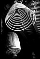
Dear Hasim,
The colors, the centering and the control of the contrast are all jsut perfect. Was the peculiar lighting on the top of the window due to an artificial lighting? Would it be possible for you to take other pictures with various small opening of the window? If yes, please keep the same centering, the lateral dark zones really highlight the central part of the picture.
Well done. Congratulations!
Roland
|
| Photo By: Hasim Aksu
(K:1032)
|
|
|
Critique By:
ABC 123 (K:677)
10/2/2006 9:16:26 AM
Anyway we are all novice and that is why I love the pictures here. Honestly your pictures are really great!
|
| Photo By: Adele McGookin
(K:532)
|
|
|
Critique By:
ABC 123 (K:677)
10/2/2006 9:12:39 AM
Wow another great shot and in color this time. I hope I could see more of your pictures in China! I can tell you that you were lucky to have this light at the Great Wall. Most of the time it is smoggy and not really favorable for the photographer. In this one the depth of field is just perfect in the window opening. I wish we could see more of the Great Wall, like a snake on the top of the mountains. But we can see up to 3 levels of mountains which is by itself a remarkable feature.
Congratulations again,
Roland
|
| Photo By: Adele McGookin
(K:532)
|
|
|
Critique By:
ABC 123 (K:677)
10/2/2006 9:07:48 AM
Hi Adele,
I really love this shot!! The centering is just perfect and the tones and contrast delivers a very wide of greys from foreground to background. You just have to let your eyes follow from black to grey. I only regret the too important depth of field which makes the archery window too clear and sharp and therefore distracts the viewer from the Great Wall in the center. I went several times to the Great Wall and to different places. That is may be why I am so enthusiastic about your picture. Hen hao!
|
| Photo By: Adele McGookin
(K:532)
|
|
|
Critique By:
ABC 123 (K:677)
10/2/2006 9:01:31 AM
Hi Silvia! This is a great shot. I am crazy about such portraits of kids. I also like very much this tight frame. This look tells us so much and his mouth... Wow you caught it at the right moment. I only regret the red triangle in the bottom-left corner. This is probably the shoulder of one the kid's firend. Cropping more on the left would be a bad idea. You might have tried some "stamping tool" in Photoshop... Nevertheless it is one of the most beautiful portrait I have seen these weeks here!
Congratulations.
Roland
|
| Photo By: Silvia Festa
(K:6008)
|
|