|
|
Critique By:
Herman Pieters (K:508)
8/30/2008 11:30:04 AM
cool shot, tell me did u dodge highlights a lot on this pic? looks a bit overworked ;) but nice shot
|
| Photo By: Bader Al Awadhi
(K:50)
|
|
|
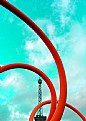
Critique By:
Herman Pieters (K:508)
8/30/2008 11:26:46 AM
nice composition, but over edited, especially the sky and the white blown out part at the top doesn't work;)
|
| Photo By: larry concepcion
(K:474)
|
|
|
Critique By:
Herman Pieters (K:508)
4/19/2007 7:39:02 AM
Interesting pose, but it looks a bit like her head is detached from her body, as if it has been put there..
anyways, just my opinion, nice colors!
|
| Photo By: Kevin Greggain
(K:2572)
|
|
|
Critique By:
Herman Pieters (K:508)
3/9/2007 6:14:13 AM
Wow! that's such a beautiful photo, so much feeling!
|
| Photo By: Wang Zhibo
(K:139)
|
|
|
Critique By:
Herman Pieters (K:508)
11/13/2006 1:09:45 PM
you photo's are really amazing, not seen photography like this in ages
well done!
|
| Photo By: Jesper Kristensen
(K:786)
|
|
|
Critique By:
Herman Pieters (K:508)
10/5/2006 12:31:33 PM
I like
well done
|
| Photo By: deniz kaan copur
(K:12726)
|
|
|
Critique By:
Herman Pieters (K:508)
9/28/2006 7:14:15 AM
a bit magenta hey
|
| Photo By: Mohamed Sherif
(K:63)
|
|
|
Critique By:
Herman Pieters (K:508)
9/22/2006 12:15:47 PM
wow, like your style and the contrast in your pics
very good execution!
|
| Photo By: Murat Tatlidil
(K:54)
|
|
|
Critique By:
Herman Pieters (K:508)
9/19/2006 11:09:18 AM
well done!
|
| Photo By: Mehmet Arseven
(K:89)
|
|
|
Critique By:
Herman Pieters (K:508)
7/9/2006 11:45:13 AM
i'd have to unfortunately repeat myself here, polarizer, do u know what it is? shame man, go to www.google.com then type it in there and maybe if u know how to browse and do research u'll figure out what it does.
|
| Photo By: Herman Pieters
(K:508)
|
|
|
Critique By:
Herman Pieters (K:508)
7/8/2006 12:28:10 PM
oooh nice, exotic feel and very well executed!
|
| Photo By: lius hanzen
(K:2844)
|
|
|
Critique By:
Herman Pieters (K:508)
7/8/2006 12:26:35 PM
amazing work!
|
| Photo By: Ray Pollard
(K:3729)
|
|
|
Critique By:
Herman Pieters (K:508)
7/6/2006 10:58:29 AM
ooh this is superb, love the DOF!!!
|
Photo By: Marcus Armani
(K:36599)

|
|
|
Critique By:
Herman Pieters (K:508)
7/5/2006 8:52:18 AM
a bit too green, add magenta
|
| Photo By: SQirl
(K:2742)
|
|
|
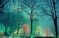
Critique By:
Herman Pieters (K:508)
7/5/2006 8:50:09 AM
Interesting, would have liked to see some long shadows to the left
|
| Photo By: SQirl
(K:2742)
|
|
|
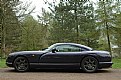
Critique By:
Herman Pieters (K:508)
7/5/2006 8:41:56 AM
nice car.
Wouldn't have the sky overexposed like that tho, that's a no no in photography.
|
| Photo By: SQirl
(K:2742)
|
|
|
Critique By:
Herman Pieters (K:508)
7/4/2006 12:43:24 PM
no comment.
|
| Photo By: SQirl
(K:2742)
|
|
|
Critique By:
Herman Pieters (K:508)
7/4/2006 12:42:51 PM
Blue channel totally over exposed, or u could have pumped up the saturation too much, fix by going to hue/saturation ctrl 5 and 4 and pull down the saturation slider about ten on cyan and blue, also needs some sharpening.
|
| Photo By: SQirl
(K:2742)
|
|
|
Critique By:
Herman Pieters (K:508)
7/4/2006 12:40:37 PM
The image is a bit soft, probably because of the lens that u use, but u could have fixed it on photoshop, filter - sharpen - unsharp mask.
cheers
|
| Photo By: SQirl
(K:2742)
|
|
|
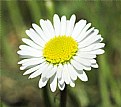
Critique By:
Herman Pieters (K:508)
7/4/2006 12:39:38 PM
Oh and one more thing, add red, your flower looks green, my screen is calibrated for color editing.
|
| Photo By: SQirl
(K:2742)
|
|
|
Critique By:
Herman Pieters (K:508)
7/4/2006 12:38:55 PM
Hi, the flower is a bit over exposed tho, you could have fixed that in photoshop...
Shadows and Highlights, read the help file, i don't have time to explain how it works.
Oh and I saw that the pic is overexposed by taking it into photoshop, going to levels and dragging the highlight slider to the left AND holding in Alt.
good tip, use it.
cheers!
|
| Photo By: SQirl
(K:2742)
|
|
|
Critique By:
Herman Pieters (K:508)
6/23/2006 10:26:48 AM
wow, great capture!
|
| Photo By: Hassan Ahmed
(K:2995)
|
|
|
Critique By:
Herman Pieters (K:508)
6/23/2006 10:25:55 AM
You've got a very good eye! but i guess that lens helps a lot too!
|
| Photo By: Fadel J
(K:13974)
|
|
|
Critique By:
Herman Pieters (K:508)
6/23/2006 10:23:59 AM
Nice colors.
WOuld have liked to see some foreground(1 metre bacK?)
personal preference
wel done!
|
| Photo By: anabella damian
(K:416)
|
|
|
Critique By:
Herman Pieters (K:508)
6/23/2006 10:23:10 AM
ok i'm jealous now, this is beautiful!
|
| Photo By: anabella damian
(K:416)
|
|
|
Critique By:
Herman Pieters (K:508)
6/23/2006 10:22:48 AM
Bit oversharpened, nice idea tho!
|
| Photo By: anabella damian
(K:416)
|
|
|
Critique By:
Herman Pieters (K:508)
6/23/2006 10:22:25 AM
haha, great, less is more, and here's a good example!
|
| Photo By: anabella damian
(K:416)
|
|
|
Critique By:
Herman Pieters (K:508)
6/23/2006 10:21:56 AM
ooh that's a cool effect!
|
| Photo By: anabella damian
(K:416)
|
|
|
Critique By:
Herman Pieters (K:508)
6/23/2006 10:20:17 AM
nice compo, what about a frown?
hehe
c ya
|
| Photo By: Derek Bair
(K:1530)
|
|
|
Critique By:
Herman Pieters (K:508)
6/23/2006 10:19:38 AM
nice capture, the posterization of the buildings on the right is usually due to too much editing, but I take it this is the way u wanted it...
makes me think of a little devil above the people flying around to attack
hehe
cya
|
| Photo By: Derek Bair
(K:1530)
|
|