|
|
Critique By:
Brian Twohig (K:384)
5/29/2005 6:59:11 AM
Nice! Great PS work. Brian
|
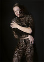
| Photo By: Joseph Welsh
(K:107)
|
|
|
Critique By:
Brian Twohig (K:384)
5/29/2005 6:53:21 AM
I love the collage. The font is great. If I had to critique this, the only fault I see is that the photos do not line up evenly on the top and bottom. Love the work. Brian
|
| Photo By: mandy welsh
(K:3146)
|
|
|
Critique By:
Brian Twohig (K:384)
5/29/2005 6:49:45 AM
I like the crop. I would soften the yellow in the flower so that it does not grab so much attention away from your subject. I appreciate the idea. Creativity is one of the hardest parts when adding a caption. Brian
|
| Photo By: mandy welsh
(K:3146)
|
|
|
Critique By:
Brian Twohig (K:384)
4/13/2005 9:36:09 AM
I believe the shadows detract from the picture. The black and white makes it hard to distinguish her hair from the shadow. I do not agree about the distance and fakeness. Looks like a happy little girl to me.
Thanks,
Brian
|
| Photo By: mandy welsh
(K:3146)
|
|
|
Critique By:
Brian Twohig (K:384)
4/13/2005 9:32:08 AM
Good job. I think the crop works well. Brian
|
| Photo By: mandy welsh
(K:3146)
|
|
|
Critique By:
Brian Twohig (K:384)
4/13/2005 9:27:50 AM
I used the healing brush tool in PS. I picked a spot that I thought should be the correct color behind the shadow and used the "replace" function to cover the shadow. This will leave you with a circular pattern. To get rid of the circles, swap the healing brush back to "normal" and go over the area that you changed. If you take your time you can do a much better job than the example I sent you. Hope this helps. Brian
|
| Photo By: mandy welsh
(K:3146)
|
|
|
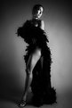
Critique By:
Brian Twohig (K:384)
4/5/2005 4:22:22 PM
As stated by the others. Great job. Very sexy.
Brian
|
| Photo By: Jeff Fiore
(K:11277)
|
|
|
Critique By:
Brian Twohig (K:384)
4/5/2005 4:19:55 PM
I agree Andrea about the shadows. You could possibly bounce your flash off the ceiling or use another flash on the side. Also in PS you can get rid of the shadows. An example is attached. If I had more time and the original scanned photo it would be much easier to keep the quality of the original photo (small loose strands of hair). You are lucky to have such willing and readily avilable subjects for practice. Not to mention, a very photogenic one. Thanks for sharing. Brian
|
| Photo By: mandy welsh
(K:3146)
|
|
|
Critique By:
Brian Twohig (K:384)
4/3/2005 12:31:26 PM
Original photo did not attach to the first message.
Brian
|
| Photo By: Brian Twohig
(K:384)
|
|
|
Critique By:
Brian Twohig (K:384)
4/3/2005 7:20:18 AM
I agree. The version that I printed to frame does not have the lens flare in it. I am posting the original. It will show how bad the shot was to begin with. Thanks for your critique.
Brian
|
| Photo By: Brian Twohig
(K:384)
|
|
|
Critique By:
Brian Twohig (K:384)
4/2/2005 10:04:28 PM
I would either straighten the photo and move the tabs onto the corner of the photo or lose them all together. I'ld probably lose them in my amateur opinion. I like the text. The word "angel" kind of contrasts the pentagram on the necklace. Good job. On another subject, if you have not bought a D100 yet and money is an factor, consider a D70. Very comparable and 300 to 600 dollars cheaper depending were you get it from.
Thanks,
Brian
|
| Photo By: mandy welsh
(K:3146)
|
|
|
Critique By:
Brian Twohig (K:384)
4/2/2005 9:52:22 PM
In this one, I attempted to resaturate the photo as much as possible and then completly unsaturate it. After that I tried to back and slowly add color to it with a coarse brush in the hopes of achieving a water paint sort of effect. It did not work to well due to not having enough color in the original shot. Did you creat this effect with PS or film? I enjoyed viewing your portfolio and hope this helps. Hopefully some of the more experienced people will be able to lend some better advice.
Thanks,
Brian
|
| Photo By: mandy welsh
(K:3146)
|
|
|
Critique By:
Brian Twohig (K:384)
4/2/2005 9:42:29 PM
I have always beena fan of the overexposed look. I tried to bring out some of the lines by unsaturating the photo and putting a soft blue color overlay over the photo. Also finished the outside with a simple outline and outer glow effect. I do not think it is any better than the original, but figured it may spark your imagination. I like the picture and cute kid.
Thanks,
Brian
|
| Photo By: mandy welsh
(K:3146)
|
|
|
Critique By:
Brian Twohig (K:384)
3/29/2005 6:18:15 AM
Looks like your PS skills are doing pretty good. I am not sure that I like the lens flare effect. The way that it extends over the framing just does not seem right. I can only imagine how many layers you must have used. From a fellow PS learner, great job.
Brian
|
| Photo By: James Bambery
(K:13421)
|
|
|
Critique By:
Brian Twohig (K:384)
12/15/2004 10:29:39 AM
Nice shot. Great timing.
Brian
|
| Photo By: Michael Holm
(K:7931)
|
|
|
Critique By:
Brian Twohig (K:384)
12/12/2004 6:24:57 AM
Beautiful. Absolutely amazing. Great job.
Thanks,
Brian
|
Photo By: John Bohner
(K:8368)

|
|
|
Critique By:
Brian Twohig (K:384)
12/12/2004 5:34:32 AM
Excellent. Great timing.
Thanks,
Brian
|
| Photo By: Suha Derbent
(K:514)
|
|
|
Critique By:
Brian Twohig (K:384)
10/13/2004 3:57:18 AM
Thanks for the very well thought out reply. The actual photo shoot was slightly overexposed due to my forgetting to change the ISO setting on my camera. I did my test shoot in the morning and forgot to compensate for the additional sunlight. I did add to the harshness with photoshop and adjusted the levels to try to create something artistic. Your portfolio is excellent and I appreciate the critique. I am a novice in this hobby, but trying to learn quickly. Thanks, Brian
|
| Photo By: Brian Twohig
(K:384)
|
|
|
Critique By:
Brian Twohig (K:384)
10/7/2004 12:05:40 PM
Yes, she does!
|
| Photo By: ppdix
(K:17069)
|
|
|
Critique By:
Brian Twohig (K:384)
10/7/2004 11:49:54 AM
I like the effect. Good job. Brian
|
| Photo By: Ahmet KASIMOGLU
(K:2137)
|
|
|
Critique By:
Brian Twohig (K:384)
10/7/2004 11:45:40 AM
I love it. Beautiful kid. Thanks for sharing. Brian
|
| Photo By: Cindy Costoplos
(K:5)
|
|
|
Critique By:
Brian Twohig (K:384)
10/7/2004 11:43:28 AM
Interesting. Took me a while to figure out what I was looking at. Great job. Brian
|
| Photo By: Vivienne Bellini
(K:388)
|
|
|
Critique By:
Brian Twohig (K:384)
9/30/2004 8:59:07 PM
I all too aware of the dificulty. That is the reason I respect your photos so much. I have no where near the set up that you have (nor the experience) and merely use others photos to guide me in the right direction as I research diferent techniques and styles. Thanks, Brian
|
| Photo By: ppdix
(K:17069)
|
|
|
Critique By:
Brian Twohig (K:384)
9/23/2004 4:52:48 AM
Thanks. I have a model scheduled in early October that wants some sexy shots. I hope to emulate this pose and lighting. Your portfolio is excellent and a great source of inspiration for creativity. Brian
|
| Photo By: ppdix
(K:17069)
|
|
|
Critique By:
Brian Twohig (K:384)
9/22/2004 4:57:52 AM
Excellent shot and beautiful model. The pose leaves everything to the viewer's imagination. Is the lighting in the background done through photoshop or through the use of lights? Thanks, Brian
|
| Photo By: ppdix
(K:17069)
|
|
|
Critique By:
Brian Twohig (K:384)
7/14/2004 9:13:09 AM
Great picture. The dog looks pretty ruff. Thanks, Brian
|
| Photo By: Guilherme Oliveira
(K:110)
|
|
|
Critique By:
Brian Twohig (K:384)
7/13/2004 7:23:27 AM
Thanks for the advice. I have found an article stating similar advice. This was my first attempt and I forgot that I had set my camera to ISO 1600 the night before when trying to take pictures at night. I don't think it helped much. Once again I appreciate your advice. Brian
|
| Photo By: Brian Twohig
(K:384)
|
|
|
Critique By:
Brian Twohig (K:384)
6/29/2004 9:00:29 AM
I am assuming this is two different pictures combined for an absolutely amazing result. The close up of the candle is perfect. The flame appears to be causing the sunset.
Thanks,
Brian Twohig
|
| Photo By: ADAM ORZECHOWSKI
(K:7957)
|
|
|
Critique By:
Brian Twohig (K:384)
6/29/2004 6:11:01 AM
Appreciate the laugh. Thanks,Brian
|
| Photo By: constance tupper
(K:191)
|
|
|
Critique By:
Brian Twohig (K:384)
6/29/2004 4:44:19 AM
Thanks for your comment. As I start school this fall I hope to have some more creative material to post. Until then I am just trying to take pictures of anything and everything to gain experience.
Thansk,
Brian
|
| Photo By: Brian Twohig
(K:384)
|
|