|
|
Critique By:
William Francis (K:365)
12/3/2005 8:57:36 PM
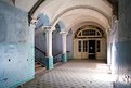
wow. very nice! you are so lucky to have so many great buildings to visit. not so many here in California
|
| Photo By: Guido Steenkamp
(K:183)
|
|
|
Critique By:
William Francis (K:365)
12/3/2005 8:54:11 PM
very nice! I take many similar type photographs here in the US. I'd love to see more from Germany
|
| Photo By: Guido Steenkamp
(K:183)
|
|
|
Critique By:
William Francis (K:365)
10/21/2005 9:51:42 PM
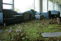
That's an undoctored photograph of a catskills area resort that's been left to decay.
|
| Photo By: William Francis
(K:365)
|
|
|
Critique By:
William Francis (K:365)
10/5/2005 7:00:59 AM
wow. fantastic shot. At this resolution it looks way over sharpened though. maybe make the smaller version for usefilm and then apply USM? That's a nit pick on a shot that I'm sure looks fabulous at full res though.
|
| Photo By: Rich Swanner
(K:-3732)
|
|
|
Critique By:
William Francis (K:365)
9/26/2005 8:32:10 PM
seeing this photograph reminds me of many happy times and makes me smile 
|
| Photo By: severine durand
(K:31)
|
|
|
Critique By:
William Francis (K:365)
3/6/2005 11:37:34 PM
reza, thanks for thinking of the b&w conversion. now available!
|
| Photo By: William Francis
(K:365)
|
|
|
Critique By:
William Francis (K:365)
3/6/2005 11:34:14 PM
thank you for your suggestion! B&W version now available.
|
| Photo By: William Francis
(K:365)
|
|
|
Critique By:
William Francis (K:365)
1/4/2005 7:40:09 AM
Actually, photoshop CS reads them just fine (through they are not offically supported, IIRC). For offical support, you can use Abobe's RAW to generic format (.dng) converter (sorry, don't have link handy) and that works great too. For best results, many people use third party converters like C1 and then edit the .tif files in photoshop... so there is nothing to "get over".
|
| Photo By: William Francis
(K:365)
|
|
|
Critique By:
William Francis (K:365)
12/17/2004 11:55:49 PM
really nice prespective and subject!
|
| Photo By: John Bolhuis
(K:42)
|
|
|
Critique By:
William Francis (K:365)
11/12/2004 6:47:18 PM
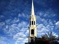
I like it - but I would have put the steeple more off center and removed the powerlines. cheers!
|
| Photo By: Aleksander Rotner
(K:256)
|
|
|
Critique By:
William Francis (K:365)
11/12/2004 5:55:03 AM
wow. I really like the composition and distortion. well done!
|
| Photo By: sindhu rajaram
(K:724)
|
|
|
Critique By:
William Francis (K:365)
10/23/2004 5:50:11 PM
very well done! I agree with all other comments!
|
| Photo By: gasior
(K:227)
|
|
|
Critique By:
William Francis (K:365)
10/16/2004 9:59:47 AM
Very nice! You divided the shot into thirds about as perfectly as you can - textbook! I'd leave the tree in
|
| Photo By: Gj Stressedafrican
(K:503)
|
|
|
Critique By:
William Francis (K:365)
10/14/2004 5:31:41 AM
I like the shot alot and think b&w is the right way to go. I think there is too much of a single tone of gray though, and with 30 seconds in photoshop adjusting the levels and curves I was able to give it a lot more punch and detail. I'm uploading a copy, but the limits on upload size don't really show off all the improvement. don't be afraid to adjust a bit!
|
| Photo By: Phil Cassell
(K:1054)
|
|
|
Critique By:
William Francis (K:365)
10/4/2004 7:06:59 PM
zehr gut composition! It's very fresh. I like it very much.
|
| Photo By: Oliver Dienst
(K:452)
|
|
|
Critique By:
William Francis (K:365)
7/13/2004 6:50:31 AM
extremely well done. thank you for sharing!
|
| Photo By: Aykan OZENER
(K:5996)
|
|
|
Critique By:
William Francis (K:365)
6/15/2004 5:08:56 AM
wow. well done!
|
| Photo By: Chris Blaszczyk
(K:610)
|
|
|
Critique By:
William Francis (K:365)
5/18/2004 6:42:09 AM
Lovely photograph with very nice contrast! I hope you visit this site again when the sky is a little exciting.
|
| Photo By: The Armed Eye
(K:3563)
|
|
|
Critique By:
William Francis (K:365)
4/28/2004 6:46:21 AM
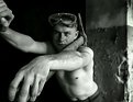
I enjoy this shot very much. I like the repeated pattern of the man leaning back and the beach umbrellas leaning the same way. Best regards!
|
| Photo By: Anindya Maity
(K:7880)
|
|
|
Critique By:
William Francis (K:365)
4/28/2004 6:42:53 AM
fantastic. thank you!
|
| Photo By: Fernando Porto
(K:1239)
|
|
|
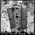
Critique By:
William Francis (K:365)
4/25/2004 6:55:34 PM
Wonderful contrast, but I think the composition would be more compelling if the shutters were off center. Regardless, well done!
|
| Photo By: Andrew Michael
(K:86)
|
|
|
Critique By:
William Francis (K:365)
4/24/2004 6:21:59 AM
Very well done. i'm impressed.
|
| Photo By: Hugh Hill
(K:1618)
|
|
|
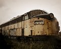
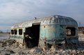
Critique By:
William Francis (K:365)
4/20/2004 5:07:31 AM
Hugo - thanks for the comments. I couldn't back up any more because there actually is another car (a caboose) directly in front of this engine. I had to photoshop out a few parts (mostly bars) that were obscuring the front of the engine. Your comment about tension intrigues me though - did you mean to suggest that perhaps a rusting engine with more open space around it would make it seem even more lonely? If so, that may be true, but I find myself trying to frame subjects so that enough detail (in this case the fading paint/running colors and rust) can be seen to keep the interest of the viewer. Either way, in this case I had no choice as other nearby objects didn't allow. I do have some wide shots of the small group of old cars and that might look nice at larger sizes. Thanks for your thoughtful reply.
|
| Photo By: William Francis
(K:365)
|
|
|
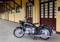
Critique By:
William Francis (K:365)
3/28/2004 3:10:24 PM
Very nice! I have a '68 R60/2 in original condition that's very nice. I hope you post some detail shots. I'll be posting some of mine soon, though being unrestored it's not quite as shiney as yours
|
| Photo By: Maurilio Ultramari
(K:8200)
|
|
|
Critique By:
William Francis (K:365)
3/27/2004 3:20:07 AM
very well done! there is something delightfully odd about this I really enjoy!
|
| Photo By: Andy Tasher
(K:126)
|
|
|
Critique By:
William Francis (K:365)
2/13/2004 6:52:13 PM
well done! Take a look at my profile for a picture of the same subject. Amazingly, it was handheld with an IS lens and even some intentional overexposure.
|
| Photo By: Cedric Sims
(K:3259)
|
|
|
Critique By:
William Francis (K:365)
1/31/2004 7:25:05 PM
I really like the photo (and my others in your portfolio). This one looks a little washed out though like there is a constant level of gray throughout the entire picture. I spent about a minute in PS with some level and curves adjustment and came up with an alternative. I gave up a little bit of detail in the darker areas (like the cups) to try to give the whole picture a little more weight, but I believe I was able to get out more detail in the mids and highs. best!
|
Photo By: Robert Levy
(K:413)

|
|
|
Critique By:
William Francis (K:365)
1/30/2004 9:53:05 AM
I love the effect! is there a tutorial somewhere for how you were able to achieve this??
|
| Photo By: Marcy Massura
(K:1848)
|
|
|
Critique By:
William Francis (K:365)
1/28/2004 2:23:21 PM
Wow neat! Can you share your location? I've shot a lot in similar looking salt marsh locations and would love to see what's at this one. email address in my profile if you don't want to tell the world http://www.usefilm.com/image/292329.html#
Submit your Rating and Comment
|
| Photo By: Alisa Mudge
(K:7511)
|
|
|
Critique By:
William Francis (K:365)
1/13/2004 7:11:59 PM
Very nice! Was this done at Altamont pass or near Mojave? I'd love to get in there but never knew who to contact. if you could email me at wfrancis@anticlockwise.com and let me know how you got in there I'd love to know!
|
| Photo By: Jim Goldstein
(K:21230)
|
|


")