|
|
Critique By:
Stephen Gaudin (K:64)
11/18/2003 5:40:23 PM
This is awesome. The composition and lighting is reminicent of one of the old Master's oil paintings. I think that I can see how parts of Michaelangelo's cistine chappel could have been inspired by an image such as this.
|
| Photo By: Darrin James
(K:3944)
|
|
|
Critique By:
Stephen Gaudin (K:64)
11/18/2003 5:30:09 PM
This is a great composition. Sometimes it pays to notice how cool a photograph can be by changing perspective. I can see how this could even offer more variations at varying times of the day, but I like the lighting on this one where you get the soft light backlighting Jennifer. Very good work
|
| Photo By: daniel mccain
(K:924)
|
|
|
Critique By:
Stephen Gaudin (K:64)
11/17/2003 5:22:22 PM
Sorry for the delay, but yes the flower in the picture is one of mine, but unfortunately it's not a very big plant. If you wanted Yellow and White cuttings, there would be no problem, I'm just about ready to throw a bunch of those out. Just kidding, but I give them away every chance I can. I just can't force myself to throw them out, even though I trim a lot every year.
|
| Photo By: Stephen Gaudin
(K:64)
|
|
|
Critique By:
Stephen Gaudin (K:64)
11/11/2003 5:39:00 PM
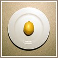
I like it, nice color contrast, I like the table covering texture and color contrasting with the white plate and then the nice deep yellow of the lemon. I can see this hanging in my kitchen right now. If I can get a bit stranger, did you intentionally do the slight diagonal not to be a 45 or 90 degree angle. It almost makes me feel like the plate is sliding down the screen viewed vertically as it is. I get almost a motion feeling when I look at the background instead of the plate.
|
| Photo By: Blakely Crawford
(K:272)
|
|
|
Critique By:
Stephen Gaudin (K:64)
11/11/2003 5:35:00 PM
I think the photo does have some appeal, just not sure exactly what. I think it would be greatly improved if the sign above the man's head had a relevant topic on it. An ad for a mental care facility or a mountain climbing school for example. Though I do have to agree that it has potential to go somewhere, for me it just doesn't quite get there yet.
|
| Photo By: Amir Pasbakhsh
(K:39)
|
|
|
Critique By:
Stephen Gaudin (K:64)
11/11/2003 3:40:25 PM
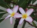
This was an unedited photo, so I may be able to do some editing. I wanted to see if I could get some ideas before I started playing with it. As for the white, it's mostly not a white flower, but has some cream and pink and yellow, unlike many plumeria's that have a lot of white and yellow. I'll play with it a bit see what I can do. Some of what I played with resulted in more vivid colors but made the picture appear even darker. I think the colors here are fairly true to the original flower. The photo was taken in a nice overcast morning light, though in some ways I think if I had increased the aperture I might have gotten a bit nicer blurring effect. I can edit that in, and will probably try that along with the "brightening" to see how it looks. Thanks for the comments.
|
| Photo By: Stephen Gaudin
(K:64)
|
|


")