|
|
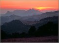
Critique By:
Mads Bangsø (K:253)
7/26/2004 7:41:40 AM
Very nice work! Great composition, but a bit too underexposed foreground, for my liking...
Keep up the good work
-mads
|
| Photo By: Michael Busselle
(K:221)
|
|
|
Critique By:
Mads Bangsø (K:253)
7/21/2004 4:06:43 PM
Exellent Colors and composition...Nice work...Great Light too..Cant finde any negative coments to this picture..
-mads
|
| Photo By: Ian T
(K:114)
|
|
|
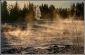
Critique By:
Mads Bangsø (K:253)
6/23/2004 12:20:24 AM
Hi Susan
It just might be the Thermal pools she was telling you about. this shot was taking about 1 km away from the "Blue lagune" which i think is the most famous of the pools on Iceland.
I was only there on a very (too) short visit with the Danish national Track and Field team, so this is the only geothermal pools i have seen there, but i think there is many more !
Yours sincerly
mads
|
| Photo By: Mads Bangsø
(K:253)
|
|
|
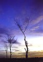
Critique By:
Mads Bangsø (K:253)
6/7/2004 8:01:45 AM
Great picture in every aspect !
-mads
|
| Photo By: Fred Lord
(K:4844)
|
|
|
Critique By:
Mads Bangsø (K:253)
3/25/2004 9:43:46 AM
I didnt use any filters for this image. I didnt use any filters at the time this picture was taken. Today i probably would have used a Polariser filter, but the result came out fine, without the filter, so itss only a prof of, you dont always have to use filters to get a good landscape photo. Also, the Fuji reala 100 film, dosnt respond as well to the use of filters as fx. the Fuji Velvia film, so you might not be able to tell weither i used a filter on this photo or not...Thank you for your comment and question, shoul d there be anything else, feel free to write me.
best regards
mads
|
| Photo By: Mads Bangsø
(K:253)
|
|
|
Critique By:
Mads Bangsø (K:253)
3/25/2004 9:42:15 AM
I didnt use any filters for this image. I didnt use any filters at the time this picture was taken. Today i probably would have used a Polariser filter, but the result came out fine, without the filter, so itss only a prof of, you dont always have to use filters to get a good landscape photo. Also, the Fuji reala 100 film, dosnt respond as well to the use of filters as fx. the Fuji Velvia film, so you might not be able to tell weither i used a filter on this photo or not...Thank you for your comment and question, shoul dthere be anytinh else, fell free to write me.
best regards
mads
|
| Photo By: Mads Bangsø
(K:253)
|
|
|
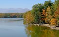
Critique By:
Mads Bangsø (K:253)
2/21/2004 3:05:09 AM
Great picture....great simplicity
no further comments !
-mads
|
Photo By: Roger Skinner
(K:81846)

|
|
|
Critique By:
Mads Bangsø (K:253)
2/21/2004 3:01:42 AM
Great shoot !!
having said that i do have some thoughs:
1. you could have enhanced the orange reflexion in the mist by adding a orange filter to your objective.
2. To get a more dramatic composition i thnik a larger, more promonent foreground would do the trick..
3. i would have liked to see a bit more sky, with a larger contrast...(a wideangel lens and a grad ND filter would do that trick)
Al in all, this is a great photo... i hope you can use some of the things i have written.
-mads
|
| Photo By: Annika Ekebert
(K:1741)
|
|
|
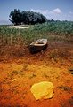
Critique By:
Mads Bangsø (K:253)
2/5/2004 7:26:43 AM
This is a great image....I do have some thoughs that might have done this picture even better:
1. more DOF would have made the entire cactus in focus, and the sailboat too !
2. Ad some more stauration to the picture and some more contrast...in taht way the picture will be more dramatic.
I do like the contrast between the green/red cactus and the blue sea...the sailbot brings life into the picture which i great..all in all, this is a really good picture !
-mads
|
| Photo By: ROD COSTA
(K:909)
|
|
|
Critique By:
Mads Bangsø (K:253)
1/5/2004 10:41:23 AM
Delicate colours ! I would have liked the composition to be a little tighter in the right part of the picture, but that might very well be a matter of taste. Also i would have liked the colors to be a little more saturated, and higher contrast in th esky (perhaps you should consider using a grad ND filter)
But all in all, a great image...keep up the good work
-mads
|
| Photo By: Herianus Madjid
(K:1488)
|
|
|
Critique By:
Mads Bangsø (K:253)
1/4/2004 3:51:12 AM
Great picture in every aspect ! Maybe i bit to over-saturated, but it?s a matter of taste !
Have you photoshoped the hills one by one ?
-mads
|
| Photo By: Zbigniew Biejat
(K:243)
|
|
|
Critique By:
Mads Bangsø (K:253)
1/4/2004 3:43:01 AM
Great Picture! allthough i would have liked to see more to the left and right of the picture. The colors are super, have you done any Photoshopping ? Is the camara handheld or did you use a tripod ? Great image ! keep up the good work !
-mads
|
| Photo By: Miguel Lasa
(K:62)
|
|
|
Critique By:
Mads Bangsø (K:253)
1/3/2004 9:11:53 AM
Great picture...could have been my picture from another angle (http://www.usefilm.com/image/274563.html), still I think you have done a better job than me ! Good work !
-mads
|
| Photo By: Ahmed J
(K:6014)
|
|
|
Critique By:
Mads Bangsø (K:253)
11/20/2003 8:22:41 AM
It was worth the effort!
It think you would have made at picture out of this landscape, if you had the foreground closer to the dune. You would have to use a more wideangeled linse, but i think the result would be even better !
Had you had the foreground closer to the dune, the rippels in the sand would have stood more out, and it would have shown the vastness of thi smassive dune !
I know it?s a matter of taste...
Also i think, you?ll get a better result if you had used a pol-filter (the sky would be deeper blue and the colors more saturated.
all in all, it?s a really good picture, with great colors and nice contrast between, colors and light/shadow.
good work
-mads
|
| Photo By: James Rathbun
(K:204)
|
|
|
Critique By:
Mads Bangsø (K:253)
11/17/2003 6:13:42 AM
Great colors! i think you would have made a better composition if you had a larger foreground. For that purpose a wideangle linse would have done the trick.
-mads
|
| Photo By: gilberto barron
(K:172)
|
|
|
Critique By:
Mads Bangsø (K:253)
11/17/2003 6:05:27 AM
Great use of the filter (s) ! Did you also use a grad ND filter ? All in all this is a really great photo, both nicely composed, great light and an beutiful sky...good work!
i like the fact that you stilel can se the ripples on the water, despite the relativly long shutter speed.
-mads
|
| Photo By: Matt Smith
(K:44)
|
|
|
Critique By:
Mads Bangsø (K:253)
11/16/2003 10:20:34 AM
Great use of teh ND and the 81C filter ! Great composition too !
Fantastic colors, beautifully saturated ! Good sharpness !
can?t find any negative comments to your picture!
-mads
|
| Photo By: Daniel Guerin
(K:7961)
|
|
|
Critique By:
Mads Bangsø (K:253)
11/11/2003 5:50:25 AM
Good double exposior ! I think it would be even better if you made the sky only on blue tones, and maybe gave it more contrast. Having said that, i this the picture is far better in large format with higher pixel density.
good work !
mads
|
| Photo By: Herianus Madjid
(K:1488)
|
|
|
Critique By:
Mads Bangsø (K:253)
11/3/2003 5:37:53 AM
I can agree on what raymund says, it is a great photo. But i don?t think the composition is perfect. (i surpose its a matter of taste!) I would have liked to see al of the cheetah, thereby not cutting of the tail.
I like the color very much, and your picture has a great light !
-mads
|
| Photo By: Alptekin Kutlu
(K:157)
|
|
|
Critique By:
Mads Bangsø (K:253)
10/27/2003 8:44:51 AM
Ups forgot to rate your picture !
Here we go !
|
| Photo By: Aykan OZENER
(K:5996)
|
|
|
Critique By:
Mads Bangsø (K:253)
10/27/2003 8:43:06 AM
Hi Aykan
Great colors in th ebottom of the picture ! I would have liked to picture better, if the top part of the picture was as saturated as the bottom part. Maybe a Grad ND filter would have done the trick...If the top part of teh picture, was less exposed, i think i would have been more saturated. Otherwise Photoshop can do it quite easily 1
The composition of the picture is great ! and the Contrasts is brilliant !
All in all, great picture !
- Mads
|
| Photo By: Aykan OZENER
(K:5996)
|
|
|
Critique By:
Mads Bangsø (K:253)
10/25/2003 9:39:23 AM
Hi Anders
Nicely composed, Brilliant colors and an great DOF. Did you use a Grad ND filter ? I would have liked more contrast in the sky, if yo had used a Pol-filter the sky might have looked a bit more Blue/red (maybe you have already used a polfilter, in that case Photoshop, will do the trick!)
All in all, a great picture...
Keep up the good work...Godt gået !
Mads
|
| Photo By: Anders Skoglund
(K:261)
|
|
|
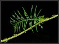
Critique By:
Mads Bangsø (K:253)
10/19/2003 1:05:36 AM
Hi Ronnie
Nice Macro! Great colors too! it really is a bit hard to give you any comstructive comments...but there is one hing that i would have made me like the picture even more: if the "large" branch went from the bottom left corner to the top right corner. I think i would make the composition a little better.
I like the DOF very much ! so all in all, thats a really good picture, you have taken..
-mads
|
| Photo By: Ronnie Gaubert
(K:3700)
|
|
|
Critique By:
Mads Bangsø (K:253)
10/18/2003 11:07:24 AM
Hi Payal
I did Photoshop the image...not as much as you might think, because the contrasts in the picture was already quit egood from the begining.
The Process was somethig along the lines of:
-Firstly i removed the background which was very fuzy due to the low DOF. I don?t know how detalied a description of the process you want, but i quess that you know your way around Photoshop, so i will not go into too many details.
- then i enhaced the saturation on first the green leaf, then on the beatle...
- last but not least...i lowered the brightness of the entire picture, and altered the contrast to make the shadow more dominant.
i hope that was answer enoght, otherwise, feel free to pose any any question, and i?ll try to answer (that goes for anybody !)
thank you for your comments...
-mads
|
| Photo By: Mads Bangsø
(K:253)
|
|
|
Critique By:
Mads Bangsø (K:253)
10/18/2003 7:29:53 AM
Hi Paul
Thanks for the comment! this is always nice to get some feedback!
It is not a Ladybug....it?s a kind of beatle who only lives on lillys....only to straighten things out ! :-)
-mads
|
| Photo By: Mads Bangsø
(K:253)
|
|
|
Critique By:
Mads Bangsø (K:253)
10/18/2003 7:12:00 AM
Thanks to everyone who have taken time to comment on my picture !
-mads
|
| Photo By: Mads Bangsø
(K:253)
|
|
|
Critique By:
Mads Bangsø (K:253)
10/15/2003 4:03:46 AM
Hi Alan
- Great colors! though, I would have saturated them a bit more...but still a great shot (one way to do that is to fit a circular Pol-fliter)!
- I would have liked the picture even better, if you had had a longer shutterspeed. In that way the reflexions, in the water, would stand a bit more out! This would also give at dreamlike fell to the picture...this dreamlike fell kan be enhanced even further by using a diffuser filter...(give a somewhat romatic look!).
- The sky looks a bit pale, by using a pol-filter the sky would be darker blue (which might not be teh realistic colors, but it looks great !) , and (as writen above) the colors would have been more saturated...
- The hills/Mountains (they would be mountains where im from!) in the background are a overexposed. You could have used a Grad ND filter (maybe one who had a difference of only one stop), in that way the background would be more vissible !
- Last but not least: i would like some more contrast in the picture.....
Now, dont get me wrong...i like the picture a whole lot ! which is why i?m spending so much time commenting on it ! All my comments are only suggestions, and thereby a matter of taste !
I hope you can use my suggestions, and i hope you will keep on taking such great shots !
yours sincerly
Mads Bangsø, CPH, Denmark
P.S. Also i hope you understand my english...which has got more than a little rusty !
|
| Photo By: Alan Orr
(K:9671)
|
|