|
|
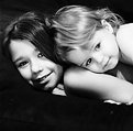
Critique By:
Richard Demanowski (K:674)
3/16/2007 6:07:30 PM
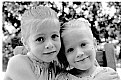
I love the connection you have with the girls, and the tenderness of the moment you caught.
The finish looks oversharpened to me, making it harsh, and detracting from the mood of the moment.
|
| Photo By: Andrea Silas
(K:230)
|
|
|
Critique By:
Richard Demanowski (K:674)
11/27/2005 1:43:58 AM
Thank you. 
|
| Photo By: Richard Demanowski
(K:674)
|
|
|
Critique By:
Richard Demanowski (K:674)
11/27/2005 1:43:32 AM
Thanks, guys.
Lately I've been getting a lot of clients who are hesitant about having their kids' photos shown on the web, so I haven't been able to share much.
|
| Photo By: Richard Demanowski
(K:674)
|
|
|
Critique By:
Richard Demanowski (K:674)
11/27/2005 1:42:21 AM
Thanks, everybody!
|
| Photo By: Richard Demanowski
(K:674)
|
|
|
Critique By:
Richard Demanowski (K:674)
8/21/2005 3:32:45 AM
I don't recognize the pistol. What make is it? It's not a Hi-Power is it? I'm partial to the Glock in the 9x19mm caliber, myself ... I've got the model 17 and the model 19. I also have a Kimber Custom .45 ACP and a Walther PPK 9x17mm in my collection.
|
| Photo By: Mohammed Al-kubaisi
(K:55)
|
|
|
Critique By:
Richard Demanowski (K:674)
8/14/2005 3:00:49 PM
Most of the suggestions I have for you have been made already.
I'll echo the thought that you should move her further from the backdrop (I find that about 5 feet between subject and backdrop works well), and open up your lens to a nice wide aperture. I like to shoot portraits at f/2.8 or f/4 in 35mm, for a nice narrow depth of field that helps focus the image on the subject. Focus on the eyes.
I'm a big fan of natural light. If you have a window that you can set up your backdrop near, I highly recommend you use it. A simple piece of white foam core or posterboard can be used as a reflector to fill in on the shadow side and adjust the contrast on your subject.
If you must use artificial light, an inexpensive way to start is to pick up some work lights from someplace like Home Depot. I would suggest raising the main light -- it looks too low to me in this image (you can see from the catchlights in her eyes where the lights are positioned -- watch for this in the viewfinder), and the direction of the light creates an unnatural abiance in this photo. Our natural tendency is to want to see the main light coming from above and off to the side (since that's where the sun usually is when we look at other people). Start with your main light about 45 degrees off to the side of the camera, and about 30 to 45 degrees above the subject, and adjust it from there to achieve the effect you want.
Like everything else in life, this takes practice. This is a good first attempt, and I wish you much joy in your exploration of this aspect of photography.
|
| Photo By: Joe Plocki
(K:779)
|
|
|
Critique By:
Richard Demanowski (K:674)
3/6/2005 6:48:16 PM
"Come on guys! I need to know why this image isn't GREAT. What should I have done to improve?"
My opinon?
Your subject is too centered in the frame, for one thing. I'd crop it in significantly from either the left or the right. You'll get a different effect from each side, depending on what kind of mood you want to generate.
Also, the lines in the bricks are too angled for my taste. I'd rotate to get them more parallel to the top and bottom of the frame. Because of the perspective, they can't be perfectly parallel, but I think a little *more* parallel would make them much less distracting, and help them focus more on the child.
Here's my take:
|
| Photo By: Marcy Massura
(K:1848)
|
|
|
Critique By:
Richard Demanowski (K:674)
2/27/2005 11:13:03 PM
Great capture. I love the composition, you've got a wonderful dynamic going here.
My only critique is that you've blown out the highlight side of this adorable little boy. For this shot, I think a bit less exposure would have been in order -- let the shadows block up a bit, that's fine, it would work better for a dramatic image such as this, than the blown out highlights.
|
| Photo By: c c
(K:13449)
|
|
|
Critique By:
Richard Demanowski (K:674)
1/30/2005 8:07:47 PM
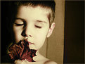
Excellent work, Anja. I love how you've used light and shadow to generate a subtle dramatic tension in an otherwise serene scene. I find the gesture with the leaf simply magnificent. He seems to be experiencing this small piece of the world around him with the curiosity and calm intensity that are so characteristic of childhood.
Well done!
|
| Photo By: Anja Scholte
(K:746)
|
|
|
Critique By:
Richard Demanowski (K:674)
9/8/2004 10:25:02 PM
Seriously Spooky! You've got quite the "Big Brother(tm) is watching" thing going on here.
|
| Photo By: Michael Grace-Martin
(K:10183)
|
|
|
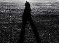
Critique By:
Richard Demanowski (K:674)
8/20/2004 5:04:52 PM
I love how you've made the texture of the grass stand out against the solid mass of the shadow. It creates a tension and drama that adds to that generated by the distortion of the shadow, and the sense of movement in it's shape.
|
| Photo By: Nigel Simmons
(K:405)
|
|
|
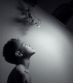
Critique By:
Richard Demanowski (K:674)
8/20/2004 4:46:37 PM
Too much on the Photoshop.
I like the effect around the edge, but it ruins the elegant lines of his arm, hand and jaw, and distracts from the serenity of his face.
I think this would be a better image with a simpler treatment in PS.
|
| Photo By: Maggie Rodriguez
(K:215)
|
|
|
Critique By:
Richard Demanowski (K:674)
6/15/2004 5:00:52 PM
Great image. Beautiful, sensual lines and curves, simply composed, very elegant.
There is just a piece of cloth covering her breast showing at the top center, which I find disrupts the otherwise smooth flow of her torso. Understanding the need to respect the modesty of the model, I think it doesn't fit in this image. I would crop it out.
|
| Photo By: g Difarnecio
(K:542)
|
|
|
Critique By:
Richard Demanowski (K:674)
6/5/2004 2:26:43 AM
Outstanding. Great intensity, simple, elegant in it's power.
Well done
|
| Photo By: Igor Kraguljac
(K:410)
|
|
|
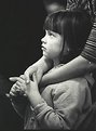
Critique By:
Richard Demanowski (K:674)
4/25/2004 6:56:20 AM
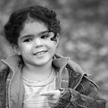
Great shot, Pat!
I love her expression, so totally fascinated and enraptured by *something*. It makes me wonder what she's so engaged with that she'd take even a short pause from munching on her yummy thing.
|
| Photo By: Pat Fruen
(K:12076)
|
|
|
Critique By:
Richard Demanowski (K:674)
4/25/2004 6:53:28 AM
Jose: This was metered with a handheld (Sekonik L-508) with the dome pointed toward the camera lens.
In retrospect, I should have spot metered on his hair on the shadow side, as well. That would have told me that it was more than two stops lower than my main exposure, meaning that I needed to kick in some light with a reflector to keep the shadows from blocking up like they did.
I tend to prefer to keep detail in both shadows and highlights in the negative, even if I later choose to print with higher contrast and allow them to block up or wash out.
|
| Photo By: Richard Demanowski
(K:674)
|
|
|
Critique By:
Richard Demanowski (K:674)
4/25/2004 6:49:52 AM
Kathleen: Yes, that bright sliver of light in the upper left is the hotlight reflector, seen edge on.
I've since settled on a tighter crop of the image. It's up on my website, I may get around to posting it here when I'm through with some other stuff I'm working on.
|
| Photo By: Richard Demanowski
(K:674)
|
|
|
Critique By:
Richard Demanowski (K:674)
4/25/2004 3:44:40 AM
This particular film was an experiment for me.
I normally use 320 TXP (Tri-X) in medium format. I chose to use the 3200 TMax film in 35mm for this because I was shooting indoors with very little light available, and didn't want to draw too much attention to myself with a flash.
I shot several rolls of the 3200 TMax, and several rolls of 400 TXP (Tri-X) pushed to 3200.
I find that I actually prefer the look of the Tri-X pushed to 3200 over the 3200 TMax.
I look forward to seeing some of your work in the medium format. The larger negative size makes a big difference, and I really really like the subtleness of the grain delivered by Tri-X in the 6x6 format that I use.
|
| Photo By: Richard Demanowski
(K:674)
|
|
|
Critique By:
Richard Demanowski (K:674)
3/30/2004 4:56:21 PM
I think this would be an excellent portrait without all the PhotoShop.
You have a great expression, good composition, and excellent light. I find all the PS wigglies terribly distracting from the mood of this image.
|
| Photo By: Teresa Wilkinson
(K:259)
|
|
|
Critique By:
Richard Demanowski (K:674)
1/10/2004 7:50:38 PM
Great candid moment.
It looks underexposed on my screen, the skin tones are far too dark.
|
| Photo By: oyku senhan
(K:874)
|
|
|
Critique By:
Richard Demanowski (K:674)
1/10/2004 7:48:39 PM
I like the image, overall. You've got a nice, calm, quiet feel here -- I'm guessing you don't get that often with these two, knowing the way siblings can be.
I like grain ... but not this much. I'd tone that down just a hair.
It might be the way you've done the conversion from color to BW (or does the 707 have a native black and white mode?), but the lighting looks just a tad flat to me. I like to see a bit more modeling on the face with the light and shadows. I think this image could use a bit more contrast.
Great job for just getting started! And welcome to UseFilm!
(BTW, I'd like to see the "before" version, with no manipulation, too.
|
| Photo By: Lisa Frankel
(K:0)
|
|
|
Critique By:
Richard Demanowski (K:674)
1/8/2004 5:49:46 PM
I love the dreamy, ethereal mood you've achieved here -- great use of window light, and it works very well with the boy's expression.
You've got a good "checkerboard" going on with the bright window, dark frame, and the highlight and shadow sides of his face and body.
I'm not too fond of that radiator coil behind his head. A step or so to your left might have hidden that.
The dark lines of the window frame converge a bit too far below his face, which leads my eye away from there. A higher camera angle might make better use of those strong lines.
I might crop it inside that lamppost, too ... I think there's a bit too much negative space on the right side of the frame.
Perhaps something more like this:
|
| Photo By: Scott Morrissey
(K:0)
|
|
|
Critique By:
Richard Demanowski (K:674)
12/16/2003 9:47:23 PM
I hate to disappoint you Michael, but I don't think I'm the guy you're looking for.
I did indeed live in the Baltimore area for about a year and a half back in the early 1990s, but my mom has never lived there, nor has she ever worked for Becton Dickinson ... sorry. 
|
| Photo By: Richard Demanowski
(K:674)
|
|
|
Critique By:
Richard Demanowski (K:674)
12/15/2003 1:54:43 PM
Oh, one other thing, on the subject of "unfair" ...
Would anybody be complaining about the kids in these images not having shirts on, IF THEY WERE BOYS?
In our culture, not likely. Nor would the subject of "sick people on the internet" come up. And yet, biologically speaking, there is absolutely NO phyiscal difference whatsoever between boys and girls of this age. Those differences only appear once puberty is reached.
So why do we so discriminate between young boys and young girls when it comes to having their shirts off? (I don't see anybody raising this issue with the images of shirtless young boys that are posted here, anyway.)
Now THAT is unfair.
And the "perverts on the internet" argument falls apart in this regard, as well. If you'll browse through the info available on the subject from places like the FBI and Center for Missing and Exploited Chilren, you'll find that there are at least as many sickos out there who lust after young boys, as those who prefer girls. Yet noone seems to bat an eyebrow when an image of a shirtless boy is posted?
Yes, THAT is indeed UNfair.
|
| Photo By: Richard Demanowski
(K:674)
|
|
|
Critique By:
Richard Demanowski (K:674)
12/15/2003 1:42:04 PM
Biliana Rakocevic wrote:
---------------------------
But you have to be very careful with the shoot of almost NUDE children! Very dangerous!!!!! ANd it is not fair!!! Why did you capture them as without CLOTHES!??!?!?!?!? and you are showing them like that. You know how much sick people there is on the Internet?!?!?!?
Regards, Biliana
---------------------------
And what, my dear Biliana, is so horribly wrong about children with no clothes? In Africa and South America many children, and even adults, spend the entirety of their lives nude or nearly nude. As I was growing up, I and the other children in my neighborhood would often remove our clothes to run through the sprinklers or go swimming in the summer.
No, it's what we, as adults, *project* onto nudity -- our own fears and insecurities, many of them bred into our culture through decades and even centuries of oppression and repression by political and religious factions -- that makes it uncomfortable to us.
Unfair? How is it unfair? These poses were *her* idea, both of her parents were present and aproved of them. I fail to see any unfairness whatsoever.
Yes, indeed, there are a lot of sick people on the Internet, Biliana ... and they'll be sick whether I post my images or not. They'll be attracted to, tittlated by, and "turned on" by images of children whether they are nude or not. Even the most innocent image can be interpreted as "pornography" by a perverted mind, even those department store ads for bathing suits, or underwear, or t-shirts that appear in every Sunday newspaper.
I, for one, refuse to allow my life, my art, my vision, and my happiness to be ruined by a few individuals with perverted minds. I simply will not allow them to rain on my parade. My creative voice will not be silenced by fear that my work may be mis-interpreted.
To them, I say: "Get help."
Nor will I allow myself to be silenced by the self-appointed "morality police", who seek to bend the wills of others into their own narrow-minded view of the world, and who are offended by every little thing they see that *might* cause someone else to -- *GASP* -- sin!
To them, I say: "Go back and re-read Matthew 7:3-5."
To you, my friend, I say: "If you don't like the image, don't look at it."
As the great Charles Lutwidge Dodgson said, "If you limit your actions in life to things that nobody can possibly find fault with, you will not do much."
|
| Photo By: Richard Demanowski
(K:674)
|
|
|
Critique By:
Richard Demanowski (K:674)
12/14/2003 7:10:29 PM
Focus! ... Focus! ... *tap lens* ... Focus!
Great moment ... reminds me of a dog and cat I had as a child ... kitty thought doggie was her mommy ...
|
| Photo By: kathy clark
(K:58)
|
|
|
Critique By:
Richard Demanowski (K:674)
12/8/2003 7:20:51 PM
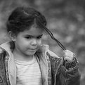
Excellent portrait, a telling view into her world.
I might have used a slightly wider aperture, to blur the background just a touch more.
|
| Photo By: Omer ARI
(K:0)
|
|
|
Critique By:
Richard Demanowski (K:674)
11/11/2003 9:59:40 PM
Great shot, I love the mischievousness you've captured here ... very "boy".
When I read your title, "be ashamed", the first thought that popped into my head was "of what?" ... the only thing about this image that I could possibly consider shameful is the fact that I live in a society where the photo might be considered pornographic.
From a compositional standpoint, I personally would prefer to see a little less dead space on the right ... I'd crop it a bit tighter. Note, however, that that is just me, and I'm a square format bigot ...
|
| Photo By: Hulusi Sogutlu
(K:171)
|
|
|
Critique By:
Richard Demanowski (K:674)
10/29/2003 10:30:07 PM
Cool ... I just bought a 503 CW (got a good deal on a used one ... no way I could afford a new one on my current budget
|
| Photo By: Darrell Larose
(K:736)
|
|
|
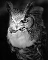
Critique By:
Richard Demanowski (K:674)
10/29/2003 10:15:27 PM
Gerhard, the experts at the aviary assure me that Barney is a "he".
|
| Photo By: Richard Demanowski
(K:674)
|
|