|
|
Critique By:
Julius Kristianto (K:184)
12/21/2003 6:39:58 PM
Thank you to Steve Lamport who has done a very good alaternative. I am vary happy and I hope Todd Miller could see it.
|
| Photo By: Julius Kristianto
(K:184)
|
|
|
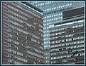
Critique By:
Julius Kristianto (K:184)
12/18/2003 6:27:49 AM
Make some straightening of the building(use simple soft ware)will make a better picture.The colour, the tone and the subject matter is very typical The Netherland well represented.
|
| Photo By: Tim Bronkhorst
(K:9391)
|
|
|
Critique By:
Julius Kristianto (K:184)
12/18/2003 6:08:38 AM
The picture is fine with the cloud and wind, one can feel the breezyness of the day.But what is the photo about?.
|
| Photo By: Claudia De Benedetto
(K:2220)
|
|
|
Critique By:
Julius Kristianto (K:184)
12/15/2003 6:15:29 AM
I would prefer upper/red part more and lessen the bottom/white part.
|
Photo By: Alisa Mudge
(K:7511)

|
|
|
Critique By:
Julius Kristianto (K:184)
11/30/2003 7:00:00 PM
oh, what a split moment captured. The story is well told.
|
| Photo By: Al Ferreira
(K:14)
|
|
|
Critique By:
Julius Kristianto (K:184)
11/30/2003 6:56:49 PM
A very strong subject matter.Graphically well done
|
| Photo By: Michael Yevdokimov
(K:0)
|
|
|
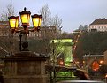
Critique By:
Julius Kristianto (K:184)
11/30/2003 6:55:16 PM
A very good trial and efford but it turned very good. I would like it better if the darker part of the bushes /branches and the pedestal of the lamp post a bit brightened up.
It is just my personal view.
|
| Photo By: Ferenc Mogor
(K:148)
|
|
|
Critique By:
Julius Kristianto (K:184)
11/30/2003 2:44:16 AM
excellent, beautiful, gorgeous! everything, the composition, lighting..where is this? i'd LOVE to go
|
| Photo By: Roger Cotgreave
(K:15892)
|
|
|
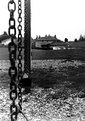
Critique By:
Julius Kristianto (K:184)
11/13/2003 1:54:50 AM
I do not get the idea. What was it meant? Why was the front chain blurred?
|
| Photo By: Corwin Peck
(K:-15)
|
|
|
Critique By:
Julius Kristianto (K:184)
11/13/2003 1:52:39 AM
It is really a beatiful shot. Well arranged and lighted. Was it a live oor dead butterfly. I am curious.
|
| Photo By: Sonny Asehan
(K:148)
|
|
|
Critique By:
Julius Kristianto (K:184)
11/13/2003 1:50:52 AM
Have you a wider shot? I think it would be prettier. The clouds looked like a flying big bird to me.
|
| Photo By: Ray Witter
(K:6149)
|
|
|
Critique By:
Julius Kristianto (K:184)
11/13/2003 1:46:54 AM
Need more space to give a stonger imotive impact.
|
| Photo By: Shawn Robins
(K:42)
|
|
|
Critique By:
Julius Kristianto (K:184)
11/7/2003 12:53:15 AM
It could be better if the lower part of the stem was in focus/sharp. I wonder wht the lower part of the spem was blur. It was of the same plane of the sharp/focus area.Could you explain my question?
|
| Photo By: Rohan Riley
(K:308)
|
|
|
Critique By:
Julius Kristianto (K:184)
9/15/2003 10:44:34 PM
Nice composition and color
|
| Photo By: Jesse Crouch
(K:20)
|
|
|
Critique By:
Julius Kristianto (K:184)
9/10/2003 1:05:43 AM
A very nice color shot.
|
| Photo By: Martin Paul
(K:140)
|
|
|
Critique By:
Julius Kristianto (K:184)
9/3/2003 8:36:17 PM
A bit unusual(not a single trace of soul was seen) yet beautiful.
|
| Photo By: Tomislav Stajduhar
(K:5)
|
|
|
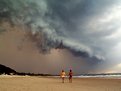
Critique By:
Julius Kristianto (K:184)
9/3/2003 8:28:43 PM
A very rare photo. I have never seen such a cloud. It looked so close to the ground. Very dramatic
|
| Photo By: Roger Cotgreave
(K:15892)
|
|
|
Critique By:
Julius Kristianto (K:184)
8/27/2003 5:25:23 AM
A country feel. Have you traied to make a painting? Worth trying.
|
| Photo By: Darrin James
(K:3944)
|
|
|
Critique By:
Julius Kristianto (K:184)
8/26/2003 6:08:31 AM
More dof would be better(my opinion). It is post-card pretty
|
| Photo By: Lawrence Ong
(K:17)
|
|
|
Critique By:
Julius Kristianto (K:184)
8/26/2003 6:05:21 AM
Too blurry.
|
| Photo By: Felipe Rodríguez
(K:9200)
|
|
|
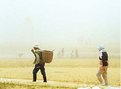
Critique By:
Julius Kristianto (K:184)
8/26/2003 6:02:56 AM
Too tight. A more space would tell more story.
|
| Photo By: Malin Kristinadottir
(K:956)
|
|
|
Critique By:
Julius Kristianto (K:184)
8/25/2003 5:25:58 AM
Careful. Winding road infront. Nice telling picture.
|
| Photo By: Hayri CALISKAN
(K:16195)
|
|
|
Critique By:
Julius Kristianto (K:184)
8/23/2003 9:38:30 PM
Very nice composition and color(night scene).
|
| Photo By: Stephen R. Zang
(K:1044)
|
|
|
Critique By:
Julius Kristianto (K:184)
8/23/2003 8:38:09 AM
A clever and very good creative but very creepy.
|
| Photo By: Jim McNitt
(K:11246)
|
|
|
Critique By:
Julius Kristianto (K:184)
8/23/2003 8:35:02 AM
Nice picture. The framing is too strong.
|
| Photo By: Igor L.
(K:7432)
|
|
|
Critique By:
Julius Kristianto (K:184)
8/23/2003 8:28:24 AM
It looks a bit blur.
|
| Photo By: Shirley Tyler
(K:7)
|
|
|
Critique By:
Julius Kristianto (K:184)
8/21/2003 6:58:20 AM
I like the color and tne composition but the color of the frame is a bit off.
|
| Photo By: David Tasker
(K:4281)
|
|
|
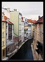
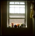
Critique By:
Julius Kristianto (K:184)
8/18/2003 2:54:02 AM
The setting, lighting and the mood were really nice. A bit space at the top of the window will make a lot of diference.
|
| Photo By: Tony Cifani
(K:66)
|
|
|
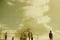
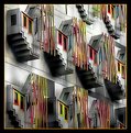
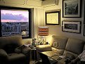
Critique By:
Julius Kristianto (K:184)
8/17/2003 8:00:16 PM
I can see that the residents were busy.The house and the photographs were nice.
|
| Photo By: Jorge Vasconcelos
(K:33746)
|
|
|
Critique By:
Julius Kristianto (K:184)
8/17/2003 7:53:48 PM
Had the backround made blurred , it would be better.
|
| Photo By: f z
(K:291)
|
|