|
|
Critique By:
Marek Krol (K:9791)
11/2/2005 10:47:33 PM
Za malo lodek po lewej, dziwny efekt filtracji (?) na gorze. Na onephoto i tutaj masz pejzaze na ktorych nic sie nie dzieje ale sa udane, w tym brak tego drugiego. Taka ok. pocztowka.
|
| Photo By: Monika Szymanska
(K:719)
|
|
|
Critique By:
Marek Krol (K:9791)
10/19/2005 9:29:55 PM
Magiczne swiatlo 
Mozna sciac gore, ale bez znaczenia. Podoba sie.
PS: wyskoczyliscie do Barcelony z majorki czy to jest starsze zdjecie?
|
| Photo By: Monika Szymanska
(K:719)
|
|
|
Critique By:
Marek Krol (K:9791)
10/19/2005 9:26:38 PM
Bardzo ciekawy schemat kolorystyczny, ale na tej odleglosci i z taka iloscia czarnego otoczenia, czuje sie oddalony. Jakby patrzac z oderwania od sceny, nie wiem czy to dobrze czy zle. Pomimo gorszych walorow technicznych, wole wczorajsze zdjecie.
|
| Photo By: Monika Szymanska
(K:719)
|
|
|
Critique By:
Marek Krol (K:9791)
10/9/2005 8:07:52 PM
Uspokojony chaos. Podoba sie - bym to puscil na onephoto...
|
| Photo By: Monika Szymanska
(K:719)
|
|
|
Critique By:
Marek Krol (K:9791)
8/2/2005 1:54:32 PM
PS: troche Ci sie chmury przeswietlily. Lekko to odciaga wzrok od dolnej polowy zdjecia.
|
| Photo By: Monika Szymanska
(K:719)
|
|
|
Critique By:
Marek Krol (K:9791)
8/2/2005 1:54:01 PM
Bardzo lubie takie klimaty i ten jest udany. Dystans i skala pomiedzy dziewczyna i tlumem trafnie sie odnosza do tytulu. Jedynie lpeije by bylo jakbys ja ujela blizej prawego boku - dalej od lodki i mniej centralnie.
|
| Photo By: Monika Szymanska
(K:719)
|
|
|
Critique By:
Marek Krol (K:9791)
7/26/2005 6:25:57 AM
Ladnie ulozony kadr. Pare drobnych rzeczy - chmury miejscami przeswietlone (troche przeszkadza), lodkowicze mogli by byc blizej lewego boku (drobiazg). Super sie przebijaja promienie przez chmury - bym je troche podkreslil w PS (dodge & burn).
|
| Photo By: Monika Szymanska
(K:719)
|
|
|
Critique By:
Marek Krol (K:9791)
6/26/2005 1:31:05 PM
Bym wycentrowal i scial glowy (zmiana punktu widzenia podczas ekspozycji). Filtr gwiezdny?
|
| Photo By: Monika Szymanska
(K:719)
|
|
|
Critique By:
Marek Krol (K:9791)
6/13/2005 9:31:48 AM
Piekna aksamitna faktura wody i dobrze spostrzezony temat. Ale bym kaczki mniej centralnie umiescil - nie przepadam za centralnymi kadrami. Tez minimalnie za duzo kontrastu - ale to na ekranie w pracy - nie kalibrowany.
|
| Photo By: Monika Szymanska
(K:719)
|
|
|
Critique By:
Marek Krol (K:9791)
5/30/2005 9:44:22 PM
Skoro ze pytam to chyba mi sie tak wydaje. Sa niezle wkomponowane - ale za jednoliy kolor i faktura.
|
| Photo By: Monika Szymanska
(K:719)
|
|
|
Critique By:
Marek Krol (K:9791)
5/30/2005 8:35:18 AM
PS: dorabialas chmury?
|
| Photo By: Monika Szymanska
(K:719)
|
|
|
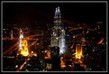
Critique By:
Marek Krol (K:9791)
5/30/2005 7:22:50 AM
bardzo fajne ujecie. Ale troche krzywy horyzont (lub budynki w Kazimierzu zapadaja sie!) no i moglo cos ciekawszego sie dziac na placu - ale tu nie da rady.
|
| Photo By: Monika Szymanska
(K:719)
|
|
|
Critique By:
Marek Krol (K:9791)
4/18/2005 9:06:21 PM
Troche za ciemne na zieleni i moze za bardzo splaszczone plany. Duzo by zyskalo jakby pierwszy plan mocniej udezal poprzez swoja 'wielkosc'. Ale ja zawsze sie czepiam. Fajna fota!
|
| Photo By: Monika Szymanska
(K:719)
|
|
|
Critique By:
Marek Krol (K:9791)
4/11/2005 6:22:37 AM
very ghostly - driven particularly by the blown out areas on it's chest and the way the tail blends into the cobblestones on the street. Not sure I like the cropping on the LHS though.
|
| Photo By: Felipe Rodríguez
(K:9200)
|
|
|
Critique By:
Marek Krol (K:9791)
3/23/2005 7:08:44 AM
Beautiful. Though could have cloned out the construction crane in the background. I take it this is from your trip to Venice last (?) year?
|
| Photo By: Felipe Rodríguez
(K:9200)
|
|
|
Critique By:
Marek Krol (K:9791)
3/16/2005 10:05:56 AM
Ladne. Troche za duzo zamieszania u dolu po prawej ale mozna by to wypalic na czarno. Bardzo fajny trojkat sie tworzy jak rzeka schodzi z linia gor. Zachod czy wschod?
|
| Photo By: Monika Szymanska
(K:719)
|
|
|
Critique By:
Marek Krol (K:9791)
3/15/2005 9:45:48 PM
Reminds me of a cartoon character, something recent but I don't recall what. Was he green one eye? But I don't belive it, this is not a giant only a string puppet of one 
|
| Photo By: Felipe Rodríguez
(K:9200)
|
|
|
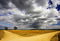
Critique By:
Marek Krol (K:9791)
3/2/2005 10:22:29 PM
niezly pejzazik b. dobrze skomponowany ale swiatlo na pierwszym planie troche nudne. o ktorej to?
|
| Photo By: Monika Szymanska
(K:719)
|
|
|
Critique By:
Marek Krol (K:9791)
3/1/2005 10:04:08 PM
Simple and beautiful. Just the right number of lines to not be too busy and the render textures on the wall make for some good abstract background. Well seen!
|
| Photo By: Felipe Rodríguez
(K:9200)
|
|
|
Critique By:
Marek Krol (K:9791)
2/24/2005 9:08:07 PM
Why o why is it not vertically oriented?!
|
| Photo By: Felipe Rodríguez
(K:9200)
|
|
|
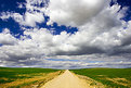
Critique By:
Marek Krol (K:9791)
2/24/2005 9:07:20 PM
Maybe a bit too colorfol for something that tries to be moody. But the use of perspective is great here. Might have included a lttle bit more road at the front of frame.
|
| Photo By: Felipe Rodríguez
(K:9200)
|
|
|
Critique By:
Marek Krol (K:9791)
2/16/2005 10:11:11 PM
A bit too tigtly cropped top andbottom - confinesthe long verticals of the railing. The blur into nthingness is quite deamy, but again the impact ofa leadig line, this time the handrail, is lostas it fills in the gap to the edge of frame not inline with its shape. Sft muted whites suit the mood very well.
|
| Photo By: Felipe Rodríguez
(K:9200)
|
|
|
Critique By:
Marek Krol (K:9791)
2/15/2005 8:17:10 PM
if this is who I think it is then hasn't she grown!
|
| Photo By: Felipe Rodríguez
(K:9200)
|
|
|
Critique By:
Marek Krol (K:9791)
2/9/2005 3:16:50 PM
I think this is better - though I would still like tosee some shadows of detail in the background. But Im picky
|
| Photo By: Felipe Rodríguez
(K:9200)
|
|
|
Critique By:
Marek Krol (K:9791)
2/8/2005 7:53:02 PM
I like the way how his music steps out to greet us from the shadows, overall it works well but...
Some shadow outlines of the bg would help to give context and 'fill out' the frame - no annoying details just variations on grey. As it stands, it's a bit like a studio shot that got spliced with a pavement. Also, you've lost some saturation doing burning on his forehead - needs some correction.
|
| Photo By: Felipe Rodríguez
(K:9200)
|
|
|
Critique By:
Marek Krol (K:9791)
2/5/2005 4:19:44 PM
The area feels very vast and open, driven by the way leading lines from every component of the image converge to a point distant on the horzion. However Felipe, you have posted a number of photos recently in this vain, water reflecting a blazing sky with leading lines to the horizon, and without wanting to detract from any one of them (as they are mostly very good photos) I think you should try doing something different in the same area. Look for a new perspective, do not let yourself drift into a comfort zone following the same techniques time and time again.
|
| Photo By: Felipe Rodríguez
(K:9200)
|
|
|
Critique By:
Marek Krol (K:9791)
2/4/2005 7:13:17 PM
Pewnie fajne miejsce ale tak srednio sie przenioslo na film.
|
| Photo By: Monika Szymanska
(K:719)
|
|
|
Critique By:
Marek Krol (K:9791)
2/2/2005 7:26:28 PM
a little bit sharper a little bit deeper - the tip really needs to be razor sharp here. Blend out into the frame is great though - blurring into a mass of shape and color. Has good balance t it
|
| Photo By: Felipe Rodríguez
(K:9200)
|
|
|
Critique By:
Marek Krol (K:9791)
2/2/2005 6:56:31 PM
zbliezenie skrzydlatej waszki - fajnie. troche mozna poprawic pionowe linie
|
| Photo By: Monika Szymanska
(K:719)
|
|
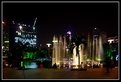
|
Critique By:
Marek Krol (K:9791)
2/1/2005 11:30:21 AM
Super - bardzo sie podoba. Pierscien ognia otaczajacy dwie wierze, a reszta poza zylami w czarnej otchlani.
|
| Photo By: Monika Szymanska
(K:719)
|
|