|
|
Critique By:
Scott McFadden (K:5663)
6/15/2007 3:15:37 PM
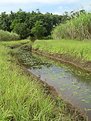
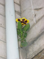
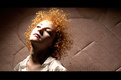
Hey there !
nice to see your still producing good photos.
Although the subject only takes up a very small percentage of the whole i find myself only able to view the subject.
First when i seen the blue writing on the post it distracted me but having finished reading it you cannothelp but follow the arrow which leads to the subject.
I wonder whether you directed your subject to gaze intoward the arrow to create this restless image.
well its always nice to view your work petros
|
| Photo By: Petros Stamatakos
(K:12101)
|
|
|
Critique By:
Scott McFadden (K:5663)
6/15/2007 3:01:37 PM
A very attractive image that has captured well a connection between the older gentleman and young child.
Straight `away im thinking almost finding myself assuming the two are related and comfortable with each other.
With the extremes of white and black in the photograph its always going to be a compromise in the exposure.
Lots of detail in the wings draw the eyes toward center and perhaps with slightly more fill on the older gentlemans wing it would help.
If you lost the lowest part of the photo where the pants were included and select instead to disclude them you will notice right away how much more distinguished the older gentleman would look.
And by the way congratulations on getting the young ones cooperation which is quite difficult at the best of times
|
| Photo By: Bjorn Beheydt
(K:12096)
|
|
|
Critique By:
Scott McFadden (K:5663)
8/24/2006 10:37:11 AM
A 'rose' by any other name is still a rose.
but this my friend is a weed and not a very nice weed at that.
The scenery behind the image you have chosen shows a delibrate break away from the associated normals of society and for that i commend your bravery.
But for me this image just didnt quite work due largely in part to the choice of subject and the marginally overexposed left hand side base.
The person in the frame though not entirely distracting due to your depth of field choice was the final determining factor in why to me this image doesn't work for me.
|
| Photo By: Paolo Bergamelli
(K:687)
|
|
|
Critique By:
Scott McFadden (K:5663)
8/24/2006 10:26:56 AM
This photo looks much nicer with the top cut off but then again i just love decent panoramas.
Im feeling its lacking a subject in the perspective you have selected and therefore the image lacks a certain punch that it surely deserves to have.
Nice even exposure and great timing in regard to the balance of the light thats just so hard to get.
Picture has great depth of field choice and some nice calm collection of color.
|
| Photo By: Alexis Polegaev
(K:379)
|
|
|
Critique By:
Scott McFadden (K:5663)
8/24/2006 8:01:01 AM
You just got to love a well designed photo like this one,
Its just so special how it fades from the solid sharp foreground to the almost unfocussed light top which helps add this gentle image a depth most could only dream of.
Its got so much variety in the scene that simply fills nearly every inch of the photo with a balanced point of interest.
Most of these points of interest i note are triangular groupings of outcroppings.
Exposure wise its just so tricky getting snow to come out so perfectly well whilst not overexposing losing detail in places you'd prefer not to.
The sky i'd have prefed to see some point of interest in but then u cant win them all and i still like this image quite alot
|
| Photo By: viviana alsina
(K:78)
|
|
|
Critique By:
Scott McFadden (K:5663)
8/24/2006 7:49:41 AM
Reasonable clarity on this image and a nice sharp silouete have helped it become better then most average holiday snaps.
Its got some nice color and has the subject in frame fully which helps the viewer understand the title quite well.
Perhaps it could have been better if the viewer had a little less information though...
If only one could afford those big zoom lenses and zoom into the person adrift when they are nearer the sunset it would look quite the diffrent photograph and perhaps even nicer one.
Oh a final note if your camera is Centre wieghted.
Turn it upside down to get a semi ok sunset shot.

|
| Photo By: Bakir Brkanic
(K:2160)
|
|
|
Critique By:
Scott McFadden (K:5663)
6/12/2005 1:59:54 AM
unusual subject of choice that most would pass by as plain and too normal.
time of day could help this particular photo perhaps a reshoot at a later time or sunset when the water could enhance the skys coloring.
good to meet a usefiler near my location...
maybe later we can go on a shoot sometime ?
|
| Photo By: Michael Owens
(K:14)
|
|
|
Critique By:
Scott McFadden (K:5663)
6/12/2005 1:54:37 AM
This is a very diffrent abstract.
do i like it ? wel being no big fan of abstracts it shouldnt be surprising to hear no.
If u wanted to improve this particular image though it would help avoiding blowout of detail in the arm on the top
sometime titles can really help an image stand out othertimes they just add to the mystery.
warms regards
|
| Photo By: D mauzer
(K:316)
|
|
|
Critique By:
Scott McFadden (K:5663)
6/12/2005 1:31:41 AM
Ryan i really enjoy your macro work.
this shot is nice though not perfect.
your subject does appear comfortable if not totally confident of your being there with camera.
the thing that really stop thius image leaping out though is seperation of backgroud and subject.
as the background is made of two parts which divide your attention into them instead of your subject.
trying for more consistant backgrouds will enable a more impact attention grabbing photo.
also see my comment in forumn about ur speedlight question as im sure this too could assist in your quest to improvement.
best of luck in future portraits.
|
| Photo By: R Pike
(K:1242)
|
|
|
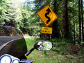
Critique By:
Scott McFadden (K:5663)
6/11/2005 11:14:01 AM
this photo has me perplexed
i lost count how many times i deleted what i was going to say.
at least your subject never had this problem !
I dont really know which side the subject is wanting to help with this sign
although ur title certainly clears the point.
-- delete key strikes again --
|
| Photo By: Uri Lidsky
(K:4932)
|
|
|
Critique By:
Scott McFadden (K:5663)
5/24/2005 6:56:01 AM
I see you tried to place trees in front of lights where ever possible , very good.
The biggest weakness this photo has is noise.
Noise and digtal long exposures seem to go hand in hand there are some tricks(i've added some below) to compensate for digitals lack of quality in that department.
THE BASIC TRICK
the best is to boost iso marginally and shutter speed increase testing.
try multiple setups to see where you get least noise like 100 iso f8 10 sec may be better at 200 iso f5.6 3 sec
but testing is the only way to find the best combo for reduced noise.
THE GOOD TRICK
If the exposure is more correct there will be less noise so bracketing a setup like this could benifit you in a more noise free photo even though they look similar.
THE TRICKY Trick (how cliche!)
Taking one photo at same settings with the lens cap ON yes thats right ON then remove and take one without it on keep the black one and later in photoshop or simmilar use the blank as a mask for selecting the noise to gausan blurr.
hope these methods help you create even more exciting images in the night time hours.
|
| Photo By: Bret Hathaway
(K:556)
|
|
|
Critique By:
Scott McFadden (K:5663)
5/24/2005 6:29:17 AM
The subject seems quite sharp but the foreground is too distracting for me to fully apreciate this image.
having said that its a credit to you getting the butterfly in focuss in frame as anyone who has tried this will know all too often the butterfly dissappears better than houdini himself when the camera comes out.
I have spent hours and hours trying in vain to get a decent photo myself only to be wound up dissapointed at what limited results i get.
Perhaps it would be interesting to see if they can be bribed by something sweet to stay still for a few moments . . . ..
|
| Photo By: isil hasircioglu
(K:35)
|
|
|
Critique By:
Scott McFadden (K:5663)
5/24/2005 6:13:00 AM
Thanks for giving me a laugh.
its really quite funny with the title you chose.
|
Photo By: Jan Graziano
(K:17920)

|
|
|
Critique By:
Scott McFadden (K:5663)
5/24/2005 6:02:34 AM
What a great title.
really helps the photo.
|
| Photo By: Frank Mercer
(K:1925)
|
|
|
Critique By:
Scott McFadden (K:5663)
4/27/2005 9:26:06 AM
Interesting how the lighting looks more like monster lighting though the only source of light was the rangehood light.
that stove must be shiny.
Good to see people using the camera away from the normal useage.
|
| Photo By: Oliver Nebel
(K:1031)
|
|
|
Critique By:
Scott McFadden (K:5663)
4/27/2005 9:21:14 AM
... A masterpiece it could have been.
if only it were sharp.
|
| Photo By: moataz k. elkateb
(K:4971)
|
|
|
Critique By:
Scott McFadden (K:5663)
4/27/2005 9:18:06 AM
They obviously were not ~
I bet the tow truck driver was happy.
Looks better as a pano.
|
| Photo By: Robert Medina
(K:296)
|
|
|
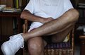
Critique By:
Scott McFadden (K:5663)
4/11/2005 8:46:07 AM
My what a large foot you have!
|
| Photo By: Salvador María Lozada
(K:69375)
|
|
|
Critique By:
Scott McFadden (K:5663)
4/11/2005 8:45:04 AM
Such an unusual title deserves some comment.
I find this title to be mildly confusing ...
why did you choose that title?
Why too the soft image its not going anywhere perhaps you can rephotograph it on tripod ?
nice work seeing something that many would pass by as ordinary and not photo worthy.
|
| Photo By: Omid Aghazadeh
(K:38)
|
|
|
Critique By:
Scott McFadden (K:5663)
4/11/2005 8:32:54 AM
Whoa cool socks !
the lines work well together especially with the cane chair.\just watch the shadows under the chair as they have intruded into the shot
|
| Photo By: moataz k. elkateb
(K:4971)
|
|
|
Critique By:
Scott McFadden (K:5663)
4/11/2005 8:25:35 AM
hmm dinner time humor ?
Im of two minds in this image its nice but i just dont like the centralised nature of it.
|
| Photo By: Vladimir Lestrovoy
(K:14)
|
|
|
Critique By:
Scott McFadden (K:5663)
4/7/2005 7:20:31 AM
Love the way the shoulder becomes the nose in the picture behind.
very good to see the eye so close to your subject.
The model seems a little too aloof for me as she looks right down her nose at us.
the hair in the corner of her eye looks out of spot athough its tiny and really doesnt hurt the photo much.
|
| Photo By: khoa pham
(K:360)
|
|
|
Critique By:
Scott McFadden (K:5663)
4/7/2005 7:11:07 AM
The middle section is clearly where the most attention will be focussed by the viewer.
I feel the shot youve chosen to be the strongest is perhaps the one I dislike out of all of them.
mainly as I cannot actually fully see what is behind the webbing.
If I were asked to view each seperate I would like the middle right most.
very nice accompanyment of photos but just didnt gel together for me.
|
| Photo By: Eric TO
(K:1706)
|
|
|
Critique By:
Scott McFadden (K:5663)
4/7/2005 7:03:08 AM
I love the composition of this photo.
especially good too see a diffrent perspective in portrature.the border you added helps this shot stand out from the crowd as it seems part of the photo.
please try some more lighting setouts with this pose as its really diffrent.
|
| Photo By: yagmur kizilok
(K:-37)
|
|
|
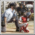
Critique By:
Scott McFadden (K:5663)
4/7/2005 6:54:03 AM
I think the photoshop work let you down a bit.
A nicely balanced image of catcher and hitter that horrible mesh doesnt help though.
curves can be done piecemeal to selections but be sure to feather this as the transistions should appear seamless.
better luck next time
|
| Photo By: Mike Trobee
(K:282)
|
|
|
Critique By:
Scott McFadden (K:5663)
4/7/2005 6:44:41 AM
could be funny as a mirrored image too...
would look as if two birds were going to smack into each other.
|
| Photo By: Rebecca Raybon
(K:26654)
|
|
|
Critique By:
Scott McFadden (K:5663)
4/7/2005 6:41:08 AM
nice reflection but i think a higher aperture may have served u better say around f8
|
| Photo By: Joggie van Staden
(K:41700)
|
|
|
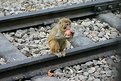
Critique By:
Scott McFadden (K:5663)
4/3/2005 5:16:25 AM
I do like monkeys and this photo is quite diffrent.
It seems the monkey had a small death whish or something just standing there on the tracks.
Did the monkey stay put or run for it ?
a much more amusing idea that proably wont be viable if another is seen on the tracks is to be on the tracks looking down at it.
then if it freaks and runs off itll look as if it saw a train comming.
Visually a thirds cropp could help add more drama to this print.
thanks for sharing a nice photo.
|
| Photo By: V Dewan
(K:79)
|
|
|
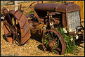
Critique By:
Scott McFadden (K:5663)
2/8/2005 6:48:09 AM
Such a lovely tracktor.
Is it local to you ? if so why not revisit in less contrasty light and even try new techniques out on it.
should really be good to display your progress as a photographer.
|
| Photo By: Eric Simpson
(K:2348)
|
|
|
Critique By:
Scott McFadden (K:5663)
2/2/2005 9:26:11 AM
Pyrotechnics are always a favourite subject.
trouble is they are very difficult to photograph predictably.
|
| Photo By: V Dewan
(K:79)
|
|