|
|
Critique By:
Henrik Hanselmann (K:658)
6/19/2006 1:59:41 PM
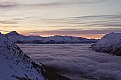
Very good Ken! Nice perspective. Good exposure. Would've been nice with some more detail in lower left part of the picture.
|
| Photo By: Ken Masters
(K:408)
|
|
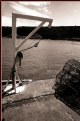
|
Critique By:
Henrik Hanselmann (K:658)
6/19/2006 12:56:49 PM
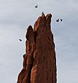
Thanks everyone! It's taken from underneath a trampoline, therefor the strange pattern. Manually focus. Took plenty, but this was the best as the afternoon sun hit them. I'll try increasing the saturation.
|
| Photo By: Henrik Hanselmann
(K:658)
|
|
|
Critique By:
Henrik Hanselmann (K:658)
6/4/2006 8:21:14 PM
thank you christina!
|
| Photo By: Henrik Hanselmann
(K:658)
|
|
|
Critique By:
Henrik Hanselmann (K:658)
5/29/2006 7:57:09 AM
Ok, but why do you think that?
|
| Photo By: Henrik Hanselmann
(K:658)
|
|
|
Critique By:
Henrik Hanselmann (K:658)
5/20/2006 11:40:17 PM
with red shirt.
|
| Photo By: Jacek M.
(K:2999)
|
|
|
Critique By:
Henrik Hanselmann (K:658)
5/20/2006 11:33:35 PM
very nice! good composition, mood and everything. Would have been perfect if the guy's shirt were red. Well done.
|
| Photo By: Jacek M.
(K:2999)
|
|
|
Critique By:
Henrik Hanselmann (K:658)
5/20/2006 4:55:37 PM
Hello!
That new image actually made me more confused, this must be an endless process... The colors on the third and forth match, but not really the first and the second. Maybe you can rearrange... Anyway the earth image is beautiful. Also the fire image might be too much of a close-up. This is not advice, just me being in a critical mood today.
|
| Photo By: Hugo de Wolf
(K:185110)
|
|
|
Critique By:
Henrik Hanselmann (K:658)
5/16/2006 11:26:52 AM
Hello Hugo! I think this i much better than the previous one, much clearer. The first image is a bit problematic for me though, it seems different from the other three, i think it's because is much less contrast. I took a screenshot of the levels.
|
| Photo By: Hugo de Wolf
(K:185110)
|
|
|
Critique By:
Henrik Hanselmann (K:658)
5/15/2006 10:59:48 PM
Hello Hugo! Nice pictures! I'll try to be as critical as i can. it's probably been said before though. If you dont show fire in the first image, you shouldnt show the exact words in the other three. The second one i tend to look at the sunset more than the sky. third one i would prefer a more closeup one of earth, and maybe without trees, last one is ok.
|
| Photo By: Hugo de Wolf
(K:185110)
|
|
|
Critique By:
Henrik Hanselmann (K:658)
5/6/2006 7:21:58 PM
Hello Nick! If you look closely... No, it's a mistake, i meant angle, was a bit tired when I wrote it...
|
Photo By: Nick Karagiaouroglou
(K:127263)

|
|
|
Critique By:
Henrik Hanselmann (K:658)
5/5/2006 12:39:02 AM
ok i understand. maybe a bit too much, and looks a bit strange since it's just on one side of the picture. Maybe a big more blur to the lefthand side as well. I like what you have done to the corners.
|
| Photo By: ignacio ayestarán
(K:372)
|
|
|
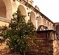
Critique By:
Henrik Hanselmann (K:658)
5/5/2006 12:36:02 AM
Muy bien! A lovely place. Pero, the main attention is on the fruit three because of the framing, and not the building itself.
|
| Photo By: Salvador María Lozada
(K:69375)
|
|
|
Critique By:
Henrik Hanselmann (K:658)
5/5/2006 12:32:09 AM
A very nice and unusual shot Nick. I really like the light and the colors. Quite dramatic because of the angel.
|
| Photo By: Nick Karagiaouroglou
(K:127263)
|
|
|
Critique By:
Henrik Hanselmann (K:658)
5/5/2006 12:28:32 AM
Very nice! Would like have had a more detail on the bird, and maybe a bit more contrast.
|
| Photo By: Milena Kertova
(K:57)
|
|
|
Critique By:
Henrik Hanselmann (K:658)
5/5/2006 12:26:55 AM
good composition. Too much blur on the right hand side for me, is that done in the camera?
|
| Photo By: ignacio ayestarán
(K:372)
|
|
|
Critique By:
Henrik Hanselmann (K:658)
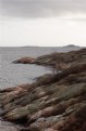
5/5/2006 12:24:12 AM
Interesting. Think i would've croped it a bit from the bottom. Looks like Scotland.
|
| Photo By: John E Robertson
(K:1752)
|
|
|
Critique By:
Henrik Hanselmann (K:658)
5/5/2006 12:20:04 AM
Great exposure, it's such hard one to get correct. very nice mr. quix.
|
| Photo By: Quix Photography
(K:20204)
|
|
|
Critique By:
Henrik Hanselmann (K:658)
5/5/2006 12:18:24 AM
Lovely! Great exposure, how did you get those clouds so nice? Don't like the title though. The house doesn't look very small, but rather majestetic taken from such an angel and in the foreground of those clouds.
|
| Photo By: Esad Mulabegovic
(K:546)
|
|
|
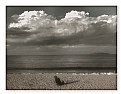
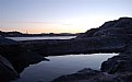
Critique By:
Henrik Hanselmann (K:658)
5/5/2006 12:12:52 AM
Very nice mood. Good capture. A difficult one or exposure. I think the composition could've been better.
|
| Photo By: Michael Kenny
(K:679)
|
|
|
Critique By:
Henrik Hanselmann (K:658)
5/5/2006 12:03:39 AM
It's a very nice shot Mr. Lara. Excellent exposure. I really like the composition and the colors! The centered lightposts and the uncentered tower.
|
| Photo By: Paul Lara
(K:88111)
|
|
|
Critique By:
Henrik Hanselmann (K:658)
5/5/2006 12:00:49 AM
Very good Michael! great composition and shapes. NIce capture. good title as well. On a technical note i think you could have had a bit more contrast.
|
| Photo By: Michael Kenny
(K:679)
|
|
|
Critique By:
Henrik Hanselmann (K:658)
4/25/2006 11:15:31 AM
Very nice, good sharpness. The colors and light is excellent.
|
| Photo By: Richard Belli
(K:76)
|
|
|
Critique By:
Henrik Hanselmann (K:658)
4/20/2006 8:19:07 AM
Thanks for your nice comment again! Interesting what you said about the composition. I'll make a new photo for you, with the compositions you recommended. It's my neighborhood.
|
| Photo By: Henrik Hanselmann
(K:658)
|
|
|
Critique By:
Henrik Hanselmann (K:658)
4/20/2006 8:16:19 AM
Hello Hugo!
I put the yellow thing in there, it's a very small dump truck. I tried to make it look like there really was two big lakes. Because the foreground one is a pond, and the the other is the sea. Just tried to trick the brain.
|
| Photo By: Henrik Hanselmann
(K:658)
|
|
|
Critique By:
Henrik Hanselmann (K:658)
4/2/2006 12:19:51 PM
Hehe. Sounds great, at least you have the Mediterranean, it's still cold here now, have to wait for the summer. But luckily the spring is slowly coming.
No never read the "Works Volume 1" I'll check it up.
|
| Photo By: Henrik Hanselmann
(K:658)
|
|
|
Critique By:
Henrik Hanselmann (K:658)
4/1/2006 7:37:25 PM
Thanks Nick! I think i would prefer a ship
|
| Photo By: Henrik Hanselmann
(K:658)
|
|
|
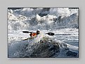
Critique By:
Henrik Hanselmann (K:658)
3/29/2006 11:54:18 PM
Fantastic. So much action. and it's all so sharp. well done!
|
| Photo By: Roberto Bertone
(K:13239)
|
|
|
Critique By:
Henrik Hanselmann (K:658)
3/29/2006 11:50:14 PM
Lovely, the colors are fantastic! Lucky you. The stem's tone is repeated in the door.
|
| Photo By: Nick Karagiaouroglou
(K:127263)
|
|
|
Critique By:
Henrik Hanselmann (K:658)
3/29/2006 6:44:12 PM
It's really nice. The only problem is that the center tulip does get the attention it deserves. The other tulips are too similar and the one does stand out too much, i think.
|
| Photo By: kokupsy_un morita
(K:2651)
|
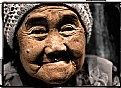
|
|
Critique By:
Henrik Hanselmann (K:658)
3/29/2006 6:39:06 PM
Very good!I like the mix of color and black and white. It's powerful. The lighting could have been a bit better. Too harsh.
|
| Photo By: Putra Anugrah
(K:18)
|
|